When adding images to technical documentation on WooCommerce.com it’s important to provide the best experience for our merchants. The following guidelines aim to ensure the images and screenshots in documentation on WooCommerce.com meet a high standard.
In general, add helpful screenshots
↑ Back to topOften with screenshots, less can be more. A good screenshot in the right place can make it easier for users to follow the train of thought in your document. Too many screenshots can be confusing or overwhelming. Ensure that when you include a screenshot, there’s a clear benefit. Otherwise consider leaving it out.
When adding a screenshot:
- Remember that images should be optional. Make sure that you write out any instructions in the accompanying text. For visitors who use screen readers, it would be a challenge to follow instructions that are only given via a screenshot.
- Use the default WordPress Admin colors.
- For frontend screenshots, use Storefront as the theme unless you’re documenting a different theme.
- Add the screenshot below the written instructions, not above.
- Use light mode when taking screenshots, not dark mode.
- Use a test site that only has WooCommerce Core and the extension you are documenting installed. Other extensions and plugins might add other confounding tabs, settings or sidebar elements.
- Make sure no unnecessary notifications are showing.
- Avoid needing to censor information in screenshots. Ideally use a testing site with sample data. If you need to highlight orders, create several different orders by multiple test users.
- You can also avoid the need to censor information by editing the page HTML using your browser’s developer tools (i.e. right-click, inspect element, and manually edit the HTML to remove sensitive or personal information.)
- If you annotate the screenshot using a screenshot editing tool, use a high contrast red color for annotations. We use a bright red with hex code
#F93442. - If your images are more narrow than the content column (653px), center them.
- Always use the latest version of WordPress Core, WooCommerce Core, and your extension.
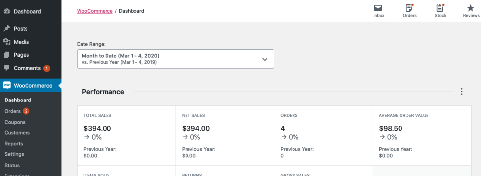
- Take a contextual screenshot for the first screenshot that moves the user to a new path. E.g., when going from a different section to
WooCommerce > Settings > Payments, include the sidebar in the screenshot to help the user navigate.


Give readers enough visual information to locate where they are in the interface, but not so much that the focus of your screenshot is unclear. Screenshots of the full admin area are not usually necessary unless you’re illustrating how to navigate to the item in question.
Use visuals to enhance, not replace, written content
↑ Back to topScreenshots, charts, videos, and other visual aids can significantly enhance documentation, but they should always be supplementary to the written content. Visuals are meant to support – not replace – clear and comprehensive writing.
It’s important to note that visual elements alone are not accessible to everyone, and are more difficult to update and maintain. Therefore, your written content should always stand on its own, conveying all necessary information even without accompanying visuals.
To ensure your documentation is effective, ask yourself:
Does this documentation achieve its purpose without the visuals?
If the answer is “no,” you should revise and strengthen the written content.
In-product screenshots should be lightboxed
↑ Back to topAll screenshots that demonstrate the in-product experience you’re documenting should be lightboxed. So that users can expand them with a click to see more details as needed. WooCommerce.com has a custom lightbox functionality that works with the “Link to image file” option.
To lightbox an image in your documentation, use the “Link to image file” option in the block toolbar.

Images in docs must be uploaded to the WooCommerce.com media library
↑ Back to topImages are not auto-uploaded to the WooCommerce.com media library when content is copied and pasted from a google doc etc. into the block editor. This can leave the images in your document hosted externally and referenced by URL in the doc content, if the external reference isn’t public (e.g. google docs storage is often not publicly accessible) then it will lead to the image showing as broken when the page is viewed by someone outside of your organization.
This is pernicious because you won’t notice the broken image unless you view the page in a private browsing session.
You can spot an external image by the additional button that will show in the block toolbar when you select it, click this “Upload to media library” button to pull the file into the media library on WooCommerce.com, solving the problem.

Placing images between items in ordered lists
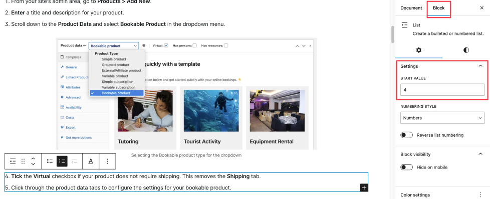
↑ Back to topWhen working with an ordered (i.e., numbered) list, you’ll find additional options in the block settings sidebar.
You can select the “Start value” setting to set your list to begin from a number other than 1. This option is useful if you need to insert non-text content (like an image) between items in your list then continue the numeric list below.
This ensures that the next item in the list after the image contains the next number in the sequence. This is important for our AI systems to correctly understand the sequence of steps that you’re sharing.
Here’s where you’ll find the setting, be sure you have the list element selected and not a list item:

Image File Sizes and File Types
↑ Back to topWe strive for clear resolution images that are 50kb or less.
Images are automatically converted to WEBP for display after being uploaded to the WooCommerce.com media library. This significantly reduces the file size. Generally if your PNG screenshot is around 300kb or less, after conversion it will be an acceptably sized WEBP image file for use in documentation.
Image File names
↑ Back to topImages should not have generic names like screen shot {timestamp}. Instead, give the image a relevant name for the subject it depicts. If you’re having trouble coming up with something It can be helpful to consider:
- What extension is this for?
- What settings or process am I depicting?
Then incorporate those answers into a simple file name.
An appropriate image file name is more than just good SEO, it also helps AI systems determine whether the image is relevant to include in an answer to a user’s query.
Annotations & Highlights
↑ Back to topAnnotations are useful to point out important specifics in screenshots. however images should only show one process or completed settings configuration. If a process is more than three steps, consider breaking it into two or more images.
Make sure any annotations you add:
- Use a high contrast red color. We use a bright red with hex code
#F93442 - Are numbered if necessary
- Are easy for users of all types to understand
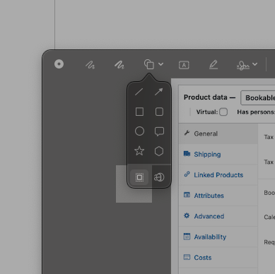
If you want to highlight or spotlight content, consider using Apple’s built in screenshot editor (preview) or Cleanshot-X, which has a similar feature.

Alt Text
↑ Back to topIf all the information about what is in the image is in the document content, alt text doesn’t need to repeat everything that’s already explained in the document. Instead, it should provide a brief, focused description of the image that complements the more detailed explanations in the main text.
Alt text and captions should not be duplicates of each other. Our AI support systems can use both alt text and captions as factors in whether or not to include an image in a response, or whether to use a document to answer a question, so be intentional with how you write them.
Note: Do not use phrasing like “this image shows…” or “this is an image of…” these are unnecessary in both alt text and captions.
Captions
↑ Back to topWrite captions for images to provide additional information that is not included in the text that introduces the image. Use captions to provide additional context or information that complements the image and surrounding text. Captions are not required. Captions and alt text should not be duplicates of each other.
Our AI support systems can use both captions and alt text as factors in whether or not to include an image in a response or use a document to answer a question, so be intentional with how you write them.