Every time someone makes a purchase online, there are a wealth of psychological factors that come into play. So understanding how the human brain works, and more specifically, how people decide to buy, can contribute to the success of your online store.
Utilizing buyer psychology is about more than just making sales. It helps you provide a better user experience, connect on a personal level with your buyers, and offer the best solution for your customers.
Consider how you can use the following psychology principles to improve your store experience.
The psychology of web design
People love pictures with faces
When choosing photos, try to incorporate images with faces. Why? There’s a part of our brain designed specifically to respond to faces and our attention automatically shifts towards them.

Facial expressions are generally universal. They’re connected with emotion and can be a great way to create a positive feeling towards your product.
We feel better when we see other people smile because the mirror neurons in our brain help us experience emotions similar to the ones displayed. So if you showcase an image of a happy customer smiling while using your product, it helps site visitors feel good about your brand.
It’s also useful to literally put a face to your business. People connect better with other people than with a company that could otherwise seem distant. Photos of your team, founders, or customers can go a long way in connecting with new shoppers.
Colors are associated with feelings and actions
Color can affect our mood and behaviors, so it’s wise to consider the ones you choose for your brand and website. It’s critical that you understand your target audience, because the way we react to color is largely dependent on personal experiences.
However, here are a few words that are often associated with specific colors:
- Red – power, energy, and love
- Yellow – joy, happiness, and inspiration
- Green – nature, health, and money
- Blue – trust, peace, and responsibility
- Purple – royalty, wealth, and spirituality
- Pink – caring, nurturing, and love
- Black – seriousness, mystery, and sadness
- White – peace, cleanliness, and simplicity
Put some time into researching how your customers interpret colors. This is especially important if you have an international audience, because the meaning of color can change dramatically in different cultures. You don’t want a color that your potential buyers associate with mourning or danger.
Also remember that about 8% of men and 0.5% of women have some form of color blindness. Don’t rely on color alone to communicate your message; use symbols and shapes as well. And make sure to provide enough contrast between text colors and background colors. Learn more about making your website accessible.
Customers connect with photos and videos
Good images do more than just look nice; they also grab attention, invoke emotion, and compel shoppers to take action. Our brains process images 60,000 times faster than text, so they’re often the very first things customers notice on your website.
If possible, use your own, branded photos rather than stock photos. Stock photos can appear fake and, therefore, reduce trust in the eyes of your customers. They’re also not unique to your brand — thousands of other companies could be using the exact same picture. If you do need to use stock photos, choose ones that appear natural and real rather than staged.
And, since you’re competing with physical stores, make sure to showcase a variety of product pictures. Potential customers can’t touch or feel your products, so include pictures from a variety of angles. Highlight details like textures and special features.
Videos are also a great way to connect with your customers. They’re both visual and auditory, so they’re more memorable than other forms of media — viewers remember 95% of a message when watching it in a video, compared to 10% when reading it.
Have you ever cried during a movie? That’s because video utilizes the exact same mirror neurons in our brain as images do. We’re able to put ourselves in the position of the people we’re watching. So feature videos with happy customers or stories of people you’ve helped. It can go a long way!
Good design relates to credibility
According to the Stanford Web Credibility Project, almost half of consumers assessed the credibility of a website based on its visual design. Factors like colors, fonts, layouts, pictures, and navigation all contribute to whether or not your site visitors view your product page design — and business as a whole — as professional.
Here are a few things to consider:
- Avoid typos and blurry images. Customers can quickly associate those types of mistakes with a lack of professionalism.
- Choose fonts that are easy to read. Feel free to be creative and make your site stand out, but it’s important that users can still read all of your content.
- Avoid clutter. Don’t cram a ton of pictures and text into your website. Instead, prioritize important content and calls to action. White space — or unused space — improves comprehension and draws focus to critical information.
- Keep things consistent. Use the same colors, fonts, and design style throughout your site. This helps your customers know they’re in the right place and encourages them to remember your brand.
If you want to update your ecommerce website design, try one of our themes built for WooCommerce. Or, hire one of our WooExperts to make the process as easy as possible.
How psychology impacts user experience
People scan screens based on experience
Eye tracking is the process of measuring where people look, and in what order, when visiting a website. Knowing how the average user behaves online can be incredibly valuable when making design decisions.
There are certain patterns that are relatively universal. For example, most people view a website in an F-Pattern. If your customer base reads in a language that moves from left to right, then they’ll typically view a website from left to right, starting at the top. Then, they scan vertically down the left side of the page, looking for interesting information and visuals.
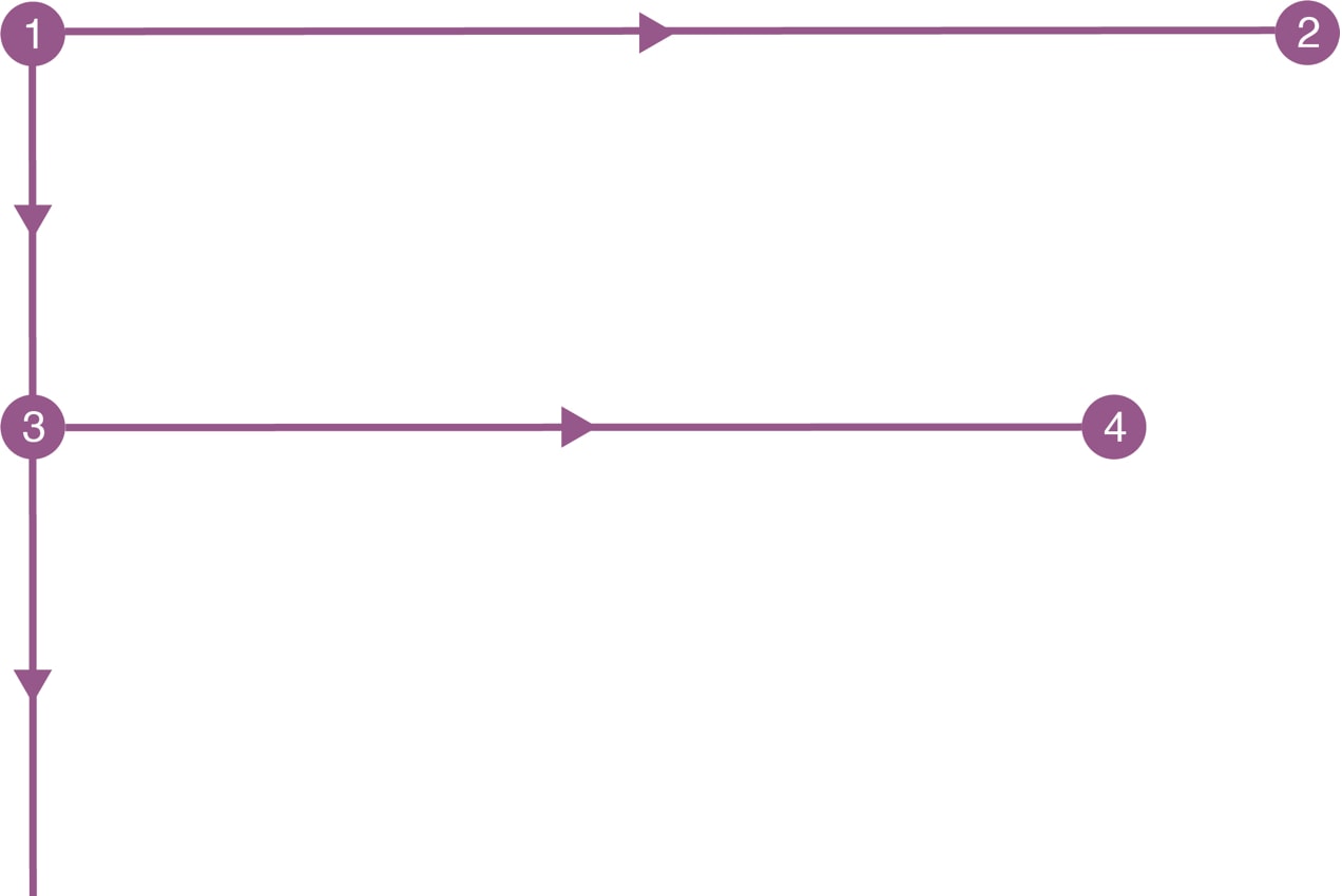
So how do you implement this on your site? Start by putting the most important information at the top of the page, or “above the fold.” Organize your content in a hierarchy that’s easy to scan, with clear headlines and bullet points. This helps your visitors find what they want to read quickly when scanning your site.
People also use patterns to navigate websites. Our brains are lazy and look for the fastest way to accomplish a task in order to save energy. There are things your visitors expect to find in specific places and, if they don’t, they might leave your website entirely.
For example, site visitors typically expect to find:
- Navigation right away, often at the top of a website.
- A search bar in a visible location, like the header, sidebar, or footer.
- A Contact page and About page.
- A logo that directs back to the home page when clicked.
- The purpose of your site right away, with a tagline, image, or something similar.
- Contact information in the footer.
This isn’t to say that your site should look like everyone else’s or that you shouldn’t try something new and push the boundaries. However, straying too far from the norm can be disorienting. Make sure that your design is built to meet the needs of your target audience.
People need bite-sized chunks of information
Our brains can only process a certain amount of information at a time, so it’s important that you provide your site visitors only with what they need and don’t overwhelm them.
However, some of your customers might want to read all the information possible. One way to balance these two schools of thought is to provide short snippets of content with links to pages with more information. You could also use accordions to allow your users to expand individual topics if they’re interested in finding out more. See how to use some of these principles on an FAQ page.
On pages with a lot of text, like landing pages and blog posts, use headlines to break up the content. Bullet points can also help your users quickly skim information to find exactly what they’re looking for.
Our brains also naturally create categories. If you organize your website into logical groups, you can save your customers from needing to categorize content themselves. While the exact way that you categorize content will vary depending on what you sell, you might want to group products by type, size, or age range.
In addition to categories, you can also allow customers to filter your products by price, rating, color, size, and more. The Product Filters for WooCommerce extension is one easy way to accomplish this.
People’s minds wander
We’ve all been there. We find an informational video online, only to get distracted by a funny cat compilation in the sidebar. Before we know it, we’ve watched 12 unrelated videos and forgotten all about the information we were looking for.
That’s because our minds wander at least 30% of the time. Mind-wandering helps our brains rest and can even contribute to a higher level of creativity.
So, build your website knowing that your site visitors will get distracted. Provide them easy ways to get back to where they started, like effective navigation. Breadcrumbs can be extremely helpful because they show a user’s location on the site and allow them to easily navigate to previous pages. Learn more about creating effective website navigation.
Users become frustrated with slow, unresponsive websites
Research has shown that people expect a response within two seconds of making a request. If it takes longer than two seconds, our concentration is broken and productivity is decreased. While this principle applies in all areas of our lives, it’s especially applicable to website design.
If your site takes too long to load, customers will become frustrated, leave, and purchase a similar product elsewhere. There are a variety of factors that impact your website load time; here are a few articles to help you get started:
- Speed Up Your WooCommerce Site with Jetpack
- How to Optimize Images to Speed Up Your Online Store
- First Things to Consider with WooCommerce and Speed
- How to Achieve a High Performance Score on Google PageSpeed Insights
The same principle applies to responsive design. If your website isn’t consistent and doesn’t work well across devices of all sizes, your site visitors will go elsewhere. After all, why would they stay on your site if they have to zoom in to read your content or if page elements are cut off?
Make sure to test your website on large screens, along with tablets and phones in both landscape and portrait mode. If you don’t have a variety of devices readily available, you can use tools like Responsive Design Checker to simulate the experience.
Everyone makes mistakes
It should be no surprise that we all make mistakes. After all, we’re only human! It’s important that you understand the potential errors that your customers will make and prevent them as much as possible. This starts with proper testing.
It’s best if you conduct user testing with people who fall into your target audience. So if you sell clothes for women between the ages of 35 and 55, try to find people that fit into that category. Users of different ages and experience levels may interact with your website differently.
There are a variety of ways to conduct user testing, including sitting down in person with potential customers. You can also use services like UserTesting.com to take care of the whole process for you.
Once you determine what the most common mistakes are, try to prevent them. That might involve changing your website design, layout, or copy. You may need to make buttons more visible or rearrange navigation to make items easier to find.
Error messages can also be extremely effective. If your customer enters a credit card number incorrectly, make sure there’s a clear message letting them know what the problem is. The same thing goes for your contact forms! This helps customers fully understand any errors that they make and how to fix them.
Too many options overwhelm people
Have you ever stood in a store, completely overwhelmed by the number of toothpaste options available? Whitening, enamel repair, sensitive teeth protection, tartar protection — which one’s the right solution?
The more choices you present your users with, the longer it takes them to make a decision and the more likely it is that they’ll become overwhelmed.
Categorizing is really important as well, especially if you have a lot of products.
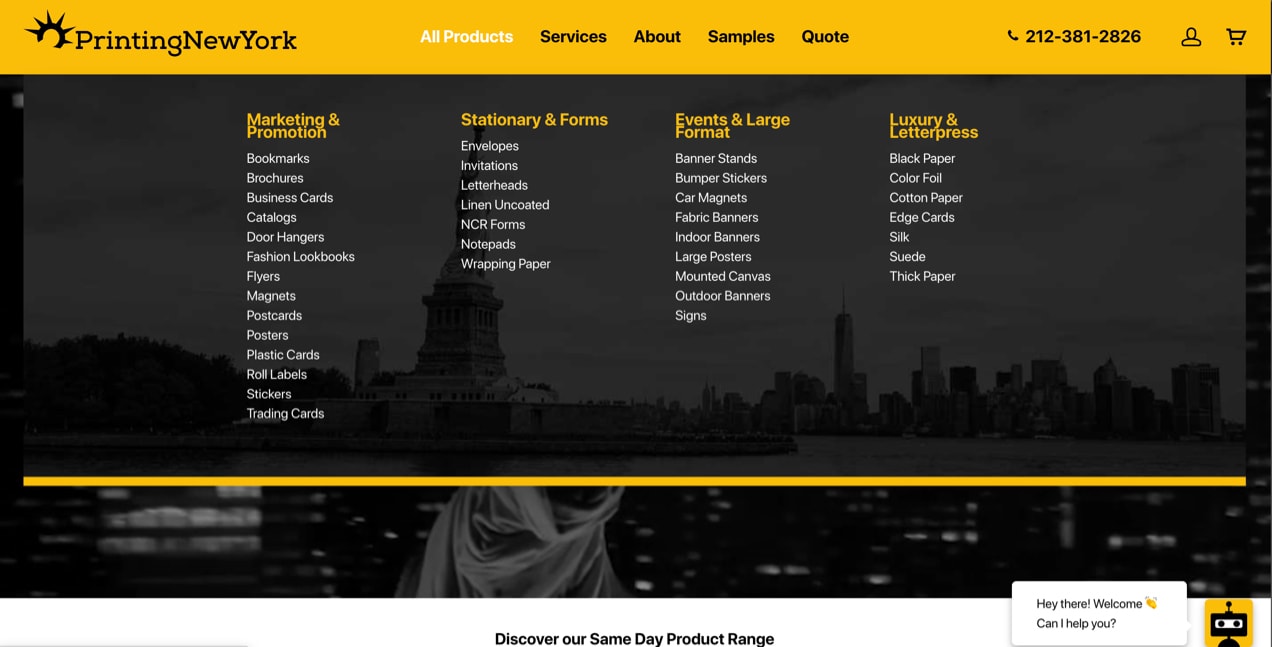
PrintingNewYork uses their primary menu to help customers find exactly what they’re looking for. Under Services, they include categories for Offset Printing, Digital Printing, and more. Then, they have subcategories like Banners and Event Signage. These types of subsets go a long way in helping people process information.
To achieve a similar menu style with the Storefront theme, try the Mega Menus extension.
You can also simplify the Checkout process by allowing for social login. Shoppers can create an account on your site using Facebook, Twitter, Google, or other platforms, without having to fill out a bunch of fields. WooCommerce Social Login is one great solution for this.
Language and psychology
Customers respond to urgency and guarantees
Urgency appeals to people’s fear of missing out. Studies have shown that we place a higher value on items that are scarce. If your customers are worried that they’ll miss out on purchasing a high-value item, they’re more likely to purchase right away.
You may want to add a banner to the top of your site or your checkout page using words like:
- Hurry
- Limited
- Right away
- Running out
- Now
- Last chance
So you might say, “Stock is limited! Get your before we run out.” You can create a similar urgency with coupons by only offering a discount for a set period of time.
Guarantees are also integral to converting shoppers. Your customers want to know that they can trust your company and that they’re purchasing a good, reliable product or service. If you have accreditations or certifications, include those throughout your website. Testimonials and reviews make a big impact as well. In fact, customers are willing to spend 31% more on a business with positive reviews!
When writing your website copy, use words like:
- Guarantee
- Certified
- Money back
- Genuine
- Proven
- Authentic
You might want to offer a 30-day money-back guarantee, allowing returns for a month after purchasing, no questions asked. This shows customers that you’re confident in your products and are willing to stand by your claims.
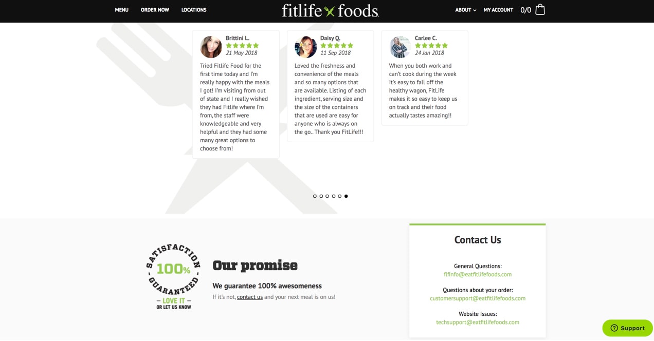
FitLife Foods, for example, offers 100% satisfaction guaranteed, promising a free meal if a customer isn’t completely satisfied.
People love stories
Everyone loves a good story. And including stories in your website adds authenticity and personality to your brand. They also grab attention and help consumers remember your products.
When we hear a good story, our levels of the happiness hormone, Oxytocin, increase. This boosts our feelings of trust and empathy and positively affects our attitude towards a product and brand.
Here are a few ways to tell your brand story:
- Share customer success stories, especially ones that are emotional or exciting. Airstream shares interesting stories of their customers’ adventures around the world.
- Create a story around your brand. Bloomscape showcases the history of their company, a compelling family story that goes back generations.
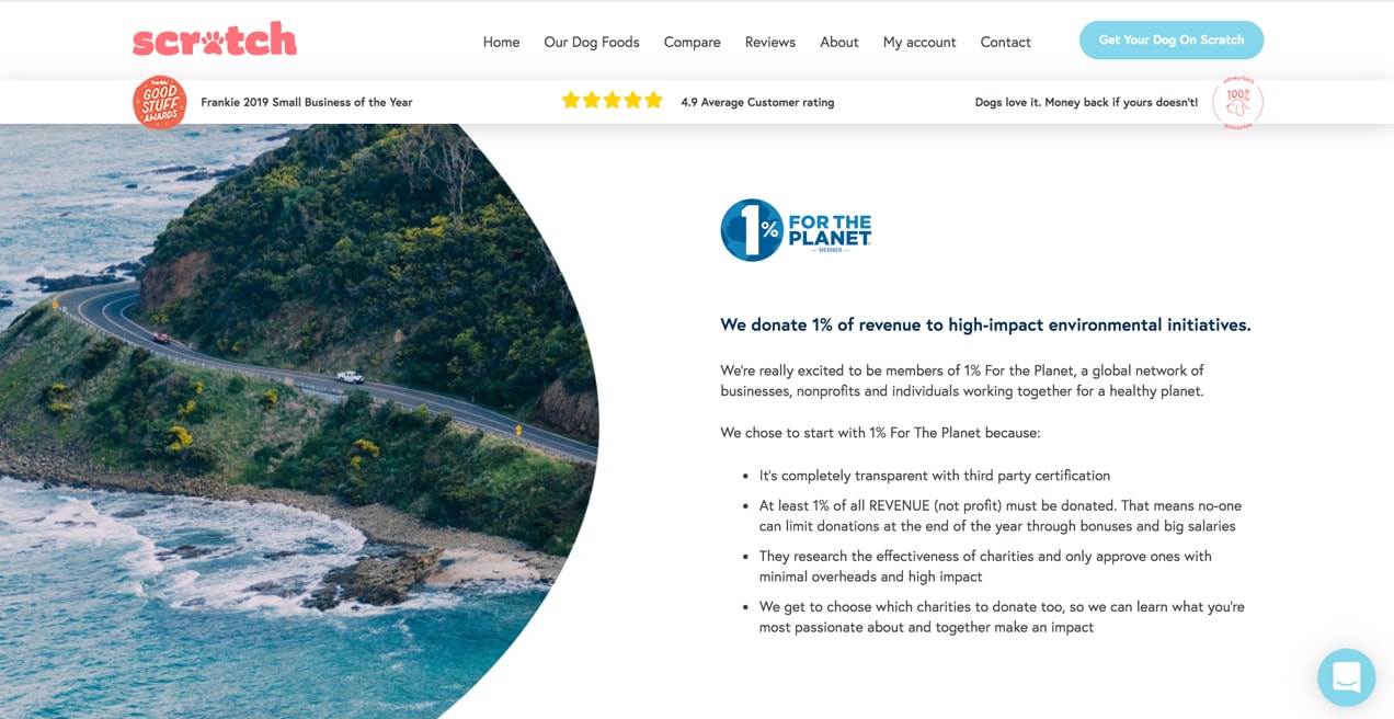
- Be transparent about your practices and manufacturing. Scratch Pet Food highlights their eco-friendly initiatives, even incorporating a bit of time travel.
- Give back to the community. Osana Bar gives a bar of soap to kids in need for every bar purchased.
- Focus on the benefits of your products or services. Bobo & Boo steps into the shoes of their customers, speaking directly to moms while explaining their products’ benefits.
The most important thing is to be authentic. Share your passion and why you love what you do. Your customers will be able to tell if you’re being fake, but will fall in love with the true story behind your products.
Other psychological factors
Customers are more likely to start with a small purchase
If you’re marketing to first-time users of your products or services, it’s best to start with asking for something small. Why?
People are more likely to give into a small request because there’s less risk involved and it’s often easier than saying “no.” Later, when customers are asked for something larger, they’re more likely to agree.
This is called the foot-in-the-door technique. It goes back to the age of door-to-door salesmen; if a salesman literally got their foot in the door, they were less likely to have it slammed in their face.
Here are a few ways you can put this into practice:
- Ask for an email address in exchange for a discount. One in three email subscribers purchase something from the brand that they subscribe to.
- Sell a box of sample-size products. Customers will feel better about getting the chance to try out your products with little risk.
- Offer a free trial. An impressive six in ten free trials convert to paying customers.
- Allow for small donations if you’re a nonprofit. Donors will feel good about themselves and be more likely to make a repeat, larger donation down the road.
Starting with something small also gives you the opportunity to connect with customers and explain why your products or services offer the best solution.
Customers need education for new products
People have certain expectations for how things work based on their experiences. If you offer a brand new product that provides an alternative to what your audience is used to, it’s important that you provide training.
For example, some of the most powerful software can sometimes come with a learning curve. Jetpack provides a great support section where you can easily navigate to the areas most relevant to your problem and quickly access solutions to common issues. Jetpack also has a team of Happiness Engineers who work full-time to ensure that you have personal, high-quality support, not scripted responses and long drawn-out processes.
Your job is to provide your customers with all the information they need to successfully use your product. Otherwise, they might be unhappy and either ask for a refund or simply disappear without making another purchase.
Here are some ways you can provide customer education:
- Offer a free tutorial library with videos on how to use a product.
- Include links to documentation and manuals in your transactional emails.
- Write blog posts with use cases and customer success stories.
- Send a series of emails between product purchase and delivery with additional information.
- Provide a help desk or online support channel.
This type of information helps your customers fall in love with your products.
People love reward programs
Many of us have a wallet full of loyalty cards that we pull out at our favorite shops. It’s satisfying to get that stamp or watch points go up on an app. But why?
Rewards offer positive reinforcement. Each time a customer makes a purchase, you provide them with a virtual pat on the back and a, “Good job!” They’re encouraged to take that same action over and over again and, in the process, form a relationship with your company.
A rewards program also results in a long-term commitment. If a customer is offered the option to switch to another provider, they risk losing the points they’ve accrued. This makes the idea of purchasing elsewhere much less appealing.
WooCommerce Points and Rewards makes it easy to create a store loyalty program. You can choose how many points customers earn for each purchase they make, then allow them to redeem those points for discounts. They can even log into their account to view their points and know how close they are to a reward!
Shoppers need to experience your products and brand
When shopping online, customers lose the ability to physically touch, feel, smell, and try out a product before making a purchase. But a solid, strong website can provide an experience that’s just as valuable.
Start by telling your story. Create a brand personality and share what you’re passionate about. Establish a positive reputation with good, solid reviews. These tactics are all critical for building a loyal, engaged customer base.
One of the most valuable benefits that an online store can provide is direct interaction with your brand. Allow your customers to ask questions directly on your site using a live chat feature or create a community on social media where customers can engage with you. This type of transparency builds trust and loyalty.
It’s also important that you provide all the information customers need to make a decision without being able to touch your products. Your product descriptions should include size charts, dimensions, and details about smell, taste, or texture. Learn more about writing great product descriptions.
FAQ pages, video libraries, and documentation can be a great way to answer customer questions and overcome any objections. Learn how to create an effective FAQ page.
Customers make decisions using common factors
While your buyers’ motivations will depend on your target audience, there are some universal truths. In a recent survey, customers said the following impacted their buying decisions:
- Free delivery
- Coupons and discounts
- Reviews from other customers
- An easy return policy
- Loyalty points
- A quick, easy online checkout process
While not all of these make sense for every online business, incorporating as many as possible can impact conversions. Get to know your buyers and understand what they value the most. Surveys are a great way to do this, whether you send them out to your email list, ask questions on Instagram Stories, or use tools like Crowdsignal.
It is interesting to note, however, that many purchase decisions are made unconsciously. Neuroscientists found that we only use about 20% of our brains consciously, so there are a variety of things that impact our decisions that we’re not even aware of.
This goes back to one of the common themes we’ve discussed — appealing to emotions. Emotions are so important that neuroscientists also discovered that people whose brains cannot generate emotions are unable to make decisions.
When choosing photos, writing product descriptions, creating ads, and building a brand, consider the emotional appeal of your products. Go beyond just explaining product features; explain how they’ll affect your buyers’ lives. This can go a long way in building a loyal customer base.
Psychology is about more than sales
Understanding your customers’ psychology is not just a way to increase sales. It allows you to connect on a deeper level with the people that make up your core support base and enhance their shopping experience.
It’s not meant to trick consumers, but instead, to be used as a tool to improve your communication so that the messages you spread are perceived how they were intended. With a little work on this important aspect of store ownership, you’ll have more sales, yes, but happier customers, too.
Does color also affect to change the mind of the buyer?
I mean converting review reader into the buyer.
Color can definitely impact the perception of buyers, so colors like blue and green can convey trust, while colors like red and yellow might be bold, powerful, or exciting. This article goes more in-depth about how color impacts eCommerce: https://woocommerce.com/posts/psychology-color-e-commerce/
How much the design of website effect?? Will brand be more powerful than design?
Website design goes a long way in establishing brand affinity and trust, so they really work together. If you have an unknown brand, then that makes the design even more critical to helping customers trust you and complete a purchase. If you have an established brand, customers may still purchase your products, but you’ll receive fewer sales if you have poor design.
When it comes down to it, it’s important to understand your target audience and know what they value the most.
When choosing photos, writing product descriptions, creating ads, and building a brand, consider the emotional appeal of your products. Go beyond just explaining product features; explain how they’ll affect your buyers’ lives
Absolutely, great point! Explaining the goals and mission of your products helps connect with customers and make your brand stand out from competitors. Thanks for sharing!