La suscripción incluye
Ayuda y soporte
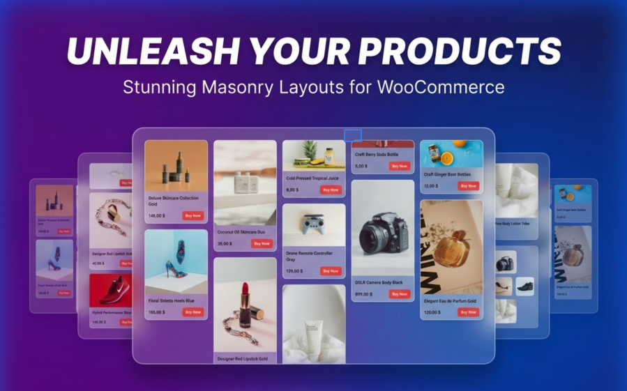
Standard WooCommerce product grids force all your products into identical boxes. Tall products get cropped. Wide products look cramped. Your carefully shot product photos lose their impact, and your store looks like every other online shop.
Product Collection Masonry changes that.
This plugin extends the WooCommerce Product Collection block you already use. There is nothing new to learn.
Your products now display in a flowing, magazine-style layout that keeps customers browsing longer.

Product Collection Masonry is not a replacement. It enhances the native WooCommerce Product Collection block through standard WordPress controls.
This means:
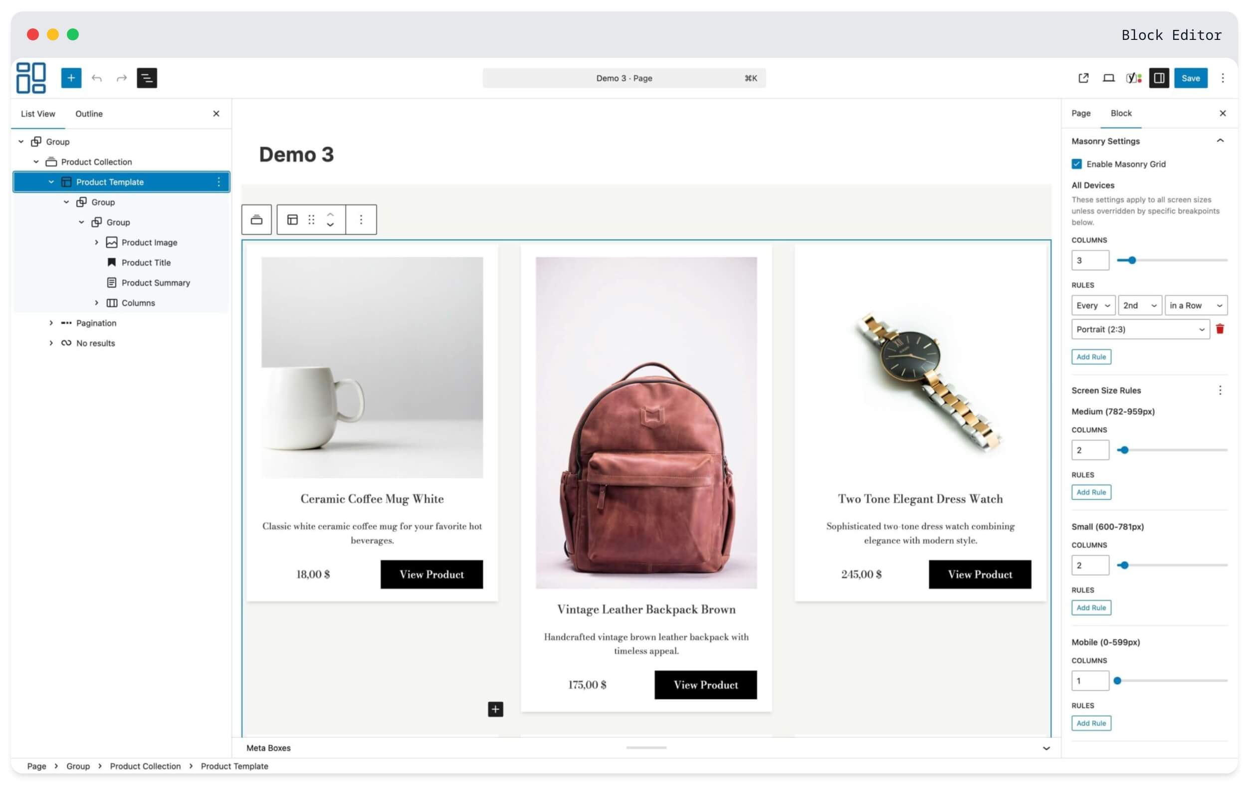
Your customers shop on phones, tablets, and desktops. One layout does not fit all.
Set different column counts for each device:
| Device | Example Setup |
|---|---|
| Mobile phones | 2 columns for larger product images |
| Tablets | 3 columns balanced for touch browsing |
| Laptops | 4 columns for comfortable viewing |
| Large monitors | 5-6 columns to display more inventory |
Each breakpoint is independent. What works on desktop stays on desktop. What works on mobile stays on mobile.
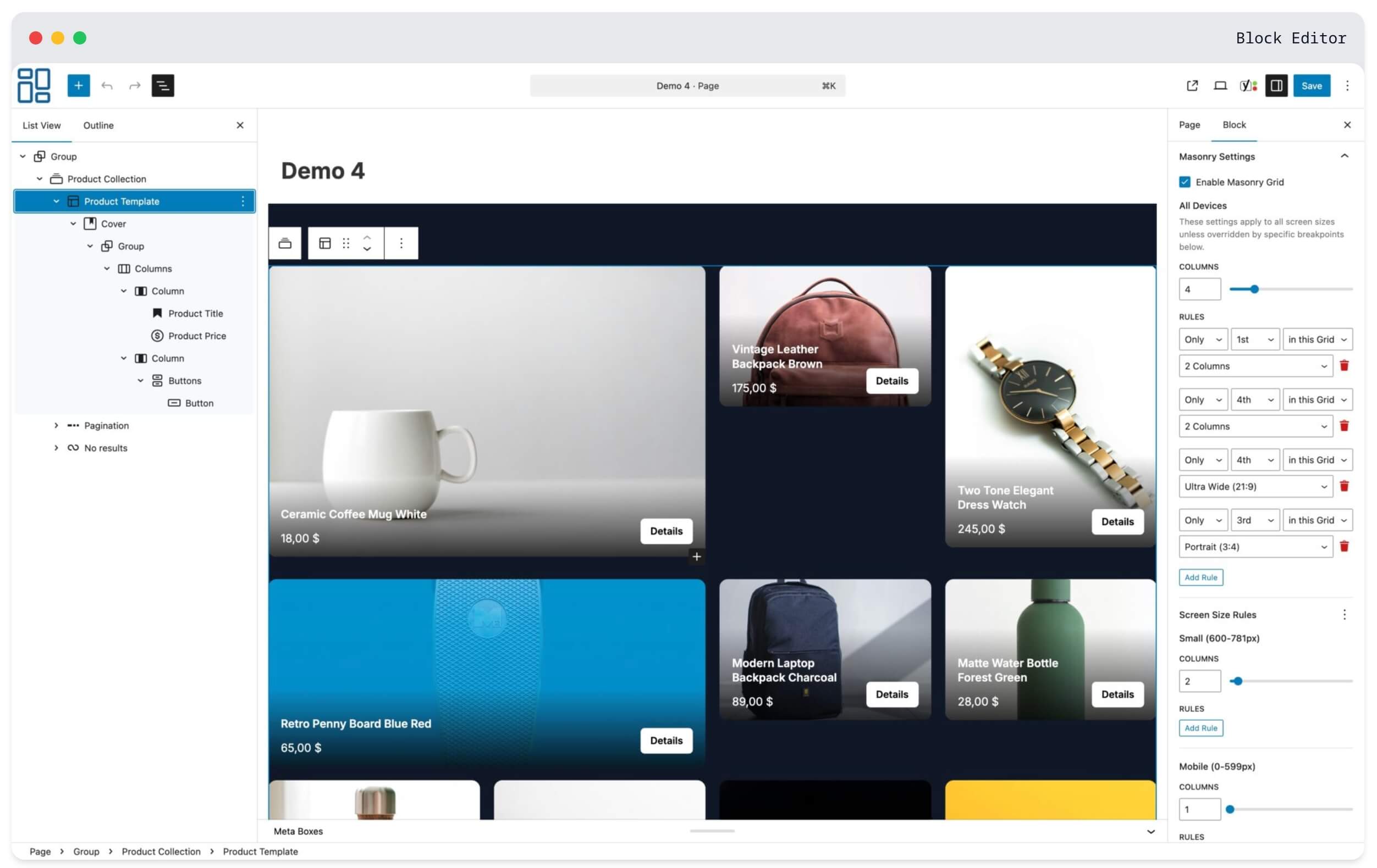
Make specific products stand out by spanning multiple columns or using different aspect ratios.
Use this for:
Create rules like «only the 1st in a Row spans 2 columns» or «every 2nd in a Row uses portrait format» for consistent column-based patterns. Or use «in this Grid» for traditional targeting across the entire product list.
Not all products photograph the same way.
Jewelry looks best in portrait. Furniture needs landscape shots. Accessories work as squares. Now you can display each product in its natural proportion without forced cropping.
Available aspect ratios:
Apply ratios to specific positions or create repeating patterns across your entire catalog.
This is important: if you deactivate this plugin, your store keeps working.
Product Collection Masonry uses only standard WooCommerce blocks. There are no proprietary shortcodes, no custom databases, and no special markup that breaks when the plugin is removed.
Deactivate it, and your Product Collection blocks simply display as standard WooCommerce grids. All your products, categories, and page layouts remain intact.
You are not locked into anything.
Your store speed matters for sales and search rankings.
Frontend footprint:
For comparison, that is smaller than most product thumbnail images.
The plugin also uses progressive enhancement. Products display immediately in a CSS grid and get enhanced to masonry layout on page load. No layout jumping. No blank screens.
See Product Collection Masonry in action on a live store:
Yes. Product Collection Masonry extends the WooCommerce Product Collection block you already use. Enable masonry on any existing block through the sidebar settings. No need to rebuild your pages.
Your store continues working normally. Product Collection blocks display as standard WooCommerce grids. No broken pages, no missing content, no error messages. You can reactivate anytime and your masonry settings return.
No. The plugin adds less than 10 KB to your pages (smaller than a typical product image). Products display immediately and get enhanced to masonry layout on page load. There is no delay or layout shift.
Yes. You have independent control over 6 screen sizes: mobile, small tablet, tablet, laptop, desktop, and large monitors. Set different column counts and aspect ratio rules for each. Changes to one breakpoint do not affect others.
Yes. All standard WooCommerce features work normally, including product filters, sorting options, and pagination. The masonry layout recalculates automatically when customers filter or sort products.
No. Everything is configured through the WordPress block editor using familiar toggles, dropdowns, and number inputs. If you can edit a page in WordPress, you can use this plugin.
Product Collection Masonry works with any theme that supports WooCommerce blocks. It extends standard WooCommerce blocks without modifying your theme files.
Aspect ratio rules let you control the shape of product images at specific positions. You can target products two ways:
This creates visual rhythm without manual positioning.
Column span rules let specific products take up more horizontal space. A product spanning 2 columns appears twice as wide as regular products. Use this to highlight featured items, new arrivals, or bestsellers.
WordPress 6.7 or higher and WooCommerce 10.2 or higher. The plugin requires PHP 8.0 or higher.
Categorías
Información de la extensión
Comprobaciones de calidad
Países
