Product Collection Masonry allows your WooCommerce store to display products in Pinterest-style masonry layouts where items flow naturally based on their image dimensions, creating visually engaging product grids that keep customers browsing longer.
Installation
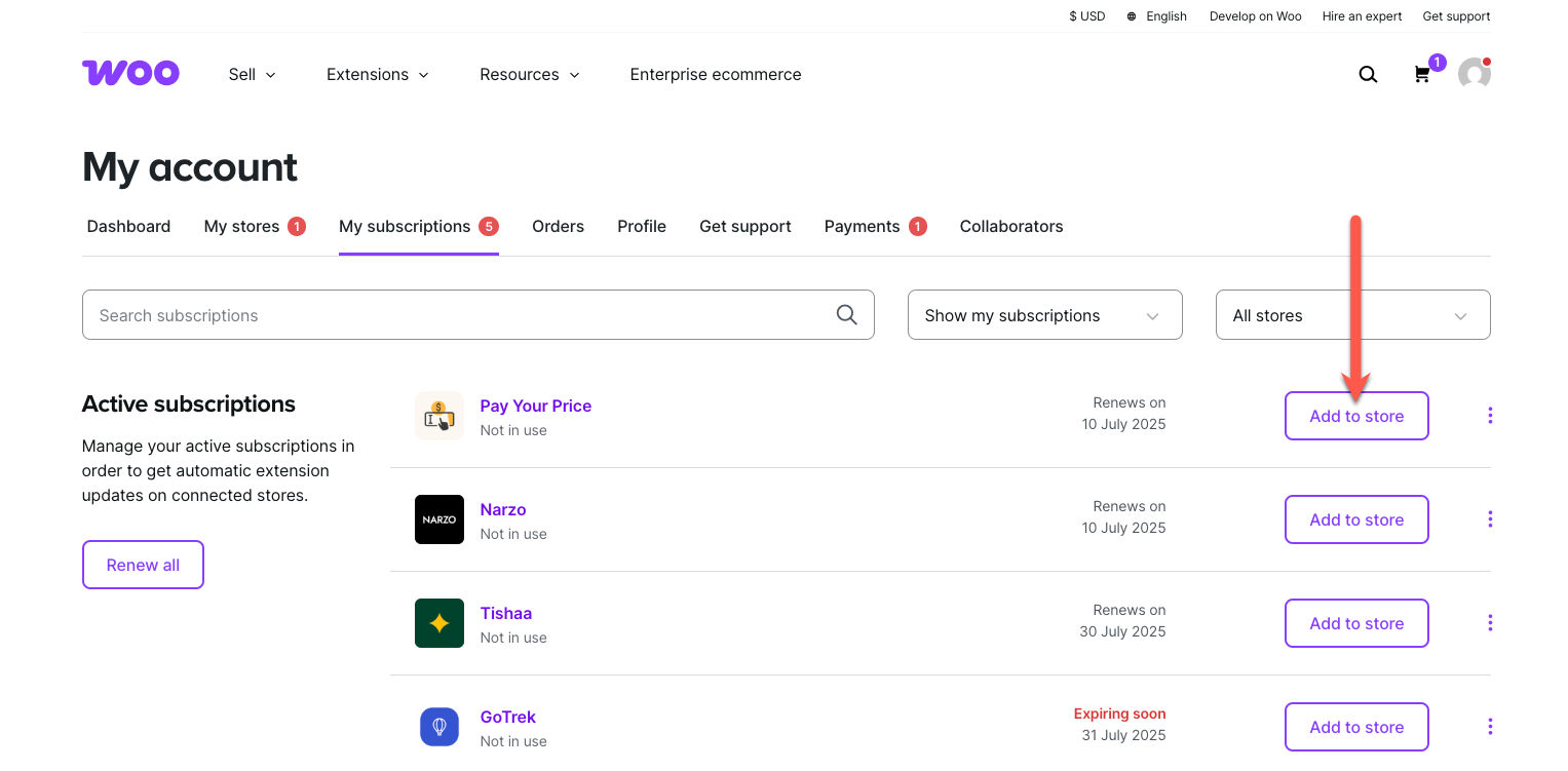
↑ Back to topTo start using a product from WooCommerce.com, you can use the “Add to store” functionality on the order confirmation page or the My subscriptions section in your account.
- Navigate to My subscriptions.
- Find the Add to store button next to the product you’re planning to install.
- Follow the instructions on the screen, and the product will be automatically added to your store.
Alternative options and more information at:
Managing WooCommerce.com subscriptions.
Setup and Configuration
↑ Back to topGetting started
↑ Back to topTo enable masonry on a Product Collection block:
- Open the WordPress block editor on any page containing a Product Collection block
- Click on the Product Template area within the block (the grid showing your products)
- In the right sidebar, locate the Masonry Settings panel
- Toggle Enable Masonry Grid to on
- Adjust your column count if desired
- Save or publish the page
Note: The Masonry Settings panel only appears when the Product Collection’s Layout is set to “Grid”. If you are using “Stack” layout, switch to “Grid” first in the parent block settings.
Settings Overview
↑ Back to topThe Masonry Settings panel contains two sections:
All Devices Your base configuration that applies to every screen size. Set your default column count and layout rules here.
Screen Size Rules Optional overrides for specific devices. When you add a breakpoint here, it completely replaces the “All Devices” settings for that screen size.
Usage
↑ Back to topConfiguring Columns
↑ Back to topThe Columns setting controls how many products appear per row.
- Range: 1 to 16 columns
- Default: 3 columns
Use the number input or slider to adjust.
Recommended column counts:
| Device Type | Suggested Columns |
|---|---|
| Mobile phones | 1–2 |
| Tablets | 2–3 |
| Laptops | 3–4 |
| Desktop monitors | 4–5 |
| Large displays | 5–6 |
Understanding Rules
↑ Back to topRules customize how specific products appear in your grid. You can apply different aspect ratios to product images or make certain products span multiple columns.
Adding and Removing Rules
- Find the Rules section within your breakpoint settings
- Click Add Rule to create a new rule
- Configure the four rule settings (explained below)
- Click the trash icon next to any rule to remove it
You can add up to 16 rules per breakpoint.
Rule Settings Explained
Each rule has four settings that work together:
Mode — Controls whether the rule repeats or applies once
| Mode | Behavior | Example |
|---|---|---|
| Every | Repeating pattern | “Every 2nd” affects items 2, 4, 6, 8… |
| Only | Single position | “Only 2nd” affects item 2 only |
Position — Which position to target (1st, 2nd, 3rd, etc.)
When using “in a Row” reach, the maximum position equals your column count. When using “in this Grid” reach, positions go up to 16.
Reach — How positions are counted
| Reach | How It Works | Best For |
|---|---|---|
| In a Row | Counts within each row based on column count | Consistent column patterns |
| In this Grid | Counts across the entire product list | Diagonal or scattered patterns |
Understanding the difference:
With 4 columns, “Every 2nd in a Row” targets the second column in every row (items 2, 6, 10, 14…).
With 4 columns, “Every 2nd in this Grid” targets every other item regardless of rows (items 2, 4, 6, 8…).
4-column grid example:

"2nd in a Row" targets:        "2nd in this Grid" targets:
[1] [X] [3] [4]                [1] [X] [3] [X]
[5] [X] [7] [8]                [5] [X] [7] [X]
[9] [X] [11] [12]              [9] [X] [11] [X]

X = affected by rule
Ratio — What to apply at the targeted positions
Choose either an aspect ratio or a column span:
Aspect Ratios:
| Option | Proportions | Recommended For |
|---|---|---|
| Square (1:1) | Equal sides | General products, accessories |
| Portrait (3:4) | Slightly tall | Apparel, bottles |
| Portrait (2:3) | Noticeably tall | Jewelry, posters |
| Landscape (4:3) | Slightly wide | Furniture, electronics |
| Landscape (3:2) | Photo proportions | Lifestyle shots |
| Landscape (16:9) | Widescreen | Banner presentations |
| Ultra Wide (21:9) | Cinematic | Dramatic hero displays |
Column Spans:
| Option | Effect |
|---|---|
| 1 Column | Standard width |
| 2 Columns | Double width |
| 3+ Columns | Continues up to your column count |
Tip: Use column spans with “Only” mode. Using “Every” with spans can cause layout conflicts.
Responsive Breakpoints
↑ Back to topScreen Size Rules let you create device-specific layouts that override your “All Devices” settings.
Available Breakpoints
| Breakpoint | Screen Width | Typical Devices |
|---|---|---|
| Mobile | 0–599px | Phones |
| Small | 600–781px | Large phones, small tablets |
| Medium | 782–959px | Tablets (portrait) |
| Large | 960–1279px | Tablets (landscape), small laptops |
| Wide | 1280–1439px | Laptops, desktops |
| Huge | 1440px+ | Large monitors |
Adding a Breakpoint
- Locate Screen Size Rules in the Masonry Settings panel
- Click the three-dot menu icon next to the heading
- Select the breakpoint you want to configure
- Set columns and rules for that screen size
Removing a Breakpoint
- Click the three-dot menu within the breakpoint panel you want to remove
- Select “Reset”
The screen size will then use your “All Devices” settings instead.
What Customers See
↑ Back to topWhen a customer visits a page with masonry enabled:
- Products initially appear in a standard grid layout (CSS-based)
- Within moments, products reposition into the masonry layout
- Images display at their configured aspect ratios
- Featured products span their designated columns
The transition is smooth with no visible jumping or flickering.
Interaction with WooCommerce Features
↑ Back to topMasonry layouts work seamlessly with standard WooCommerce functionality:
- Filtering: When customers filter by category, price, or attributes, the masonry recalculates automatically
- Sorting: Changing sort order (price, date, popularity) triggers a layout refresh
- Pagination: Each page displays with proper masonry positioning
- Load More / Infinite Scroll: New products integrate into the existing masonry layout
Layout Pattern Examples
↑ Back to topHere are ready-to-use configurations for common design goals.
Featured First Product
Make the first product prominent.
- Columns: 4
- Rule: Only → 1st → in a Row → 2 Columns
Result: First product spans double width; others flow around it.
Alternating Portrait Column
Create rhythm with one column styled differently.
- Columns: 3
- Rule: Every → 2nd → in a Row → Portrait (3:4)
Result: The middle column in every row uses portrait orientation.
Periodic Hero Products
Highlight products at regular intervals.
- Columns: 4
- Rule: Every → 5th → in this Grid → 2 Columns
Result: Every 5th product (5, 10, 15…) appears at double width.
Clean Mobile Layout
Simplify the mobile experience.
- Breakpoint: Mobile
- Columns: 2
- Rules: None
Result: Mobile visitors see a fast-loading two-column grid without complex variations.
Mixed Gallery Style
Create a Pinterest-like varied layout.
- Columns: 4
- Rule 1: Every → 1st → in a Row → Portrait (2:3)
- Rule 2: Every → 3rd → in a Row → Landscape (4:3)
Result: First and third columns have distinct proportions, creating visual interest.
Troubleshooting
↑ Back to topMasonry Settings Panel Not Visible
↑ Back to topCause: Wrong block selected or incompatible layout type.
Solution:
- Click directly on the product grid area to select the Product Template block
- Confirm the sidebar shows “Product Template” as the selected block
- Check that the parent Product Collection uses “Grid” layout, not “Stack”
Masonry Not Rendering (Standard Grid Appears)
↑ Back to topCause: JavaScript not loading or plugin conflict.
Solution:
- Open browser developer tools (F12) and check the Console tab for errors
- Temporarily disable other plugins to identify conflicts
- Clear any page caching and refresh
Rules Not Affecting Products
↑ Back to topCause: Mode, reach, and position combination not targeting expected items.
Solution:
- Review the “in a Row” vs “in this Grid” explanation above
- Verify position number is valid for your column count when using “in a Row”
- Ensure you saved/published after making changes
Mobile Layout Different Than Expected
↑ Back to topCause: A breakpoint override is active.
Solution:
- Check Screen Size Rules for Mobile or Small breakpoints
- Remember: breakpoint settings completely override “All Devices”
- Reset unwanted breakpoints to fall back to base settings
Products Overlapping
↑ Back to topCause: Column spans conflicting with grid structure.
Solution:
- Check that total span width fits within the row
- Use “Only” mode instead of “Every” for column spans
- Ensure span value does not exceed available columns
FAQs
↑ Back to topHelp customers by answering commonly asked questions.
Does this work with my theme?
Yes. Product Collection Masonry works with any theme that supports WooCommerce blocks. The plugin extends standard WooCommerce blocks without modifying theme files.
What happens if I deactivate the plugin?
Your store continues working normally. Product Collection blocks display as standard WooCommerce grids with no errors or broken layouts. If you reactivate later, your masonry settings are preserved.
Will this slow down my store?
No. The plugin adds less than 10 KB to your pages (smaller than a typical product image). Products display immediately and get enhanced to masonry layout on page load. There is no delay or layout shift.
Can I use different layouts for mobile and desktop?
Yes. Use Screen Size Rules to configure independent settings for each device category. Changes to one breakpoint do not affect others.
Does this work with WooCommerce filters and sorting?
Yes. All standard WooCommerce features work normally. The masonry layout automatically recalculates when customers filter or sort products.
Can I have multiple masonry grids on one page?
Yes. Each Product Collection block has independent masonry settings. Configure each block separately.
Why don't I see masonry in the editor preview?
The editor shows a simplified preview. Full masonry positioning and aspect ratios appear on the published page. Save your changes and preview in your browser to see the complete layout.
What is the difference between "in a Row" and "in this Grid"?
“In a Row” targets column positions consistently (the 2nd column is always affected in every row). “In this Grid” counts across all products regardless of row boundaries (every 2nd item overall). See the Understanding Rules section for visual examples.
How do I reset all settings?
Toggle “Enable Masonry Grid” off to disable masonry while preserving settings. To fully reset, remove individual rules and breakpoint overrides, or delete and re-add the Product Collection block.