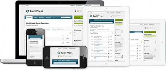
When we initially sat down to discuss features for FaultPress you may imagine the words « bugs, tickets, milestones, priorities » being thrown around a lot. And you’d be right. But beyond which functionality we built into FaultPress we were keen to ensure it’s usability was as good as it’s feature set. Not only on desktops, but on a variety of different devices.
« Responsive design » were two other words which kept cropping up. Mobile perusal of the web is an increasing trend and we decided to embrace this by delivering a device agnostic design. In Laymans terms this means that whether you’re checking out FaultPress on your desktop, your iPad or your smartphone, content is delivered to you in an intuitive and appropriate way.

So how is it done? With a little spinkling of CSS3 media queries. Media queries have been attracting a lot of attention recently, so much so that we’re already starting to see responsive web design galleries popping up.
A media query is a simple piece of code, placed in a web site header or a stylesheet the purpose of which is to detect different information about a user, and deliver a specific stylesheet based on that information. There are several different media features we can query but the most important one for us was width, browser width that is. By finding out the current width of the users browser we can make educated assumptions as to which device they’re using. For example:
- 320 x 480 – Smartphone
- 480 x 320 – Smartphone in landscape orientation
- 768 x 1024 – iPad
- 1024 x 768 – iPad in landscape orientation / netbook
- Anything larger – Desktop / laptop computer
Numbers are representative of pixels.
Using these widths as thresholds we delivered optimised designs for each of these devices.
How? As I mentioned earlier media queries can be included in the page header (if you want to separate your stylesheets per device) or directly in a main stylesheet. Because FaultPress is a very large theme, we opted to create a separate stylesheet for each device. The code itself is very straightforward:
If you want to place media queries within a stylesheet opposed to the page header you should use the following syntax;
@media only screen and (min-width: 768px) and (max-width: 991px) {
    Styles go here
}
Read more about media query syntax here.
The first stylesheet is the default and all the main styles are placed here. This is aimed at resolutions between 1024×768 and 1280×1024. The two most popular resolutions at present. The second is for modern widescreen displays and will be delivered to users whose screen resolution width is greater than 1212px. The third is for tablets and viewports with a resolution width between 768px and 991px.
With specific stylesheets prepared for a sufficient range of devices, the next thing to do is make sure your main wrapping element’s width is appropriate for those devices. The easiest and most semantic way to do this is by using the body tag. As a quick example (I don’t want to bore you with endless code), inside your handheld-portrait.css file you would insert something along the lines of:
body {
    width:300px; /* Smartphone resolution 320 x 480 */
    margin: 0 auto;
}
With smartphones accounted for you can go ahead and create rules for different devices based upon the resolutions outlined above.
Hopefully that covers the basics of media queries and will help you set up responsive designs. The final comment I leave you with is to be careful with this technique. It’s easy to fall into the trap of assuming that Smartphone users are in a hurry therefore not interested in feature x. I used the term « device agnostic design » at the beginning of this article and it’s one I much prefer to « responsive design ». Your web site should deliver identical functionality across devices, media queries simply allow us to optimise how that functionality is delivered.
About


Very excited to see how this will positively affect other designs from you guys. Keep pushing the envelope.
Love it! FaultPress doesn’t fit into my workflow at all (no projects I’m doing need a bug tracker) but the fact that you guys used the Less Framework for it made me giddy. I’ve been working on a redesign for my personal website for ages, oscillating on designs and themes but ultimately, I have decided I want to go responsive and I’d like to use the Less Framework if possible (cos it’s so clean and I like the dimensions of the grid).
My only issue now is whether or not I do a custom design from scratch or if I augment a WooThemes design (something like Briefed) but make it responsive. As interesting of a challenge and designer exercise as turning a fixed design into something responsive is, I’m just not sure I have the bandwidth to take it on, which means I’ll likely just do a new design from the start but borrow ideas.
This is to say, I hope we see some responsive designs from Woo in the future. After Ethan’s ALA article last year, it’s become more and more common to have the discussion amongst my designer/developer friends and seeing it hit WordPress would be great for Woo.
On a production site, optimising a Woo theme for mobile would be relatively straightforward should you choose to go in that direction 🙂
All the app themes myself and Mike build for Woo will include mobile support (providing the app in question has a genuine call for it) so keep your eyes peeled for the next app theme 🙂
I believe since Ethan Marcotte wrote about this in his now famous article, all themes should have this functionality built in. I’m very excited to see this:) Thanks WooTeam!
Thanks for the insight on responsive web design. Would love to see the next version of Canvas be « responsively designed. »
+1 for Canvas
I’m all for our themes having some kind of base responsive design baked in. A starting point for CSS people to finish with their customizations. 🙂
Don’t worry, It’s got my vote!
Yes, definitely Ryan! This is a feature that woo should look into adding to their themes. Keeping up with the times if you like. 🙂
Thanks for this article guys, Faultpress is some of your best work so far.
I am not a developer but more of a publisher and I am in the planning stages of using the Premiere theme for a site scheduled to launch at the end of the summer, early Fall.
My question is simple, will current Woo Themes be updated to be more mobile friendly or is this something users would have to integrate themselves? For Premiere at first blush it might not seem obvious that a mobile component makes sense but mobile video on smartphones and tablets is exploding so to me it makes sense to integrate the functionality from the get go.
Currently you would need to implement your own mobile solution. It’s tough since there are many approaches to making your site mobile, we’re always keen to hear what the majority of our WooCommunity wants though.
I feel we’ll definitely be exploring this more as the mobile browsing world is growing. 🙂
« Spinkling? » 🙂
Tendances
How to start a pet business (best online tips and tools)
By Kathryn Marr •
AI is changing how shoppers find your products
By Julia Callicrate •
Best dropshipping products and ideas for 2026 and beyond
By Kathryn Marr •
Never miss a beat — join our mailing list
Please enter a valid email.
View our privacy policy. You can unsubscribe anytime.
There was an error subscribing; please try again later.
Thanks for subscribing!
Emails will be sent to
You're already subscribed!
Emails are sent to