Variation Monster for WooCommerce provides dedicated mobile design options for the Variation Table, ensuring a smooth and user-friendly experience on smaller screens. This allows customers to easily view and purchase variation products on mobile devices.
Mobile Variation Table Templates
↑ Back to topFor mobile devices, Variation Monster offers four different table templates that are optimized for:
- Better readability
- Touch-friendly interaction
- Faster variation selection and checkout
These templates ensure the variation table looks clean and works smoothly on smartphones and tablets.
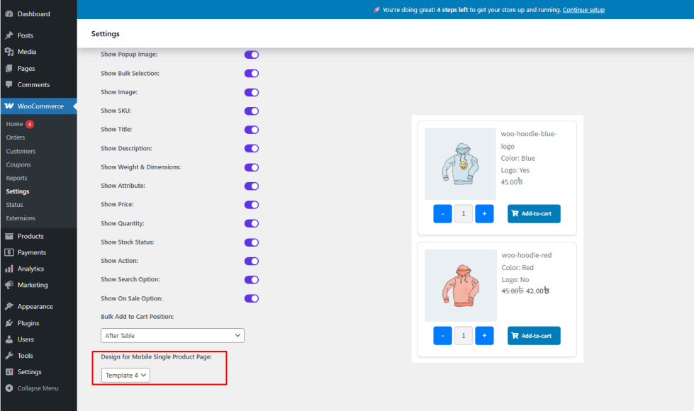
How to Configure Mobile Variation Table Design
↑ Back to top- Go to WooCommerce → Settings → Variation Monster
- Open the Variation Table section
- Find Design for Mobile Single Product Page
- Select one of the four mobile-optimized templates
- Save the settings
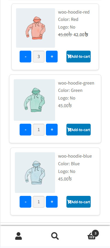
Frontend Result
↑ Back to topAfter configuration:
- Mobile users will see the variation table in the selected mobile template
- Variations will be easy to browse and select
- Customers can quickly choose quantities and add products to the cart
Benefits
↑ Back to top- Optimized shopping experience for mobile users
- Improved usability and conversion rates
- Consistent and professional mobile design