A person’s home is a very personal thing — it’s where someone spends much of their time, meets with friends and family, and makes memories that will last for many years. So it only makes sense that decorating this home is a personal activity.
When a shopper comes to your furniture, wall decor, or home goods store in search of an addition to their home, they’re embarking on a process that probably feels very personal to them, and far more important than buying groceries or perhaps even clothing. If this feeling isn’t acknowledged, you’re likely to lose more customers than you gain.
One of the ways that you can better support the customers who are going through this personal journey is with strong on-site content. This content is most helpful when it takes the form of pages designed to make the purchasing process easier.
Let’s go over some of the basic pages you should consider adding to a home goods site, what purpose they serve in a customer’s journey, and how you can execute on them expertly.
Background on your store’s principles or specific style
A brand new customer arriving on your store may not just want to know what you sell. They probably want to know about you, too — why your products are the best, how they came to be, and why they should go with you over a competitor.
Bring them into your world by creating a page about your guiding principles, the style your products follow, or why you’ve chosen to sell what you have. This will quickly introduce new customers to you — and show them why your products might be a good fit.
For example, Calico Wallpaper opens their «about us» page with details on the inspiration behind their wallpaper designs:

CABLE DESIGN opts for a mission statement to explain their «urban modern» design, and what it means for all their products.

Let your customers know what you’re about before they start shopping, and they’re more likely to know right off the bat if they’ve found a good fit in your store.
Information and FAQs around shipping and delivery (especially for large items)
↑ Back to topSpeaking of finding a good fit, some home goods can be tricky to ship, and no one knows this better than your customers. One of the biggest fears of a visitor to your store might be overspending on shipping, or having to take time off to manage a complicated delivery process.
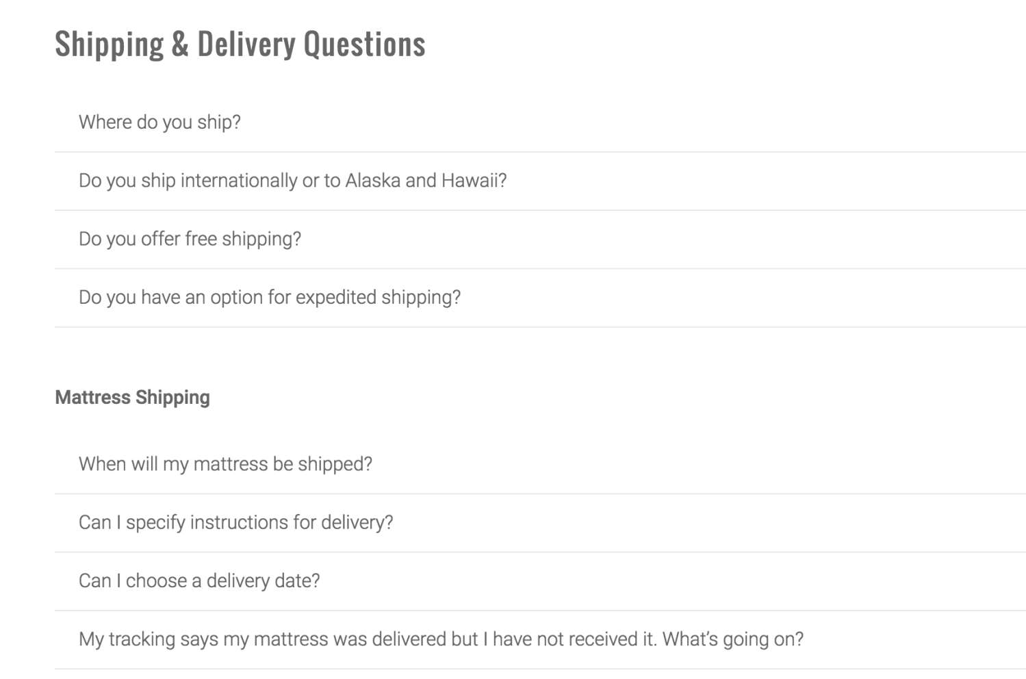
We recommend creating a separate page with FAQs around your shipping and delivery processes to ease those fears and answer common questions. Though this should be done for any decor shop (customers want to know how soon can fill in those empty spots on their walls or shelves!), it’s especially important for stores with furniture, flooring, or wallcoverings — that is, big pieces.
Aim to answer questions like:
- How soon products will be shipped and delivered
- How much shipping costs, or when it might become free
- What extra expenses might accompany specific products or orders
- How delivery is handled of items that are large, require special shipment, or require assembly
- How assembly is handled or if it can be purchased (that is, if you offer it)
You can spot some fantastic examples of customer questions on HIBR’s FAQ page:

Though it’s fine to roll these questions into a single FAQ page, a separate page allows shoppers to quickly get the answers they need before moving with to the purchasing process.
[Tweet «Create separate pages on your home goods store for shipping, delivery, and returns FAQs.»]
How to return, replace, or exchange a product — with clear details and instructions
One question your potential customers may ask is «what will happen if I get this and it doesn’t fit or look right in my house?»
It’s easy enough to give «just return it» as a response to this question, but if you don’t effectively communicate how, you might scare away shoppers. You might also notice some wariness if you aren’t clear on whether or not any product can be returned, or if customers can only exchange goods that are unopened, unassembled, and so on.
The first step here is to make sure you have a page with information on returns. With that out of the way, take a good, hard look at the information you’ve presented. You should aim to:
- Thoroughly explain the return or exchange process in a transparent manner — don’t leave out details that you think aren’t important, or that will only come up in an email or phone conversations.
- In the same vein, be clear about any fees that may accompany returns or exchanges, such as if a customer has to pay for their own shipping, must pay a 15% restocking fee on open goods, etc.
- Be clear as possible about what a customer can’t return, whether that’s an assembled piece of furniture, a used pillow cover, or a roll of wallpaper that’s half-applied.
- Finally, if there are multiple ways to return an item, give proper directions on all possible methods (say, if an online purchase can be returned to a local store). Remember also to indicate if local returns won’t be held to the same standards as online ones in any way (a higher/lower restocking fee, longer period to return…).
Remember also to give details on how customers should get in touch with you regarding potentially damaged goods, and what your process is for dealing with these items.
Products on sale (for new customers) or new to your store (for loyal ones)
↑ Back to topThe final page we recommend is actually up to you — rather, we’re giving you a choice. We recommend highlighting either products that are on sale, or products that have just arrived in your store.
Why are we giving you a choice? It’s because one option might fit your store better than the other. If you see a lot of repeat customers, highlighting new products will make more sense to them than highlighting items on sale… which they might have already purchased.
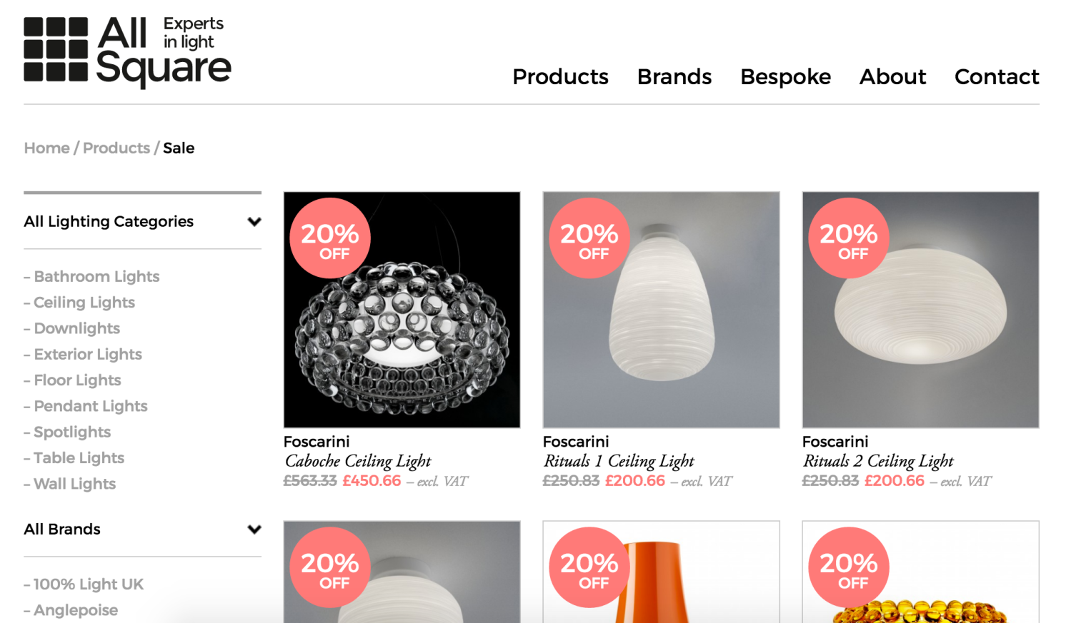
Let’s look at two examples before we dive in a bit more here. All Square has an always-in-action sale page for their lighting on discount, whether it’s for a summer sale or another special event:

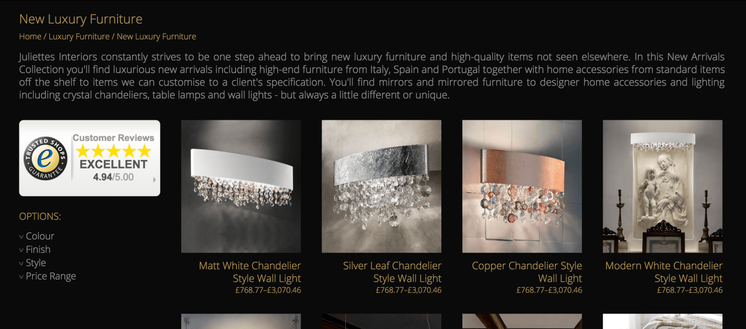
Juliettes Interiors, meanwhile, has a «new luxury furniture» page where they highlight the products just added to their online store and physical showroom:

The page you opt for here, if you only want to add one, depends almost entirely on the audience your store serves or wants to attract.
If you sell mostly inexpensive products, and you’re finding that shoppers come back to you for frequent purchases, it makes more sense to highlight new goods. But if you have expensive products and your customers are likely to buy from you rarely, highlighting sales or special promotions makes more sense.
Basically: if your aim is to nurture relationships with repeat customers, it probably makes more sense to create a page highlighting the newest goods they’ll want to see. For one-time purchasers, draw them in with a great deal.
Of course, you can always do both (that is, create both pages). But give some serious thought to the customers you’re trying to attract first. 🙂
With these crucial pages, your home goods store will thrive
↑ Back to topConvincing shoppers to take the very personal journey of decorating their home with you can be tricky. But with these select pages, you can make them feel more confident about their choice to buy from you, no matter how big or small their purchases are.
Do you have any questions about these must-have pages for home good stores? Or any ideas of your own you’d like to share? Let us know in the comments.
About


