Do your customers tell you that your eCommerce site is a joy to shop? Probably not! While some people really do love online shopping, few rave about the actual buying experience.
We shop for goods and services we need or want. Whether or not we enjoy the shopping experience is partly a personal preference, partly the ability of the merchant to read customers. Unlike brick and mortar store owners, eCommerce businesses don’t have the opportunity to judge body language and see if customers appear satisfied. At best, they can offer real-time or automated chat assistance.
When it comes to the ultimate shopping commitment, brick and mortar stores have it pretty easy. They take the payment, swipe (usually), and bag items small enough to be carried. Customers rarely change their minds and literally abandon a shopping cart once they get in line to buy.
If only eCommerce business owners had it this easy! Instead, they are presented with depressing website statistics that point out cart abandonment and site bounce rates. They don’t have a chance to turn the charm on customers who are about to make a quick exit.
While a creative, thoughtful designer can make an eCommerce site a straightforward and satisfying shopping experience, parting with your money is never fun. But there are ways to make the actual checkout process less of a hassle for customers, and maybe even lower the cart abandonment rate in the process.

eCommerce Puts the Checkout Burden on Shoppers
↑ Back to topWe’ve already noted how easy it is for brick and mortar store owners to take payments. Their customers will even stand in line to make their purchases!
While virtual queues are relatively rare in the eCommerce world, the checkout burden is completely on the customer. So site owners need to make sure their checkout
Mobile-Friendly. First and foremost, eCommerce owners must ensure checkout works well on mobile devices. More people shop with their mobile devices than ever before, and these numbers rise each month. If your checkout page doesn’t adapt to smartphone screens, you’re making it difficult for mobile shoppers and may be turning off more than half your potential customers.

Remember, too, that mobile shoppers aren’t using a mouse to browse and shop. Crazy Egg suggests forgetting the mouse’s role and designing checkout pages for thumbs: almost half of all mobile shoppers buy with one hand on the phone, with the thumb navigating. More than one-third cradle the phone in one hand and use their opposite-hand thumb for navigating. And since thumbs are thicker than a mouse pointer, make sure buttons aren’t too close together.
Use Google Analytics or other trustworthy tools to determine what mobile platforms are used for checkout. If your customers are heavy iPhone users, make sure you take Apple Pay. If Android dominates your checkout, make sure other mobile wallets work with the software.
Above all, the checkout process should be completely visible on these smaller screens. It’s annoying enough when content runs off laptop or tablet screens; on smartphones, it can be infuriating!
User-Friendly. Do some UX testing before going with a payment processor and especially for the mobile checkout application. Here are some items to look for:
- Don’t litter the payment page with additional content that has nothing to do with the actual checkout process and slows down payment, particularly for mobile. Keep customers focused on closing the deal.
- It’s okay to include thumbnail pictures of the items about to be purchased, though, and in the color selected if possible. You want to minimize returns and/or refunds, which are time-consuming for both seller and customer, and photos reassure shoppers that they’re purchasing the right item.
- Upselling is important, in eCommerce, but the payment page isn’t the place to do it. Put upsell messages like “check out this great accessory for your [item]!” once it’s been added to the shopping cart.
- Offer a checkmark auto-fill option when the billing and delivery locations are the same. It’s too easy to make a typo, even on a laptop/desktop.
Security. It should go without saying: your site must have reliable secure-socket layering (SSL) and display certificates certifying this. According to BlueSnap’s Payment Processing KPILibrary, 18% of customers who abandon a shopping cart cited ecommerce security concerns. (See the free PDF.)

End the Site Registration Reign of Terror!
↑ Back to topA number of UX and payment experts surveyed by the UX insights company User Zoom highlighted registration oppression–requiring people to register with an eCommerce site before they can make purchases–as an unnecessary and counterproductive step on eCommerce checkout pages. As Digital Marketer’s Justin Rondeau says, it’s the last straw for some shoppers: enough with the passwords!
Every sale counts. That one- or two-time buyer may eventually decide to register and reap the benefits of coupons, free shipping, and other incentives you offer. But refusing service unless a customer registers with your site hurts both of you unless you’re Amazon, Rondeau says.
HubSpot’s Alex Birkett adds that requiring registration adds more friction to the buying process– the opposite of what you’re trying to achieve.
Instead, use a thank-you page to invite people who just bought from your site to register with it. You can also use it to upsell, offer a coupon or discount for purchases made in the next 15 days, or ask people to take a fast (no more than five question) survey, with or without a reward.
Collect only what you need to complete the transaction. Let customers specify if they prefer to be contacted by email, phone, or text if there’s an issue with the order (which you should explain is unlikely). While it’s nice to get a lot of contact information, not everyone wants to hand this out. And remember, the law requires you to ask if they would like to be added to your email list–you can’t just do it because they gave you their address.
Make It Easy for Registered Shoppers to Reset Passwords
People who have set up accounts on your site will probably forget their passwords. As Graham Charleton of SaleCycle told User Zoom, people only remember passwords they use a lot — i.e., nearly every day. And many change their passwords whenever they hear a major news story about a hack, only to promptly forget them.
As a seller, you have to be forgiving and make password retrieval relatively quick and easy for your registered customers while maintaining security. Writing for email manager PostMark, Garrett Dimon offers these tips for allowing password resets via email:
- Never confirm or deny the existence of the user account in question.
- Set up login software to determine if the user account exists or not.
- Offer to send an email to help users establish a new password
- Create two emails to send out depending on the problem:
- One email goes to customers whose accounts have been confirmed and includes a link to reset passwords.
- The other email advises that no user account is associated with the email address provided, and suggests that customers try using another email address they might have used at registration.
- Create two emails to send out depending on the problem:
Show As Much Information as Possible Before Processing Payment
↑ Back to topWhile you don’t want to delay the ultimate goal–getting that “Place Order” click–you do want to be as transparent as possible. So be sure your final payment page shows the full amount, including tax.
Offer Some Leeway With Shipping Costs
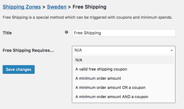
You can’t play with taxes, but you can play with shipping costs. Free shipping is an excellent way to attract and keep new customers. Consider offering it in these situations:
- The first time a customer places an order with your store
- Regularly scheduled orders
- Orders over a certain amount
Free shipping with the first order is a great way to encourage new customers to make a purchase. Coupled with competitive prices are competitive, it creates a positive first experience that breeds loyalty to your site — which means ongoing orders.
Consider offering free shipping for items customers regularly replace, particularly those they might not think about too often. You also have an an excellent opportunity to upsell when you send reminder emails to expect that next shipment. I’m scheduled to buy new fish tank filters from a pet supply site every three months. After a year, I was asked (quite sensibly, I think) if I needed a new air pump (no) or tubing (yes.) And oh, I needed water testing strips, too.
Many sites provide free shipping when customers spend over a certain amount of money (pre-tax). You can decide the amount, based on when it no longer costs you anything to ship. For many consumer goods, this sweet spot is $50. Check this list of free shipping cost points from various eCommerce websites.
Finally, some businesses offer free shipping all the time by incorporating those costs into their product fees. Even if customers understand that nothing is truly free, many don’t like to see shipping costs, ever. Some regard them as add-on “surprise fees” and will abandon a cart for that reason.
Building shipping into product costs also helps customers have a more accurate idea of the exact cost they can expect to see on the payment summary page, where you can also put FREE in all-caps under “shipping.”
Learn more about how to set up free shipping for WooCommerce.

Give an Honest Estimate of the Shipment Arrival Date
Giving customers accurate information about when they can expect their shipments to arrive is part of being transparent, and a practice all eCommerce sites should adopt.
I’m a big believer in delivering sooner than expected, but when it comes to shipped goods, it’s better to be more exacting. If you estimate a delivery will be completed within three days, don’t tell customers five to eight days. Some people don’t want packages sitting outside their front door and schedule weekday deliveries to their offices. If you’re pretty sure a delivery will come on a weekend, tell them.
Shipment Tracking for WooCommerce is a neat extension that enables you to send an email to your customers with a link to track their order – learn more.

At Every Step, Allow Customers to Continue Shopping
↑ Back to topI rarely finish my online shopping in one sitting and while I shop, I often check my cart to see what’s in there and the cost I’m running up. Amazon used to have a button labeled “Continue Shopping,” which I used quite a bit.
I’m not sure why Amazon decided to remove this button. The only way I could continue to shop was to click on the footer link to its homepage. Backspacing simply took me to the previous page of the checkout process. Apparently, I’m not the only one who’s wondered about this: it was discussed on Amazon’s Sellers’ Forum a couple of years ago.
In any event, I don’t see why you wouldn’t want to make it easy for shoppers to continue shopping; after all, that’s why you list complementary items along with product descriptions. Even better, take shoppers back to the last category page they visited before adding to the cart, something Walmart and Nine West both do, as Linda Bustos notes in an excellent piece on this topic for Get Elastic. Or don’t even take customers to the checkout page until they tell you they’re ready, and keep a running tab on the cart situation on the upper left corner of each page.
If you offer free shipping over a certain amount, remind your customers about this and list how close they are to this goal.
Always Offer PayPal!
↑ Back to topSpeaking at WordCamp Phoenix 218, WooCommerce expert Chris Lema urged his audience to always include PayPal as a payment option. Many customers leave balances in it and regard it as “free money,” making it useful for impulse purchases. It’s also a lot faster for customers to use than typing out a credit card number.

Some brick and mortar stores avoid American Express because it charges higher fees. But if you sell high-end products, don’t mark it off. I recently spoke with a banking attorney who says he only buys online with American Express because the banks that offer Visa and MasterCard “don’t care about their customers who’ve been hit by fraud.” Now, while all cards and customers can’t avoid fraud 100%, American Express does have excellent resources for this.
According to an article written on Finder.com, American Express has a 100% timely response rating and nearly a 60% closing rate on all fraudulent activities on customer’s accounts.
Validate Physical Addresses and Store Them for Registered Customers
↑ Back to topGive customers the opportunity to auto-validate their addresses. Ask them to review the billing and shipping details before you process payment.
Sometimes validating addresses is as quick as offering a ZIP+4 code, or matching an office address with a suite number. Just be sure to allow users to override and update addresses.
Registered customers who change or modify addresses should be asked if they want this to be their new default, kept as an alternative one, or if it’s a gift. Offer them a free gift card they can inscribe.
Make sure the payment page is accurate and reasonably fast to complete, even for non-registered customers.
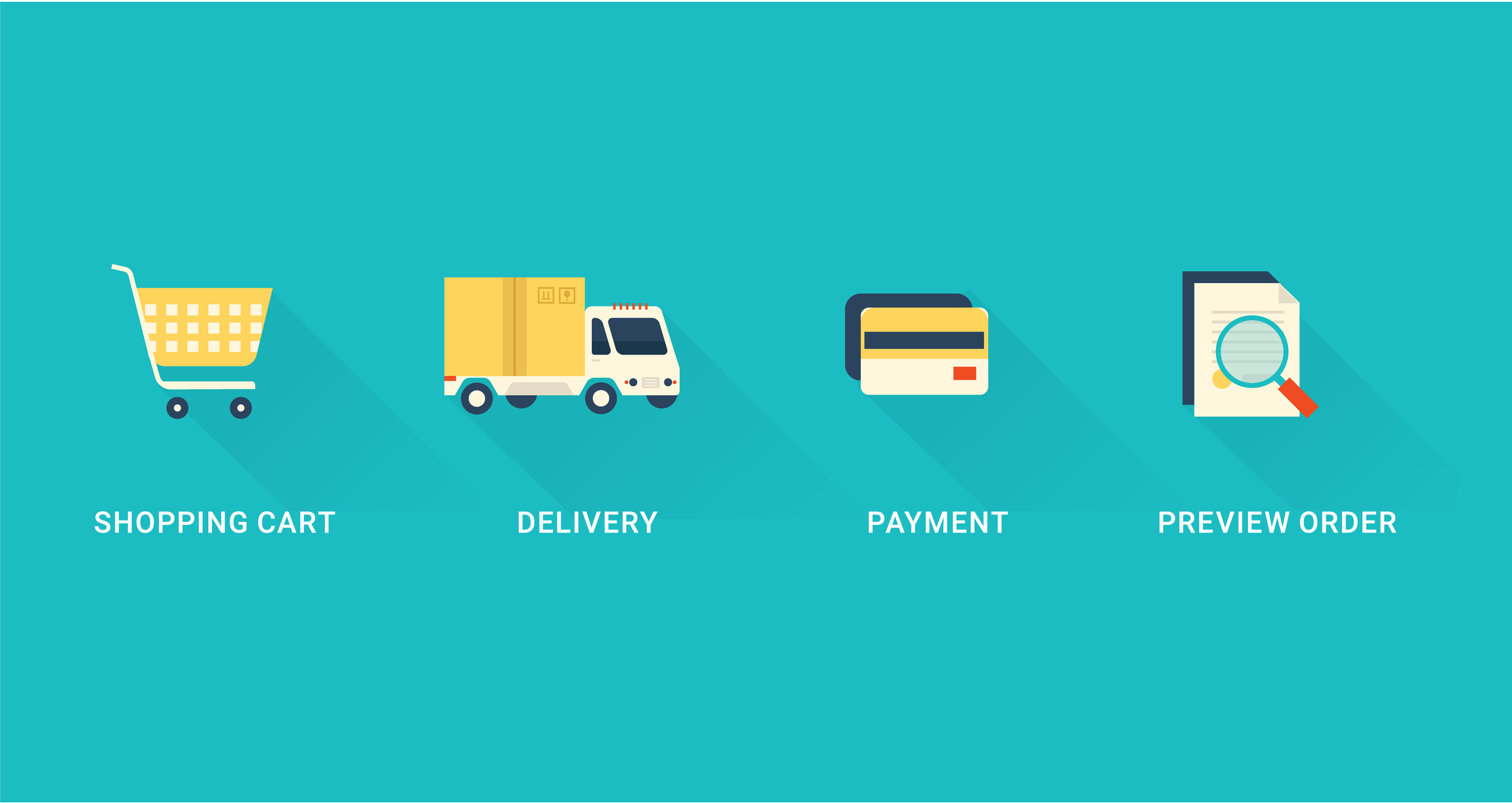
Your goal isn’t to just close a sale: you want the entire customer experience to be a highly satisfying one, from product research to orders, payment, and shipment. That last step–payment–is where it can easily fall apart, so be sure you have a process in place that works quickly and without glitches. A positive customer experience can bring repeat visits, recommendations, glowing reviews, and eventually, another registration.
I hope these tips have been helpful! Let me know in the comments if you have additional ideas for making eCommerce checkout a pleasure not a chore.
About


Great article,
One of the main things is to make sure you test the checkout to make sure you understand how easy (or not) it is to complete a purchase.
If there are things that would put you off or you find frustrating, then you can be sure they will frustrate your customers too.
Try your own checkout on your mobile device and if you can complete it without getting annoyed then you are getting there.
Woocommerce is very helpful for me. I installed woocommerce in my all client sites and all they are happy.
Thanks
In our case, our products are not sold on amazon, you can only get them from our website. We have been requiring customers to register (no guest checkouts) for 17 years and it works well for us because they can not go elsewhere. They can drop items in their cart all day long and don’t have to register until they initiate checkout, and even then our cart abandonment rate is less than 10%. The value of having their e-mail address is massive for ongoing marketing. It works for us. If the same products were sold elsewhere this wouldn’t work and I would agree with the author.
Point #2
As a tip, if you ship physical goods like we do, one of the best plugins I’ve found allows us to track our actual cost of shipping. The plugin imports data directly from ShipStation as well. Solves a huge shortcoming in WC. It’s free on WordPress.org “WooCommerce Cost of Shipping”
Thanks for very much worthy tips. No more « thank you page » for buyers.And now we shall integrate Paypall also.
Woocommerce is very successful with advanced e-commerce solutions. Thanks for the informative content
Definitely! These are some really amazing tips, Thanks
Great write-up!!!
Checkout functionalities is one of the biggest issues with most eCommerce websites. Thanks a lot for this article.
Woocommerce is a best e-commerce choice in 2018, since I switched to this system everything has become easier and immediate.
Thank you
This is great to hear!
nice blog
Thank you for the amazing info :).
Really easy checkouts is the key to a successful online business. You have included some easy and useful tips to follow.
Great post, Cody. Thank you 🙂
Combining all these points will really make a difference for one’s store conversions and cart abandonment rates. Sometimes your checkout must be much simpler to bring you more sales. Here are the 2 cents to this list from my own experience:
1. In some cases, especially when you are selling packages (like a set of 3 bottles of supplements) or singleton items (like online course, ebook, coaching), you will get much higher conversion rates by adding these three things to your checkout page: product logo with a short description, a few testimonials with live photos and some trust points (guarantee, privacy, secure connection). For example, the checkout form can be in the left column and these things I mentioned can be in the right column on your checkout page.
2. Upselling. That’s a great way to get more from every sale. And there certainly exists ONE way to make upsells on your checkout page, that will not harm your sales. It’s called Order Bumps. Usually it’s a little box near the « place order » button, that has some text inside and a checkbox. When you click on a checkbox, it adds the complementary upsell item to the cart. Almost like McDonald’s « Do you want fries with that? », but you chose what to offer there 🙂
Our company provides a Handsome Checkout plugin for WooCommerce to almost a 1000 stores, so we’re working with store owners all day, everyday. Everyone we work with has seen an increase in sales exactly because of what you’re sharing here.
Thanks again for the write up!
Tendances
Best dropshipping products and ideas for 2026 and beyond
By Kathryn Marr •
No Pong: From startup to multinational business with WooCommerce
By Vanessa Petersen •
Use print-on-demand to scale your business without inventory risk
By Latoya Duffus •
Never miss a beat — join our mailing list
Please enter a valid email.
View our privacy policy. You can unsubscribe anytime.
There was an error subscribing; please try again later.
Thanks for subscribing!
Emails will be sent to
You're already subscribed!
Emails are sent to