We recently released Editorial, a magazine theme that aims to mimic familiar features of traditional print media, like newspapers and magazines. This post takes a look at the thought process that went into designing Editorial, and the implementation and development of some of those ideas.
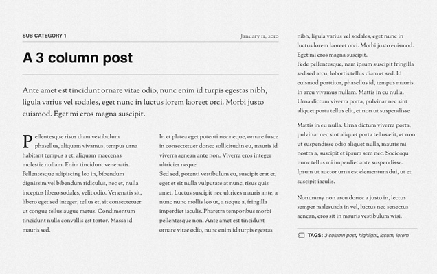
Editorial’s design is very much inspired by traditional newspaper layouts, focusing on the content. The center aligned header, slightly textured background, strong sans-serif headlines, serif body copy and drop-caps all help to give the design a more traditional aesthetic. But the theme’s real strong point, the feature that sets it apart from other magazine themes, is it’s single post layouts. Users have the option to choose from a number of different columnized post content layouts, allowing each post to be styled uniquely.

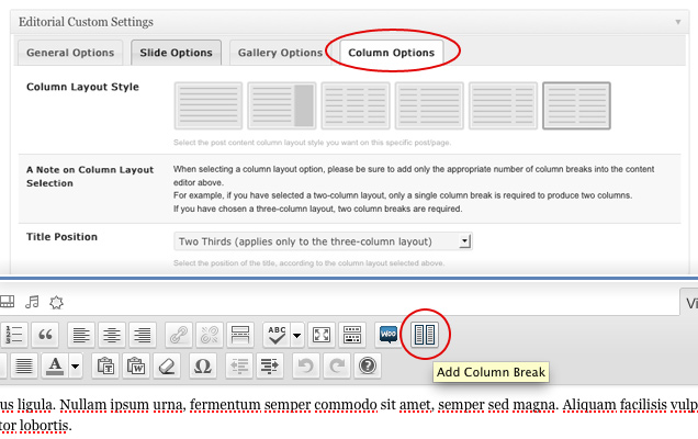
These layouts divides the post content into different vertical columns, just like a print publication. These column layouts are setup via a couple of options on the edit post screen, giving the user as much flexibility and control over their layout as possible. First the user selects the column layout they want – Traditional full-width blog, traditional blog, 3 column, 2 column wide left, 2 column wide right or 2 column 50/50. The great thing about the columns is that they do not automatically split the text up. The user sets the « column breaks » in the post editor by using the « Add Column Break » button on the toolbar.

You can also control the appearance of the post titles, setting them to span either one or two columns, or even spanning full-width across the top of the post. This, along with options to add a post gallery image slider and an intro paragraph (the excerpt) really allows the user to create a variety of different layouts.
Now that you’ve seen how to control the columns in Editorial, let’s take a look at how these columns are actually built with CSS.
Whilst doing research I came across a couple of approaches to building HTML/CSS columns. One was to use the CSS Multi Column Layout module, which proved to work relatively well, but I experienced problems with floating images and controlling text breaks. There are also a number of Javascript solution out there, but none of them really offered me the control I was looking for.
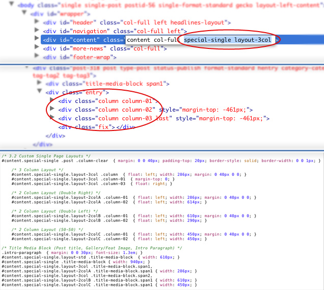
We ended up going with a custom CSS & jQuery solution. First off, based on the options selected on the edit post screen, CSS classes for each of the different layouts are added to the HTML, allowing me to target each layout with CSS. Next we have to specify the columns in the markup. As mentioned above, the column breaks are inserted with a button on the post edit screen. These column breaks are detected with PHP (thanks to some magic by Matty) and the blocks of text are wrapped in DIV tags, allowing the columns to be floated with CSS.

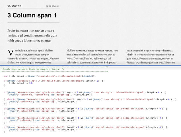
There were some issues with spanning the post title only x amount of the columns. The columns that were not spanned by the title, still defaulted below it, unlike when you float an image in a paragraph of text. We used jQuery to determine the height of the post title and applied negative margins to the « non-spanned » columns, pulling them up to be vertically top aligned with the title.

The CSS & jQuery solution works really well, and results in the columns being compatible in most browsers, even Internet Explorer 7!
So there you have a brief look into what went into building the custom single post layouts for Editorial. The theme has loads of other cool features that make it a great magazine theme, be sure to head on over to demo site to see it in all it’s glory!
[wtsfc]
test!
[/wtsfc]
About


Was that the bug you encountered last minute with IE7? 🙂
Looking throgh the css involved here, I can see that at the moment at least, it is not possible to use the editorial on a fluid/adaptive template. Are there plans to extend this to work on fluid templates in the future?
*use % vs. fixed widths*
Indeed. Unfortunately at this time Editorial is very much fixed width. A fluid layout was something I considered initially, but decided against it, rather focusing on the column layouts.
We’re experimenting with fluid/adaptive layouts for some other themes, and we’ll see how many users request the feature for Editorial. So we could possibly include it at a later time.
What is the updated version anyway.
Last time i check. mine was v 1.3
What is the font used in the logo-left.png
that reads « A Real Magazine Theme »
It’s a nice font
Fluid/adaptive layout would be so fantastic
I’ve got to update for the full width column addition but I’m really impressed with how the theme has worked out. Adaptive would be nice but it was smart to release it like this first.
I was using a custom post type for my photography posts, but archived that once I started using Editorial. I’m working on my own post regarding the theme.
I love that it breaks up how we consume blog content. I enjoy things that are outside of what everyone has and Editorial is outside of what I’m seeing on blogs.
Thanks for the update. Editorial is amazing.
fluid widths would really boost this theme, adapting to multiple columns based on width would be sweet!
How many adds format does the theme support, does it support tiled 125×125 px ad placement that we commonly see, how about horizontal banner add, vertical banner adds?
Tendances
How to write product descriptions for SEO, AI agents, and shoppers in 2026
By Vanessa Petersen •
How to prepare your store for AI-driven commerce
By Julia Callicrate •
High-converting landing page design for ecommerce (with examples)
By Erika Ellacott •
Never miss a beat — join our mailing list
Please enter a valid email.
View our privacy policy. You can unsubscribe anytime.
There was an error subscribing; please try again later.
Thanks for subscribing!
Emails will be sent to
You're already subscribed!
Emails are sent to