Greg Douglas shares his experience working with our Buro theme for a client project and how he designed a completely custom, visual site based on it.
My name is Greg Douglas. I am the Art Director at Domestic Equity Studio. A digital media and graphic design studio based in Southern California. And this is a case study for The LAB anti-mall website.
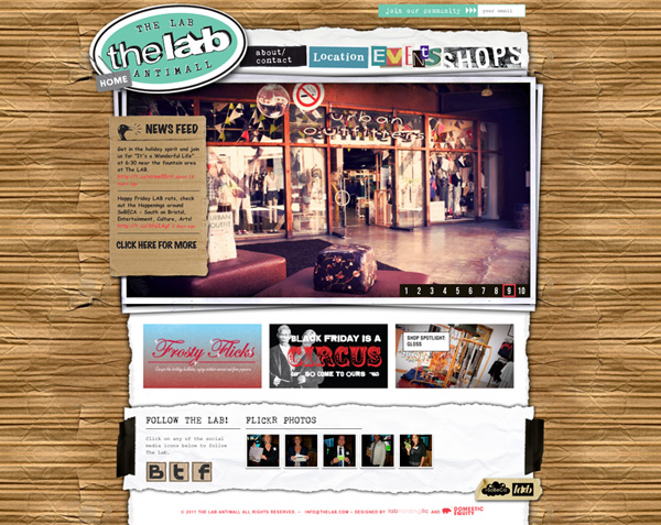
“The LAB” is a unique outdoor shopping mall in Costa Mesa CA. The LAB stands out in it’s vision for what an Orange County retail space can be by incorporating an eclectic collection of artistic expression and baking it right into the design of the stores and the common areas. The challenge for us was to design an online presence equally unique to this destination shopping location. When The LAB approached Domestic Equity Studio to redesign their online presence they had two primary objectives. Design-wise they wanted the site to capture the essence of a home-made, in the garage feel and to avoid a traditional corporate look. And technically they wanted a website that better integrated their social media and to be designed with a backend they could easily update in-house.
From a design perspective we had a few ideas that guided us. The first one was that we knew we wanted the design to feel like it broke out of the “grid” and the second was we wanted the site to feel layered like things were just thrown on top of each other in a haphazard manner. We felt if we could design the site keeping these things in mind the site would feel casual and “not corporate.” So at this point before we made any technical decisions we planned and laid out the site in Adobe Photoshop and Illustrator to establish the look and get the placement for all the content and social media integration just where we wanted it.
From a technical stand point we had already made the move to WordPress as our favorite content management system and at the time had been experimenting with different premium themes in our other website design work. Since we had just finished our own website with the Kaboodle theme by WooThemes and liked that experience, we decided to look for another theme that might meet the needs of this new site but with similar backend theme treatment that we had with our previous Woo Theme site. It turns out that Buro had just been released the month before and we responded to the simplicity of the Buro layout. And we thought it was cool that the three most recent blog posts appeared on the home page. So I downloaded Buro mainly to test out how flexible it was and to see if Buro was going to be flexible enough to let me ad my own graphical navigation and let me ad a bunch of background images into the design of the theme and control spacing the way I wanted to via my custom.css file. And low and behold, it did. In fact I was able to manipulate the css and move things around with such ease that I just kept working in Buro and didn’t bother testing any other themes.
The Result in our opinion is magical. A website that does not look remotely like an “out of the box” WordPress template with all of the advantages of a WordPress backend. A CMS, an events blog, custom shop pages as well as full integration of social media including twitter and flickr feeds. Original theme was Buro(link here) by WooThemes and the final website customization can be found here www.thelab.com.
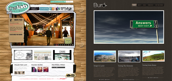
And now the part where we lift up the hood and reveal how I achieve some of the effects I create in my theme customizations. One of the main reasons I like working with WooThemes is because of how much I am able to get into the CSS and monkey with it… To push the template sometimes to a degree that it doesn’t resemble the initial template at all. Keys to my development style…
- Background images are my best friend. I utilizing them with little to no restraint. One can create all kinds of cool effects by layering transparent .pngs
- I always design a GUI that scares me a little bit. What I mean is, I look at the template and then try to design my layout in Photoshop to mostly fit the structure of the original theme but that is definitely out of my comfort zone to code. Often times there are parts of my design that I don’t have any idea how I am going to get to work at the time I design them.
That being said, let’s look a little closer at one area of my theme customization that highlights my approach.
When it came time to develop the primary navigation for thelab.com I struggled with how I was going to replace the current Buro navigation with my own custom graphical rollover buttons. So i started by using “inspect element” on the main navigation area using the Safari browser to find out what each of the navigation buttons was named. Hint the names of each of your main nav text links on your theme will look something like this… “menu-item-500”… Then writing my own CSS in the custom.css file to overwrite the style.css I controlled the appearance of each one of the navigation buttons in the Buro theme main nav.
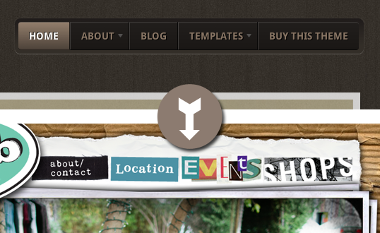
So, to achieve the graphical navigation I used in thelab.com, the code I wrote and pasted into custom.css looked like this…
header .nav a  {
	background: none;
 }

header .nav li:first-child a  { }

header .nav .menu-item-503 a {
	text-indent: -9999px;
	background: url(http://...url path to image.../images/nav_503.png);
	width: 168px;
	height: 75px;
}

header .nav .menu-item-503 a:hover {
	background-position: 0 -75px;
}

header .nav .menu-item-502 a {
	text-indent: -9999px;
	background: url(http://...url path to image.../images/nav_502.png);
	width: 144px;
	height: 75px;
}

header .nav .menu-item-502 a:hover {
	background-position: 0 -75px;
}

header .nav .menu-item-501 a {
	text-indent: -9999px;
	background: url(http://...url path to image.../images/nav_501.png);
	width: 170px;
	height: 75px;
}

header .nav .menu-item-501 a:hover {
	background-position: 0 -75px;
}

header .nav .menu-item-500 a {
	background: url(http://...url path to image.../images/nav_500.png);
	width: 189px;
	height: 75px;
}

header .nav .menu-item-500 a:hover {
	background-position: 0 -75px;
}
If you want to create this style of nav then there are a few tricks here that you need to pay attention to. The first is to pay attention to the full path of how to control the menu item. For the Buro theme the path I needed to control the menu items was, “header .nav .menu-item-# a” but if you use a different theme the path might look a little different in your CSS. The next one is to use “text-indent: -9999px;” to make the old text navigation disappear so your new back ground image will be the only thing they see. And finally to create the clever rollover effect all it takes is moving the button image position the height of the button. As you can see in my code above the code for each of my four buttons has a hover state, “a:hover” and the only thing that changes is the background position to “-75px;”. In the image below you will see one of my button images that illustrates how the rollover state is directly below the normal state…
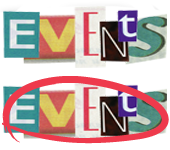
The total height of this .png image is 150px so the visibility for the background image is set to 75px and when the user rolls over the image the background image moves -75px to reveal the rollover state.
The second thing I would like to share in my design/development style is a very simple technic one can use to dress up what might otherwise look like a normal plugin. One of my favorite plugins is the NextGEN Photo Gallery plugin and one of the ways I make my galleries appear to be custom is by simply adding a background image. Below you will see an example screen grab of one of my pages where I utilize this technic…
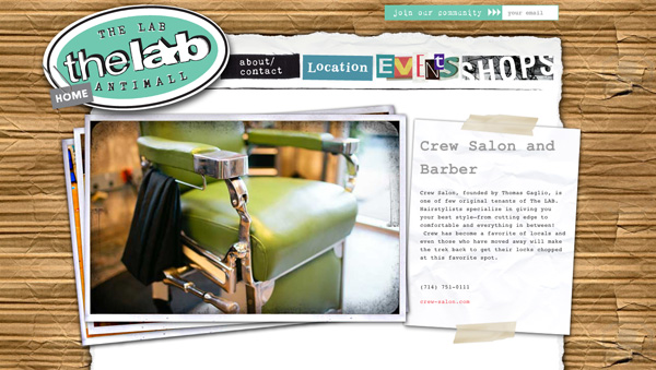
Really what you are seeing above is a background .png image that goes behind a NextGEN gallery and some text content controlled by some simple CSS in my custom.css file. The code on the individual page looks like this…
Crew Salon and Barber
Crew Salon, founded by Thomas Gaglio, is one of few original tenants of The LAB. Hairstylists specialize in giving you your best style–from cutting edge to comfortable and everything in between! Crew has become a favorite of locals and even those who have moved away will make the trek back to get their locks chopped at this favorite spot.
(714) 751-0111
… And the CSS in the custom.css file that controls this page looks like this…
/*Special Header For Shops*/
#headerSpecial {
	background-image: url('images/shops_featured_bg.png');
	margin: 0 0 0 -110px;
	width: 1047px;
	height: 497px;
}

.hs_positioning {
	float: left;
	width:609px;
	height:81px;
	margin: 0 0 0 67px;
	padding: 38px 0 0 0;
}

.hs_text {
	float: right;
	width:290px;
	height:120px;
	font-size:18px;
	margin: 65px 40px 0 0;
	padding: 0;
}

.hs_text p {
	font-size:11px;
}
In this case the real challenge here was just to remain patient while I dialed in the margins to get the background image to line up correctly with the Next GEN gallery and the text content, but once that was achieved I have a really cool grid-breaking design. And as you can see this is really a simple and straight forward approach to adding some original design flair to your site designs.
One of the things I really love about WooThemes is the great flexibility in their theme platform and the fact that I know I am starting with a sound base before I start customizing.
I would like to thank the entire Woo Ninja team for answering my questions in the forum and being patient with me as I have been forming my approach to theme customizing. I enjoyed writing this article and sharing a little bit of my design approach with you and I hope this short case study was an inspiration for you in your WooTheme, WordPress site designing as well.
If you are interested in seeing more of my WooTheme customizations you can visit my portfolio site at http://www.domesticequity.com and if you have questions you can contact me there and I will do my best to answer any questions you might have.
About




Impressive mods!
Thanks Calzo! Cheers
I eat there, at the Gypsy Den, all the time. Stoked to know that the hip cats over there rock WP in style. Very impressive work.
That’s awesome to hear Alex! Sounds like you guys need to connect and chat about WordPress! 😛
Thanks for the compliment Alex. You have some impressive work as well. It would be cool to meet up there at the Gypsy Den next time I am down in the O.C.!
You ever hear of the orange county WordPress meetup group? Meets twice a month. It would be awesome to meet ya. 🙂 also, I’ll be speaking at WordCamp OC, if you attend, say “hallo.” 🙂
Haha, me too! I lived in Aliso Viejo and would go to The LAB often. Glad to see a familiar business.
Interesting design! One suggestion, however … you may want to change the font color of the Twitter links/timestamp on the slider. I’m colorblind, but they are really difficult to read. 😀
Thanks for the feedback on that Nick, always an important thing to consider in testing and picking colors. 🙂
Thanks for the suggestion Nick. I did change the color of the links to that of the body text and am now using an underline to tell user where to click. 🙂
Just a tidbit to add to the case study Greg!
While your method of finding the nav selectors works perfectly fine, you have another option of adding a specific CSS class to each menu item in WordPress.
If you go to menus under appearance then drop down the actual menu item, you’ll see this. – http://cl.ly/2J1O1Z3F0g0g0u3m0q3Q and then this. – http://cl.ly/311r1A3q0U3E3N3I002W
Just another way to create a class for your nav menu and then style it. 🙂
Oops… you beat me to it… Yes the styling per menu is such a powerful feature. 😉
Thanks for this tip Ryan, This is a really cool feature I didn’t know existed… and in some cases I am sure I will use it in my future work…
But for those designers that really want to push the templates in their visual design they will still need to write unique CSS in the custom.css file in order to control specific positioning of their nav. That is where some of the code above could still come in handy…
Another example of this would be in this customization I did for one of my site designs (main nav customization of Canvas theme) – http://anaheimpackingdistrict.com/
Impressive change of an relatively simple theme into an eye-catcher. Thanks for sharing pointers to create the effects. You have nice portfolio too.
Thanks Melvin, I had a lot of fun tricking out this theme and it was fun writing this article. If you are trying to use any of my effects in your sites and have a question feel free to write me… Thanks also for the compliment on my portfolio!
Looks great Greg! Thanks for sharing this. Awesome 🙂
Thank you Scott, and congrats to you on recently becoming a WooNinja!
Fantastic write up, learnt something new with what you have done. Any reason you didn’t make this a multisite install and let those shops enjoy their own smaller subsite of the parent site? They could have all had a small mini market on their own websites then. 😉
Ciaran, Thanks for the compliment. I like your portfolio site. It is clear you know your stuff….
We avoided mini market sites simply based on the fact that some of the tenants are large chains and have their own full websites already and some are boutique and want to control their brands at their own URLs. To keep things fair and balanced amongst all tenants our design solution was to create one page teasers and link out to the full websites for each tenant. Thanks for the suggestion none the less. 🙂
Cheers
Hi there Greg, thanks for taking a look at my site, of which I find quite embarrassing. Am rebuilding to be more modern and fresh with a total re-brand as well. Development site http://27.54.81.33/~cmwwebfx/
As for multisite, have you done many of them in your client work?
News
See allWooCommerce + YouTube Shopping: Sell Where Your Customers Are Watching
By Jay Walsh •
WooCommerce 10.7: 51% fewer queries, a real fulfillment API, one important cache fix
By Brent MacKinnon •
Stripe’s Agentic Commerce Suite launching with WooCommerce support from day one
By Jay Walsh •
Never miss a beat — join our mailing list
Please enter a valid email.
View our privacy policy. You can unsubscribe anytime.
There was an error subscribing; please try again later.
Thanks for subscribing!
Emails will be sent to
You're already subscribed!
Emails are sent to