To run a successful online store, you not only have to attract the right audience to your site — you have to capture their attention and persuade them to purchase.
One key indicator of your site’s performance in this area is your bounce rate. Optimizing with this metric in mind matters a great deal — especially considering that 55% of visitors spend fewer than 15 seconds on a website.
To improve your bounce rate, you must deliver immediate value and a great customer experience with no hiccups. Ready to learn how to improve bounce rate? Let’s explore some key terms and then dive into proven strategies to make the most of every visitor.
What is bounce rate?
↑ Nach obenBounce rate describes the percentage of people who land on a page of your site and then leave without visiting any other pages. This metric tells you a lot about how well your site is engaging potential customers.
If your bounce rate is high, it can indicate that you’re not capturing visitor attention, which means you don’t have much of a chance of persuading them to purchase.
What is a good bounce rate?
↑ Nach obenThere is no set rule for qualifying a “good” or “bad” bounce rate. Semrush lists bounce rates by industry benchmarks. According to them, the average bounce rate for ecommerce is around 30%.
Blogs and news sites tend to have a much higher average bounce rate than online stores. This is because, in many cases, people land on a specific article and then move on to another source of information. So, bounce rates are significantly impacted by the subject matter of a site and its target audience.
When you work to improve your site’s bounce rate, you should be less concerned about industry benchmarks and more about how your rates compare to previous periods.
A good bounce rate is one that’s lower than the previous period you’re measuring against (month, quarter, year, etc).
There is one caveat: in certain situations, a high bounce rate isn’t a bad thing. For example, pages providing specific, succinct information can naturally exhibit higher bounce rates without signaling poor performance. This metric is also not very useful for single page sites, either.
How do you find your website’s bounce rate?
↑ Nach obenSeveral tools measure bounce rate, an indication of user engagement, quite effectively. In Google Analytics 4 (GA4), bounce rate isn’t displayed in the same way as it was in Universal Analytics.
Instead, GA4 focuses on metrics like Engaged Sessions and Engagement Rate. You can still access bounce rate, though, by customizing your reports. To do this:
- Go to Reports in the left-hand menu.
- Open a report like Pages and Screens, then click on the “Customize report” icon (pencil) in the upper-right corner.
- In the customization panel, click Metrics then Add metric. Search for and select Bounce rate.

- Use the date selector in the upper right corner to analyze data for specific time periods, such as a month, quarter, or year.
If you’re running an ecommerce store on WooCommerce, the built-in WooCommerce Analytics feature or the optional Google Analytics Pro for WooCommerce extension can provide even greater insights. These tools link bounce rates directly to product performance and sales, helping you identify areas to improve.

If you have more specific feature needs, such as enhanced visitor privacy controls, check out tools like the following:
- Matomo: This is an open-source platform that offers advanced analytics while respecting user privacy. You can track bounce rates and review heatmaps and session recordings.
- Hotjar: Another popular tool, Hotjar analyzes user behavior through heatmaps and session recordings. It helps visualize where users are clicking and how they interact with your site. It can be a good addition to a more standard tool like Google Analytics.
- Piwik PRO: This is another privacy-friendly analytics tool with features similar to Google Analytics. It’s a good choice for those working in highly-regulated industries.

How should you measure bounce rate?
↑ Nach obenOnce you’ve selected a tool to measure your bounce rate, focus on analyzing data over a meaningful time period or between substantial events.
Compare bounce rates for this month to the same month last year, or evaluate the first month after a site redesign against the month before the launch. These comparisons help you identify trends without being easily subjected to short-term anomalies.
Avoid making decisions based on small sample sizes, like twenty visitors from an ad campaign where none convert. This kind of data doesn’t provide enough context to inform major changes. Instead, aim for a sufficient sample size that accurately reflects user behavior over time.
Day-to-day bounce rates often fluctuate, so it’s unwise to rely on them for strategic decisions. However, monitoring daily bounce rates can help identify potential issues.
If your typical bounce rate is 35% but suddenly spikes to 90%, it could signal a technical issue, like a broken page or slow load times.
Beyond the time frame, consider what you’re measuring. Analyze bounce rates for individual pages or groups of pages. Product category pages might perform better as a group than blog posts. Your site’s overall bounce rate might be significantly weighted by a few under- or over-performing pages. You’ll need to assess and consider a wide variety of measurements in order to draw accurate, actionable conclusions about your bounce rate.
Why do people bounce off of a website?
↑ Nach obenPeople bounce for numerous reasons, but it’s usually because of reasons like:
1. There was a mismatch between site visitors and the ideal customer
If a targeting strategy is misaligned, it could attract people who aren’t really interested in what a site has to offer. For instance, running ads targeting bodybuilders when a site focuses on running shoes and accessories will lead to an elevated bounce rate.
Even with a beautifully-designed site, mismatched messaging and targeting drives people away.
2. The messaging that doesn’t resonate
If site content fails to grab attention or resonate with your audience, visitors will leave quickly. Even a perfectly-targeted user will bounce if the page lacks engaging visuals, clear messaging, or a strong call to action (CTA) that entices them to continue exploring.
3. There was a poor user experience
A range of usability issues can frustrate visitors and lead to an increased bounce rate. This includes:
- Slow loading times. According to Google, the probability of a bounce increases by 32% when a page load time goes from one second to three seconds.
- Poor readability or accessibility. Small fonts, low contrast, or crowded layouts discourage visitors from sticking around.
- Lack of mobile optimization. People expect smooth navigation and responsive design no matter the device they’re using.
- Intrusive ads. Excessive pop-ups, auto-playing videos, or disruptive chat boxes can annoy visitors and push them to leave.
- Perceived security risks. Malware alerts or the absence of HTTPS erodes trust and drives visitors away.
4. The site provided exactly what they were looking for
Sometimes, a high bounce rate isn’t negative — it could indicate that a specific page is quite effective. If someone searches for “What size shoes does Store Name sell?” and lands on a page that answers this question concisely, they may be satisfied without further navigation. In this case, a high bounce rate reflects success, not failure.
5. They had an intrusive or irrelevant experience
Pop-ups, cookie consent banners, and excessive promotional overlays lead to frustration, especially when combined with irrelevant offers. Test and refine these elements to balance your business goals without overwhelming and pushing away visitors.
6. The site didn’t win the multi-tab competition
People browsing online often open multiple tabs simultaneously, skimming content to decide which pages are worth exploring further. If a site doesn’t immediately convey value, it risks being dismissed.
7. They performed price comparisons and competitor research
In ecommerce, shoppers frequently bounce after comparing prices or researching alternatives. If a product page doesn’t clearly highlight unique value propositions — like free shipping, faster delivery, or better quality — competitors might win.
8. There was a lack of personalization
Some visitors expect personalized experiences customized to their preferences. Static, one-size-fits-all pages might fail to capture attention. Personalization options — such as product recommendations — can help engage users and reduce bounce rates.
Think about the full context of the user experience and your marketing goals when considering your own bounce rate.

What can you do to improve your bounce rate?
↑ Nach obenThere are several ways to reduce your bounce rate. Let’s explore some of them now:
1. Get technical
People expect websites to load quickly, be mobile-optimized, and offer straightforward navigation.
Since people are more likely to bounce if a site takes a long time to load, it’s a good idea to run some speed tests and see how your site performs. Does your site consistently score well?

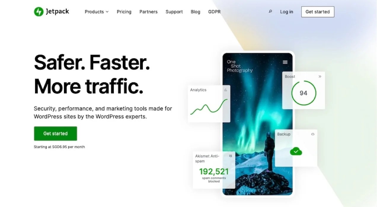
Use tools like Google PageSpeed Insights or GTmetrix to diagnose and resolve issues like unoptimized images or excessive scripts. Then, implement lazy loading for images and videos to reduce initial load times. You can both optimize images and configure lazy loading by installing the Jetpack extension.

Also be sure to optimize for Core Web Vitals like Largest Contentful Paint (LCP), First Input Delay (FID), and Cumulative Layout Shift (CLS) to improve user experience and search rankings (and organic traffic as a result).
Mobile-friendliness is a factor, too. If your site is hard to navigate on a mobile device, you greatly increase the chances that your visitors leave without viewing any additional pages.
Use Google’s mobile-friendly test to see how well your site measures up along with suggestions for improvement.
Finally, make sure you’re following security best practices and resolve any malware issues you may have had in the past. This ensures your site offers a safe browsing experience for visitors and conveys a sense of trustworthiness.
2. Limit distractions
First-time visitors to your site may be greeted with a notice and request for permissions on their screen. If you immediately accompany that notice with a pop-up, chat box, or something else that gets in the way of navigation, customers can get annoyed. Quickly.
The same goes for having too many ads, multiple offers flashing, pop-ups, and general clutter. You wouldn’t want to walk into a physical store and be greeted by incessant salespeople at the same time, right? The same goes for online experiences.
Displaying too much too quickly makes browsing uncomfortable and causes would-be customers to not be customers.
Limit your use of these kinds of tools for best results. Test each one to see how it impacts your bounce rate and sales and optimize the user experience according to what provides the best results.
You could run a pop-up every other week using an extension like Splash Popup and see if there’s a measurable impact on sales or bounce rates.

Do the same for chat bots or other tools. The Live Chat for WooCommerce extension makes integrating this feature straightforward.

And remember, these tools may be worth a higher bounce rate if the increase in sales outweighs the loss of visitors.
3. Create straightforward navigation
The best ecommerce navigation doesn’t draw attention to itself. Rather, it meets the site visitor’s expectations. No more, no less.
Sometimes, this means simplifying your menus. If you offer products across multiple categories, present the available options clearly and quickly.
Items in your menu should be short, concise, and descriptive. Avoid using niche terms or lingo in your menu, as a first-time visitor may not understand what they mean.
Sticky menus help on long pages so visitors don’t have to scroll all the way to the top to access your main menu. Customers also expect to find things like contact information, FAQs, and policies in your site’s footer. While you may be tempted to get creative with placement, you should probably just follow these norms.
Finally, if your site contains a lot of complicated information or pages, consider adding breadcrumbs.
These provide a secondary way for users to navigate your site and easily get back to the web page they were on previously. They also outline the hierarchy of your site and keep visitors from getting lost.

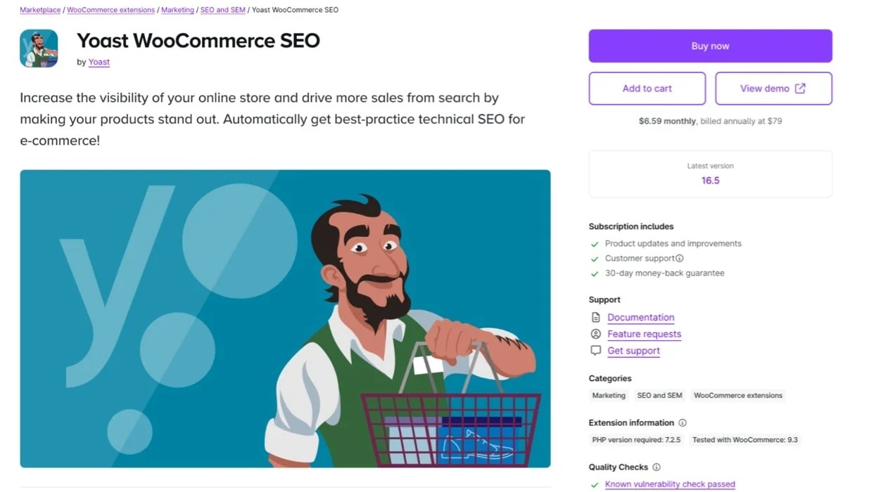
The Yoast WooCommerce SEO extension improves default breadcrumb navigation, making your products simpler to find by customers and Google.
4. Put your best content above the fold
The term above the fold comes from newspapers. Newspapers sit on a rack and all you can see is the top half — what appears before they’re folded over. That top half must draw you in immediately. The attention-grabbing headline isn’t at the bottom because no one would see it. The main idea is big, bold, and commanding.
On a website, above the fold refers to what’s visible to visitors before scrolling down a page or clicking a link. What appears above the fold will be different across device types and screen sizes.
Test as many sizes as possible to make sure you grab attention right away. Depending on where you place notices for things like GDPR, this may not always be at the very top of the page.
Use GA4 or similar tools to identify which screen sizes and devices drive the majority of your website traffic. While there are hundreds of possible device and screen size combinations, a small subset typically accounts for most of your visitors. To maximize your impact, prioritize optimizing the user experience for these high-traffic devices before moving on to others.
5. Conduct regular tests
If you’re unsure how changes to your site might impact bounce rates, conducting A/B testing (also known as split testing) enhances the accuracy of decision-making.
These tests let you present alternate versions of a webpage to different segments of your audience and gather performance data to determine which version does better.
One test could trial two variations of a homepage banner image. Version A features a product image, while version B highlights a lifestyle image. After running the test for a statistically significant period, analyze the results to see which version achieves a lower bounce rate or higher engagement.
Tools like VWO and Split Hero make A/B testing straightforward to implement. These platforms let you:
- Test headlines, calls-to-action, layouts, and color schemes.
- Analyze metrics like bounce rate, time on page, and conversion rate.
- Automatically declare a winner once enough data is collected.

Keep in mind that testing should be continuous. User behaviors, trends, and preferences evolve, so regularly evaluate and refine your site to ensure it meets visitor expectations.
6. Direct visitors to the right place on the first visit
Guiding visitors to the most relevant pages on your site from the outset reduces bounce rates.
Consider SEO
Focus on optimizing individual pages for specific categories or products so that visitors find exactly what they’re looking for instead of being funneled to a generic homepage.
If someone searches for “[Your Brand Name] running shoes,” your running shoes category page should rank prominently — not just your homepage. The Yoast SEO Premium extension helps refine on-page SEO and improve search engine visibility.

Use ads
Next, implement some ads. Google’s Performance Max campaign platform worked well for PickandMix.com. Use sitelinks to direct people to specific pages.
Let’s say you sell school-related merchandise. An ad targeting “back to school clothes” could include sitelinks for Uniforms, Athletic Clothes, and Shoes. Then when a potential customer looks for uniforms, they could click the corresponding sitelink and land directly on the uniforms category page, increasing their likelihood of staying and exploring further.
Create landing pages
Create dedicated landing pages for seasonal campaigns, specific product lines, or customer segments. For instance, a “Back to School Sale” landing page can combine relevant products, promotions, and messaging into one cohesive experience.
Add site search
Make sure your site has quality site search functionality. Take the default search functionality one step further with the Jetpack Search extension. This tool makes the experience much more visual, plus adds helpful features like spelling correction, filters, and instant results that populate as a visitor types.

7. Use high-quality, unique images
High-quality images make all the difference for ecommerce businesses. In the absence of physical interaction, customers rely heavily on visuals to assess products.
Clear, detailed images provide a comprehensive understanding of a product’s features, functionality, and aesthetics. This makes for more informed purchasing decisions. Poor-quality images, on the other hand, deter potential buyers.
All of this is to say, generic stock photos won’t work. Investing in custom, high-quality product photography allows you to showcase your products in keeping with your brand identity. Over time, consistent imagery builds brand recognition and sets you apart from competitors.
Featuring images that depict products in real-life scenarios or in use by people tend to increase user engagement, too. Such visuals help customers envision the product in their own lives. To that end, accurate and high-quality images set realistic expectations as well, which reduces the likelihood of returns.
A survey by PowerReviews revealed that 49% of respondents returned products they bought online because they did not match the description. So your product images must match the actual items you’re selling.
Lastly, while high-resolution images are expected, they need to be optimized so they don’t affect site performance. Techniques like lazy loading and using next-gen image formats like WebP can maintain quality without compromising load times.
8. Accessibility and readability
Your website visitors have diverse needs, and prioritizing accessibility ensures an inclusive experience. Optimize your site for those with disabilities by following WCAG 2.1 guidelines, and incorporating features like keyboard navigation, alt text for images, and readable fonts.
An accessible site enhances user satisfaction, improves SEO, and ensures compliance with regulations like the ADA. Investing in accessibility is an investment in a broader, more loyal audience, too.
9. Show authority and legitimacy
Do you ever wonder why products often feature the “as seen on TV” logo on their packaging? Or why wine bottles will list the awards or ratings the wine has received? It adds a sense of legitimacy to what they’re selling.
Establishing trust is key to converting visitors into customers. Showcase your credibility by prominently displaying awards, certifications, or media mentions your product or brand has received.
Badges like “Top Rated,” partnerships with trusted organizations, or quotes from reputable media outlets build instant legitimacy.
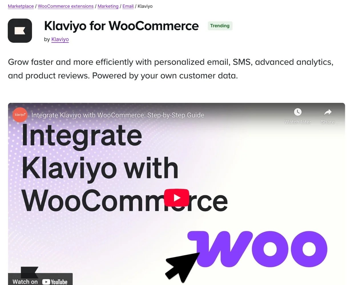
Including customer reviews and testimonials further reinforces your authority and reassures potential buyers of your product’s value, too. Use extensions like Klaviyo for WooCommerce, Trustpilot Reviews for WooCommerce or Google Merchant Center Customer Reviews Integration to highlight customer reviews on your site.

After the bounce
↑ Nach obenEven with a well-optimized site, some visitors will leave after viewing just a single page, and many won’t make a purchase on their first visit. However, you can re-engage these visitors and address their objections with targeted strategies that go beyond traditional remarketing ads.
1. Email retargeting
Collect email addresses through lead magnets, signup forms, or abandoned cart flows. Use email campaigns to follow up with visitors, offering personalized recommendations, exclusive discounts, or reminders about their last viewed products.

Tools like Klaviyo allow you to create targeted email campaigns based on customer behavior. Offer single-use coupons, add dynamic product recommendations, and even sync with your social media accounts.
2. Push notifications
Use push notifications to bring visitors back to a specific sales page. Notify them about price drops, restocked items, or limited-time promotions. Push notifications work well for immediate re-engagement and complement longer-term email retargeting efforts.
The Push Notifications for WooCommerce extension helps greatly with this.

3. Address patterns and issues
Use tools like heatmaps, session recordings, and analytics to identify patterns in bounce behavior. Examine the collected data and ask yourself questions like:
- Are visitors leaving product pages because they can’t find enough information?
- Is my pricing unclear or overly complex?
- Are people bouncing from a slow-loading page or a confusing layout?
Address these by optimizing the areas that frustrate visitors.
Monitor bounce rate and improve your site
↑ Nach obenBounce rate is a key metric for understanding your site’s effectiveness, but it’s only one piece of the puzzle. Always measure bounce rate in context — accounting for time periods, page types, and user behavior. Then, you’ll uncover real insight on how to steadily enhance your site’s performance.
Rather than comparing yours to the industry average bounce rate, focus on continuous improvement through testing, analysis, and targeted optimization. Over time, these efforts will reduce how many visitors bounce and boost engagement, conversions, and overall profitability.
About


I just read your article. We are owners of an e-commerce portal based in Ghana 🇬🇭. Can you glance through our portal and advise exactly what we should do to boost sales immediately. We are not making the numbers at all.
Hi Selasi,
Thanks for reading the article! If you go to https://woocommerce.com/experts/, you’ll find a lot of wonderful professionals who can help you with the next steps to boost sales. Best of luck!