Do your shop and archive pages feel static? Customers often scroll past products because they cannot see the available options instantly. They have to click through to a single product page just to check a size or color. This extra step kills your conversion rate.
You need to make your archive pages interactive. The Carousel Settings in Variation Monster allow you to display variations and purchasing options directly on the listing page.
This guide covers how to configure the visual and functional aspects of the Quick Cart Carousel. It ensures a faster shopping experience for your customers.
To access these options, navigate to WooCommerce > Settings.
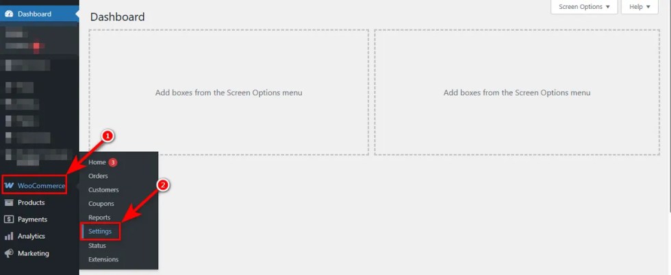
Then, click the “Variation Monster” tab and then hit the “Carousel Settings.”
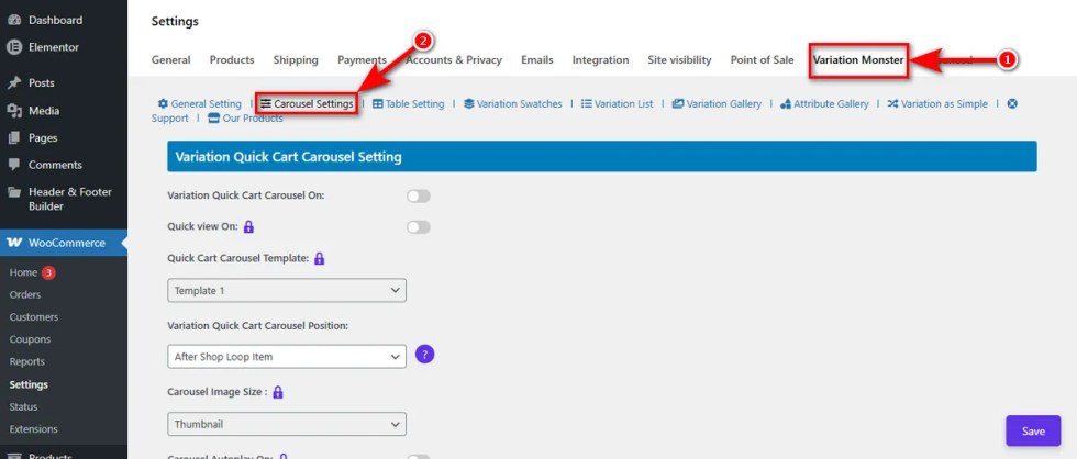
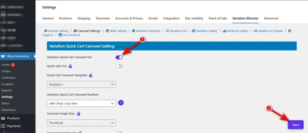
Enable Variation Quick Cart Carousel
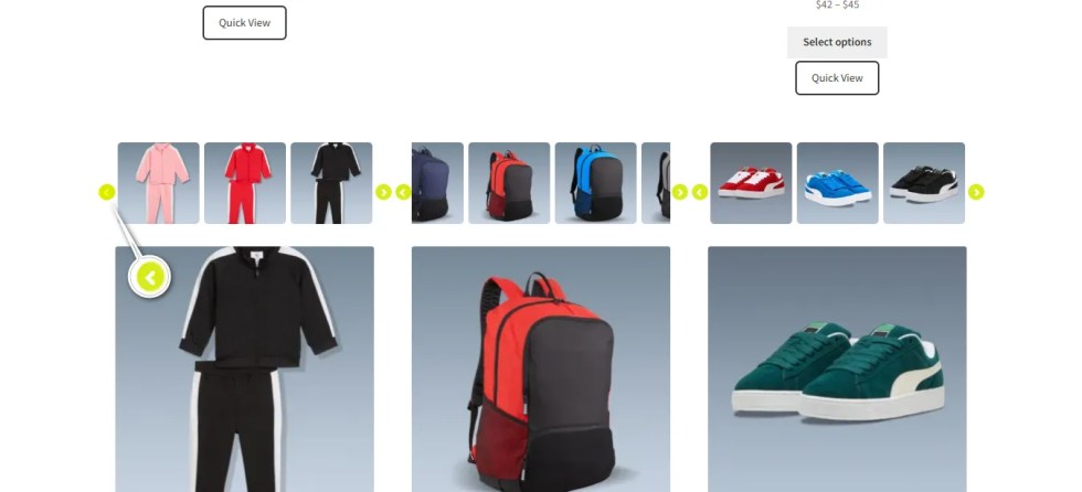
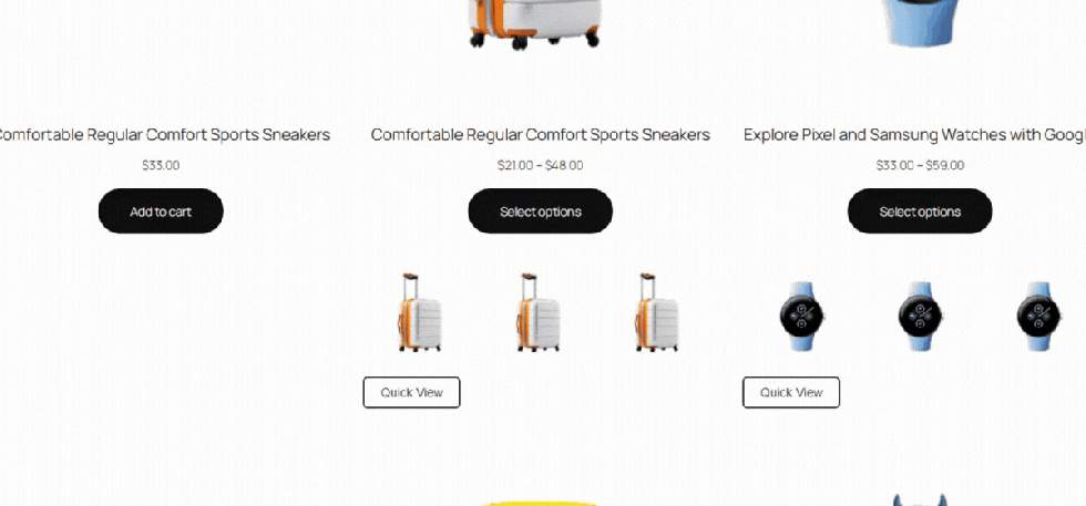
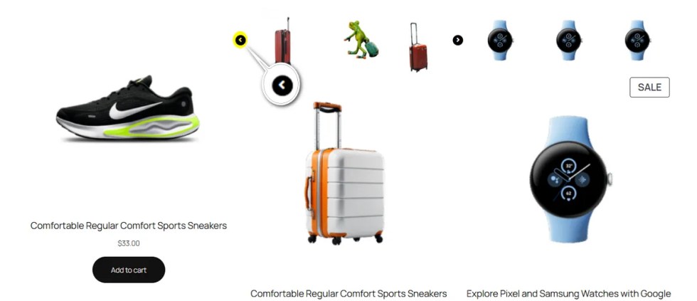
↑ Back to topStandard WooCommerce archive pages hide your product depth. Customers assume you only have the one color or style they see in the thumbnail.
This toggle switch controls the activation of the Quick Cart Carousel on your shop, category, and archive pages.
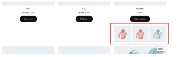
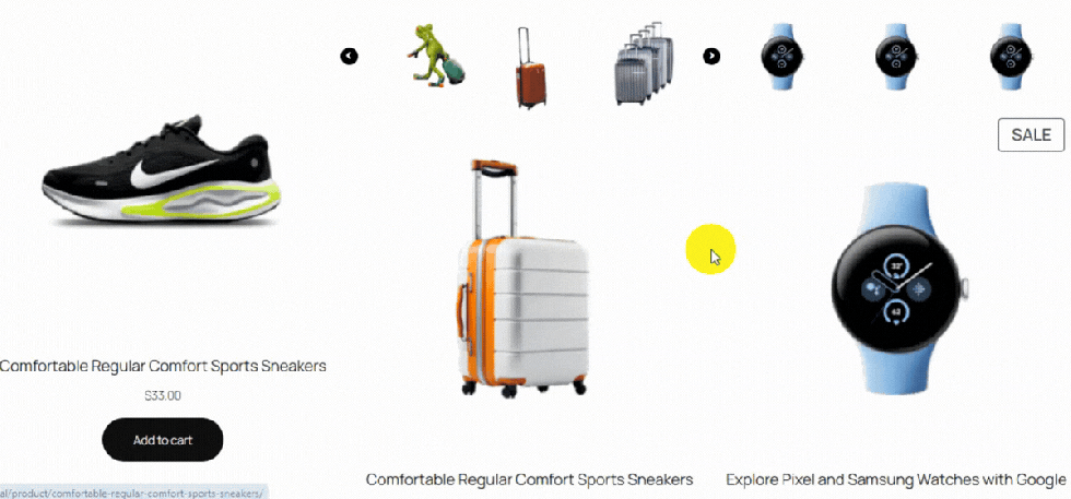
By turning on the Quick Cart Carousel and clicking the ‘Save’ button, you display a dynamic carousel of variations right under the product image.
This simple change lets users see their options immediately. It grabs attention and captures impulse buyers who would otherwise scroll past.
Quick Cart Carousel Template (Pro) Works
↑ Back to topOne layout does not fit every store. A generic design can clash with your theme or make your products look out of place.
This visual disconnect lowers the perceived quality of your brand.
You need flexibility to match your store’s style. Thus, Variation Monster comes with a Quick Cart Carousel Template setting that provides multiple pre-designed templates for your carousel.You just select a specific Quick Cart Carousel Template from the dropdown and hit the ‘Save’ button.
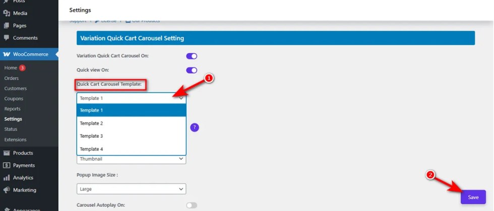
Doing this lets you instantly change the look and feel of the variation display.
Variation Quick Cart Carousel Position
↑ Back to topPlacement determines visibility. If your add-to-cart options are hidden or misaligned, customers won’t use them. This leads to lower engagement on your archive pages.
You need control over where the carousel appears relative to the product details.
This setting allows you to change the Quick Cart Carousel position.
By adjusting this, you ensure the layout flows naturally with your specific theme structure.
You can choose from four specific placements to perfectly align the carousel:
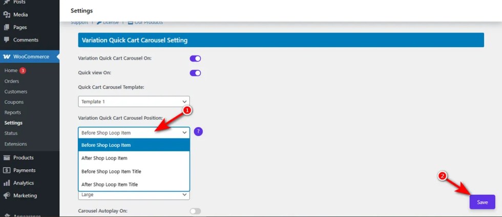
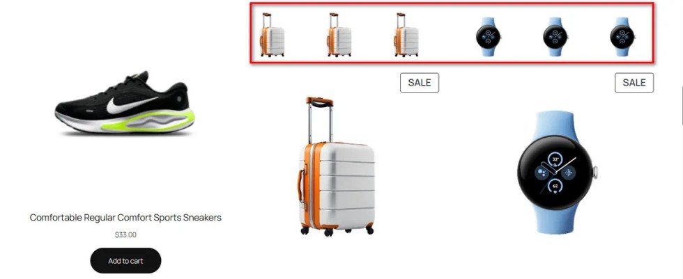
- Before Shop Loop Item: Places the carousel at the very top of the product card, above the main thumbnail.
- After Shop Loop Item: Displays the carousel at the very bottom of the product card, after the price and buttons.
- Before Shop Loop Item Title: Inserts the carousel directly above the name of the product.
- After Shop Loop Item Title: Positions the carousel immediately underneath the product name.
Carousel Thumbnail Size (Pro)
↑ Back to topImages that are too large slow down your page loading speed. Images that are too small hide important product details. This imbalance hurts the visual appeal of your shop.
You need the right size to match your specific theme layout.
The Variation Monster’s Carousel Thumbnail Size setting allows you to change the carousel image size.
Just click on the Carousel Thumbnail Size dropdown, select an image size from thumbnail, medium, large, WooCommerce thumbnail, or any other size, and hit the ‘Save’ button.
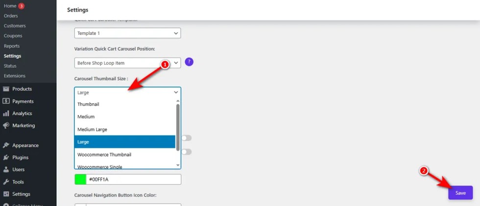
This ensures your variations look sharp without breaking the page structure and show clearly image
Enable Carousel Autoplay
↑ Back to topStatic images often fail to catch a shopper’s eye. If a customer has to click just to see the next variation, they might lose interest and scroll away. This lack of movement makes your store feel lifeless.
Motion grabs attention. You can enable carousel autoplay to cycle through your variation images automatically.Hence, turn on the “Carousel Autoplay On” switch and click the ‘Save’ button.
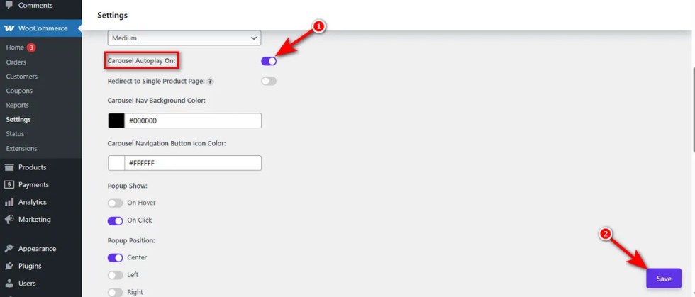
This feature showcases your product variety dynamically without requiring a single click from the user.
Carousel Nav Background Color
↑ Back to topDefault navigation arrows often blend into the product image. If users cannot see the arrows, they cannot scroll through your variations. This hidden functionality limits their view of your products.
You need clear navigation cues.
The Variation Monster lets you change the carousel navigation background color.
Just click on the Carousel Nav Background Color swatch, drag and drop to select your preferred color, and hit the ‘Save’ button. You’re all set!
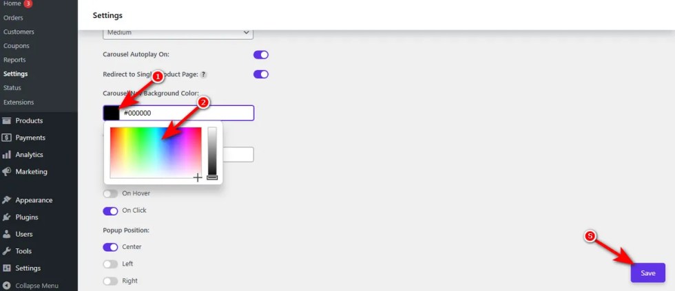
By selecting a high-contrast color, you ensure customers can easily find and click the next arrow in the carousel.
Carousel Navigation Button Icon Color
↑ Back to topA visible button background is useless if the icon inside is invisible. If the arrow color matches the background, users will not know where to click. This confusion stops them from browsing your options.
You need high contrast for clarity.
Use the Variation Monster’s Carousel Navigation Button Icon Color setting to change the carousel navigation button icon color.
Similar to the Carousel Nav Background Color, you need to click Carousel Navigation Button Icon Color swatch, choose your desired color, and, press the ‘Save’ button.
By selecting a color that stands out against the button background, you ensure the arrow is always easy to see.