Buying multiple items at once should be fast and obvious. If the primary checkout action fades into the background, shoppers might miss it entirely.
They end up buying fewer items or abandoning the process out of frustration. Customizing these action buttons makes them impossible to ignore.
A striking design encourages bigger orders and keeps the buying journey highly engaging.
Let’s customize these critical buttons to maximize your sales.
3.10.1 Bulk Add to Cart Background Color (Pro)
A dull checkout button kills conversions. If it looks inactive, users hesitate to click it.
You need a prominent call to action to drive multi-item purchases.
Find the “Bulk Add to Cart Background Color” field. Open the color palette and select a vibrant shade that demands attention.Click the ‘Save‘ button at the bottom right.
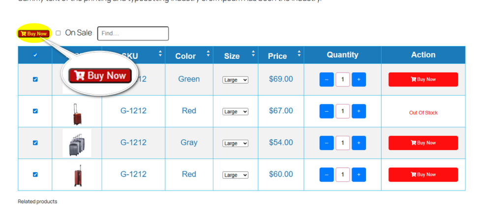
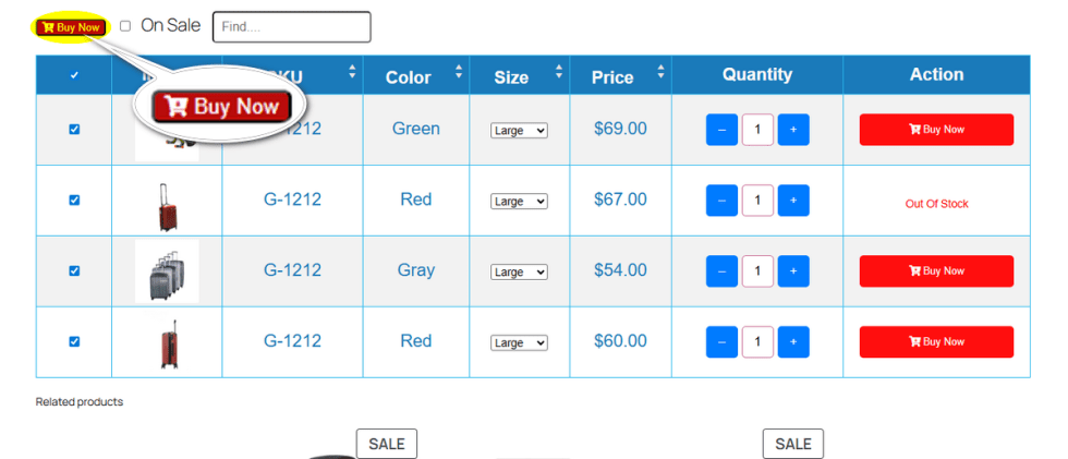
Check your store. The bulk purchase button now stands out clearly from the rest of the page.
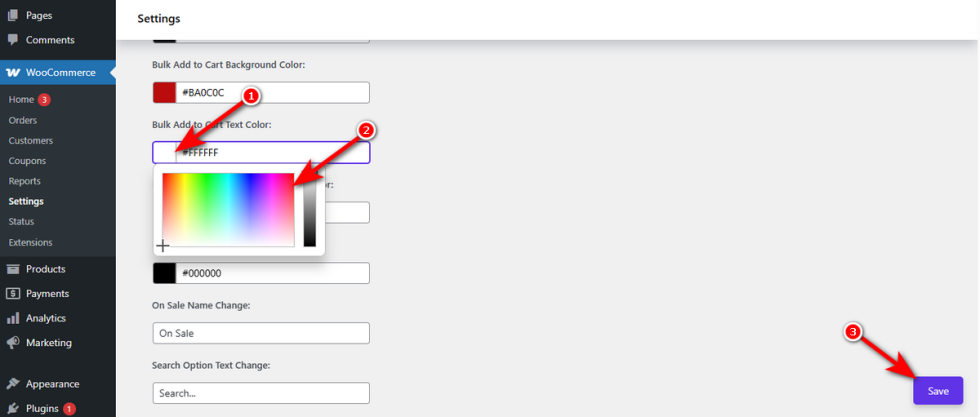
Bulk Add to Cart Text Color (Pro)
↑ Back to topHigh-contrast backgrounds mean nothing if the text is unreadable. Shoppers will not click a button if they cannot decipher what it says.
Ensure total clarity by adjusting the font shade.
Locate the “Bulk Add to Cart Text Color” setting. Pick a solid color, like white or dark gray, that contrasts sharply with your chosen background.
Press ‘Save‘ to apply your adjustments.
View your live site. The words on your button are perfectly legible and easy to spot.
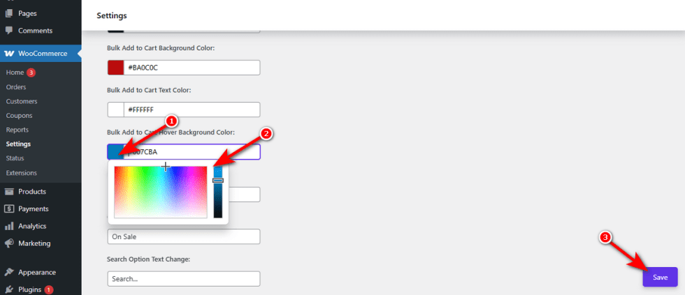
Bulk Add to Cart Hover Background Color (Pro)
↑ Back to topA flat, unchanging button feels broken. Users expect visual feedback when they prepare to interact with a page element.
Adding a color shift creates a satisfying, interactive experience.
Navigate to the “Bulk Add to Cart Hover Background Color” input box. Choose a slightly altered tint from your main button color to indicate interactivity.
Hit ‘Save‘ to confirm this setting.
Hover your cursor over the button on the front end. It reacts beautifully to the user’s movement.
Bulk Add to Cart Hover Text Color (Pro)
↑ Back to topSometimes the background color change makes the original text hard to read during a hover. This sudden loss of clarity causes last-second friction.
Keep the text visible during the transition by assigning a specific hover hue.
Click on the “Bulk Add to Cart Hover Text Color” option. Select a shade that maintains perfect readability when the button changes state.Do not forget to click the ‘Save‘ button.
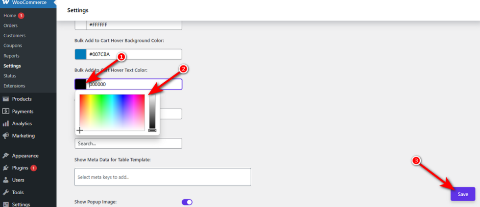
Test the live interaction. The text remains sharp and clear throughout the entire buying process.
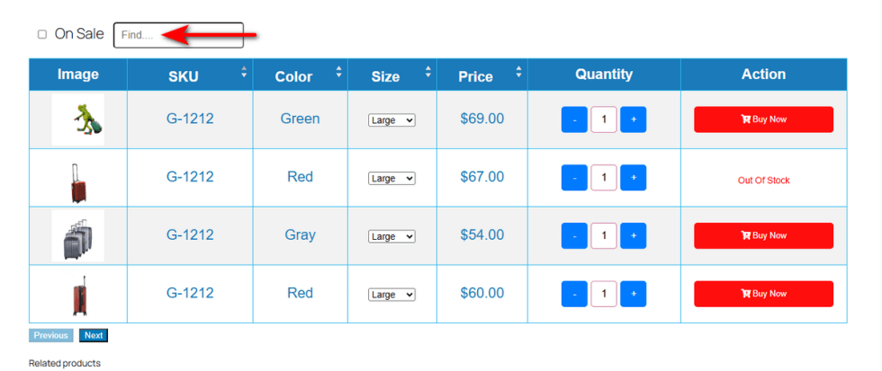
On Sale Name Change
↑ Back to topGeneric labels like “On Sale” might not fit your brand’s unique tone. If you are running a specific promotion like “Summer Clearance,” the standard text feels disconnected.
Mismatched messaging weakens your marketing efforts. Shoppers might ignore the filter completely.
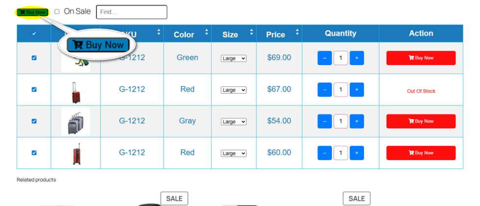
You need to match this text exactly to your current campaign. Variation Monster places this handy filter checkbox directly on top of your variation add-to-cart table. This setting lets you rename that specific toggle instantly.
Locate the “On Sale Name Change” input field in your settings. Remove the default text and type your custom phrase, such as “Clearance Deals.”Hit the ‘Save‘ button.
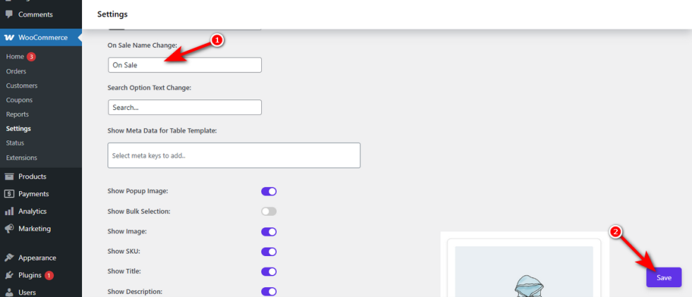
Check your front end. The filter checkbox attached to your add-to-cart table now displays your fresh promotional label.
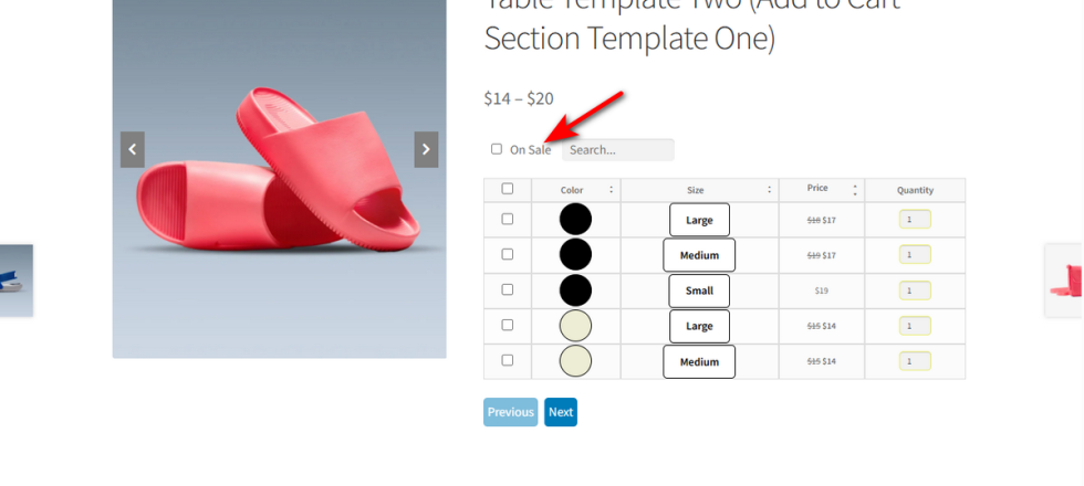
Search Option Text Change
↑ Back to topA standard “Search” placeholder is easy to overlook. It might also clash with your brand’s unique voice.
Unnoticed search bars force customers to manually scan massive tables. This slow process causes frustration.
You can make this tool more inviting.
Variation Monster positions a helpful search box right next to the sale filter on your add-to-cart table.
This setting lets you customize the placeholder text inside that box.
Find the “Search Option Text Change” input field.
Type a clear, actionable phrase, such as “Find….”.Click the ‘Save‘ button at the bottom right.

Preview your store. The search box now features your custom text to guide your shoppers.
Bulk Add to Cart Position (Pro)
↑ Back to topWhen customers want to buy multiple items, they need a clear path to checkout. A poorly placed bulk buy button forces them to scroll up and down, searching for the next step.
This friction leads to abandoned carts. You need a prominent button right where the shopper naturally expects it.
This setting allows you to position the global checkout button precisely within your layout.
Click the “Bulk Add to Cart Position” dropdown menu. You can choose to place the button “Before Table,” “After Table,” or “Both“.Hit the ‘Save‘ button in the bottom right corner.
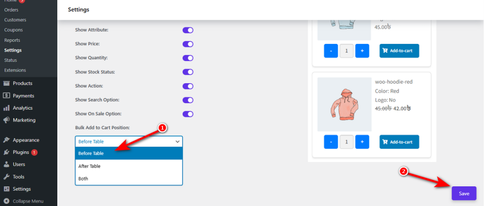
Check your shopfront. The button now sits exactly where it serves your customers best.