The Accordion Group block displays collapsible content sections on your store and product pages. Use this block to organize information such as FAQs, product details, or multi-step instructions into expandable sections that reduce page clutter and keep content accessible. This guide covers how to add an Accordion Group block and configure its header icons, icon position, and panel content.
Add an Accordion Group block
↑ Back to topTo insert an Accordion Group block into a page or template:
- Open the page, post, or template where you want to add the block.
- Click the + block inserter icon or type
/in an empty block. - Search for Accordion Group and select it.
- The block inserts with a default Accordion item that includes an Accordion Header and an Accordion Panel. Add your content and configure settings as described in the sections below.
Block structure
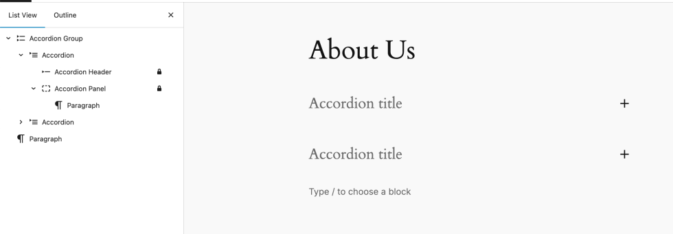
↑ Back to topThe Accordion Group block is a container that groups multiple collapsible accordion items in a structured layout.
Each accordion item includes an Accordion Header and an Accordion Panel. Customers click the header to expand or collapse the associated panel. When you insert an Accordion Group block, it automatically includes the following nested blocks:
- Accordion
- Accordion Header: The clickable title that toggles visibility of the panel.
- Accordion Panel: The content section that expands or collapses.
You can add multiple Accordion items within a single group.
Accordion header
↑ Back to topThe Accordion Header is the clickable element that expands or collapses the associated content panel. Select an Accordion Header block to view its settings in the sidebar.
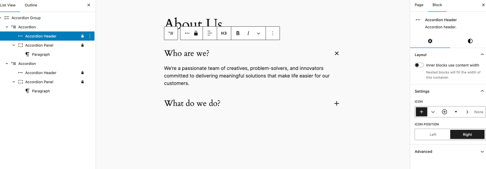
The Accordion Header provides the following settings:
Icon
The Icon setting adds a visual indicator next to the header text, such as an arrow or plus sign, to signal that the section is expandable. You can configure the following options:
- Icon Selector: Choose an icon from the dropdown of available options.
- None: Select this option to hide the icon entirely.
Icon position
The Icon Position setting controls where the icon appears relative to the header text:
- Left: The icon appears before the header text.
- Right (default): The icon appears after the header text.
Choose the position that matches your store’s layout direction. For example, right-to-left (RTL) language stores may benefit from placing the icon on the left.
Accordion panel
↑ Back to topThe Accordion Panel is the collapsible content area that appears when a customer clicks the associated Accordion Header. You can add any standard WordPress block inside the panel, including paragraphs, images, lists, and videos.
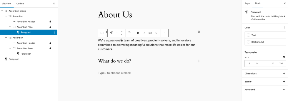
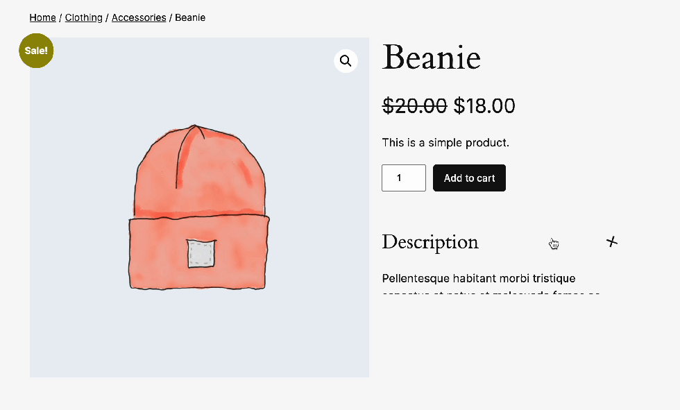
When you use a block theme, the Single Product template from WooCommerce allows you to insert WooCommerce-specific blocks inside the panel, such as Product Description, Reviews, or Additional Information. These blocks pull dynamic data from the current product automatically.
Questions and support
↑ Back to topDo you still have questions and need assistance?
This documentation is about the free, core WooCommerce plugin, for which support is provided in our community forums on WordPress.org. By searching this forum, you’ll often find that your question has been asked and answered before.
If you haven’t created a WordPress.org account to use the forums, here’s how.
- If you’re looking to extend the core functionality shown here, we recommend reviewing available extensions in the WooCommerce Marketplace.
- Need ongoing advanced support or a customization built for WooCommerce? Hire a Woo Agency Partner.
- Are you a developer building your own WooCommerce integration or extension? Check our Developer Resources.
If you weren’t able to find the information you need, please use the feedback thumbs below to let us know.