
Use the Single Product block to display a product on a page, post, or homepage.
The block displays the selected product’s image, title, price, summary, rating, and add-to-cart controls. Its inner blocks let you customize each part separately.
Before you start, create the product you want to display and make sure you can edit the destination page or template. Template editing requires a block theme and permission to use the Site Editor.
Add a Single Product block
↑ Back to top- Open the page or template in the block editor and insert a Single Product block.
- Choose the product to display, then select Done.
- Select an inner block to customize its settings. You can use List View to select a nested block.
- Save the page or template, then preview it on your storefront to confirm the product details and controls.
If the editor reports that the selected product is no longer available, choose another product. For other loading errors, use the retry control and check that the product is still available.
Inner Blocks
↑ Back to topThe Single Product block is built from inner blocks for individual product details. Select an inner block to edit its content and settings.
| Inner Block | Purpose | Details |
|---|---|---|
| Product Image | Displays the product’s main image. | Can link to the product page and supports image size and border styling. |
| Product Title | Shows the name of the product. | Links to the single product page. |
| Product Rating | Displays the average customer rating. | Shows a star-based rating based on the product reviews. |
| Product Price | Displays the current product price. | Supports regular and sale prices and adjusts automatically for variations if applicable. |
| Product Summary | Shows a short product description. | Pulled from the product’s short description field |
| Add to Cart with Options | Display a button so the customer can add a product to their cart. | Allows you to choose how the quantity field is displayed – text input or a stepper |
| Product Meta | Displays additional product metadata. | Includes multiple inner blocks: Product SKU, Product Categories, and Product Tags. |
| Product SKU | Displays the product’s Stock Keeping Unit (SKU). | Identifies the product using its SKU. |
| Product Categories | Displays the categories the product belongs to. | Allows for easier navigation and grouping of similar products within the store. |
| Product Tags | Displays product tags for further classification. | Useful for filtering, searching, and related product grouping. |
Select an inner block in the editor canvas or List View, then open its settings in the sidebar. Available design controls depend on the block, theme, WordPress version, and layout context.
Product Image Block
↑ Back to topThe Product Image block displays the main image of the product and serves as a key visual element in the Single Product block. This block helps customers get a quick visual understanding of the product and can optionally link to the full product page.
Before you start, open a page or template that contains a Single Product block, then select its Product Image inner block.
Block Settings
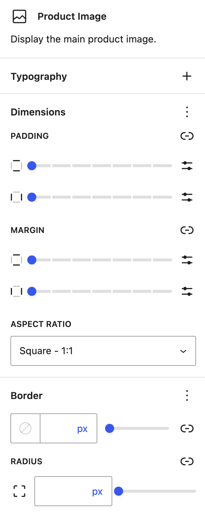
- Image size: Set the image’s Height and Width. The unit selector supports px, em, rem, %, vw, and vh. When you set a Height, choose a Scale option: Cover, Contain, or Fill.
- Link to Product Page: Use this setting to link the image to the product page.
- Border controls: The Product Image block supports border color, width, style, and radius. For shared border and radius guidance for inner blocks, see Typography Settings.
In WooCommerce 11.2, open the Border options menu to show Border and Radius controls if they are hidden. Set a border width, use the color and style picker to choose a color and Solid, Dashed, or Dotted style, then set the radius. Save the page or template and preview it on your storefront. If the border does not appear, confirm that Product Image is selected, the width is greater than zero, and your theme supports the chosen settings.
Product Title Block
↑ Back to topThe Product Title block displays the name of the product and plays a key role in product identification, accessibility, and SEO. It helps guide shoppers to the product page when configured as a clickable link.
Block Settings
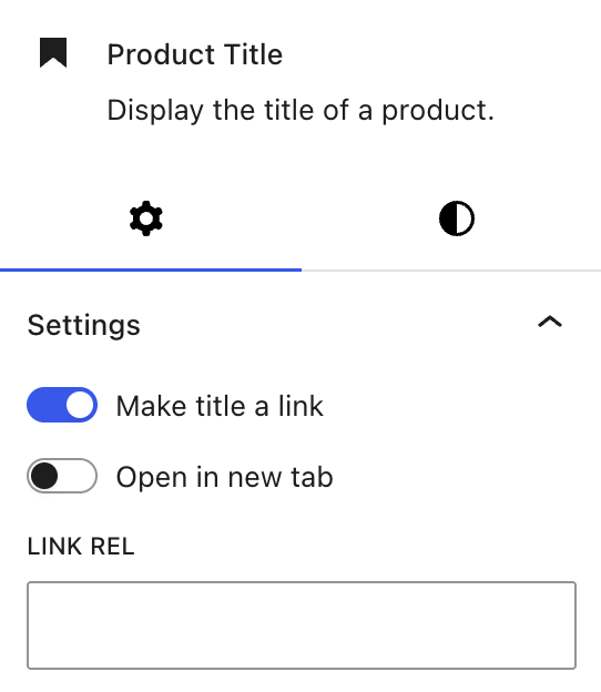
- Make Title a Link: When enabled, the product title becomes a clickable link that directs visitors to the original product page.
- Open in New Tab: Determines whether the link opens in a new browser tab. This is useful when you want users to stay on the current page while still giving them access to more product details.
- Link Rel: Allows you to define the rel attribute for the link (e.g., nofollow, noopener, sponsored).
Product Rating Block
↑ Back to topThe Product Rating block displays the product’s average customer rating in a star format. This block is a quick trust builder, giving potential customers insight into product popularity and satisfaction.
Block Settings
- Text Color: Customize the color of the stars and the text shown next to the star rating (e.g., the number of reviews).
- Typography and Dimensions: Adjust the available typography and spacing controls.
Product Price Block
↑ Back to topThe Product Price block displays the product’s current price, including sale pricing when applicable.
Block Settings
- Text Color: Change the color of the price text to better match your site’s design.
- Background Color: Adjust the background color behind the price label for added visual emphasis.
- Typography and Dimensions: Adjust the available typography and spacing controls.
Product Summary Block
↑ Back to topThe Product Summary block displays a short description of the product, pulled from the product’s short description field.
Block Settings
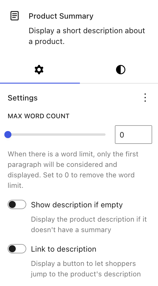
- Max Word Count: Limit how many words to display. If set to a specific number, only the first paragraph up to that limit is shown. Set to 0 to show the full summary.
- Show Description if Empty: When enabled, and if the product’s short description is empty, the block falls back to the full product description.
- Link to Description: Adds a button that takes shoppers directly to the Product Description section on the Product page.
- Typography and Dimensions: Adjust the available typography and spacing controls.
Add to Cart with Options Block
↑ Back to topExisting layouts may use the classic Add to Cart with Options block. It includes a quantity selector and an Add to cart button.
Block Settings
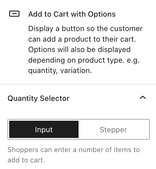
- Quantity Selector: Choose how shoppers select quantity:
- Input: A numeric input field where customers can type a number
- Stepper: Plus/minus buttons to increase or decrease the quantity.
Introduced in WooCommerce 10.0, the Add to Cart + Options (Beta) block offers a fully blockified, customizable add-to-cart form. Use its inner blocks to customize the quantity selector and other form controls.
Product Meta Block
↑ Back to topThe Product Meta Block displays the product’s SKU, categories, tags, and other meta. By default, it displays the SKU, categories, and tags.
Product SKU
The Product SKU block displays the SKU of the product.
Product Categories Block
The Product Categories block displays a list of categories the product belongs to.
Block Settings
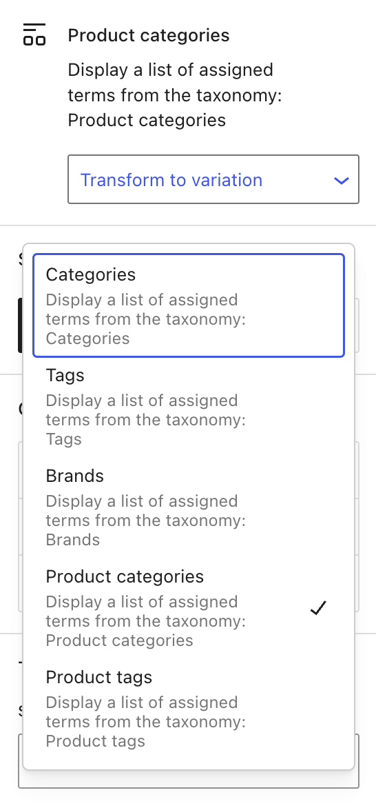
- Transform to Variation: Change the taxonomy from Product Categories to Product Tags, Brands, etc., using the dropdown.
- Styles: Choose between Default and Pill-shaped tag styles.
- Color: Customize Text, Background, and Link colors for improved visual integration.
Product Tags Block
The Product Tags block displays product tags for further classification and filtering.
Block Settings
- Transform to Variation: Change the taxonomy from Product Tags to Product Categories, Brands, etc., using the dropdown.
- Styles: Choose between Default and Pill-shaped tag styles.
- Color: Customize Text, Background, and Link colors for improved visual integration.
Typography Settings
Inner blocks offer design controls supported by the block and your theme. Use the options menu beside a panel heading to reveal hidden controls. The available controls may include:
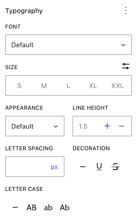
- Font: Choose a specific font (based on your theme’s available fonts) or leave it as Default.
- Size: Select a preset size (S, M, L, XL, XXL) or fine-tune it using custom controls for precise scaling.
- Appearance: Adjust text weight and style if your theme supports multiple font appearances (e.g., bold, italic, light).
- Line Height: Modify the vertical spacing between lines for better readability.
- Letter Spacing: Control the space between individual characters. Useful for subtle design refinement.
- Text Decoration: Add styling such as underline, strikethrough, or none for headings or prices.
- Letter Case: Transform text to uppercase, lowercase, or title case depending on your design preference.
- Dimensions: Fine-tune the padding and margin for spacing inside and around each block element.
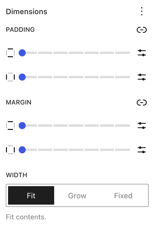
- Width Settings:
- Fit: Automatically adjusts to content width.
- Grow: Expands to fill the available space.
- Fixed: Lets you set a specific width.
- Border Controls:
- Add borders with customizable thickness.
- Use the Radius option to round the block’s corners for a softer, more modern appearance.
Save the page or template when you finish. Preview it on your storefront and check the product details, links, image border, and add-to-cart controls. If a control is unavailable, confirm that the intended inner block is selected and check the options menu and your theme’s supported settings.
Questions and support
↑ Back to topDo you still have questions and need assistance?
This documentation is about the free, core WooCommerce plugin, for which support is provided in our community forums on WordPress.org. By searching this forum, you’ll often find that your question has been asked and answered before.
If you haven’t created a WordPress.org account to use the forums, here’s how.
- If you’re looking to extend the core functionality shown here, we recommend reviewing available extensions in the WooCommerce Marketplace.
- Need ongoing advanced support or a customization built for WooCommerce? Hire a Woo Agency Partner.
- Are you a developer building your own WooCommerce integration or extension? Check our Developer Resources.
If you weren’t able to find the information you need, please use the feedback thumbs below to let us know.