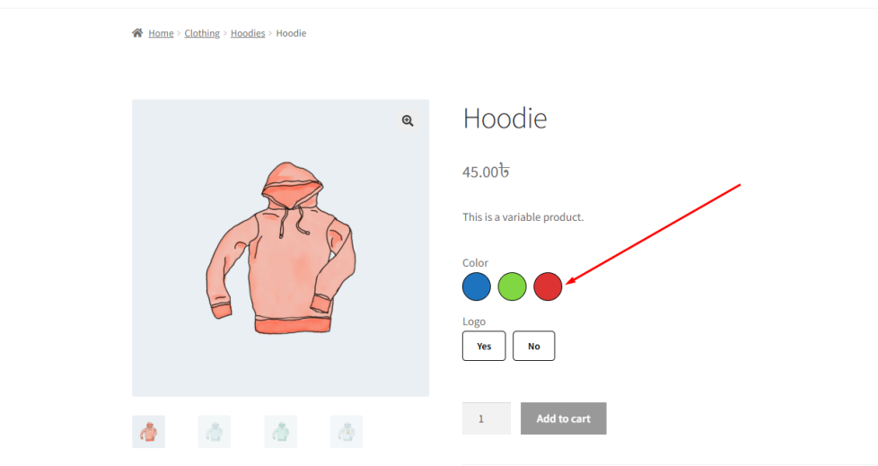
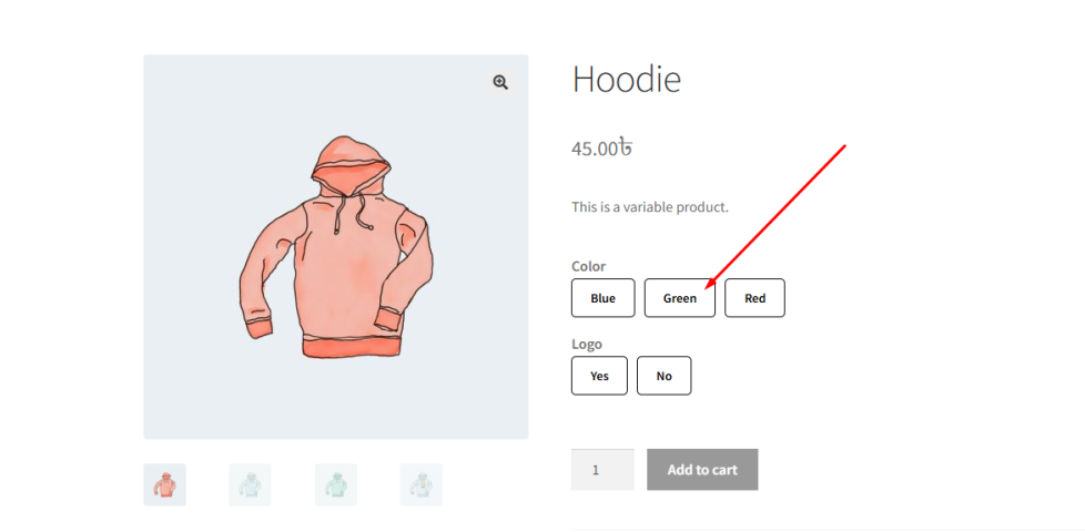
The Tooltip Enable for Variation Swatches feature allows you to display helpful tooltip text when customers interact with variation swatches.
When this feature is enabled, a tooltip appears when the user hovers over or focuses on a variation option such as:
- Color Button
- Image Button
- Normal Button
These tooltips typically display the attribute name or value, helping customers clearly understand what each variation represents.
For example, instead of guessing a color from a small swatch, a tooltip can display:
“Blue”, “Red”, or “Black”
This improves usability, especially when:
- Swatches are small
- Colors look similar
- Images are not fully clear
It ensures that customers can confidently select the correct variation without confusion.
How to Configure
↑ Back to top- Go to WordPress Admin Panel → WooCommerce → Settings.
- Click the Variation Monster tab.
- Navigate to the Variation Swatches section.
- Enable the Tooltip Enable for Variation Swatches option.
Click the Save button.
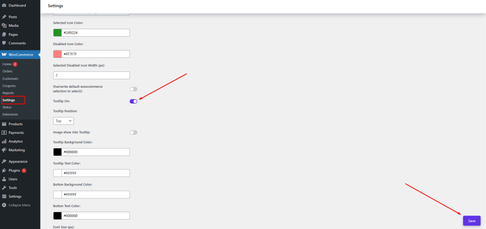
After saving the settings, tooltips will appear on variation swatches on the single product page, helping customers easily identify each option.
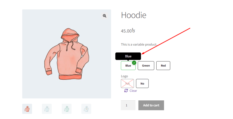
Tooltip Position
↑ Back to topThe Tooltip Position setting allows you to control where the tooltip appears relative to the variation swatch.
When the Tooltip Enable for Variation Swatches feature is active, tooltips are displayed when customers hover over or interact with variation options. Adjusting the tooltip position ensures that it appears in a location that best fits your store’s layout and design.
Variation Monster provides four different tooltip position options:
Top
↑ Back to topDisplays the tooltip above the variation swatch.
This is the most commonly used position and works well for most layouts.
Bottom
↑ Back to topDisplays the tooltip below the variation swatch.
Useful when there is limited space above the swatches.
Left
↑ Back to topDisplays the tooltip to the left side of the variation swatch.
Ideal for horizontal layouts or when swatches are aligned to the right.
Right
↑ Back to topDisplays the tooltip to the right side of the variation swatch.
Works well when swatches are aligned to the left side of the layout.
How to Configure
- Go to WordPress Admin Panel → WooCommerce → Settings.
- Click the Variation Monster tab.
- Navigate to the Variation Swatches section.
- Locate the Tooltip Position option.
- Select your preferred position:
- Top
- Bottom
- Left
- Right
Click the Save button.
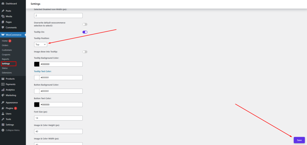
After saving the settings, the tooltip will appear in the selected position on the single product page, improving visibility and usability for customers.
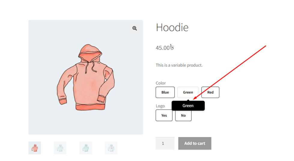
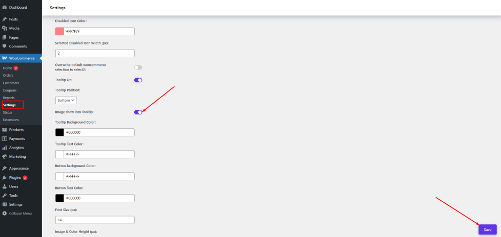
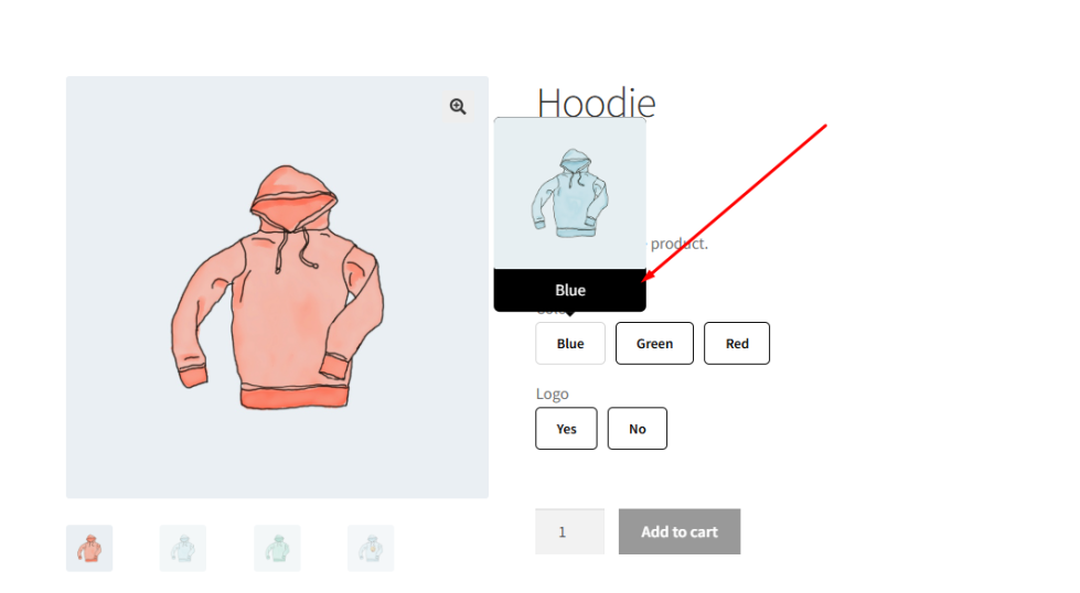
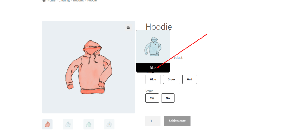
Image Show into Tooltip
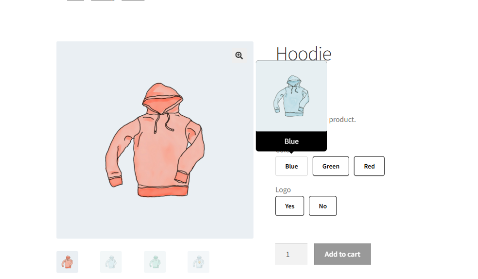
↑ Back to topThe Image Show into Tooltip feature allows you to display an image inside the tooltip for each variation swatch. This enhances the user experience by providing a clearer visual representation of the variation when customers hover over it.
When this feature is enabled, tooltips will not only show the attribute name or value, but can also display an associated image. This is especially useful for products where visual details matter, such as colors, patterns, or styles.
For example, when a customer hovers over a color swatch:
- The tooltip can display the color name (e.g., Blue)
- Along with a preview image of that variation
This helps customers better understand the product option before selecting it.
How to Configure
- Go to WordPress Admin Panel → WooCommerce → Settings.
- Click the Variation Monster tab.
- Navigate to the Variation Swatches section.
- Enable the Image Show into Tooltip option.
Click the Save button.
How to Add Images to Tooltips
↑ Back to top- Go to Products → Edit Product.
- Open the Variation Monster tab inside the product edit page.
- Navigate to Extended Attribute Settings.
- For each attribute term, upload or assign an image for the tooltip.
- Update the product to save the changes.
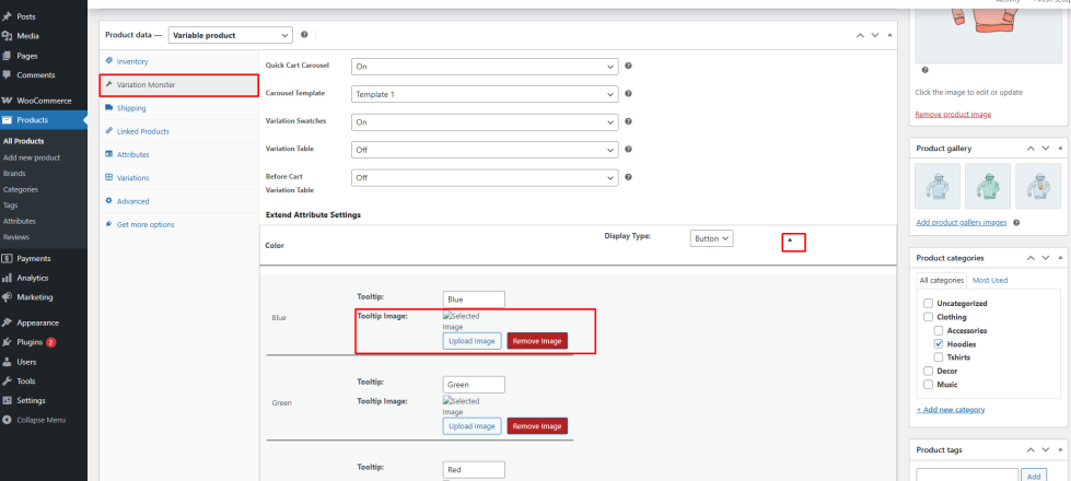
After configuration, when a customer hovers over a variation swatch on the single product page, the tooltip will display both the attribute name and the associated image, providing a more informative and visually rich experience.
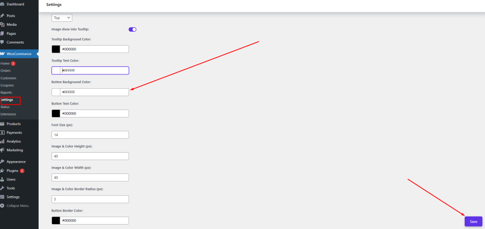
Tooltip Background Color
↑ Back to topThe Tooltip Background Color setting allows you to customize the background color of tooltips displayed in variation swatches.
By default, tooltip colors may not always match your website’s design or branding. This feature helps you adjust the tooltip background so it blends seamlessly with your store’s overall theme.
Using an appropriate background color improves readability and ensures that the tooltip content remains clear and visually appealing.
How to Configure
↑ Back to top- Go to WordPress Admin Panel → WooCommerce → Settings.
- Click the Variation Monster tab.
- Navigate to the Variation Swatches section.
- Locate the Tooltip Background Color option.
- Choose your preferred color using the color picker or enter a hex code.
- Click the Save button.
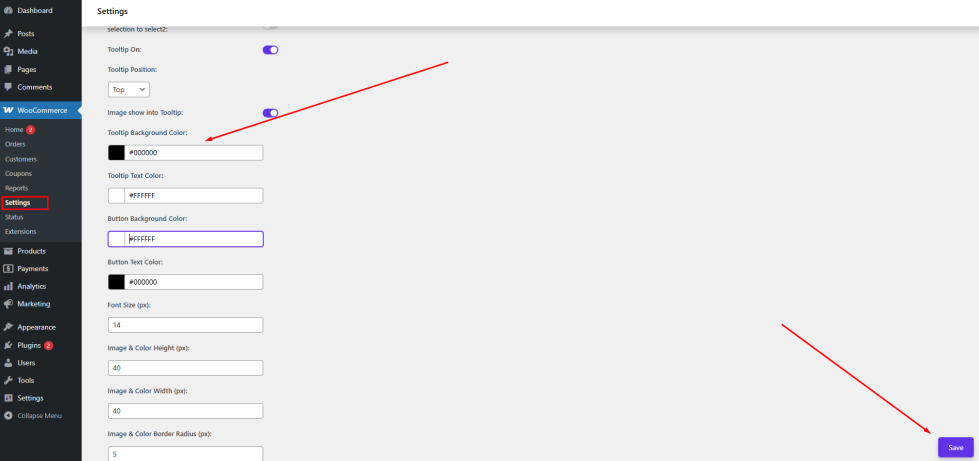
After saving the settings, the selected background color will be applied to all tooltips on the single product page, ensuring a consistent and polished look across your website.
Tooltip Text Color
↑ Back to topThe Tooltip Text Color setting allows you to customize the color of the text displayed inside variation swatch tooltips.
When you change the tooltip background color, it is important to ensure that the text remains clearly visible. Choosing the right text color helps maintain proper contrast and improves readability for customers.
For example:
- If you use a dark background, a light text color (such as white) is recommended
- If you use a light background, a dark text color (such as black) works best
This ensures that customers can easily read the tooltip content without any difficulty.
How to Configure
↑ Back to top- Go to WordPress Admin Panel → WooCommerce → Settings.
- Click the Variation Monster tab.
- Navigate to the Variation Swatches section.
- Locate the Tooltip Text Color option.
- Choose your preferred color using the color picker or enter a hex code.
- Click the Save button.
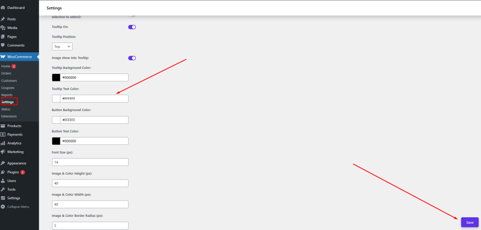
After saving the settings, the selected text color will be applied to all tooltips on the single product page, ensuring clear visibility and a consistent design.
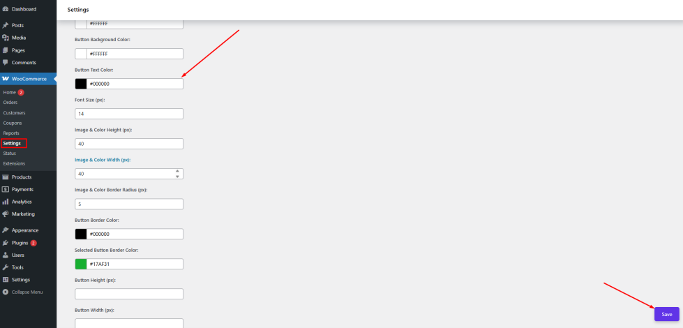
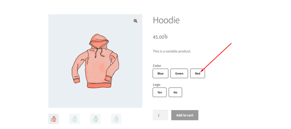
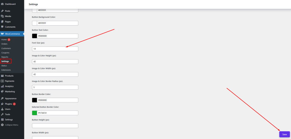
Button Background Color
↑ Back to topThe Button Background Color setting allows you to customize the background color of variation swatches when the attribute display type is set to Button.
When variations are displayed as buttons, their appearance plays an important role in user experience. If the default button color does not match your store’s design, it may look inconsistent or fail to attract attention.
With this setting, the admin can define a custom background color for all variation buttons. This helps ensure that the buttons align with your website’s branding and remain visually appealing.
For example:
- You can use your brand color to maintain consistency
- Or choose a high-contrast color to make variation options more noticeable
This improves both the visual design and usability of your product pages.
How to Configure
↑ Back to top- Go to WordPress Admin Panel → WooCommerce → Settings.
- Click the Variation Monster tab.
- Navigate to the Variation Swatches section.
- Locate the Button Background Color option.
- Choose your preferred color using the color picker or enter a hex code.
- Click the Save button.
After saving the settings, the selected background color will be applied to all button-type variation swatches on the single product page, ensuring a consistent and attractive design.
Button Text Color
↑ Back to topThe Button Text Color setting allows you to customize the color of the text displayed inside variation swatches when the attribute display type is set to Button.
When variation options are shown as buttons, the text inside them (such as size, label, or option name) must be clearly visible. If the text color does not contrast well with the background color, it can become difficult for customers to read.
This setting gives you full control over the text color, ensuring better readability and alignment with your store’s design.
For example:
- Use a light text color (such as white) on dark button backgrounds
- Use a dark text color (such as black) on light button backgrounds
Choosing the right combination improves both usability and visual consistency.
How to Configure
↑ Back to top- Go to WordPress Admin Panel → WooCommerce → Settings.
- Click the Variation Monster tab.
- Navigate to the Variation Swatches section.
- Locate the Button Text Color option.
- Choose your preferred color using the color picker or enter a hex code.
Click the Save button.
After saving the settings, the selected text color will be applied to all button-type variation swatches on the single product page, ensuring clear visibility and a polished design.
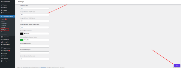
Attribut Font Size
↑ Back to topThe Font Size setting allows you to control the size of the text displayed inside variation swatch buttons.
When variation options are shown as buttons, the text (such as size, label, or attribute name) must be easy to read across all devices. If the font size is too small, it may be difficult for customers to understand. If it is too large, it can break the layout.
With this setting, you can adjust the font size to achieve the perfect balance between readability and design.
For example:
- Use a larger font size to improve visibility and accessibility
- Use a smaller font size for a more compact and minimal layout
This flexibility ensures that your variation buttons look clean, professional, and user-friendly.
How to Configure
- Go to WordPress Admin Panel → WooCommerce → Settings.
- Click the Variation Monster tab.
- Navigate to the Variation Swatches section.
- Locate the Font Size option.
- Enter your desired font size value (e.g., in pixels).
- Click the Save button.
After saving the settings, the updated font size will be applied to all button-type variation swatches on the single product page, ensuring better readability and a consistent appearance.
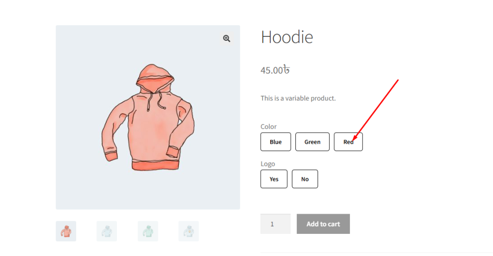
Image & Color Height
↑ Back to topThe Image & Color Height setting allows you to control the height of variation swatches when the attribute display type is set to Image or Color.
The size of swatches plays an important role in both design and usability. If the height is too small, customers may find it difficult to recognize colors or images. If it is too large, it can disrupt the layout of your product page.
With this setting, the admin can define a consistent height for all image-based and color-based swatches, ensuring a clean and well-structured appearance.
For example:
- Use a larger height to make images and colors more visible and easier to select
- Use a smaller height for a more compact and minimal design
This flexibility helps maintain a balanced layout while improving the overall user experience.
How to Configure
- Go to WordPress Admin Panel → WooCommerce → Settings.
- Click the Variation Monster tab.
- Navigate to the Variation Swatches section.
- Locate the Image & Color Height option.
- Enter your desired height value (e.g., in pixels).
Click the Save button.
After saving the settings, the defined height will be applied to all image and color variation swatches on the single product page, ensuring a consistent and visually appealing design.
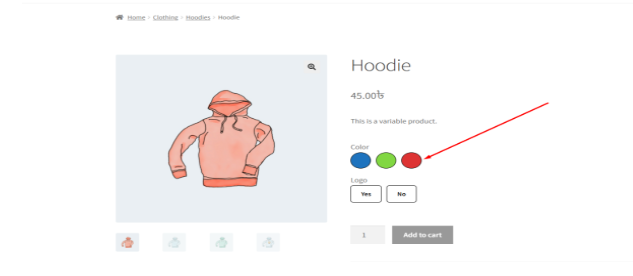
Image & Color Width
↑ Back to topThe Image & Color Width setting allows you to control the width of variation swatches when the attribute display type is set to Image or Color.
Along with height, the width of swatches is essential for maintaining a balanced and visually appealing layout. If the width is too small, it may be difficult for customers to clearly see the image or color. If it is too large, it can disrupt the alignment of elements on the product page.
With this setting, the admin can define a consistent width for all image-based and color-based swatches.
For example:
- Use a larger width to improve visibility and make selection easier
- Use a smaller width for a compact and clean layout
This helps ensure that your variation swatches look well-structured and user-friendly across all devices.
How to Configure
- Go to WordPress Admin Panel → WooCommerce → Settings.
- Click the Variation Monster tab.
- Navigate to the Variation Swatches section.
- Locate the Image & Color Width option.
- Enter your desired width value (e.g., in pixels).
Click the Save button.
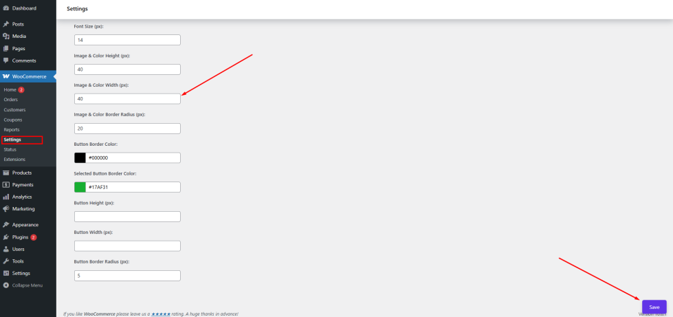
After saving the settings, the defined width will be applied to all image and color variation swatches on the single product page, ensuring a consistent and polished appearance.