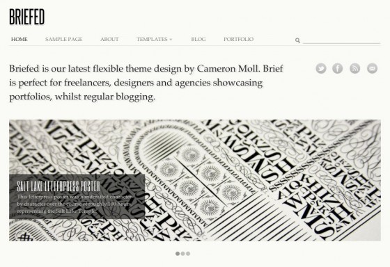
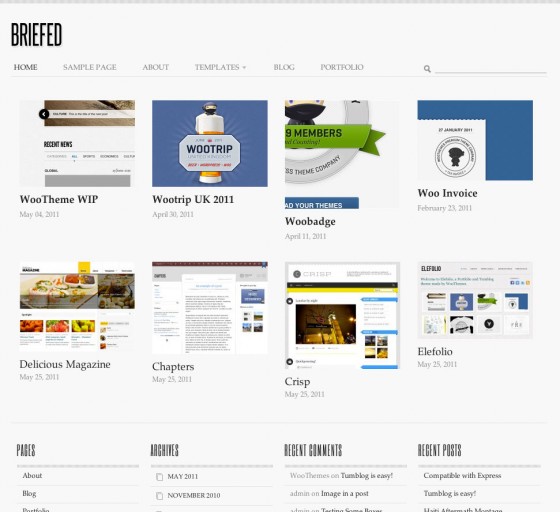
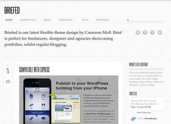
 In February we worked with the design talent that is Cameron Moll on a portfolio/tumblog theme, similar to Elefolio given it’s popularity.
Cameron is a seasoned speaker, a graphic designer with proficiency in website interface, a letterpress & videography enthusiast, as well as the owner of Authentic Jobs – which only yesterday launched it’s new Authentic Jobs UK division. Quite a creative talent.
With the «Briefed«Â theme that Cameron designed for us, it caters for creatives like himself – one’s that don’t fit into a box. The comment Cameron provided with the initial concept of Briefed sums up the design well:
I’d like this design to appeal to more than just the web designer crowd. If a graphic designer selling letterpress prints were to use this template—in addition to the guy posting icons and UI screens on Dribbble—I would be elated.
With minimal styling creating a very clean theme Cameron didn’t want a theme boasting all sorts of bells and whistles, rather a theme that could cater for all, with the emphasis on the content within the theme.
Modular design allows for extreme flexibility
With home page modules that includes an about section, featured slider, blog/tumblog with widgetized sidebar, and a custom post powered portfolio with optional Dribbble feed the combinations are limitless to create your ideal home page display.


Theme option’s also allow for complete customization of the background colors/imagery, and typography with a vast selection of fonts available thanks to Google Web Fonts.
Browse the demo or view all of Briefed’s details here.
About


Just have a question regarding to the fonts. You say it uses Google Web fonts, but I see Steelfish in it ? Did not see it on GWF… :-/
BTW, great job from Cameron, really like the style, I am sure it will be a best seller ! 😉
Very observant! The logo uses Steelfish, but the module headers and post titles actually use the Google font ‘Six Caps’ – a very similar looking font.
Hi Mark,
Thanks for your reply ! 😉 I wanted to use Steelfish on a WP theme (public release + commercial) but the owner does not allow it unless an exhorbiting price to my opinion. So I was curious to know how you would manage it ! 😉 Six Caps seems to be a good replacement even if to me it is not as readable as Steelfish… :-/
Yeah that’s the problem we had with Steelfish, like you say Six Caps is a good replacement and at the right size, and in small dosages works well in the theme.
We talked at length over typography with Cameron and are very happy with the results.
So Clean! I really love the font used too. This will be such a hit.
Consider myself Briefed.
It looks great. I like simple designs with a bunch of features ready to use. Thanks for the coupon.
Its really a Great Theme for Any Designer and specially «Portfolio Page Template». 🙂
Man, this is gorgeous. I don’t comment too often on ‘theme preview’ posts, but this one has me excited. 🙂
Whoa, «foot in mouth» moment – this baby’s here! I thought it was a sneak preview of a future release… time to download & play!
Hah, how’s it been treating you so far?
Looks nice. Take out the Dribbble emphasis, and it would be useful to me and my clients.
That is an optional extra enabled by the WP-Dribbble plugin, so no need to use it 🙂
Dribbbble / portfolio section seems to have a bit of css issue in Safari (5.0.5) on the mac?
Noticed this too!!!!
The homepage portfolio does that for me too if you’re seeing the same thing. A line of thumbs stacked on top of each other down the left?
Sorry about that! I’ve reported it, hopefully we’ll see an update pronto. 🙂
I like the fonts, but any way to dial up the kerning on the titles of the slider? They are really tricky to read.
Looks very clean, love the fonts! From my experience, these kind of themes always go well.
We think so too, hope it does. 🙂
For some reason, for me the portfolio section of the homepage is not floating properly in Mac Safari. All the thumbnails are lined up vertically on the left.
Product page reads:
«…somes up the design well»
The word you’re looking for is ‘sums,’ not somes.
Maybe I’m blind but couldn’t find this, could you point us in the right direction where this is at. Perhaps someone already fixed it. 🙂
I found what Adam was talking about – it is on this blog entry, not the product page. Screenshot at: https://skitch.com/vjl323/fb5h3/a-theme-for-any-designer-woothemes
HTH. 🙂
Thanks Vince and Adam, should be fixed now. 🙂
Fonts here are not to be read! Just for looking of a designer. Letter spacing and size is breaking all rules of type. No one over 40 will read any of the words and will bounce to next site.
Tendencias
Best dropshipping products and ideas for 2026 and beyond
By Kathryn Marr •
No Pong: From startup to multinational business with WooCommerce
By Vanessa Petersen •
Use print-on-demand to scale your business without inventory risk
By Latoya Duffus •
No te pierdas nada: únete a nuestra lista de correo
Introduce una dirección de correo electrónico válida.
Consulta nuestra Política de privacidad. Puedes darte de baja en cualquier momento.
Se produjo un error al suscribirse. Inténtalo de nuevo más tarde.
¡Gracias por suscribirte!
Los correos electrónicos se enviarán a
You're already subscribed!
Los correos electrónicos se envían a