
Your «About Us» page is one of the foundational elements of your website.
It’s more than just a rundown of company details — it’s the heart of your brand story, where you connect with potential customers on a personal level.
If you’re looking to create a page that resonates with visitors, inspires trust, and enhances your brand identity, you’re in the right place. In this article, we’ll cover what this page should include, share real life examples, and give tips on creating an amazing one for your site.
What is an About Us page?
↑ Back to topAn About Us page tells your story. It’s where you share who you are, what your business does, and why you do it. And it’s a key opportunity to build trust with visitors.
For example, an earth-first lifestyle brand could share their company’s mission and focus on how they plant trees for every item purchased.
A kids’ toy brand could tell the founder’s story of struggling to find solutions for their children’s unique needs or playstyle, and finally developing their own.
A food founder could talk about their experience growing up and how certain foods impacted their development. They could go on to discuss their passion for sourcing ingredients that help others experience their culture or meet health goals.
The About Us page can also serve as a central resource for potential investors or other third parties to access historical information on your organization, download brand assets, and find press contacts. It might share stats, discuss your leadership, and direct to additional media relations pages.
As opposed to product pages or promotional articles, an About Us page seeks to be the answer when people come to your site and wonder, “Who’s running this store?” “Why did someone start this?” “Is this an organization I can trust?” “I wonder if this is something I should get involved with?”
Why is an About page important?
↑ Back to topYour About page provides background on your business — who you are, what motivated you to start your company, and what you stand for.
And that background builds trust and establishes a real connection with visitors.
But the benefits don’t stop there. A strong About Us page also:
- Differentiates you from competitors. The page is a chance to showcase what makes you unique. For example: «We’re the only company that hand-stitches all our garments, ensuring the highest quality craftsmanship.»
- Humanizes your brand. Your About Us page puts a face (and a story) to your business name. For example, «As a busy mom of three, I started this business because I know firsthand how hard it is to find time for self-care.»
- Establishes credibility and expertise. Sharing your experience, qualifications, and brand core values shows customers they can trust you to deliver. One might say, “Our founder has over 15 years of experience in the renewable energy industry and has been featured in Forbes, Bloomberg, and The Wall Street Journal.»
- Improves your SEO. About pages give you an opportunity to naturally incorporate keywords to help your site rank higher in search results. Example: «At [Company Name], we’re committed to providing the best [keyword phrase, e.g., ‘eco-friendly cleaning products’] to help you keep your home clean and green.»
- Drives conversions. A compelling About Us page can be the tipping point that turns browsers into buyers. Example: «Join the thousands of satisfied customers who have made the switch to our premium, all-natural skincare line — your skin will thank you!»
Do ecommerce stores need an About page?
↑ Back to topAn About page is even more crucial for ecommerce stores.
Why?
Because shoppers can’t see or touch your products in person. They can’t walk into your online store and get a feel for your brand. Your About Us page is often their first (and sometimes only) chance to connect with you on a deeper level.
Research backs this up. A study by Nielsen Norman Group shows that About Us pages that prioritize trust-building perform the best. And according to Harvard Business Review, a strong company narrative can increase the perceived value of products or services.
You need an About Us page because it can drive real business results.
What to include in your About Us page
↑ Back to topEvery About Us page is unique, just like your business. The key is to include what’s necessary to fully reflect your brand’s personality, your leadership’s experience and attributes, and your mission or purpose as an organization (your “why”).
Not all elements will be necessary for every site, but here are a few to consider:
Mission statement
Your mission statement includes your purpose, core values, and goals. It’s a concise declaration of what you do, how you do it, and why it matters.
Including a mission statement gives customers a clear sense of what drives you. It helps them understand not just what you sell, but what you stand for. More than a formality, it’s another chance to make a meaningful impression on visitors.
When crafting you mission statement, consider your:
- Unique value proposition. What makes your brand, product, or human resources stand out from competitors?
- Target customer. Who are you serving, why, and how do you meet their needs?
- Broader impact. How does your business seek to make a difference beyond the bottom line?
- Vision for the future.What do you hope to achieve as a result of running a successful organization? Why should customers, stakeholders, or potential investors care?
Value proposition
Your core value proposition is a clear statement of the primary benefit you offer — the one thing that makes you indispensable to your target customer.
A strong value proposition should:
- Focus on benefits, not just features. How does your product or service make your customers’ lives better?
- Be specific and relevant to your target audience. Speak directly to your ideal customer’s needs and desires.
- Create an emotional pull. Tap into the deeper reasons why your offering matters.
A truly effective value proposition goes far beyond the surface level. Sure, you can say that your teen clothing brand’s value proposition is that it saves people money, but that’s fairly boring. Instead, you might say you help families afford fashionable, durable clothing that will help students fit in at school and feel comfortable year-round.
Don’t rush this step. Getting it right can mean the difference between a bounce and a lifelong customer.
Social proof
People are always looking for some kind of reassurance that they’re doing the right thing. Sometimes, that assurance can come simply from others making the same choice. This is why trends take off and peer pressure is so effective.
Social proof is the technical term used to describe this phenomenon where people look to the actions and attitudes of others to guide their own behavior or affirm their decisions.
In the online world, social proof is incredibly important because it helps add legitimacy. With the surge in fake content and photoshopped images, people can struggle to gauge authenticity, and social proof can help.
Online shoppers can’t see or touch your products in person. They can’t look you in the eye and get a sense of your trustworthiness. So they rely on the experiences of others to gauge whether you’re legit.
In the context of your About page, you can use social proof by including:
- Customer testimonials. Feature glowing quotes from satisfied shoppers.
- Product reviews. Showcase star ratings and detailed feedback from real users.
- Social media feeds. Embed real-time posts from your social media accounts that show customers engaging with your brand. Add social media links, too.
- Trust badges. Display seals from trusted third parties like the Better Business Bureau.
When done right, social proof taps into our innate desire to follow the crowd and can give hesitant shoppers the confidence they need to click «add to cart.»
Press highlights
Press mentions or features are another powerful form of social proof that you can include on your About Us page.
Well-known publications give your brand credibility and importance. They’re a proven trust signal. That’s why so many landing pages have an “As seen on…” section.
When including press mentions on your About page:
- Highlight recognizable publications. Focus on outlets your target audience is likely to know and trust.
- Use logos or featured images. Make the mentions visually engaging and easy to scan.
- Include snippets or quotes. Give a taste of what was said about you, especially if it reinforces your core value prop.
- Link to the full articles. Let interested readers dive deeper and see the full context.
If you’ve been successful enough to have lots of press features to choose between, select a balance of the most well-known publications and mentions that speak to your unique selling points and resonate with your core audience.
Core values
Your company’s core values dictate how you do business. They’re the unchanging beliefs that shape your decisions, your culture, and your brand identity.
Value-driven consumption is increasing. Including your brand values helps customers understand what you stand for beyond making a profit. It gives them a sense of your priorities and your larger purpose.
To make your values compelling on your About page, strive to:
- Be specific and actionable. Avoid generic platitudes and focus on real brand values that guide your day-to-day operations.
- Show, don’t just tell. Provide concrete examples or stories of your values in action.
- Tie them to your customer experience. Explain how your values translate into benefits for your shoppers.
- Make them visually engaging. Use icons, images, or formatting to make your values easy to digest and remember.
Videos and imagery
Creative visuals showcase your products, convey your brand personality, and build an emotional connection with your customers.
Videos and imagery also put a face to your brand and evoke an emotional response. Plus, they break up text and make your About Us page more scannable.
Here are some types of images and videos you should consider:
- Behind-the-scenes photos or videos. Show your team, your workspace, or your production process.
- Customer photos or videos. Authenticity trumps production value in most cases. User generated content is the ultimate in authenticity.
- Aspirational imagery. Capture the lifestyle or feeling you want to associate with your brand.
- Product close-ups or 360-degree views. Give customers more opportunities to see key features and benefits up close.
- Infographics or illustrated explanations. Describe your business model, values, or the company’s mission using graphics that might be more engaging than blocks of text.
History
Your company history is the story of how your business came to be. It’s your journey from an idea to an established brand.
it gives customers a sense of your roots and your evolution. It helps them understand the origins of your mission and values, and it creates a narrative arc they can follow and invest in.
When crafting your history section:
- Start with the «aha» moment. What inspired you to start this business? What problem were you trying to solve?
- Highlight key milestones. What were the major turning points or achievements in your journey? How did you grow and evolve?
- Emphasize the human element. Who are the key players in your company’s story? What challenges did you face, and how did you overcome them?
- Tie it back to your mission. How does your history inform your current values and approach? What has remained constant throughout your journey?
Craft a narrative that shows the heart and the hustle behind your brand. Showcase the late nights, the learning curves, and the breakthroughs.
Eight About Us page examples to get you started
↑ Back to topThese eight diverse About Us examples demonstrate the varying styles and elements available for different business needs. Use them as an inspirational starting point to create a page that reflects your brand and includes all of the core elements discussed earlier in this article.
1. Badeloft Luxury Bathrooms
Badeloft is a boutique company that sells high-end bathroom fixtures, especially bathtubs. Their About Us page is a masterclass in storytelling.
First off, they nail their brand’s story.
Three high school friends, united by a shared frustration with the luxury bathroom market, decide to start their own company.

They also lay out their mission and approach in a way that feels authentic and customer-centric.

Their goal is to provide luxury to every bathroom for the “ultimate bathing experience.”
But the real showstopper is the social proof. They’ve got glowing reviews from Houzz (a go-to site for home design inspiration).

Plus, they feature Instagram posts from real customers showing off their gorgeous Badeloft tubs.

It’s not just pretty pictures — it’s proof that people love their products.
Badeloft’s About Us page works because it’s not just about them. It’s about a shared passion for great design, a commitment to customers, and a story you can’t help but get invested in.
2. Offerman Woodshop
Offerman Woodshop is a collective of skilled woodworkers based in East Los Angeles that focuses on traditional joinery and sustainability.
Their About Us page shines with personality, passion, and a deep commitment to their craft and community.
The page opens by highlighting their values — a focus on hand-crafted quality, sustainable practices, and strong local partnerships.

This conveys a brand that cares about its impact and its roots.
But where the page really comes to life is in the team profiles. Each woodworker, from founder Nick Offerman to the newest recruit, gets a spotlight that showcases their unique journey, favorite project, and personal quirks.

These aren’t just resumes — they’re stories that make you feel like you’re meeting the team in person.
Offerman also includes alumni profiles, a testament to the lasting relationships they build.

And by highlighting each member’s distinct background and passions, they show that woodworking is a craft that welcomes all.
Coupled with the warm, conversational tone, these personal touches create an About Us page that feels like a friendly introduction rather than a corporate overview. It’s an authentic glimpse into a tight-knit team united by a love of wood, craft, and community.
3. myLAB Box
myLAB Box is a pioneering company that offers at-home health testing solutions designed to be easy, reliable, and discreet. Their About Us page builds trust and credibility in a sensitive industry.
The page starts by emphasizing their mission — empowering people to take control of their health.

They highlight their commitment to quality, innovation, and customer satisfaction, positioning themselves as a trusted partner in health.
One standout section is «Private and discreet». Here, they address common pain points around traditional lab testing (time-consuming, costly, stressful) and present their service as the solution.

This shows they understand their customers’ needs.
The founder story adds a personal touch. It explains the company’s origins in a relatable way.

By sharing their frustrations with traditional testing, they create a «we’ve been there» connection.
Finally, the team section is a powerful trust-builder.

Featuring medical advisors with impressive credentials assures customers they’re in expert hands. Importantly, they use original photos, not stock imagery to gain credibility.
Throughout, the tone is empathetic and empowering. They position themselves not just as a service, but as an understanding ally.
4. Marey
Marey is a family-owned company providing innovative and affordable tankless water heating solutions since 1955.
Their About Us page is a compelling mix of the company’s history, mission, and values that paints a clear picture of who they are and what they stand for.
The page opens with the company’s origin story, tracing its roots back to founder Mariano Reyes and his vision for sustainable, endless hot water in his native Puerto Rico.

This history establishes Marey as a long-standing, pioneering force in the industry.
The «Who We Are» section puts a personal face to the brand, introducing the brother-sister duo now at the helm.

This family legacy adds a layer of warmth and authenticity.
But perhaps the most powerful element is their clear articulation of mission, vision, and values.

From their commitment to energy-efficiency to their focus on affordability and dependability, they paint a picture of a company that truly cares about its customers and the planet.
While the page could benefit from more visuals or social proof, it nonetheless succeeds in telling a cohesive, compelling brand story.
It leaves the reader with a sense of Marey’s expertise, values, and dedication to innovation — all key traits for building trust and loyalty.
5. Burning Man
Burning Man is a global ecosystem of artists, makers, and community organizers united by the values expressed in the “10 Principles”.
Their About Us page serves as a central hub. It offers an overview of their ethos and invites you to visit multiple pages covering their mission, history, and ways to get involved.
The page opens with a short introduction that highlights the scale and scope of Burning Man’s impact.

From there, the page offers clear pathways to dive deeper. Clickable boxes invite you to explore their mission statement, history and timeline, and ways to get involved.

This hub-and-spoke design makes the information manageable and allows the reader to choose their own journey.
Despite the need for more interactive and visual elements, the structure provides a clear overview while encouraging further engagement.
Overall, the Burning Man About Us page succeeds in providing a comprehensive introduction to their complex organization. By offering a strong philosophical foundation and clear paths to learn more, they invite the reader to not just understand, but to participate in their global community.
6. Ryanair
Ryanair is Europe’s largest airline group that covers over 240 destinations in more than 40 countries. Their corporate About Us page is a great example of a comprehensive information hub for a wide range of stakeholders, from customers and investors to potential partners and employees.
The page opens with a clear, concise introduction that establishes Ryanair’s market position and reach.

The emphasis on their commitment to sustainability right off the bat is a smart move, given the increasing importance of environmental responsibility to all stakeholder groups.
There is a prominent section for the latest news.

It shows transparency and keeps stakeholders up to date on the company’s activities and achievements. This element also keeps the page fresh and relevant.
But the real heart of the About section is in the clickable categories. From Our Network to Sustainability to Investors, each section caters to the specific informational needs of different stakeholders.

This tailored approach recognizes that a corporate about us page isn’t one-size-fits-all, but needs to serve multiple audiences.
For potential partners or investors, the Our Network and Our Fleet sections provide critical operational details. For job seekers, the Our People section is key. And for environmentally-conscious customers, the Sustainability section is a must-read.
While the design is fairly standard for a corporate site, the structure is great at delivering the right information to the right stakeholders.
7. Fuji Electric
Fuji Electric is a global manufacturer of quality energy and technology products with a century-long company history of innovation.
Their About Us page reflects their position as an established industry leader and focuses on their expertise, reliability, and commitment to customer success.
The page opens with a strong value proposition that emphasizes that Fuji Electric is more than just a manufacturer — they’re a partner invested in helping businesses overcome challenges.

The «Century of Innovation» section is a highlight that celebrates Fuji Electric’s 100th anniversary.
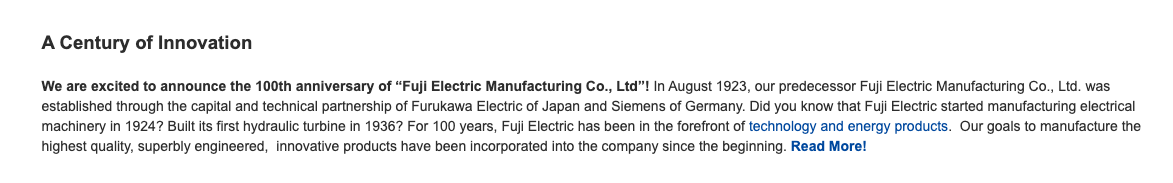
The timeline of key milestones, from manufacturing electrical machinery in 1924 to building their first hydraulic turbine in 1936, showcases their long-standing expertise and pioneering spirit. This history of innovation builds trust and credibility.
The page then directs website visitors to more specific categories, from Products and Locations to Customer Service and Tech Tips.

It caters to the diverse information needs of their corporate audience, whether they’re customers, partners, or employees.
The overall tone is formal and appropriate for a large, global corporation. The focus is on substantive information rather than flashy design or storytelling.
Overall, Fuji Electric’s About Us web page provides an informative overview of the company. While it may lack the warmth or engagement of smaller brands, it communicates their scale, capabilities, and commitment to quality and innovation.
For their target audience of large-scale energy and technology customers, this approach likely instills confidence and trust.
8. World Vision
World Vision is a global humanitarian organization dedicated to empowering children and families to overcome poverty and injustice.
Their About Us page is a testament to their unwavering commitment, faith-driven mission, and decades of bold, compassionate action.
The page immediately captures attention with powerful, emotive language. Phrases like «Going to the ends. Where no one else goes.» and «Dangerously soft-hearted.»

The centrality of their faith is a recurring theme while also making clear their commitment to serving every child, regardless of faith. This balance of conviction and inclusivity is striking.

Their timeline is especially impactful. It’s a story of consistent, courageous action from humble beginnings helping a little girl to now serving millions.

Examples like challenging the church on AIDS or helping Vietnamese refugees demonstrate a willingness to take unpopular but necessary stands.
The images of children throughout create a powerful personal connection.

These visuals drive home the real, transformative impact of World Vision’s work.
Overall, World Vision’s About Us page is an outstanding example of how to convey mission, faith, and impact in a way that inspires.
Six tips for a great About Us page design
↑ Back to topDesigning an effective «About Us» page involves more than just laying out the elements mentioned earlier. Here are six practical tips to help you create a page that’s visually appealing and resonates with your audience.
Favor authenticity over stock
Original images and charts beat generic stock photos any day. Why? Because they showcase the real you.
Stock photos might be convenient, but they don’t tell your unique company story. They’re like using someone else’s family photos in your own album. It just doesn’t feel authentic.
When you use images of your actual team, your products, or your office space, you give customers a genuine peek behind the scenes. You’re showing them the faces behind the brand, the process behind the products.
And that builds trust and connection.
The same goes for charts or infographics. Original data visualizations help customers understand and buy into your story in a way generic graphics can’t.
A Nielsen Norman Group study talks a bit more about the importance of trust in relation to About Us pages:
“Perhaps the most noteworthy trend that emerged in our most recent round of research is that users now expect companies to demonstrate a heightened level of authenticity and transparency not only on their websites, but in every interaction a person may have with the organization. More than ever, users are skeptical of companies and see right through complex corporate speak, jargon, and stock photography.
People favor companies that showcase themselves as being customer-focused, human, and easy to understand.”
Check page responsiveness
Your About Us page needs to look great and work well on any device. That’s where page responsiveness comes in.
Responsive design means your page automatically adjusts to fit the screen it’s being viewed on. Whether it’s a desktop monitor, a tablet, or a smartphone, your content will be easy to read and interact with.
No zooming, no scrolling, no frustration.
Why is this important? Because more and more people are browsing and buying on their phones.
If your About Us page isn’t responsive, you could be losing out on a potential customer who gets fed up with a clunky mobile experience.
Reduce load time
Load time is how long it takes for your page to fully appear in someone’s browser.
If your About Us page takes too long to load, prospective customers might bounce before they even see what you’re all about. That’s a missed opportunity to connect and convert.
Fast load times boost conversion rates and improve your search engine rankings (Google loves fast sites!).
There are plenty of ways to speed things up:
- Optimize your images. Large image files are a common culprit for slow load times. Use tools to compress your images without losing quality.
- Minimize HTTP requests. Every element on your page (images, scripts, stylesheets) requires an HTTP request. Streamline your page to reduce these requests.
- Enable browser caching. This tells a visitor’s browser to store parts of your page so they load faster on repeat visits.
- Use a content delivery network (CDN). CDNs distribute your content across a network of servers, so site visitors load your page from the server closest to them.
- Choose a performance-optimized hosting provider. Where your website lives matters. Look for a host that prioritizes speed and performance.
And if you want to test the current load time of your About Us page, you can use tools like Google PageSpeed and GTmetrix. These tools will also provide actionable strategies for improving your performance.
Looking for a place to start? If your site is on WordPress, Jetpack Boost provides easy-to-implement tools to measure and improve your site performance.
Consider the fold
When you’re designing your About Us page, you might hear people talk about «the fold.» The fold is the bottom of a user’s screen.
Why does this matter? Because anything «above the fold» is what a visitor sees first, without having to scroll. It’s prime real estate on your page, and it’s your chance to make a great first impression.
Think of it like a storefront window display. You want to put your best stuff up front to entice people to come in and see more.
So what should go above the fold on your About Us page? Here are a few ideas:
- A compelling headline that captures your unique value proposition.
- Eye-catching visuals that showcase your brand personality.
- A clear and concise summary of who you are and what you do.
- A call-to-action that encourages new visitors to keep exploring.
But don’t try to cram too much up there. Keep it clean, focused, and easy to digest. You want to pique interest, not overwhelm.
And while the fold is important, it’s not the be-all and end-all. With responsive design, the fold can be in different places on different devices.
A great About Us page takes visitors on a journey, with each section building on the last to create a compelling narrative.
Direct users to take an action
Your About Us page isn’t just a place to introduce yourself — it’s also a powerful tool for driving action. And one of the best ways to do that is with a clear call-to-action (CTA) at the end of your page.
Think about it: You’ve just taken your visitor on a journey through your brand story. They know who you are, what you stand for, and why you’re awesome. That’s the perfect moment to invite them to take the next step with you.
Maybe that’s browsing your product collection. Or signing up for your newsletter. Or following you on social media.
Whatever it is, your CTA should be specific, compelling, and in line with your overall brand goals.
Here are a few CTA ideas to consider:
- Shop our latest collection. This is perfect if you want to drive sales and showcase your company’s products.
- Join our community. This is a strong option for building your email list or social following.
- Read our blog post. This is an ideal choice if you want to establish your brand as a thought leader and provide value beyond your products.
- Get in touch. This is a good fit if you want to open up a dialogue and build relationships with visitors or partners.
The key is to make your CTA unmissable and irresistible. Use action-oriented language, eye-catching design, and a clear value proposition.
Use concrete numbers
Numbers can be your best friend. They add credibility, context, and impact to your narrative. But what kind of numbers are we talking about?
Think stats like how many customers you’ve served, how many products you’ve sold, or how much your business has grown. Or maybe it’s awards you’ve won, milestones you’ve hit, or years you’ve been in business.
For example, instead of just saying you have «a lot of happy customers», you could say «we’ve had the pleasure of serving over 10,000 satisfied customers.» Instead of «we’ve grown a lot», you could say «we’ve seen a 150% increase in sales over the last year.»
Numbers make your accomplishments tangible and impressive. They help potential customers understand your scale, your experience, and your expertise.
But a word of caution: Don’t go overboard. You don’t want your About Us page to read like a math textbook. Choose your most impressive and relevant stats, and sprinkle them throughout your narrative.
A good rule of thumb is the rule of three. Pick three key numbers to feature, and weave them into your story. Any more than that, and you risk overwhelming your reader.
And context is key. A number alone might not mean much to your reader. The magic happens when you pair it with an explanation of why it matters.
Let people discover what you’re all about
↑ Back to topYou’ve got a unique story and your About page is the perfect place to tell it.
Remember, your About page isn’t just about what you do; it’s about why you do it. Share your passion, be painfully transparent and authentic, and invite your visitors to be a part of your journey.
Start your story with WooCommerce.
Looking for more ideas? Check out these online business examples.

About


Exactly! It is all about the investment in yourself and your growth that will make you successful. We need to get over the «hacks» or shortcuts. Learn, grow, and succeed! This blog post was eye-opening for me.
Thanks for reading, Cielo!