Lead generation is your bread and butter for long-term growth and stability. Your store depends on a steady stream of new customers to refill the pipeline.
Whether your business model relies on thousands of smaller transactions — or a smaller number of large transactions — you should continually improve your lead generation marketing strategies. And an effective call-to-action (CTA) lies at the heart of it.
Why?
Because without clear, focused, actionable directions, your potential leads will be left to guess their next step. This result is inaction and a missed opportunity to secure a new lead.
Let’s examine ten CTA tips with a focus on lead generation and customer acquisition.
1. Shrink the obstacles to taking action
↑ Volver al principioNew leads are often hesitant to pay full price at a business they’ve never purchased from. If the journey to becoming a customer takes five steps, your lead generation CTA should take them from step one to step two.
So instead of ‘Buy Now,’ it might be ‘View Our Products.’
Here’s a chart showing more examples of bigger vs smaller steps in the sales process:
| Shorter-step CTAs | Longer-step CTAs |
|---|---|
| Take the quiz | Join our newsletter |
| See your score | Schedule a free consultation |
| Try a free sample | Get my first week free |
Notice that none of these are asking for a sale. But it’s less daunting to take a quiz or see a score than to join a newsletter or schedule a consultation. Trying a free sample with no obligation is easier than a first week free, because the second option implies you’re signing up for something.
The smaller the step, the less your leads will feel like they’re making a commitment. That means less resistance to your offer.
2. Use first-person language
↑ Volver al principio‘Sign Me Up!’ is better than ‘Sign Up!’. It personalizes the CTA. It gives the person ownership of their decision and gets them more invested in the outcome. Simply adding pronouns like “me” and “my”, as opposed to “you” and “your”, helps turn a CTA from a message into a decision.
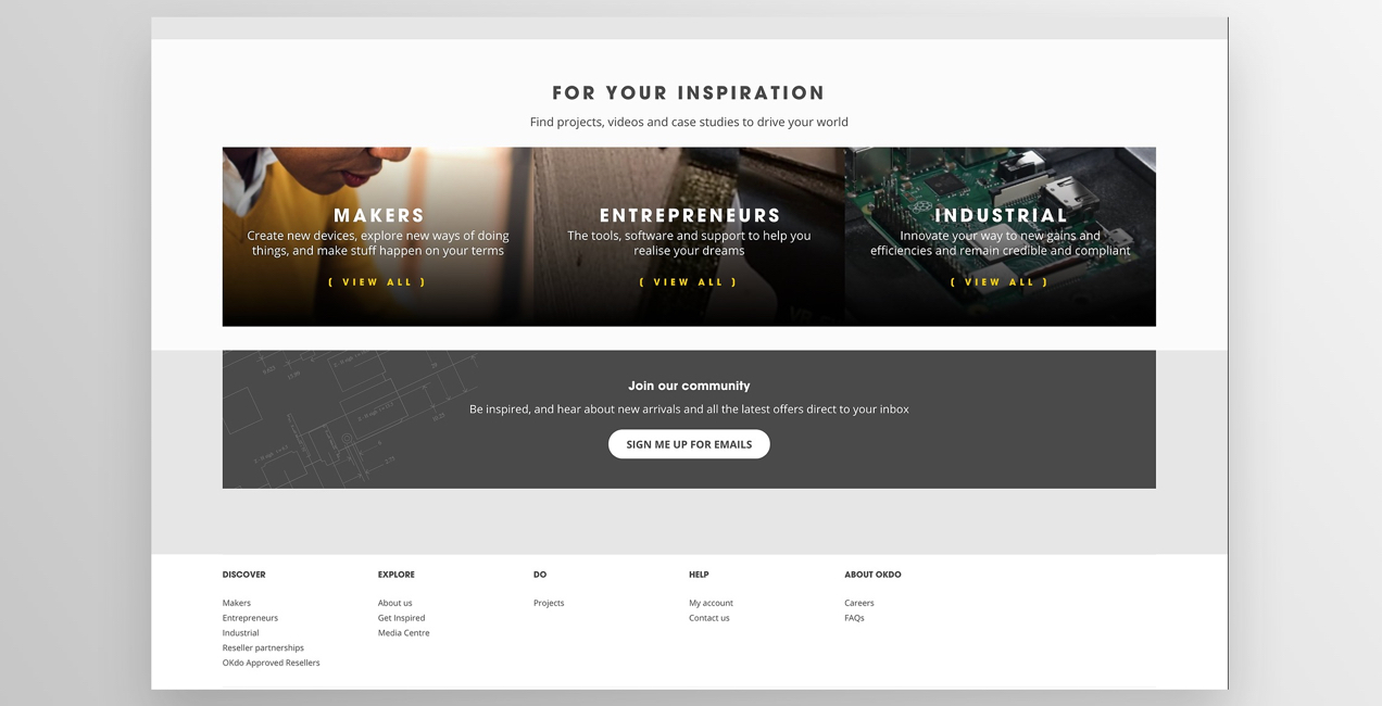
Other examples of this approach:
- Send my free book
- I’m in!
- I want to be in the club!
- Reserve my spot in the webinar
3. Make your CTA as specific as possible
↑ Volver al principioBe clear exactly what the person is getting when they take action. This is why ‘submit’ isn’t super effective.
What happens after you send in the form? Find a way to imply or directly state that in the CTA.
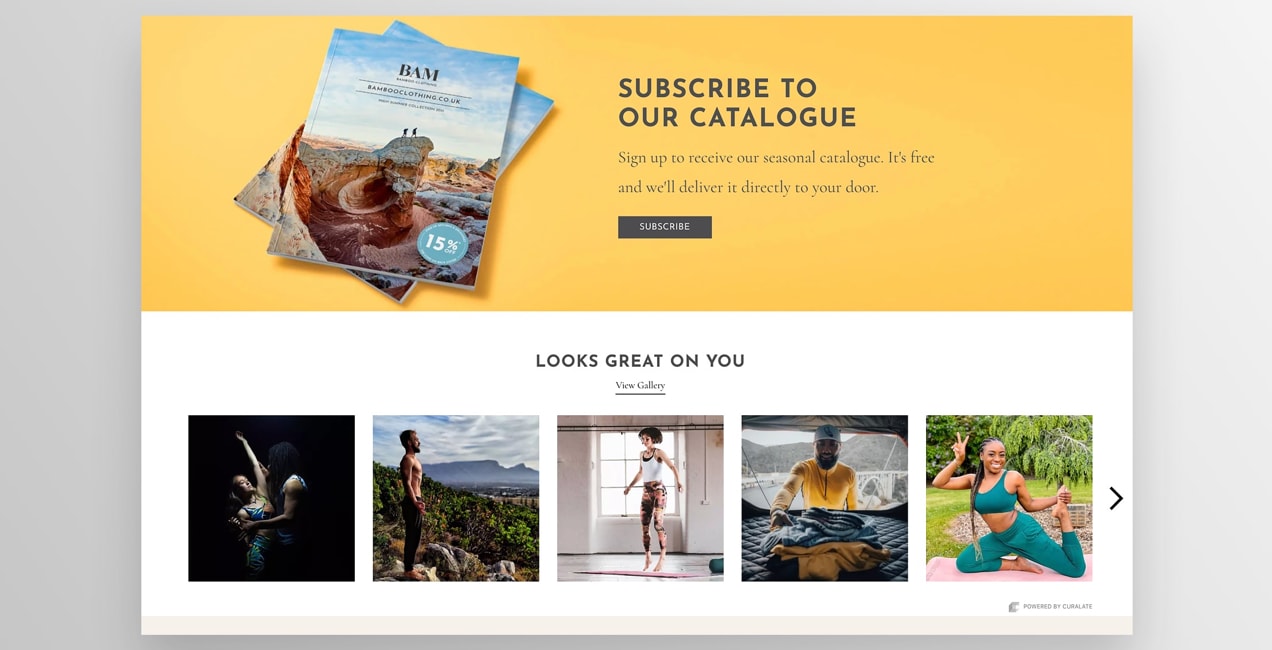
‘Send Your Question’ implies that an answer will be forthcoming. ‘Snag My Fast-Action Guide’ tells someone what they’ll get when they ‘submit’ the form. By telling the lead what happens next, you help prepare them for when it happens. Then, they’ll be more likely to take the next step you offer as well.
4. Focus on benefits and outcomes
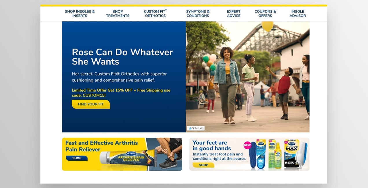
↑ Volver al principio‘I want to save more money’ focuses on the outcome, whereas ‘Send my budget guide’ just tells someone what they’re getting. Both are good because they’re specific and use first-person language. But the first one states the desired outcome vs. the tool you’re offering.
The person is thinking, “I don’t want this guide because I have nothing better to do. I want it because I want to save money.”
Below the main CTA, some businesses will use the opposite approach to manipulate people into accepting. Instead of a simple “x,” there might be a line of text that says “No thanks, I don’t want to save money,” with a link to close the offer.
This is distasteful and could damage your company’s reputation. Moreover, if you use manipulation to close deals, those people are more likely to be unhappy, leave poor reviews, and be one-and-done customers.
5. Use numbers
↑ Volver al principioNumbers are a particularly effective form of CTA. For example:
- Respond within three days
- Get 20% off your first order
- Upgrade to one-day shipping
The number adds to the certainty of what’s happening for the customer.
6. Make the CTA impossible to miss
↑ Volver al principioVisibility is really your top priority for your call to action button. And yes, you should probably use buttons instead of text links because they grab attention more easily. For offline CTAs in direct mail situations, text emphasis like color, bold, underline, centering, larger fonts are essential.
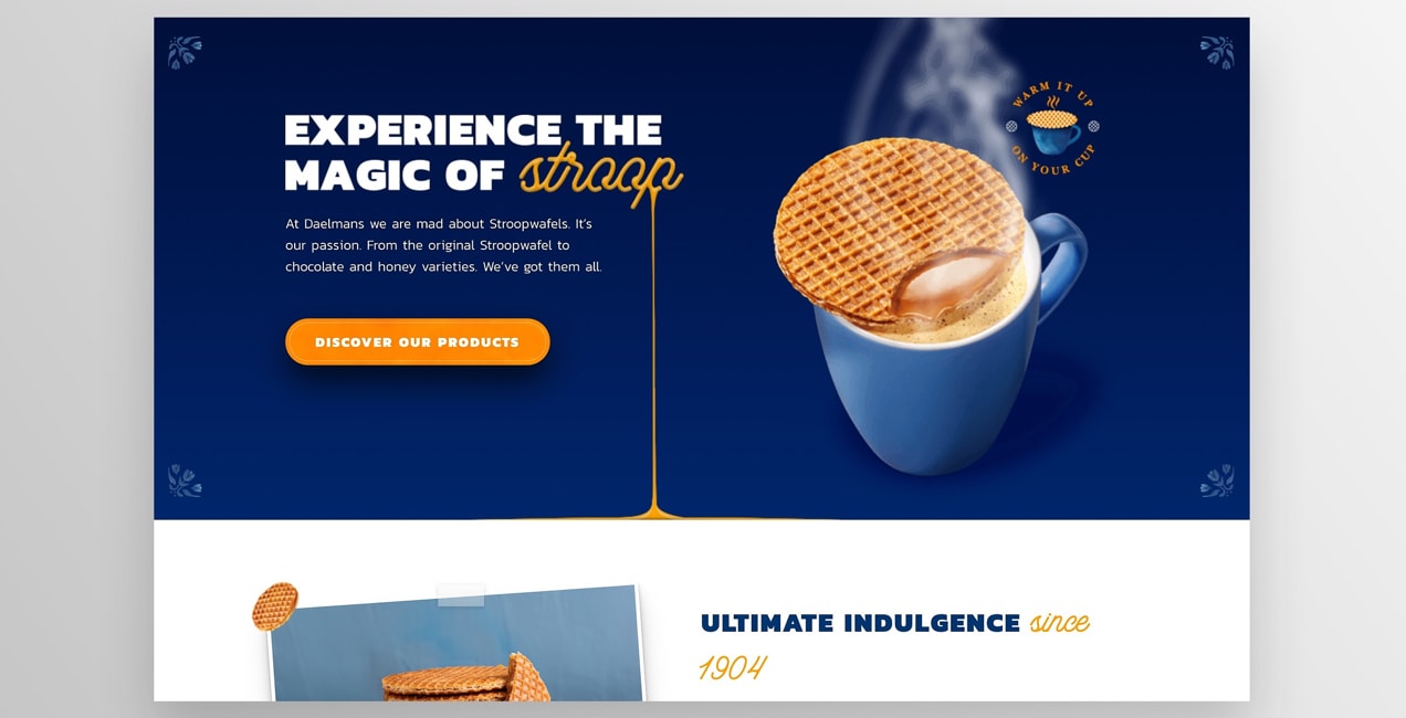
If your brand guidelines have a bold color that’s reserved for special occasions — this is the occasion. You want it to stand out without straying from the feel of the rest of your brand. If your page consists of a lot of text, using an image could draw in visitors’ eyes. Another option is to leave physical space around your CTA (white space) so it stands on its own.
And for longer sales pages, use more than one CTA. Sprinkle them throughout the text as appropriate. If you do this, use the same text each time so the person hears the repetition and gets a clear picture of what is expected of them. Don’t change the messaging every time, or it feels like there’s more than one offer.
7. Place CTAs where they fit in your copy
↑ Volver al principioTiming is everything, as they say in comedy. The same is true with marketing. It’s not just how you phrase your CTA or what it looks like; it’s when you say it.
Putting it too early can dilute your message and make it obvious you just want their information. Putting it too late can cause you to lose some readers. Putting them every other paragraph will make the reader feel like you’re desperate.
Some good places to put CTAs are:
- After you’ve asked a key question that the offer answers
- At natural pauses
- When you’ve just finished a main point that is meant to motivate the lead
Also, consider the location of the call to action on the page.
Here’s some data on how well CTAs have converted at various locations. You have to take this kind of data cautiously, of course, because no conversion rates will be consistent across all industries. Nevertheless, it’s notable which places seem to perform better than others.
- Sidebar: 0.5 – 1.5%
- Generic, end-of-post: 0.5 – 1.5%
- Pop-ups: 1 – 8%
- Sliders and bars: 1 – 5%
- Welcome gates: 10 – 25%
- Feature Box: 3 – 9%
- Navbar: varies
The one place that stands out the most is the ‘welcome gate.’ This is typically near the top of the page or takes over the entire page, and requires someone to respond before they can close it. If it’s the right offer that touches on a core need for your ideal customer, you can amass a treasure trove of leads.
You’ll need to be careful, though. These full-page takeovers can annoy users and actually earn you penalties from Google. And gated content can boost conversions, but also turn away casual visitors who might have otherwise become loyal fans over time.
8. Employ CTA urgency
↑ Volver al principio‘Claim your spot’ is good. But ‘claim your spot before the webinar fills up’ is better. If you’re giving away physical copies of a book, limit the number and use it in the CTA. Deadlines of all sorts can move a person considering taking action to actually do so.
Urgency is one of the most powerful marketing techniques. It might just be the missing element of your entire sales effort. Don’t wait until it’s too late — learn how to implement urgency in your marketing.
9. Use ‘power words’
↑ Volver al principio‘Subscribe’, ‘buy’, ‘get’, and ‘sign up’ have their place. These do well in certain situations. But they can be better. ‘Claim’, ‘reserve’, ‘snag’, ‘secure’, and ‘seize’ have more emotion behind them.
Don’t be afraid to sprinkle in a bit of “negative” language when appropriate. This can emphasize the fact that you’re offering a solution to a specific problem: “Stop struggling,” “End bad hair days,” etc.
You can also use descriptive words like ‘easy’, ‘simple’, ‘fast’, ‘quick’, ‘proven’, ‘free’, and ‘guaranteed.’
Urgency can be enhanced with words like ‘only’, ‘miss out’, ‘lose’, and ‘give up’ (as in, don’t give up your chance to X).
Action is driven by emotion more than logic. Inject emotion into your CTA.
10. Make sure your CTAs are responsive
↑ Volver al principioIt’s important that your calls to action look great on all devices, from desktops to tablets and phones. Otherwise, you’re not reaching a large portion of your audience!
Take the time to check your design with a tool like LambdaTest, which previews your site on devices and browsers of all types. Make sure that nothing’s cut off, buttons are easy to click, forms are easy to use, and everything looks great for everyone.
Convert more leads with better calls to action
↑ Volver al principioYou’ve worked hard to create an awesome product or service and you’ve worked equally hard at driving traffic to your site. Encourage those visitors to take the steps you want by providing clear, motivating, and inspiring calls to action. Make sure each CTA is specific, can’t be missed, and creates urgency. Then, just like with everything in marketing, continue to experiment to see what works best for your audience.
If you’re looking for an edge in your business, spending some extra time perfecting calls to action might just be all you need.
Have you discovered something that works for your site? Share it with the community in the comments below!
About


Am I the only one who noticed that tip 3 out of 10 was missing from this article?
Hi Freddie, thanks so much for pointing that out! We added it back now — good catch!
yeah. i consider one of this and i can see the benefits.
in my website. instead of (add to cart) buttons i used ( i want this product) and its more effective.
Thanks for sharing your experience, Zia! Glad that works well for your store!
I am loving all of the suggestions. Thank you!
Glad you found it helpful, Chelsea!
This was so enlightening and helpful!
Thanks, Anna!
Tendencias
AI is changing how shoppers find your products
By Julia Callicrate •
Best dropshipping products and ideas for 2026 and beyond
By Kathryn Marr •
No Pong: From startup to multinational business with WooCommerce
By Vanessa Petersen •
No te pierdas nada: únete a nuestra lista de correo
Introduce una dirección de correo electrónico válida.
Consulta nuestra Política de privacidad. Puedes darte de baja en cualquier momento.
Se produjo un error al suscribirse. Inténtalo de nuevo más tarde.
¡Gracias por suscribirte!
Los correos electrónicos se enviarán a
You're already subscribed!
Los correos electrónicos se envían a