
Howdy. I’m Jeremy Miller of JAM Creative, a digital communications and branding agency based in New Orleans, LA or NOLA for short. I run JAM Creative with my lovely wife, Aimee Miller. Together we also run a side business called SHULTZILLA, a NOLA-inspired t-shirt shop. We print fun t-shirts that poke fun at what we call the “Colloquial Jibba Jabba” of New Orleans. We do some silly things down here in NOLA, and we love it.
SHULTZILLA v1.0
We launched SHULTZILLA in November of 2009. Being a small start-up, we were limited in our initial capital, so we were looking for an inexpensive way to build a fully functional e-commerce solution that was user-friendly and had an easy-to-use back end.
Since JAM Creative was very familiar with WordPress we looked for a plugin that allowed us to do everything we wanted. We wanted an easy way to update products. We wanted a blog. We wanted our store to integrate seamlessly into WordPress. Unfortunately, we chose a plugin that turned out to be less than stellar. The product didn’t work, and lack of support was a big issue. We had issues with users not being able to order, problems with the back end, the list goes on.
We had been mulling around with the idea of updating our website for some time, but client work always took precedence over our own work, unfortunately. In August of 2012 we decided our website needed an update, and we made it our top priority. We gave ourselves a deadline of Sep 1, 2012.
This time around we wanted it done right. We wanted a product that worked. We wanted support. We wanted to know that if the software didn’t work as expected, someone would be available to assist us.
We contemplated leaving WordPress as a basis for our shopping cart. We looked into other hosted products, but with JAM Creative being a custom development firm, the options we came across lacked the control we really wanted to have over our own content. We then found WooCommerce.
One of the main selling points of WooCommerce was the support. After installing and playing with the default theme, we began to realize how powerful and robust this software really is. The Woo Framework allowed us tons of options we didn’t get with a normal WordPress install.
We only had about a month to design and build the website, so we needed to find a quick solution. We figured our best bet would be to use a theme available from WooCommerce. After going through several themes, we settled on Buro. Buro is responsive and very customizable. It is built for WooCommerce, came with a responsive featured slider, and it even included a press custom post type already built in.
Even though we built our site using Buro as a skeleton, we stripped the stylesheet of any styling and started with a clean slate.
Design for Mobile
We took A List Apart’s “Mobile First Approach” We started off with the mobile version and worked our way up from there. This approach has several advantages. The main advantage is that it helps us decide what is really important on the page. The mobile first approach forces the us to choose hierarchy ahead of time, and ultimately makes designing the rest of the site super easy.
Since there are no hard and fast screen resolutions anymore we designed for a range of devices ranging from small smartphones to large desktops. We designed the specific breakpoints because we noticed that as the screen size shrunk, the content looked bad otherwise. We then designed it so that the content looked nice where it needed to change. The content doesn’t have hard pixel dimensions, but fluid percentage widths that change based on the screen size.
In total, we designed for the following breakpoints:

We started our design process with the average smartphone resolution. This mockup makes sure the design will look good on smaller smartphone screens, like the iPhone. This design also scales well with larger smartphone screens like the newer +4” Android devices.
Fluid Grid – for smaller 7” tablets like the iPad mini, Kindle Fire, Nexus 7, etc.
Fluid Grid – Has a small sidebar and is designed for larger tablets like the iPad and Android tablets like the Xoom and Tab.
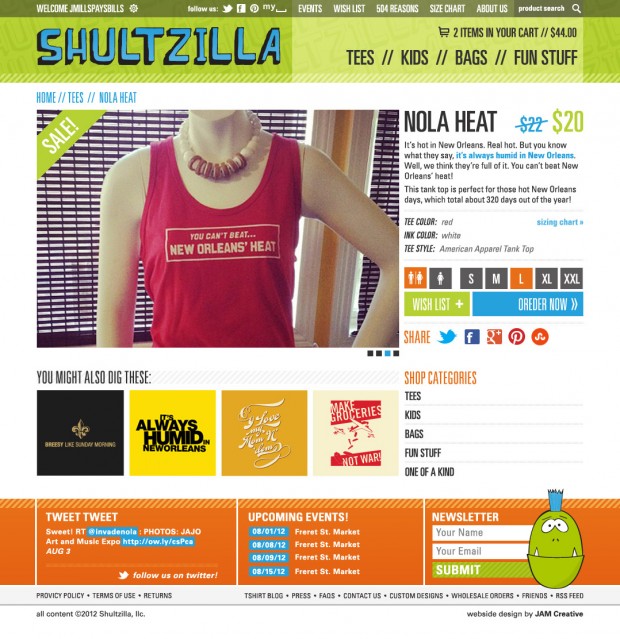
Fixed Grid – This size is based on the pretty standard 950 Grid System. It works well for smaller screens like laptops.

Fixed Grid – The design for this resolution is basically a scaled up version of the 950 grid scaled up to 1030px for for larger monitors.
Completing the Design
JAM Creative has a “design first” philosophy. We don’t start building a website until we’ve accounted for all of the content and meticulously thought about where each piece of information fits. We created a mockup for every page, at every breakpoint level, before we started building, that included:
- Home page
- Main category overview page
- Product page
- Checkout page
- Blog page
- Single blog page
- Single page with sidebar
- Single page with no sidebar
In all, we created 40 mockups – 5 sizes for each page. This is an important part of the design process that many designers and developers miss. We see this process as a necessity. This process ensures each page is thoughtfully designed and that the site user has been taken into full account. This gave us the opportunity to really think about the design and how every piece fits together to make a cohesive and smooth user experience. It’s important to think about where each element will go ahead of time, before starting to code and turning the pages into template files.
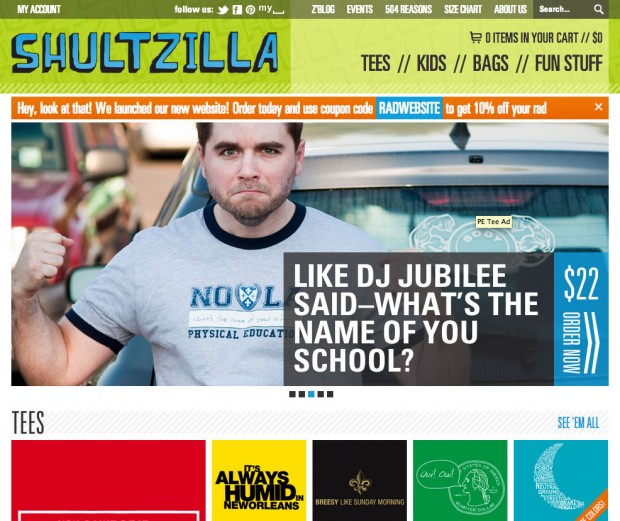
Time to Build
Since we didn’t have to wait for client approval, the design process moved rather quickly. We were able to knock out all designs in a week and a half. At this point, to maintain our deadline, we had about 2 and a half weeks to build the site.
WooCommerce was very easy to use. Everything worked exactly as it was supposed to. We had numerous custom features, so we needed to purchase several plugins to get the standard WooCommerce plugin to act as we designed for.
The Product Page
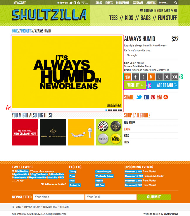
We used the following plugins on the product page:
A: Product Gallery Slider plugin – With minimal modifications to our main CSS files, we were able to modify this plugin without changing any of the core plugin files.
B: Variation Swatches and Photos – Unfortunately, due to the design we weren’t able to get around modifying the core Plugin files, but we were easily able to achieve our desired effects. We were also able to do nice styling on the checkout page using this size/style paradigm.
C: DVin Wishlist plugin – available at Themeforest.net – We tried to use woo plugins wherever possible, but ufortunately, Woo doesn’t have a wishlist plugin. (Word on the street is they’re working on it.) We had some initial issues with this plugin. We were able to track down the developer within a week and resolved the issue. Now, it works great.
The Checkout Page

On the checkout pages we did a few things to ensure the site user has a smooth experience.
A/B: We arranged the standard layout to make it flow a bit easier. We moved the shipping calculator above the total, and the “proceed to checkout” button below the total. This allows the user to know exactly what they’re spending before they proceed—we feel that honesty is the best policy!
C: Viral Coupon for Woo Commerce plugin – We give 10% off to tweet or share a purchase on Facebook. We’ve gotten some great feedback using this plugin. We highly recommend it to all of our clients requiring e-commerce.
D: We wanted to do something a little more interesting than the standard shopping cart page. We decided to use the same design paradigm that we used on the single product page. This enabled us to display the shopping cart on mobile phones without going to multiple lines. In order to do this, we were forced to modify the core WooCommerce files.
Filling Everything Out
We used several additional plugins throughout the website.
Official Woo Commerce plugins:
- WooCommerce CSV Export
- WooCommerce PayPal Pro Gateway
- WooCommerce Print Invoice/Packing list
- WooCommerce Shipment Tracking
- WooCommerce Newsletter Subscription
- WooCommerce USPS
Other Plugins:
Other Customizations
- We used the theme-options.php to modify the framework to add a notification box to the header of the pages. This box contains things like important updates, coupon codes, sale notices, etc. We used a cookie to determine if the box was closed. If the user closes the box, it doesn’t appear until the cookie is cleared or expires.
- We used a tagging system to create a “more colors” banner that appears similar to the “sale” banner. This way, the user knows there is more than one color option for specific products.
Measuring Success
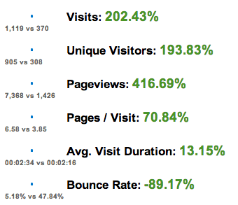
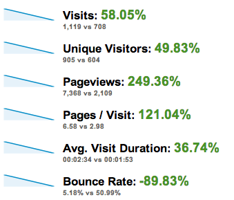
We install Google Analytics on all of our clients’ websites. We use the analytical data to ensure that our work is optimized appropriately and to gauge user-experience. Below features comparisons of several main statistics tracked by Google Analytics:
Stats Overview
Sept 1-30, 2012 vs Sept 1-30, 2011
SHULTZILLA saw a 202.43% increase in site visits during the first month of launch compared to the same dates one year ago.

Sept 1-30, 2012 vs Aug 1-31, 2012
SHULTZILLA saw a 58.05% increase in site visits during the first month of launch compared to one month prior to launch.
Sept 1-30, 2012 vs Sept 1-30, 2011
The bounce rate decreased 89.17%, while the pageviews increased by 416.69% when compared to Sept 2011.
Sept 1-30, 2012 vs Aug 1-31, 2012
The bounce rate decreased 89.83%, while the pageviews increased by 249.36% when compared to August 2012, a month prior to launching the new site.
Mobile
Ensuring that websites are visible on mobile devices is imperative. The target market for SHULTZILLA is late teens through mid 30s. Not only are these site users constantly viewing sites on mobile devices, but they are now also purchasing items via phones and tablets. It is interesting to note the increase in mobile access to the site from Sept 2011 to Sept 2012. SHULTZILLA v1.0 was viewable on phones in 2011, however, the site was not a responsive design.
Operating System
Sept 1-30, 2012 vs Sept 1-30, 2011

Sept 1-30, 2012 vs Aug 1-31, 2012

About




A perfect post for those saying that all stuff using WooThemes look the same. Great work.
Really nice case studies ! It seems that Viral Coupon is not available anymore. Anyway thanks for sharing your experience with WooCommerce.
Hey Jacques its an external plugin from the website woo-com dot com
I am not affiliated with them in anyway, I also thought it was great way of driving sales using of social media.
Love this design. Excellent work guys.
Very impressed and surprised to see the base for this was Buro!
Well done with everything here!
Real Great Case Study… love your work also.. thx 4 the time…
Great work, I love the traffic comparison. Looks like you’ve got a winner.
Hey guys! Thanks for the great feedback! We’re totally stoked to have Woo feature us on the blog. This is great news for us, and we’re certainly happy to show off what we’ve done with such an awesome piece of software.
If anyone has any technical questions or something specific about what we did for Shultzilla, please don’t hesitate to give us a holler. We’re happy to help out the woo community!
Jeremy Miller
JAM Creative
Loved your walkthrough of the process, and was really interested in your discussion of started with mobile design first. Smart and thought-provoking. Thanks!
*starting
Thank you for sharing your very comprehensive process review and method towards implementing WooCommerce. Also appreciate your inclusion of the plugins used – this is most helpful.
Thank you, great work and excellent design. Thank!!!
Great case study, how do you submit case studies for this section? We have a great one about one of our clients who we work closely with and have used WooCommerce to build an online store with a limited budget to generating sales of over £100,000 in its first year. http://www.afarleycountryattire.co.uk/
Trackbacks/Pingbacks
News
See allWooCommerce + YouTube Shopping: Sell Where Your Customers Are Watching
By Jay Walsh •
WooCommerce 10.7: 51% fewer queries, a real fulfillment API, one important cache fix
By Brent MacKinnon •
Stripe’s Agentic Commerce Suite launching with WooCommerce support from day one
By Jay Walsh •
Never miss a beat — join our mailing list
Please enter a valid email.
View our privacy policy. You can unsubscribe anytime.
There was an error subscribing; please try again later.
Thanks for subscribing!
Emails will be sent to
You're already subscribed!
Emails are sent to