
Did you know that, typically, 80% of revenue comes from 20% of customers? Okay, it’s not an exact rule, but this idea turns out to be true more often than not — and for almost every industry.
And so while you should always be looking for new customers, more specifically, you should be looking for more customers like that top-spending 20%.
But how exactly do you do that? What kinds of metrics should you keep your eye on and where can you find those metrics? Which ecommerce analytics programs do you need?
It all starts with Average Order Value (AOV), Customer Lifetime Value (CLV), and your WooCommerce Dashboard.
How to find big-spending eCommerce customers
↑ Nach obenThe WooCommerce Analytics dashboard
The dashboard has always been the place to find essential indicators of your store’s health. And thanks to a recent upgrade, it’s gotten even more powerful. In fact, we have an entire post on getting the most from the WooCommerce Analytics dashboard.
You can sort by various timeframes, and compare performance during that time to another. How did your first week of July this year compare to the first week of July last year?
You can quickly see the following kinds of data:
- Total Sales
- Net Sales
- Orders
- Items Sold
- Returns
- Discounted Orders
- Gross Discounted Amount
- Total Tax
- Order Tax
- Shipping Tax
- Shipping
- Downloads
- Gross Sales
- Average Order Value
The last one on that list — Average Order Value — is where you start the journey to find your best customers. This should serve as the benchmark to determine who a “big spender” actually is. If your average order value is $20, someone who spends $22 probably doesn’t count. That’s about average. But someone who spends $75 on a single order? That’s a pretty big spender.
Make sure you go far enough back in your history to find a good, healthy average. The past 12 months is an ideal timeframe.

Within your WooCommerce Analytics dashboard, you can also use the leaderboard feature to highlight top-selling products, your most popular coupons, and (drumroll, please) your top customers by name along with their total spend for your selected period.
You can only show up to the top 20 and you can’t export the list. But you can find the top 20 for each period of your choosing (monthly, weekly, etc.) and write them down one by one to get a bigger list of top spenders. If that seems like a bit too much manual work, there’s a hack at the end of this article that does this for you.
Now that you’ve identified your actual top customers, you can:
- Reach out individually to interview them about your store. Learn why they love it, ask what changes they’d like to see, and use what you learn to continue to grow.
- Offer special perks, loyalty rewards, and more. Big spenders deserve special attention. Make sure your best customers stick with you forever by giving them the VIP treatment.
- Market to them with exclusive deals. Because they’re prone to spend more, you can create sales offers that unlock with a minimum spend amount that would be too high for your average customer.
There are plenty of advantages to discovering who, specifically, your best customers are. But how did they find you? How can you shape your ads to reach more of these high rollers? That’s where tracking your ads and traffic sources comes into play.
Facebook is a powerful way to reach consumers because you can combine organic reach with paid options (like influencer marketing and advertisements) that can expand your audience.
First, make sure you’ve connected your Facebook page, store, and ads account. The Facebook for WooCommerce extension is the best way to sync everything.
As your ads strategy gets more intricate and you seek to find your absolute best (highest spending) customers, you’ll need to make sure you have all of the possible data at your fingertips. The Facebook extension is the best way to make this happen.
Note that you’ll encounter some limitations in reporting due to customers who’ve opted out of tracking because of iOS 14. But part of the solution to maximizing your available data in the age of iOS 14 is Facebook conversions API. Learn more about Facebook Conversions API and how to connect your site to Facebook.
For this post, we’re assuming you’re familiar with the Facebook ads dashboard.
By default your campaign view results look something like this:
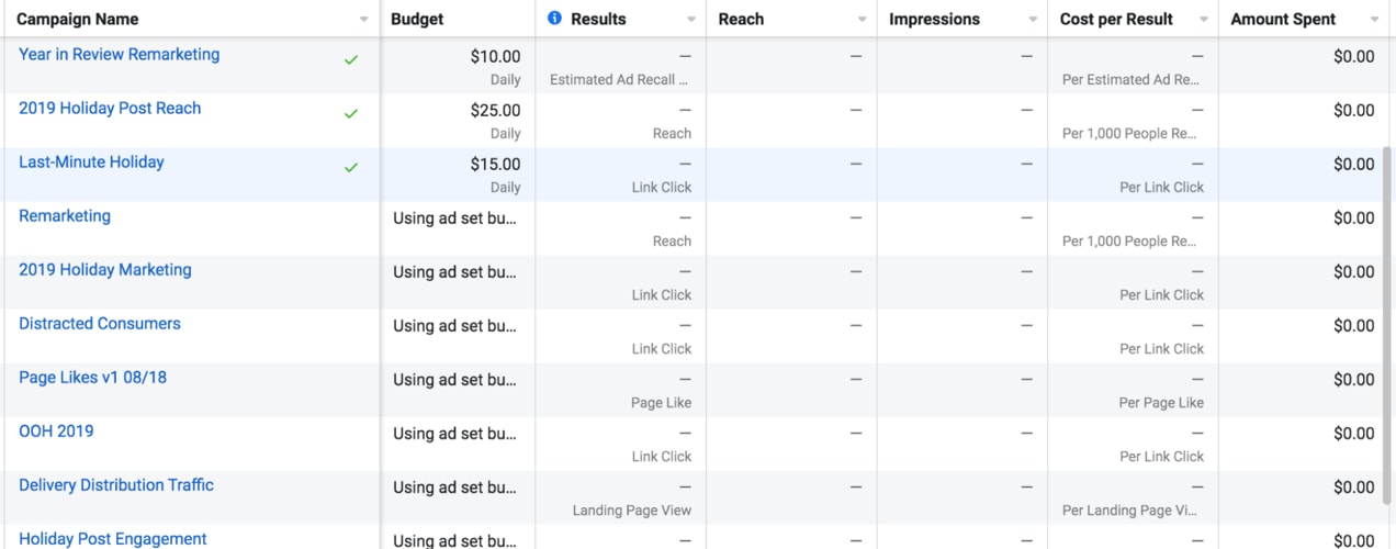
But you can customize your columns in thousands of ways.
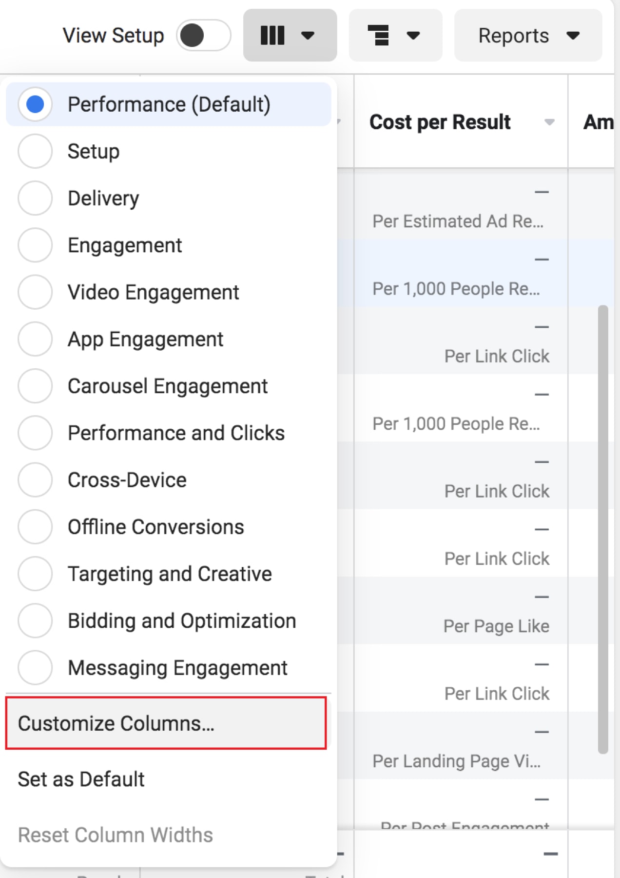
Select the three vertical columns at the top and click Customize columns. This will open up a menu of choices where you can look for your most valuable metrics.
For eCommerce stores, there’s a lot of potential choices like:
- Adds of payment info
- Adds to wishlist
- Adds to cart
- Checkouts initiated
- …and more.
All of these things help you get a better picture of your sales funnel and where people are dropping off.
There are also a number of options for looking at ad spend, actual purchases made, and revenue generated as a result:
- Unique purchases
- Purchase ROAS (return on ad spend)
- Purchase conversion value
- Cost per purchase
But to find the sources of your highest-spending customers, you need to know the average order value from each source. So, we’re going to look at two specific metrics:
Purchase conversion value + unique purchases
To find the average order value, divide the purchase conversion value by the number of unique purchases.
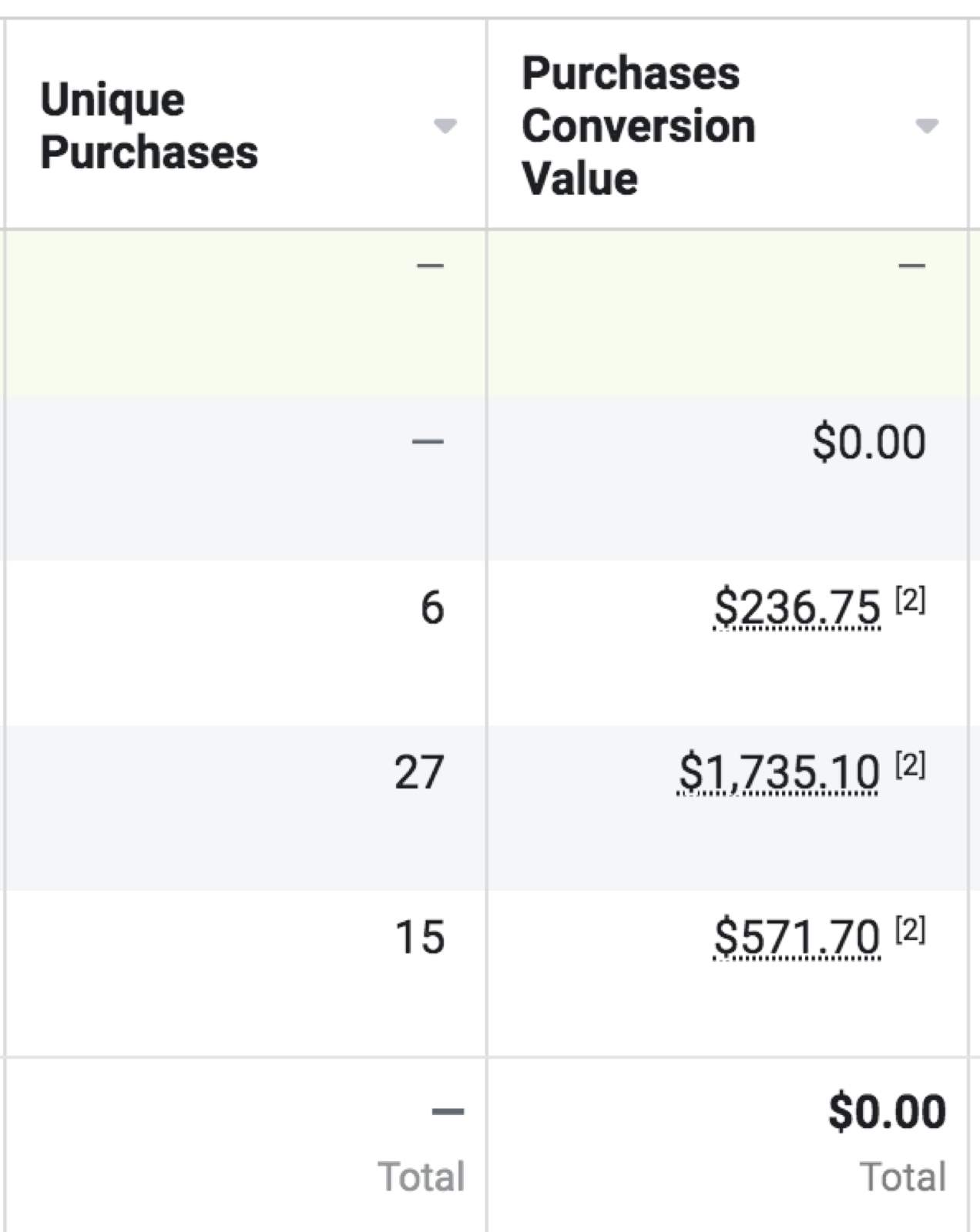
In the example above, the third row with six sales has an average order value of $39.46. The 4th row shows 27 sales. But not only did that campaign result in more sales, the average order value was substantially higher at $64.26.
Now, you’ve found campaigns that deliver the highest average order value, but unless your campaigns are sorted by specific audiences, you still don’t know who.
Within each campaign, you can create different ad sets that can be targeted towards different audiences. You can even create custom audiences and save those to use over and over again.
Below is a screenshot of a few different audiences within a campaign.

In the example above, you can see that the “Clemson Fans” audience is responsible for about twice the revenue despite only one more purchase than the “Alabama Fans” audience. In other words, the average order value from this audience is much higher.
Make sure you always segment ad groups based on consistent audiences. If you change them before you roll out each new campaign, it will be harder to draw accurate conclusions.
You can do this for any campaign and audience that you set up. Now, you know which audiences tend to spend more on your store.
Finally, it’s important to note that no single metric should be the sole thing that informs your decisions. Just like one ad group might have the most conversions but only be responsible for a fraction of the revenue generated, those that spend the most aren’t always your best option.
Why? Because even if an audience spends twice as much as your average consumer, if they are three times more expensive to reach, the campaign will ultimately be less profitable.
ROAS, or return on ad spend, is a metric that helps you determine the amount of revenue generated for each dollar in ad spend. If your ROAS is 2.5, you’ve made 2.5 dollars for each one spent on advertising.
Just like you shouldn’t only focus on your highest-spending audience or only focus on the campaigns that provided the best ROAS, you also don’t want to forget about the variety of marketing methods that exist. Maybe your best-performing Facebook campaign doesn’t do as well as your worst-performing Google Ads campaign. Or maybe no paid ads have been nearly as successful as the organic traffic you’ve built up through your search engine optimization efforts.
The advantage of Google Analytics is that it brings your data together into a single place. You can get a side-by-side comparison of broad channels (social media, organic, pay per click, etc.) and even specific sources and ad campaigns.
Google Analytics’ default information is incredibly helpful. But stores need more data. Google’s Enhanced Ecommerce Reporting is the answer. It requires some intricate integration, but this free extension takes care of it for you. You’ll need this full integration to take advantage of everything we’re about to discuss.
See our advanced guide to tracking ad performance with Google Analytics. In this guide, you’ll also learn about UTM parameters. These let you add extra information to each link so that when someone visits your site, you can learn more about what sent them there.
Note that Google is among the majority of platforms impacted by iOS 14. Learn more about the impact of iOS 14 on eCommerce advertising.
How to find average order value in Google Analytics
Once logged into Google Analytics go to Acquisition → All Traffic → Channels.
Then, select Ecommerce and it will reload with some great data.
First of all, at the top, you can see the aggregate average order value across all sources. This gives you an overall benchmark for your store as a whole.
You can expand the timeframe to get an accurate estimate of your average order value but also see if it’s increasing over time (another great goal). This information will help you determine which source gives you above and below average order values.
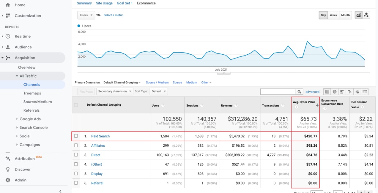
Now, you can also analyze the average order value by channel. You’ll notice, in our example, that “Paid Search” has a dramatically higher average order value than any other source.
This again should be taken with the context that we don’t know how much was spent to find those few high spenders. And, since there were so few, though they spent a lot more individually, their total spend was significantly lower than those who came from direct search.
You can click on each channel to see more data if it’s available.
If you’re correctly using UTMs labeled for attributes — like source, medium, campaign, etc. — you can change the primary dimension above the graph to see more information about hyper-specific sources.
You can also find data for a specific segment of an audience and compare it to the overall average. Here’s how:
Select Add Segment near the top.
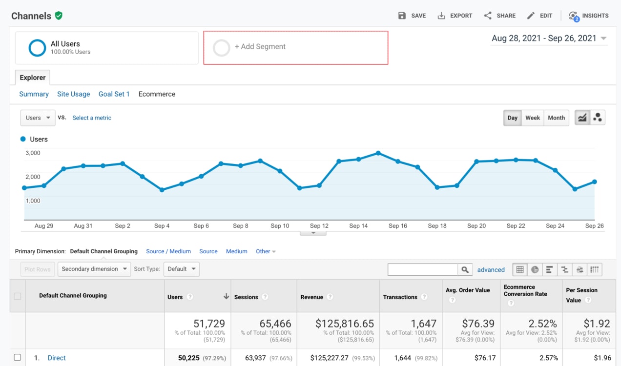
You can select from predefined audiences here. But for our example, we’re going to click the red New Segment prompt to find a specific audience we want to compare.
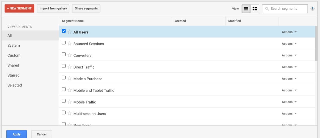
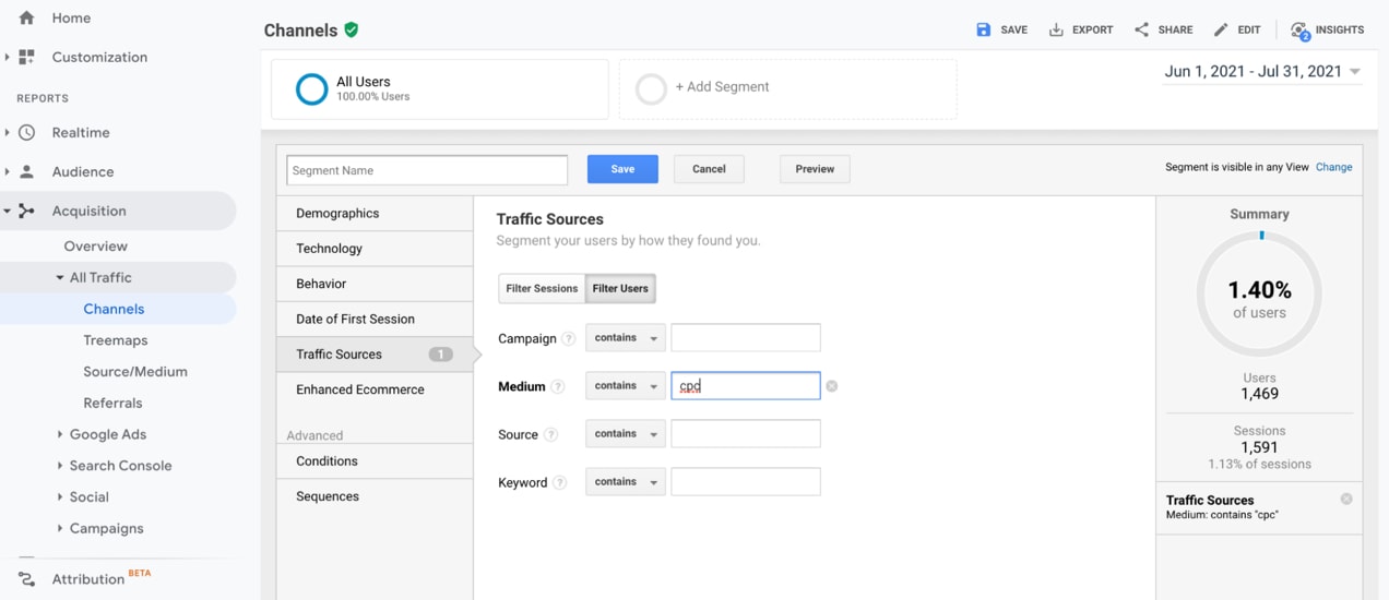
Even without parameters, you’ll likely find a lot of great information about users. Use the filters on the left to create audiences to compare. In this article, we’ve mostly talked about discovering traffic sources that result in the highest-spending customers. But with this tool, you might also be able to see what other kinds of attributes — like age or the device they’re using — that your highest spenders have in common!
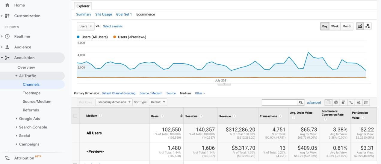
We named our audience “<preview>”. Google Analytics identified the totals for this audience: 13 transactions for an average order value of $409.
Again, UTMs are the key to finding hyper-specific information. If you ran a campaign and labeled it “DiscoPromo” you could sort by that tag and see if the promo results in higher, lower, or typical order values.
How to find customer lifetime value in Google Analytics
Average purchase value is great for finding campaigns and audiences that result in large purchases. But what about customers that make lots of smaller purchases? Over time, these customers can spend way more on your store than the average person. In other words, they’re big spenders, too.
With the right setup on Google Analytics, you can estimate customer lifetime value based on campaigns or even specific audiences, helping you truly identify your most valuable customers.
To find customer lifetime value, go to Audience → Lifetime Value
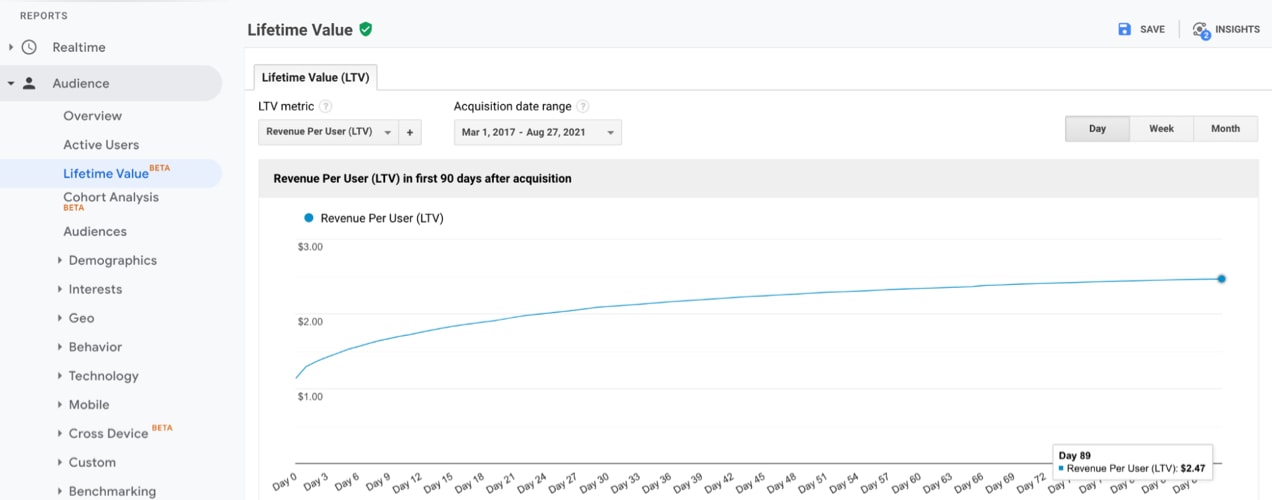
The first thing you’ll see is an overall graph for lifetime value. You’ll notice it’s curved because as visitors return for repeat purchases, the average goes up. The flatter your graph, the fewer repeat purchases your business has overall.
Note: Not every business should expect a curved graph — like if you sell something that’s usually only a one-time purchase.
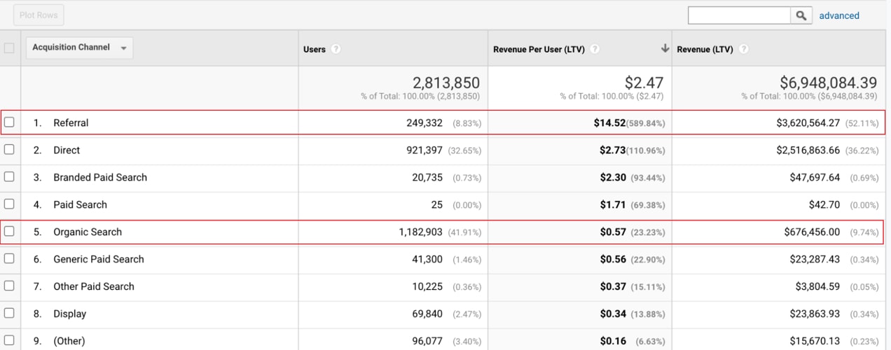
Below the curved graph, you’ll find a breakdown of users, revenue per user, and overall revenue organized by acquisition channel.
In the example below, there’s an interesting insight. Referral lifetime value is so much higher than others — like organic search — that even though organic search has nearly five times as much traffic, it accounts for significantly less overall revenue.
This is fantastic information. But it gets better.
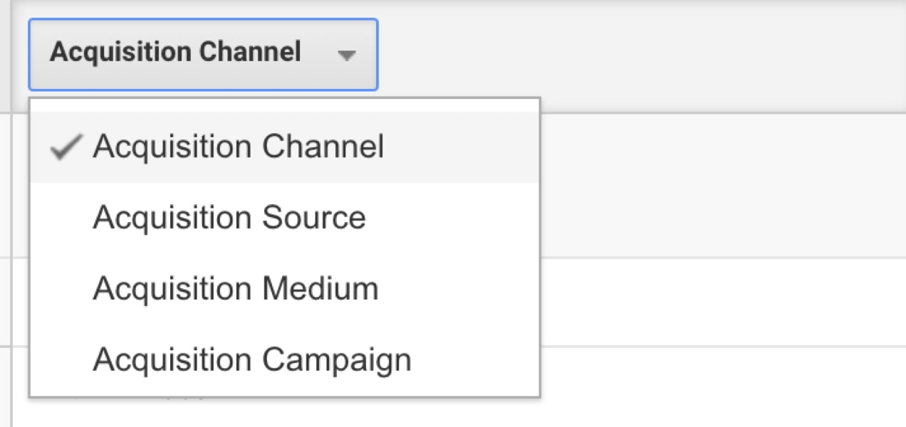
You can also sort based on channel, source, medium, and campaign. Again, if you’re using UTMs, you can find out some incredibly detailed information. You may find that customers acquired through your annual New Years Facebook blitz have a much higher LTV than those acquired through your summer sale. With this information in hand, you can divert some of your summer sale budget and put more towards your New Years promo!
MailPoet: Efficiently find your top customers by name and market to them!
Remember how we started with being able to identify your best customers based on revenue from the WooCommerce dashboard?
With MailPoet, you can identify your best customers by segmenting your email list based on lifetime order value. Then, you can send specific email marketing messages to that list. For example, push sales with higher purchase limits that might not resonate as well with the rest of your audience.
You can also export this data. So, maybe export a list of anyone who’s spent more than $1,000 in your store and contact them individually to find out why they love your shop. Ask them to complete a survey. Send a special gift “just because” to retain their loyalty. Invite them to participate in special events, and more.
Plus, if these people have opted in to marketing and this is compliant with your relevant regulations (like GDPR), you can upload your list to places like Facebook and Google to create custom audiences for hyper-targeted remarketing.
MailPoet has all kinds of powerful features. But the ability to segment lists based on spend and export data for use in a variety of ways? Now that’s a game-changer.
Top stores identify and retain their best customers
↑ Nach obenIt’s less expensive to retain existing customers than it is to find new ones. And, when we’re talking about the 20% of your customers who account for 80% of your revenue, retention becomes even more important.
Use the tools in this article to locate your best sources of high-spending customers so you can find even more. Plus, identify key customers, by name, so you can reward and retain your biggest fans.
About



I didn’t know that the WooCommerce analytics can be used to identify our high-paying customers. Customer retention has always been the driving force of sales growth for online and e-commerce businesses. The GA tips is interesting too! It’s time to try them out. Thanks for the above great tips!
Thanks for reading!