
Today’s post is all about the numbers. There are many ways to enhance your marketing efforts, but one important step is to use ecommerce analytics tools to gain insights into the performance of both your products and your website. What’s nice is that this is fairly straightforward if you’re using WordPress and WooCommerce.
If you own an online store (or are planning to start one), you’re probably always thinking about how you can grow your business. To thrive over the long haul, you’ll need to keep converting more prospects and refining operations for financial efficiency.
In this post, we’ll start by discussing the benefits of tapping into ecommerce analytics. Then we’ll provide you with an in-depth guide to the key metrics that WooCommerce Analytics — Woo’s built-in data tool — offers.
And no matter how you feel about numbers, you’re going to love the way you can use what you learn to achieve more when you sell online.
A brief overview of ecommerce analytics
↑ Back to topIf you’re thinking about opening an ecommerce store, or you’ve just completed a successful launch, you might not have much experience with ecommerce analytics. Don’t worry, though — this is going to be a beginner-friendly guide.
So, what is ecommerce analytics? This term refers to the process of tracking and analyzing data about ecommerce businesses. This data includes key numbers such as the amount of online sales, number of customers, percentage of returns or refunds, and so on.
That’s a lot of information to process. Fortunately, you can use sophisticated ecommerce software to collect this data for you. Then, you can use that same software to access and analyze your key ecommerce metrics.
Why it’s important to track your ecommerce analytics
↑ Back to topWhy should you care about analytics for ecommerce? The answer is simple — the metrics along with strong data analysis can help you optimize and grow your ecommerce business.
You can use it to gain valuable operational, marketing, and sales insights, and then adjust your strategies accordingly. The most important ecommerce metrics are straightforward, so you don’t need to be a customer data scientist to interpret and learn from them.
As an example, let’s say you’re unsure about whether your product lineup is appealing to your customers. You can start by tracking your top-performing products, as well as any returns. This will make it clear which products customers like and which ones they end up sending back.
Once you’ve analyzed all the data, you can use your findings to tweak your inventory, and even adjust your overall product catalog. This will allow you to sell the best products for your audience, leading to happier customers and more conversions.
You can also track the sales data that results from promotional deals, like free shipping coupons or percentage discounts. When you know which type of deal performs better, you can offer more of the same (rather than having to guess).
Additionally, when you pay attention to data points like average order value (AOV), you may discover that you need to start upselling and cross-selling products. With the right software, you can also learn about more advanced customer behaviors. This can guide your marketing campaigns to boost customer retention, satisfaction, and loyalty at a lower customer acquisition cost.
There are endless ways you can leverage ecommerce business analytics tools to gain actionable insights, improve your ecommerce store, and grow your business.
An introduction to WordPress and WooCommerce
↑ Back to topNow that you know the benefits of ecommerce analytics, it’s time to get practical. For the purposes of this article, we’re going to be working with WooCommerce Analytics. WooCommerce is the most commonly-used platform to create an online store in the world — and for good reason.
If you’re not using WooCommerce, much of what you’ll learn can still be applied to the platform of your choice. But if you’re curious why Woo and the merchants that rely on it are so successful, here’s a quick overview:
Let’s start with WordPress — a powerful content management system (CMS). You can use this software to create any type of website you want — from personal blogs to corporate websites, membership programs and, yes, online stores.
WordPress is highly-customizable and ideal for beginners, thanks to its intuitive design tools (like the block editor and the Site Editor). When you use these features, you can build and manage a custom site without ever having to touch a line of code. Additionally, you can choose a WordPress ecommerce theme to fast track the design process.
Plus, you can extend your site’s functionality using plugins, which add any features you need to your site. Some of these plugins are free, while others may require a premium membership or license.
You can transform any WordPress site into an ecommerce store for free, by using the WooCommerce plugin.
Or, you can take advantage of Woo Express, which is a powerful, hosted ecommerce solution. In addition to ecommerce tools, you’ll also get managed hosting, live chat support, automated backups and security solutions, live shipping rates, and more. This truly sets you up with everything you need to get started quickly and efficiently.
If you’re hosting your website yourself, all you have to do is log into your WordPress dashboard, and install and activate WooCommerce. You can then follow the setup wizard to customize key elements of your online store. This wizard will help you with everything from adding your first products to choosing payment gateways.
Once your store is set up, you’ll see some new tabs in the left-hand menu of the WordPress dashboard. You’ll notice that one option is the Analytics tab. This is one of the great things about using WooCommerce — it includes all of the features you need to make your store a success, including built-in ecommerce analytics tools.
Getting around: Key elements of WooCommerce Analytics
↑ Back to topIf you’re a beginner and want to leverage the power of ecommerce analytics, WooCommerce may be the perfect ecommerce platform for your business. That’s because it comes with some highly useful web analytics features built directly into the platform. You don’t need to install or configure any additional plugins to get access to them.
Let’s start by exploring the Analytics dashboard, which is the hub for your online store’s data. To find it, go to Analytics → Overview.
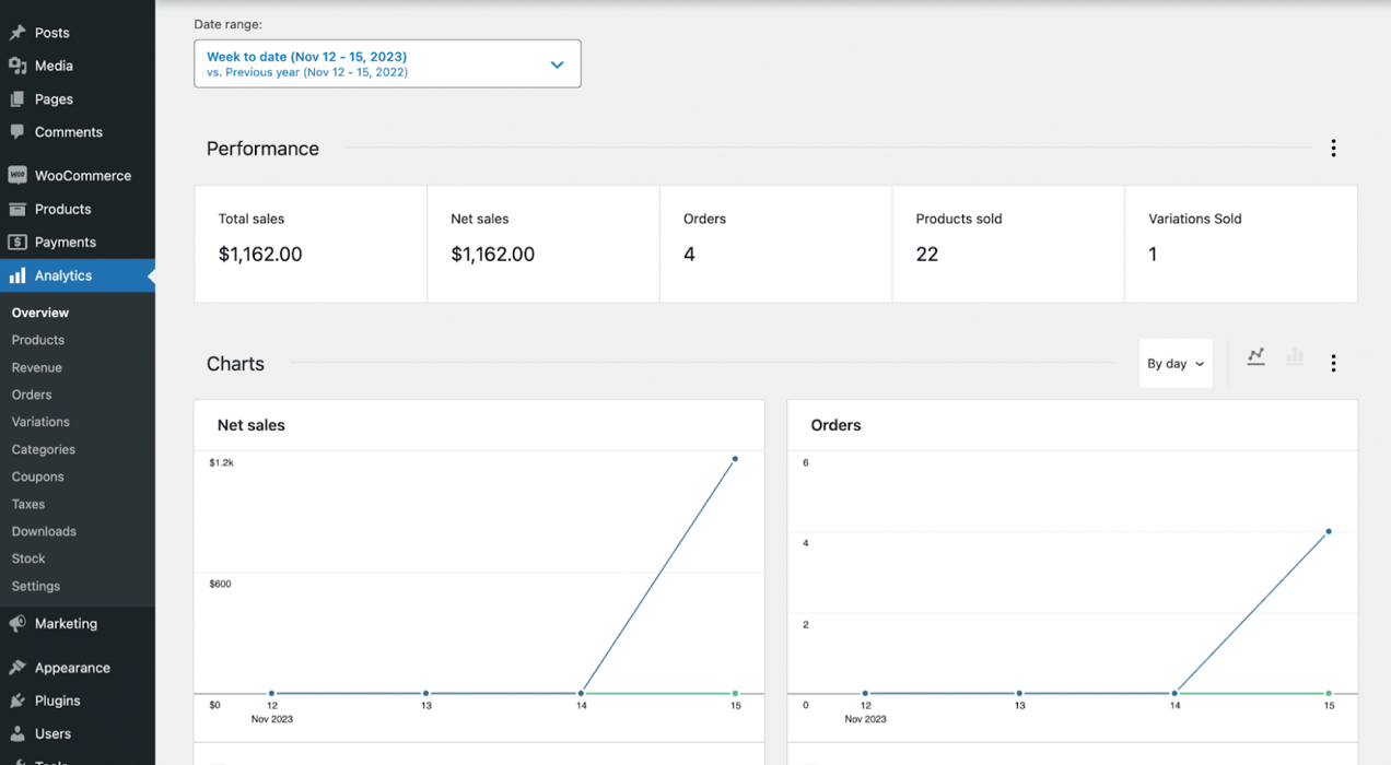
This screen is divided into three main sections — Performance, Charts, and Leaderboards.
As you can see, you can customize the view for all the data by selecting a Date range. In our example, we’ve chosen a week’s worth of data. But you can easily expand the Date range drop-down menu to select a different option.
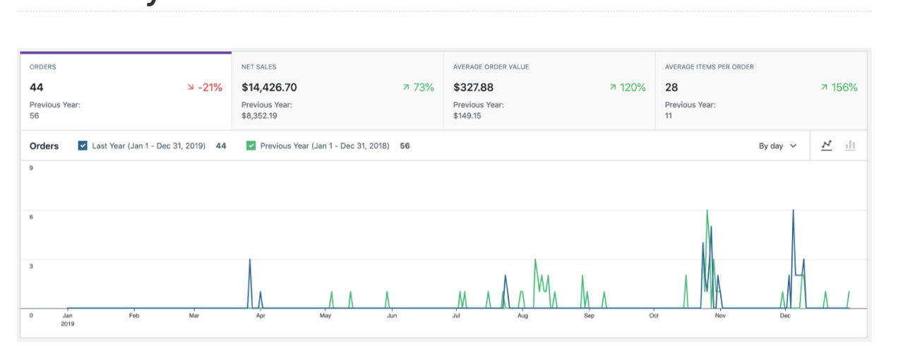
In the Performance section, you’ll see valuable insights like Total sales, Net sales, Orders, etc. When you move along to Charts, you’ll see a visual representation of that data.
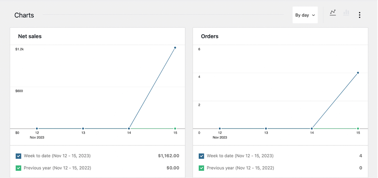
By default, the Charts section is set to use a line graph, but you can change it to a bar graph by selecting the bar chart symbol.
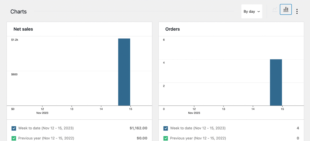
These simple visuals are a great way to make the data more accessible and user-friendly.
What’s more, once you have enough customer data, you’ll be able to compare these graphs on a greater scale. As you can see, you’re able to check boxes to display or hide comparisons of different date ranges.
Now, let’s continue on to the Leaderboards section.
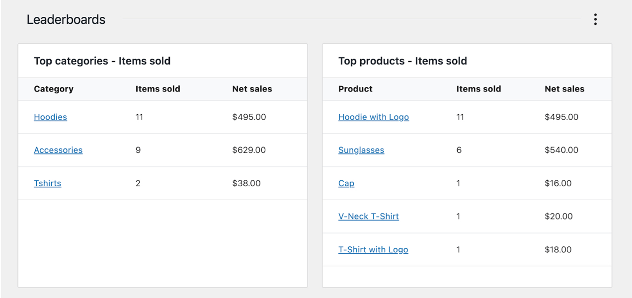
Here, you’ll be able to view your top performing products, categories, and more.
Understanding the benefits of WooCommerce Analytics
↑ Back to topAs we discussed earlier, there are plenty of benefits to leveraging ecommerce analytics in general. But you might want to know more about the specific advantages of using WooCommerce Analytics.
First of all, the WooCommerce Analytics dashboard is built directly into WordPress, making it highly convenient to access. You don’t have to leave your website and access your ecommerce analytics through a third-party tool.
Furthermore, WooCommerce offers a highly-visual interface. The separation of Performance, Charts, and Leaderboards is straightforward, making it quick to navigate through plenty of advanced ecommerce data. And you can use the toggle buttons to modify your stats, so they’re displayed in the way that’s most convenient for you.
In other words, the way you use WooCommerce Analytics can be extremely personalized. You’re able to show as many or as few data points as you like.
Along with its convenience, WooCommerce Analytics enables you to reveal useful metrics about your store and its products. Here’s how each section of the dashboard can help you:
- Performance. With insights on overall sales, orders, and returns, you’ll be able to optimize your inventory and product catalog.
- Charts. If you’re dealing with large amounts of data, the line and bar graphs can make that information easier to understand.
- Leaderboards. This section enables you to identify best sellers and loyal customers at a glance.
In the upcoming sections, we’ll dive a little deeper into how you can use WooCommerce Analytics to improve your store and grow your business.
Using chart and performance data to improve your store
↑ Back to topNow that you have a basic understanding of the WooCommerce Analytics dashboard, let’s take a closer look at the chart and performance sections. This way, you’ll know exactly how you can use them to improve your business.
As mentioned previously, you can customize what performance metrics you see. To do so, just click on the three dots on the far right of the Performance section.
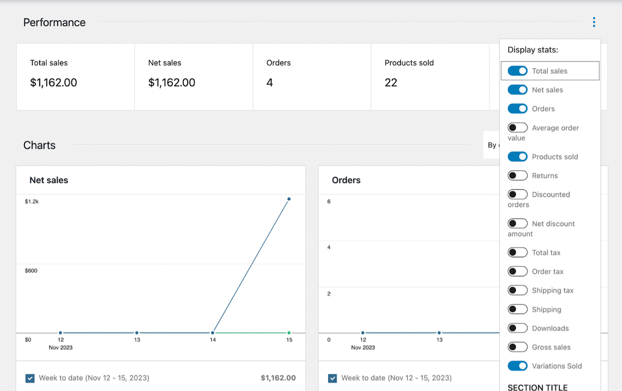
The same applies to the Charts section.
You can choose to show:
- Total sales
- Net sales
- Orders
- Average order value
- Items sold
- Returns
- Discounted orders
- Gross discounted amount
- Total tax
- Order tax
- Shipping tax
- Shipping
- Downloads
- Gross sales
It’s also important to note that you can export WooCommerce data as a CSV file. Then you can use it with other tools or software. But you’ll only be able to export certain metrics from the above list.
To do this, just go to Tools → Export in your WordPress dashboard.
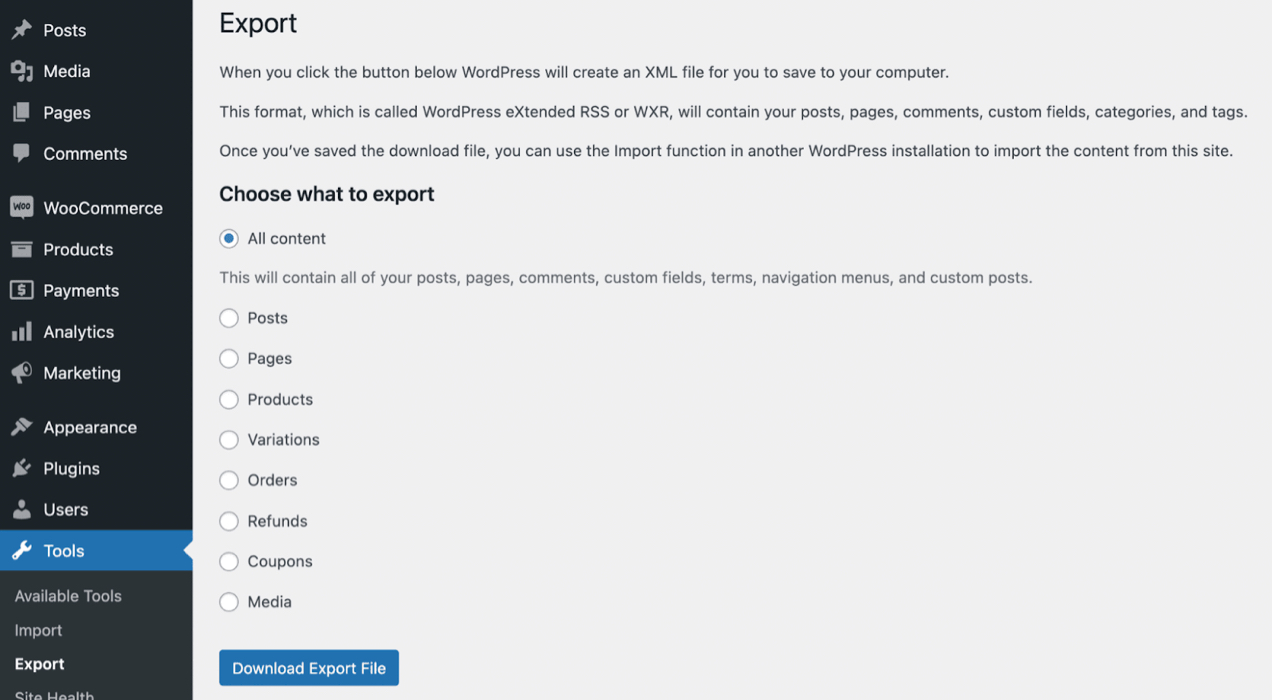
Make your selections, and click on Download Export File.
Alternatively, you can use a premium WooCommerce extension, like WooCommerce Customer / Order / Coupon Export. This tool will give you the power to export more advanced data in multiple formats.
Now we’re going to check out some of the most important data points and what they mean.
Total sales
Sales are the heartbeat of your store, and while they might not always equate to profitability, they are a quick way to assess your performance.
First, you can check your total sales in a given month as compared to the same month last year. In the Performance section next to each metric, you’ll see either a red or green box with a percentage. You’ll want to aim to always keep these boxes green.
If you’ve never looked at your ecommerce analytics before, you might be deceived by a red box this month, and think your store is in trouble. But if you select a range starting with the beginning of the year, you might see that you’ve actually grown overall, and this was just a slow month. This is why toggling and analyzing different date ranges is an important exercise.
The longer the date range is, the more applicable the data becomes. And it’s not about the data quality. Let’s say you’ve been in business for at least five years, and on January 1st of this year, you hired a new marketing manager. By selecting a period that goes back five years, you can see if the new manager has made an impact on sales.
Why is the date range so important? If you just look at one slow month, you might decide that the marketing manager isn’t helping. But if you see an overview of the last five years, you might see that your sales have been down year over year, and the new employee is actually reversing that trend. Now, you can make better data-driven decisions.
Average order value (AOV)
Even if you’re new to managing an online business, you probably already know that it’s more profitable to keep existing customers than to find new ones. But if you want to increase revenue without new customers, you’ll need to increase average order size or purchase frequency.
Average order value is important for any ecommerce strategy. For instance, maybe you’re running a new Google Ads campaign. Although this is an expensive customer acquisition method, you may find that your AOV is high enough to make the campaign profitable. This metric also helps you evaluate other marketing strategies, like upsells and cross-sells.
Again, it’s best to look at a wider date range to see if your average order value has increased or decreased over the years. Then consider what changes could account for the differences you see, and adjust your strategies accordingly.
Returns
Returns are a good indicator of customer satisfaction. Unhappy customers return products, don’t make repeat purchases, and don’t leave reviews (or worse, leave negative ones).
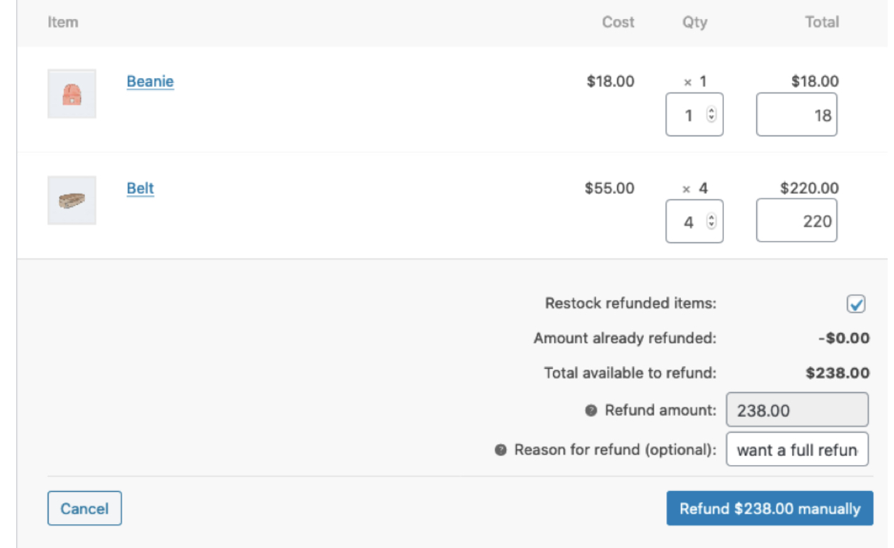
Perhaps you’ve recently changed suppliers. The margins on your products may have improved as a result, and everything seems great on the surface. But upon examining your metrics, you find that returns have doubled since your new partnership. In this scenario, you may need to reconsider and determine whether the improved margins are worth the cost of returns (and the loss of loyal, repeat buyers).
The same applies to a change in return policy. Offering no-hassle returns can increase customer confidence and boost sales. But if the cost of processing returns swells too much, it can hurt your bottom line.
Paying attention to your metrics can also help you predict future returns. Do you have a massive ‘cyber week’ sale on the horizon? An unexpected rash of returns could negatively impact cash flow. By looking back to last year’s sale, you might know to expect returns to be 15 percent above average, and you can prepare accordingly.
Discounted orders and net discounted amount
Coupons and discounts are powerful ways to motivate customers to buy, but they can also be a liability if shoppers expect or abuse them. The discounted orders and net discounted amount reports can help you spot both types of problems.
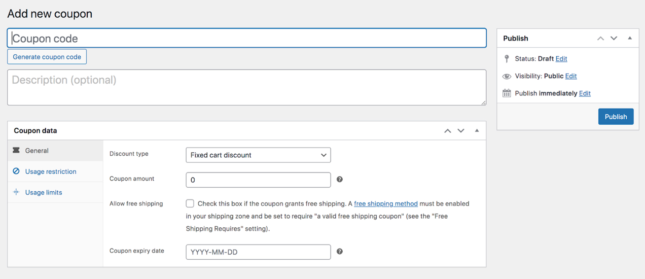
Are people redeeming substantially more coupons this month than they did during the corresponding month last year? This might be a cause for alarm, or it may be completely acceptable.
You can use the chart view to see if there are any days where coupon use peaked significantly. If one or two days account for the majority of discounts, what could be the cause? An email with a promo code or a flash sale might be innocent explanations.
Then, you can look at a longer time period to see if you’re issuing discounts too frequently. Along with the effects on revenue, you might consider whether this will cause coupon fatigue, which occurs when customers are no longer motivated by sales because they’ve seen so many.
Have discounted orders increased by ten percent every month for the last two years? You might worry at first, but make sure you compare that result to the Orders report. If the number of orders increased at approximately the same rate, there’s really been no change.
Keep in mind that these aren’t all of the available reports. Make sure you explore the full list at the top to see what might be most relevant for your store!
Leveraging leaderboard data
↑ Back to topThe last section of the Analytics dashboard is equally as valuable. There are four leaderboards for you to explore.

1. Top Customers, Total Spend
Knowing who your best customers are could change your ecommerce business entirely. Here are three ways you can make the most of that information.
The first option is to reward them! Loyal customers can be hard to come by, and marketing campaigns get expensive, but they provide a high customer lifetime value. So when you find someone who’s truly passionate about your store, you want to keep them forever. You can offer them a special gift, give them access to exclusive products, or treat them to discounts.
Secondly, you can also learn a lot from your loyal customers. For instance, you might reach out to them with a survey or simple email, and ask why they love your store and how you might improve it.
Finally, this metric can be another indicator of your store’s overall health. In most cases, your best customer’s total spend shouldn’t be much higher than a customer in the middle of the pack (median total spend).
Why? If a few customers make up the majority of your revenue, losing one could have a major impact. A greater number of customers that spend about the same amount results in more financial security.
There’s one caveat: if you expand the date range to a year or more, and almost all of your customers spent a similar amount during that time frame, this could mean that you don’t have any repeat customers. In that scenario, you’ll want to explore ways to get shoppers to come back again and again.
2. Top Coupons, Number of Orders
These next relevant data points can help you answer some crucial questions, like:
- Which promotions worked best this quarter?
- Are any coupon codes floating around on the internet and being abused?
If you’re struggling to determine what kind of promotion to run next, you can expand your date range to identify your all-time greatest performers. Then consider: What do the top coupons all have in common? You can use this information to become a top-notch promoter.
3. Top Categories, Items Sold
On this leaderboard, you’ll get a quick view of the kinds of items that are your best performers. As with the other sections of WooCommerce Analytics, you can modify the date range in order to evaluate trends, and see if certain categories perform better during different times of the year.
If you run a fashion shop, you may find that, last year, your best category was earrings, but this year, those items are near the bottom of the list. You’ll want to determine what’s causing that trend (perhaps via customer surveys), and consider what strategies you can use to bring back your earring sales.
4. Top Products, Items Sold
Similar to the previous leaderboard, on this one you can quickly determine your biggest winners, and identify trends to continue growing your store.
As an example, if you sell seasonal items, you might use last year’s data to predict what will perform well this year. Alternately, you might spot an over-performing product in a category that, as a whole, is near the bottom. If you can figure out why that specific product has been so successful, you may be able to boost its entire category.
Additional ecommerce analytics tools and growth tips for WooCommerce
↑ Back to topNow that you know how to leverage WooCommerce’s built-in ecommerce analytics tools, you’re already in good shape when it comes to growing and improving your ecommerce business.
Still, if you’re interested in even more powerful analytics tools, you may want to consider installing additional WooCommerce extensions to get the job done.
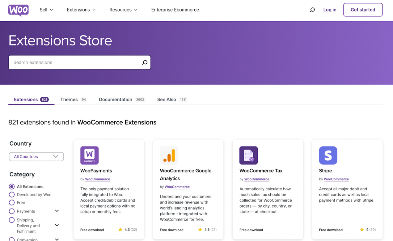
You can search the extensions catalog based on ecommerce data analytics categories like Conversions, Store Management, and more. Alternatively, you can use the search function to look for an ecommerce analytics tool using keywords.
For example, if you search for “analytics,” you’ll discover the WooCommerce Google Analytics extension. This tool enables you to leverage Google Analytics to study customer behavior and measure results for key performance indicators. Plus, it’s completely free!
Alternatively, if you want more advanced tracking features, you might consider WooCommerce Google Analytics Pro. If you would prefer daily custom updates about your store, you might try the WooCommerce Sales Report Email extension.

If you’re looking for additional WooCommerce tools, check out this comprehensive list of extensions for new WooCommerce stores.
Techniques for improving your online store
↑ Back to topAs we’ve discussed, you can use ecommerce analytics to optimize your store and increase profits. But that’s only part of a strong overall ecommerce strategy. There are some other simple growth techniques that you won’t want to overlook.
Following best practices for search engine optimization
For instance, ecommerce businesses can benefit from prioritizing search engine optimization (SEO). This is a subset of search engine marketing that’s focused on the practice of refining your web pages (and your site as a whole) so that they have a better chance of appearing in search results. And appearing in more search results is pretty much the entire game when it comes to generating more organic traffic.
Search engines have highly-advanced algorithms, and they ultimately prioritize a safe, positive user experience for searchers. Therefore, it primarily focuses on quality, performance, and relevance.
So you’ll want to ensure that everything on your website is top-notch in terms of quality. This helps with more than just results on search engines, though…
Improving customer trust (and conversions) with a strong brand presence
Providing a memorable, enjoyable shopping experience is largely influenced by having a strong brand personality.
This will include basic elements like a logo and color palette. But it should also involve more nuanced aspects, like paying attention to the tone and voice of your brand.
To further support a positive shopping experience, you’ll want to make sure your product pages are attention-grabbing and efficient. It’s a good idea to take professional product photos, since people care a lot about what products look like.
Improve your store’s performance
As mentioned earlier, performance is also crucial if you want to improve your store’s visibility. With that in mind, you’ll want to make sure all your web pages and interactive elements are running smoothly. Your website should also be mobile-friendly, so customers have a positive experience no matter what type of devices they’re using..
If your store is built with WordPress and WooCommerce, you should consider using Jetpack Boost to improve performance.

This tool can help you automatically optimize several elements of your website, including images, JavaScript, and mobile-friendliness. Learn more about speeding up your WooCommerce store.
Powerful data, simplified for growth
↑ Back to topWhen you have powerful ecommerce data and actionable insights at your fingertips, you’ll be able to understand customer behavior, maximize sales, and grow your store. And if you’re using WooCommerce, this is straightforward thanks to the built-in analytics dashboard.
You can start by keeping track of basic ecommerce data like net sales, average order value, and products returned. After that, it’s useful to check out your top-performing products, categories, coupons, and even customers. When taking into consideration all of these key metrics, you’ll be better equipped to modify your marketing strategies, product inventory, and even your coupon strategies.
Once you have a grip on ecommerce analytics essentials, you can move on to even more advanced analytics extensions — like Google Analytics — to continue your growth and explore deeper into data sources!
Are you looking to expand your toolkit to further grow your online store? Check out the complete catalog of WooCommerce extensions!

About


Hello! I am so excited to have discovered this awesome blog site!! I am looking to expand my knowledge with eCommerce and i know all of the information you provide in the blogs will be enlightening and helpful for me! I’m looking forward to implementing the ideas, tips, and insight to be gained from being subscribed to wooeccomerce. Thank You all!
Great to have you here, Deja.