Your mobile shoppers need a tailored experience. The layout that looks perfect on a desktop often feels cramped on a small screen.
A clunky mobile interface destroys conversion rates. If elements overlap or text becomes unreadable, customers will simply leave.
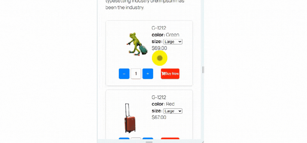
This feature ensures your variation table looks flawless on mobile devices.
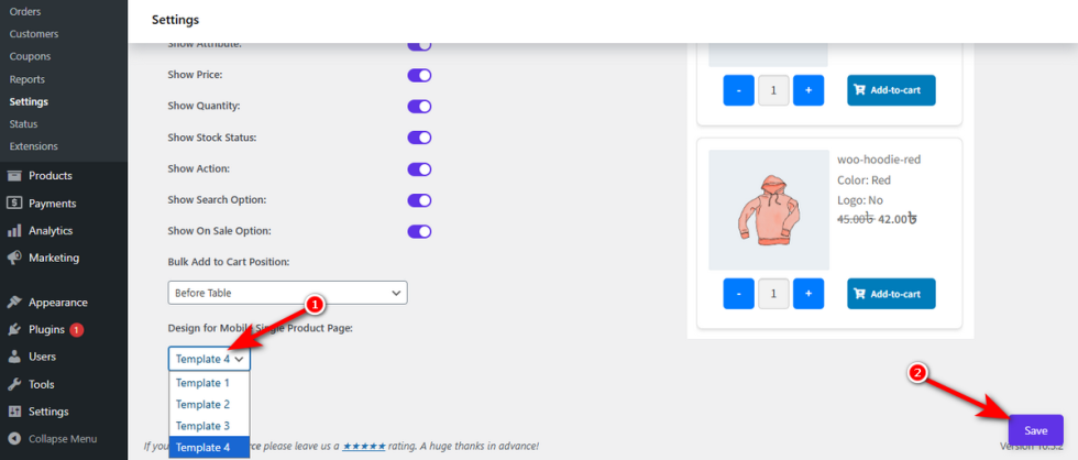
Find the “Design for Mobile Single Product Page” dropdown. Select the specific template from four templates that creates the best mobile shopping flow, such as “Template 4”.Click the ‘Save‘ button at the bottom right.
Test your product page on a mobile device to confirm the new layout.