Everyone who shops online does so a little differently. We make decisions at our own pace, use different devices, and interact with stores in ways that feel most comfortable to us.
For some shoppers, the process of viewing or buying a product is vastly different than you might expect. Their internet connection may be slow due to living in a developing country, they may rely on a screen reader due to visual impairment, or they may navigate with a keyboard due to the inability to reliably use a mouse.
These differences create the need to design and maintain a store that is accessible for everyone. That’s the goal of accessibility for eCommerce: creating an online store that everyone can use, no matter their age, skill level, location, or presence of a disability.
Today we’re going to take a look why you should make your WooCommerce store more accessible, and some resources you can use to improve its design and functionality for all your shoppers.
Ready to learn? Let’s start with a closer look at what we mean when we talk about accessibility.
eCommerce accessibility: what it is and why it matters
↑ Voltar Para o TopoThe World Wide Web Consortium (W3C for short) says that “accessibility means that people with disabilities can use the [internet].” Their Web Accessibility Initiative (WAI) introduction elaborates:
Web accessibility encompasses all disabilities that affect access to the Web, including visual, auditory, physical, speech, cognitive, and neurological disabilities.
A customer’s ability to access or use an online store could also be affected by external factors, like the speed of their internet connection or the availability of computer hardware. It may also be affected by temporary factors, like a broken arm or incorrect glasses prescription, or aging.

Whether you are developer, store builder, or store owner, it’s your responsibility to ensure that everyone can use your store effectively. This doesn’t just make your customers happy: as the W3C demonstrates, it can have very real impacts on your profitability, search engine visibility, and long-term ROI.
Accessibility involves a lot more than just adding alt text to images and optimizing your store to load quickly. So you can better understand, let’s take a look at how different some of your customers’ online experiences might be.
Exploring the vast differences between online experiences
↑ Voltar Para o TopoWhile we were in the early planning stages for this post, we had an eye-opening encounter with a WooCommerce customer who had contacted us for support. One of our team members asked the customer to send us a screenshot of an error. They couldn’t, and gave us the reason:
We are blind, the computer reads to us.
This particular customer had built their entire store with a screen reader and other assistive technology. They then interacted with WooCommerce their customers, and our support team through the use of audio.
This was a forehead-smacking moment for our support team to be sure. But it was also a fantastic reminder to build accessible stores — because if a blind individual can build a usable store with a screen reader, those of us with full or partial sight should be able to build a store that is usable with screen readers.

Beyond screen readers, there are customers who can’t use a computer mouse, perhaps because of a physical disability. These shoppers navigate websites with their tab and arrow keys and “click” links with the enter key.
There are also shoppers who need help placing an order. Some customers simply feel more comfortable providing their billing information over the phone. Others can’t see or use the online order form. And others only have access to technology that won’t reliably support online ordering.
This is just a sampling of the many ways that different people use the internet and shop online. The multitude of backgrounds, experiences, and devices ensure that we all do things a little different… and create the need for stores that work for everyone.
The first step to a more accessible store: trying what you already have
↑ Voltar Para o TopoWith a better understanding of the importance of accessibility, you might be asking “how do I know if I’m accessible or not?”
The first thing you should do is try using your store yourself. Put yourself in the shoes of a shopper with color-blindness, the inability to use a mouse, or poor eyesight.
As you browse through your store, do you notice any images or buttons that might look strange without full color perception? Can you use your keyboard to navigate, or is it a tedious process? If you increase the zoom to 150% or more, is your store still usable?
Depending on the media in your store, you may find some concerns there as well. If you have product videos, do they have subtitles? Do your product descriptions say what a shirt feels like (texture-wise) as well as what color it is?
You can often find weak spots by simply slowing down and paying attention. These weaknesses are often easy to fix — for example, changing a button’s color or pushing your navigation higher on the page — but they require a willingness to live your life, even temporarily as a differently-abled person.
Use real shopper feedback, free online tools, and official resources to improve your store
↑ Voltar Para o TopoOf course, unless you have a disability, are underprivileged, or are in another situation which prevents you from using an online store in a typical fashion, it can be difficult to know exactly how you are challenging your shoppers to do even simple things.
We encourage you to use — and perhaps even actively solicit — real feedback from shoppers to learn how you can make the process of accessing your store easier. Getting this feedback can be difficult, but if you actively ask for it (say, in post-purchase emails?) it will come with time.
You can also try a service like UserTesting.com or work with a local agency that offers testing to collect feedback, although you’ll want to ask about accessibility specific tests first.

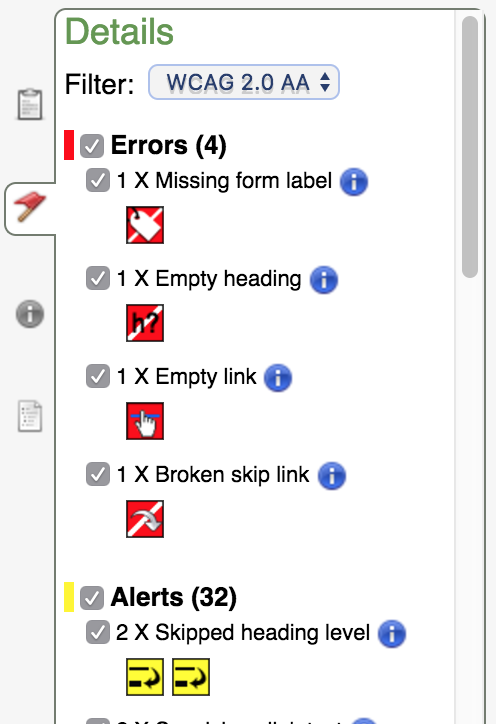
One free tool we recommend is WAVE, the Web Accessibility Tool. Plug any URL into this tool and you’ll be presented a list of errors and alerts that could present a problem for shoppers, ranging from missing alt text (necessary for screen readers) to broken or empty links (just bad design in general).

WAVE also provides documentation for each error or alert, so you can read up on why something has been flagged and decide how to address it.
Specifically on the visual side of things, you can try Vischeck to simulate what a website looks like with color blindness, or use ACTF aDesigner to check your store’s content for compatibility with tools like screen readers.
For speed testing — since slow internet connections can impact the experiences of those in developing countries — we recommend Pingdom, which will both test your store and provide detailed recommendations for improving it. There are also a handful of good tips in this post, which deals specifically with optimizing WooCommerce.
Finally, if you’re based in the United States (or selling to customers residing there), you can skim the government’s Section 508 Standards for Electronic and Information Technology. These standards (particularly those in section 1194.22) provide requirements for accessible technology like websites, including alt text, items being viewable with color blindness, and alerts for timed responses.

It’s not all about the store: remember accessibility when you’re working with email, social media, and more
Much like the example we gave above of the blind WooCommerce customer, it’s crucial to remember how differently each of your customers interact with you. But accessibility goes beyond the pages on your store — it encompasses your entire online presence.
Any time you are responding to emails, sending out marketing messages, or posting tweets, you are interacting with customers who access the Internet in very different ways. Think about:
- Email communication — Are you including a plain text version of your emails? How about a “view online” option? Most clients will generate both of these by default.
- How you support your shoppers — If you normally ask for a screenshot of an issue or a photo of a defect, consider offering alternate options. For example, we allow WooCommerce customers to create temporary logins so we can check out issues ourselves.
- The requests you make, especially with links — Phrases like “click here” or “click the link in our bio” could be problematic not only for screen reader users, but those on a tablet or mobile device (who are tapping, not clicking!).
- How to make processes easier — Could you accept phone calls instead of emails? Orders in person or over the phone instead of via your store? Or, if you rely only on phone calls, what processes could you move online to help out customers with anxiety, etc.?
One final word of advice: don’t aim for “good enough”
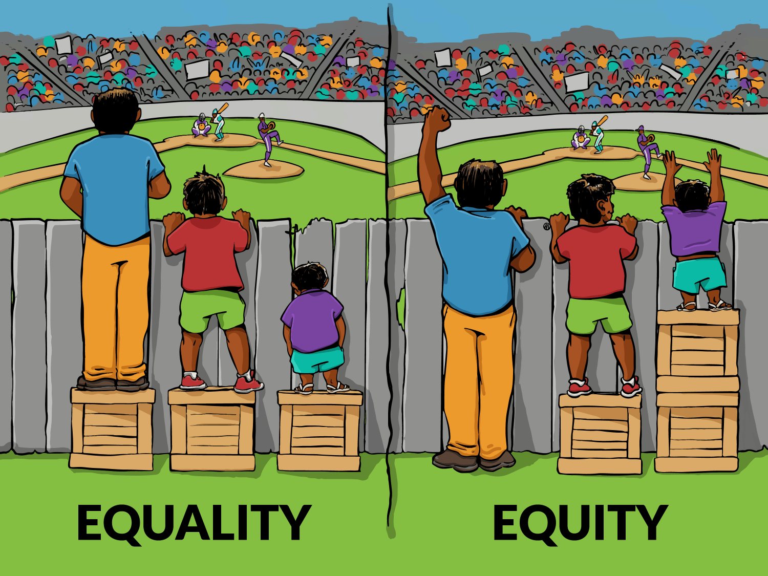
You may have seen variations of this image before:

It may be tempting to read a few tips on accessibility, try out your store with a keyboard or single online test, and call it “good enough.” But good enough isn’t really good.
Updating your store specifically to give differently-abled shoppers a better experience is admirable. But that doesn’t necessarily help the shoppers who have slower connections or devices with very small screens. That’s why we recommend making your ultimate goal to improve the experience for multiple kinds of shoppers, devices, and needs.
This goal even goes beyond accessibility, we think — it’s a broader goal of overall customer happiness. Think about it this way: what can you do to make every customer more likely to buy from you, whether they’re a blind user of a desktop computer or a fully sighted mobile shopper in a developing country?
You may have to make specific changes to your store just for those specific scenarios. But that’s why we think you should focus on equity vs. equality — because giving everyone what they need will make them much more likely to buy from you. 🙂
Here’s to creating a more inclusive shopping experience
Accessibility isn’t an easy topic to cover, much less learn about. We’ve done our best to show you why it’s important, but we recommend doing some additional research and reading on this subject. The W3C is a great place to start.
For now, we hope this post gives you some food for thought, and a few helpful tips or resources as you work toward a store that everyone can use.
Have any questions about any of the accessibility tools, tips, or ideas recommended in this post? Or any feedback of your own to give on this subject? We would LOVE to hear from you on this one — leave a comment below to get the discussion started.
Thanks for reading!
Header image credit: #WOCinTech Chat (CC)
About


I think the Equality / Equity graphic explains the difference, but it’s ironic since the people in the stadium paid to see the game and the ones by the fence did not. 🙂
Haha, I didn’t even think of that — my favorite field (Camden Yards in Baltimore) has fenced areas where paying ticket holders choose to stand in lieu of their seats when they want to stretch their legs or the games get good and they want to be closer to the outfielders. That’s where my mind went the first time I saw this 🙂
Nice post, Thanks for sharing Nicole
Cheers Mary 🙂
Great and useful informations! Good tips! And the fence comment is so right!
Very nice and informative post especially the way you’ve explained accessibility from the customer’s perspectives. Also, I’m much convinced with the idea of ‘Equality’ which brought all to the same level.
Thank you so much Nick! Really appreciate your feedback.
How to Use woocommerce on ECommerce Website please tell ?
Hi there — if you’re looking to use WooCommerce you’ll need to install it alongside WordPress. You can read more about the requirements to run WooCommerce and how to get it set up right here: https://docs.woocommerce.com/document/installing-uninstalling-woocommerce/
I hope that answers your question! If not, let me know how I can help 🙂
Thanks for sharing this- clear writing and strong tips & tools. I have saved this article and will make this a monthly review activity.
I just start using woocommerce and it has been a huge help! I highly recommend it
Hi Nicole,
This is a really interesting and informative post on online store. If possible, as you become expertise in woocommerce, would you mind updating a tutorial how can I install woocommerce without facing any issue.
Interesting article. I am currently using your Storefront theme and found a couple of issues. For example, there is no label for the quantity placeholder on my individual products and there are multiple form labels for the search bar.
Since these are basic elements in the theme, will you be going through the themes to find any errors and then have a new update?
I am no coder, and only barely figured out how to create a child theme, but it would be nice to know that the basic structure has good accessibility.
Angela — thanks for this feedback. We’ll give our designers a heads up on this, but if you’d be willing we’d love it if you could send a full list of the issues/accessibility flaws to our support team by opening a ticket with us. https://woocommerce.com/my-account/tickets/
Storefront is one of the themes we have tried to make more accessible, but given the limited reach and experience of our team, we’re always grateful for feedback like this to steer us in the right direction.
Also, if you need help creating a child theme, our support staff will be more than happy to point you to the right docs and resources there as well!
Interesting article. Disappointing that the images that were used to accompany it did not have any sort of ALT IMG text. I’m reading this from a developed country (Australia) but still have accessability issues (dial-up connection)due to my remote location. The only image that displayed was the picture of Nicole Kohler. The top of the page rendered in my browser like this:
WooCommerce
The most customizable eCommerce platform for building your online business. Get started today for free.
Navigation
WooCommerce
Showcase
Extensions
Features
Get Hosting
Documentation
iOS App
Meetups
WooExperts
Hi Tanya,
In taking a look at the WAVE report for this blog post (http://wave.webaim.org/report#/https://woocommerce.com/2016/11/woocommerce-accessibility-tips/) it looks like the first two images were missing their alt text when this was initially published. I’m not sure why that is when all the other images had theirs intact, plus the captions (which we add to every image, both for accessibility and commentary purposes) but I’m fixing that right now. Thanks for pointing it out. 🙂
Well done thanks for the technical details!
Improving accessibility opens up your business to anyone, no matter what device they use, language they speak, and regardless of their ability.
i have become a follower and reader of your articles i have you bookmarked cos i like you style of writing..thanks again Nicole
Too many websites have applications that “time out” and make it really hard for disabled users. Removing time limits on shopping carts, for example, is a big help.
I think you have made a great point here. Thanks
This is a great point indeed. Something to think about!
Another thought/question — are features like popups that typically require a manual close/removal and DON’T time out presenting accessibility issues for some users?
I think what Masha Wlnget said is true. Have seen such experiences myself…..
Thank you for bringing awareness to accessibility!
One of my previous jobs was for a very large pharmacy chain based out of Pennsylvania. One of my job duties was to constantly test our website for accessibility. My process started with code where I would text for W3C and Section 508 errors and make adjustments. With this, I also needed to discuss copy writing with marketing/agencies because they always used “click here” for every link, a big no-no. Tell the person where that link takes them! I also used the JAWS screen reader myself to make sure web pages and even PDF files read properly for people with disabilities. Finally, I worked with SSB Bart Group which provided tools and assistance for accessibility testing.
It’s a lot of work, but if you think of it as “What if I had disabilities, or a family member?” It can really hit home.
I still have to remind myself not to use “click here” when I include links (and sometimes forget, I’m sure) — not only for accessibility reasons, but also because you don’t “click” on a tablet or phone, you tap. That was a question I asked at one of my very first WordCamps (about “why not say click here?”) and I’ll never forget the proper schooling I got in response 😀
Great comment!
Wow! There are some key areas you mentioned in this post that I think would be so helpful. Thanks
You’re most welcome Ginny 🙂
This is very rich and detailed, thanks Nicole
You’re welcome Milo! Thanks for reading.
Very nice and informative post especially the way you’ve explained accessibility from the customer’s perspectives. Also, I’m much convinced with the idea of ‘Equality’ which brought all to the same level.
Muito interessante e informativo, adorei as suas dicas.
That’s interesting. For the last couple days I am getting a bunch of messages from customers that can’t access our shop page anymore. It seems that there is a problem to access it on a iPad / iPhone.
Is there anyone out there that can help us?
Thanks,
Karen
Hi there. Sorry for the delay in picking this up. If you still need help, create a ticket via your WooCommerce Account dashboard and we will take a looK!
Trending
Q&A with Claudia Pearson
By Vanessa Petersen •
How to migrate from Webflow to WooCommerce
By Brent MacKinnon •
How to write product descriptions for SEO, AI agents, and shoppers in 2026
By Vanessa Petersen •
Never miss a beat — join our mailing list
Please enter a valid email.
View our privacy policy. You can unsubscribe anytime.
There was an error subscribing; please try again later.
Thanks for subscribing!
Emails will be sent to
You're already subscribed!
Emails are sent to