Showcase products with Variation Swatches as Radio Buttons for WooCommerce by displaying variations as radio buttons with customizable colors, images, and labels.
Installation
↑ Back to top- Download the Variation Swatches as Radio Buttons for WooCommerce.zip file from your WooCommerce account.
- Go to WordPress Admin > Plugins > Upload Plugin and choose the plugin .zip file.
- Then install and activate the plugin.
Configurations
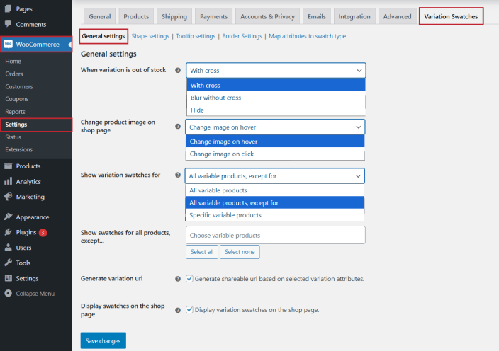
↑ Back to topWithin the WordPress admin panel, go to WooCommerce > Settings and click on the Variations Swatches. Here you will find the following settings.
General Settings
↑ Back to topClick on the General Settings tab to configure variation swatches for WooCommerce:
- When Variation is Out of Stock: Display out-of-stock variations with Cross, Blur, or Hide.
- Change Product Image on Shop Page: Set whether the product image is displayed on click or hover on the shop page.
- Show Variation Swatches for: Choose to display variation swatches for All Variable products or specific Products.
- Generate Variation URL: Checkbox to generate shareable URL links for variation and attributes.
- Display Swatches on Shop Page: Checkbox to display the WooCommerce swatches on the shop page.
Shape Settings:
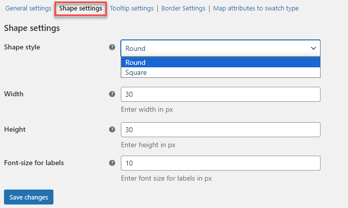
↑ Back to topClick on the shape settings tab to configure the shape of WooCommerce product variations swatches for the shop page.
- Shape Style: Set shape style of swatches, e.g., Round or Square.
- Width: Enter the width of the swatches in px.
- Height: Set the height of the swatches in px.
- Font size for labels: Adjust the font size in px for the labels.
Tooltip Settings:
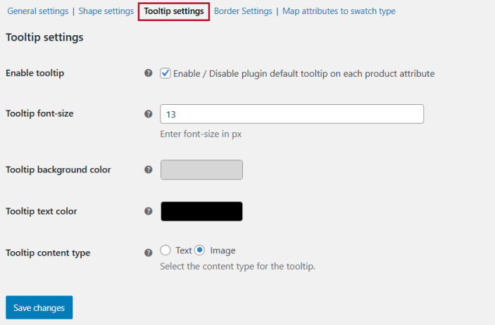
↑ Back to topYou can configure the tooltips of WooCommerce variation swatches in the Tooltip Settings tab:
- Enable Tooltip: Check the box to enable the tooltip on each variation attribute.
- Tooltip Font Size: Set the tooltip font size in px.
- Tooltip Background Color: Choose a color for the tooltip’s background.
- Tooltip Text Color: Select the color of the tooltip text.
- Tooltip content type: Select the type of the tool tip. Choose between Text or Image.
Border Settings:
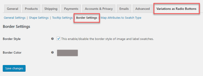
↑ Back to topClick on the Border settings tab to configure the WooCommerce swatches borders.
- Border Style: Enable or disable border style for images and labels.
- Border Color: Set the border color of variation swatches.
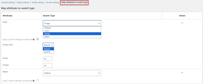
Map Attributes to Swatch Type:
↑ Back to topUnder the “Map Attributes to Swatch Type” tab, all created attributes will be displayed, and you can assign them to their respective swatch Type. You can also customize the shape and size of variation swatches for WooCommerce. However, it will only customize the shape and size of swatches on the product page.
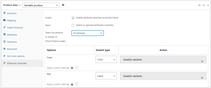
Product Level Settings – WooCommerce Variation Swatches for Each Product
↑ Back to topTo customize the WooCommerce variations swatches for each product, add a product or edit the existing one.
Then add variations and their attributes to create the variable product. Scroll down to product data and click on the attribute swatches tab to customize the product-specific variation swatches.
The priority of product-level settings for swatches is higher than general settings.
- Enable: Checkbox to enable the WooCommerce product variations swatches at product level.
- Reset: Checkbox and update the product to revert the settings to general attribute swatches
- Select the attribute to display on Shop/Category pages: Select from the dropdown which attribute you want to display on the shop page. You can also choose All Attributes to display multiple attributes per product (if available).
Below these settings, you have the table to customize the swatch type. Also, a checkbox to apply custom settings for the swatches and personalize the WooCommerce variation swatches plugin. You can set the shape style, width, height, and font size for the labels at the product level.