 Hi my name is Greg Douglas. I am the Creative Director at Premium Interactive based in Los Angeles, CA. This is a case study for www.edwinpireh.com.
The Project
Based in Melbourne, Edwin Pireh specializes in designing hand-made, premium quality, luxury silk ties and scarves. The challenge in designing and developing this website solution was to take the inspiration given to us by the client and establish an upscale, luxury online brand with a unique and customized UX design without compromising the responsive nature built into the WooTheme we selected. To capture the essence of this premium brand we felt the theme that best fit our needs was the “Athena” theme. We felt the homepage could be customized to reflect an upscale brand and the shop page template would be the right fit for achieving our goals for creating a unique shop UX design.
When I am developing from a pre-built theme I see the entire project as a series of additions and subtractions. I am working back and forth from commenting out elements that will not be needed for this customization to sometimes writing my own code or searching through past WooTheme forum posts to see if someone already solved the same challenge I now face. For the Edwin Pireh, Athena customization most of the challenges I faced centered on the WooCommerce components, How to first customize my shop pages and then secondly how to prepare my mobile specific .css to display the site as intended for phone viewing. In this case study I will focus specifically on how I solved some of these challenges. And give a peak at my design process and coding technics for responsive WooThemes based website design that I used to customize Athena into a premium silk accessories ecommerce website. The screen shots of Athena before and after my customization appear below.
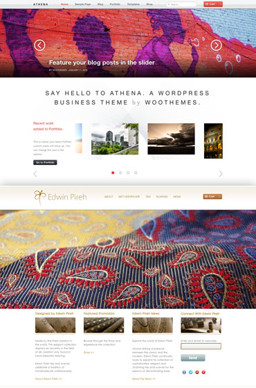
The Design Phase/Prepping For Development
The first thing I would like to share is a little bit about my design process. In designing my customized WooThemes sites I like to start by taking screen grabs of the template site from woocommerce.com. And then open these screen grabs into Photoshop and design my project homepage, WooCommerce and tertiary pages in one, two, three or more master files. To design my custom site for Edwin Pireh I used screen shots I took of the Athena WooTheme home and shop pages; and proceeded to set my guides around how Athena has been developed by the WooThemes team. For me setting guides gives me the initial structure or a loose map to follow as I move the guides to create my unique customized theme UI. From these guides I am able to design down to the pixel how I want the theme to be customized; which will in turn determine how my site gets developed/coded.
I have found that there are many benefits to designing in this way but for this case study I would like to share one specific example of how this design approach helped me get the scaling right for my home page, 100% width slider area. As pictured below you will see a portion of the guides I set for my customization of Athena…
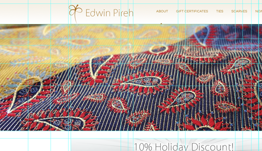
After determining in my design in Photoshop that the desired affect I wanted for this customization was to make the slide always appear at 100% width. The first thing I did was in Google Chrome I right clicked on the demo site and viewing the source code. From doing this I was able to identify the code that controlled the slider width. I found that if all I did was change the width of the slide-media img from “auto” to “100%” then it resized the slider automatically regardless of how big the browser was open too. So using the guides I set in Photoshop I simply copy-layers-merged after selecting just the slide area within my guides and then pasted the copied area into a new image and then scaled it proportionally to create the perfectly scaled slider images. This way when I imported the images into my site and changed the code in my custom.css file for the slide area from “width:auto;” to “width:100%;” the slider area would always scale proportionally to look good in larger browsing experiences as well as on mobile devices, like so…
#featured-slider .slide-media img {
 display: block;
 margin: 0 auto;
 width: 100%;
}
This is a detailed process of designing and developing but the rewards are often stunning and as you can see above with just a little extra focus and planning in the design phase sometimes you can find a really elegant solution that only requires a change in one line of your .css to create a big visual design change to your theme customization.
Customizing A Theme Shop Page
Now let’s turn our attention to the shop template page and discuss the solution I created to customize Athena’s shop template.
Once again I started by doing a screen shot of the Athena shop page and set guides in the file. From here I was able to design the look for my own shop page with this page as the template.
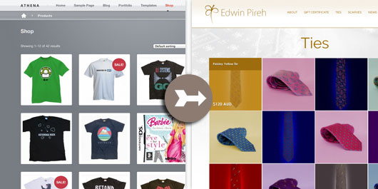
Once I established the exact scale and spacing for my shop page thumbnail sizes, this would let me know what sizes I would need to set for my thumbnails as well as give me a guide for which code I would need to change within the custom.css code to control the content margins and spacing between the shop thumbnails.
To change the size of the shop page thumbnails themselves I simply navigated in the dashboard to WooCommerce/Settings and clicked on the “Catalog” tab. From here I scrolled to the bottom of the page and changed the width and height for my Catalog Images to reflect the size I needed which in this case was 230 width x 230 height. Note: It is important to remember here that each time you save new sizes for your Catalog, Product Images or Thumbnails you will need to run the “Regen. Thumbnails Plugin” to fix the blurriness that can occur when you change and save the new sizes.
Once I saved my new Catalog image sizes I still needed to control my margins as well as the rollover customizations including colors and spacing. The code I added to my custom.css is as follows…
ul.products {
 margin-left: 2% !important;
 float: left;
}

ul.products .product:hover .product-hover {
 background: rgba(158, 108, 13, 0.6);
 text-shadow: 0 0.15em 0 rgba(0, 0, 0, 0.8);
 width: 229px;
}

ul.products .product:hover .product-hover a {
 background-color: #9e6c0d;
 padding: 1.327em 1.327em .327em 1.327em;
 width: 194px;
}


ul.products .product {
 width: 24.5%;
 background: #ffffff;
 margin-right: 0;
 margin-bottom: 0;
}

ul.products .product img {
	height: auto;
	padding: 0;
	display: block;
	border: 1px solid #ffffff;
	background: white;
	margin: 0 auto;
	-webkit-border-radius: 0em;
	border-radius: 0em;
}

ul.products .product:hover .product-hover .price {
	width:50%;
}

ul.products .product .title {
	text-shadow: 0 0.15em 0 rgba(0, 0, 0, 0.8);
}
And here is a link to the finished “Ties” shop category page showing you an example of the finished customized look.
Mobile Specific Shop Page CSS
Of course in today’s web more and more users are visiting their favorite sites on their mobile phones. And WooThemes has been great in staying in step with web trends as they have evolved by not only offering really excellently executed responsive themes but also making it easy to alter the custom.css file. Each of the WooThemes that are responsive come prepackaged with a line of code in the custom.css file that will allow you to add styles that will only be applied to the desktop layout or conversely only the mobile viewing of your site. This line of .css is
@media only screen and (min-width: 768px) {}
or if you prefer you can change it to
@media only screen and (max-width: 768px) {}
For my purposes when coding Edwinpireh.com I chose to use the @media only screen and (max-width: 768px) {}, allowing me to focus on the desktop customized code first and then repurposing some of my desktop specific .css to respond to mobile phone devices within my @media only screen specific .css second. Within this area of my .css code I was able to add needed .css that changed the way the site is viewed when a user visits my site in a mobile browser.
In the case of my shop pages for edwinpireh.com the challenge I faced was changing the .css I added in the custom.css file so that the Catalog of ties and scarves would appear neatly in two columns when viewed on a mobile phone rather then four as designated for the desktop browsers. Below is a screen shot of the finished mobile version of the shop pages when viewed on a phone…

… The way I approached changing my code for this site was actually quite similar to viewing the source code for my desktop .css changes. I simply viewed the source code after resizing the window down to about phone size to see how squeezing the page affected the layout. From here it was just a matter of making adjustments in my @media only screen and (max-width: 768px) {} section within the custom.css file, saving my changes and viewing the results in my mobile browsers until I was able to dial the site in to display precisely as I intended.
Below is the changes in the code that I needed to make in the @media only screen and (max-width: 768px) {} .css that allowed my Catalog of products and their rollovers to appear as intended on mobile phones…
ul.products {
	margin-left:0 !important;
}

ul.products .product {
	width:50%;
	background:transparent;
	margin-right:0;
	margin-bottom:0;
}

ul.products .product:hover .product-hover .title {
width:125px;
}

ul.products .product .title {
width:125px;
}

ul.products .product:hover .product-hover a {
width:125px;
padding: 1em 0 .327em 1em;
}

ul.products .product:hover .product-hover {
width:140px;
}
The main things I would like to make note of here are the locations in which I needed to make changes to the widths or change the margins and padding for the .css that had been written for the desktop specific viewing. For the ul.products .product all that was really needed was to overwrite the “width: 24.5%;” for the desktop viewable experience with “width:50%;” when it was to be viewed on mobile. From there it was just a matter of making sure the rollovers, margins and padding were set for phone viewing and then I had it.
Wrapping It Up
Many of the other detailed cosmetic changes I made across Athena in order to create this unique WooCommerce customization were executed the same way that I described for my shop pages… I started with a screen shot of the page I wanted to customize, set guides, designed my custom look in Photoshop and then viewed the source code out on the live version of the site in order to target the .css that I would need to change in my custom.css file.
It was a pleasure for me to write this brief case study for you about a few of my solutions customizing the responsive Athena WooTheme with WooCommerce. Feel free to post any thoughts or questions below or if you would like to contact me directly you can reach me at premiuminteractive.com.
About


Wow, thanks!
Glad someone finally chimed in on this excellent post! Blown away, nonetheless!
Sorry it took me this long to say WOW, and thanks. This post was really helpful and useful. Thanks Greg! Great design and development pointers.
Thank you rbest! I appreciate the encouragement. Let me know if you have any questions and I will do my best to answer.
Excellent work on customising the theme. One of my reservations with wordpress is getting stuck within the theme framework and the struggle to make the website appear unique and not simply a theme or template. You have done a very good job it is hard to tell the site was built via the wootheme just by looking at it.
Thank you Adam, I know where you are coming from. I started with the same reservations which is one reason I really like working with the WooTheme framework. The initial structure is there for us to start with, but they make the entry point into their WooTheme customizing an easy step by giving us the custom.css file in Dashboard/Appearance/Editor. I found that being able to edit and write my own CSS there to override the style.css helped me practice customizing themes one small step at a time; to ease into being the WordPress website developer I am today.
News
Ver todosStripe’s Agentic Commerce Suite launching with WooCommerce support from day one
By Jay Walsh •
WooCommerce integration with Mastercard accelerates digital acceptance for EMEA ecommerce merchants
By Jay Walsh •
Reddit for WooCommerce: Bringing high-intent shoppers to your store
By Jay Walsh •
No te pierdas nada: únete a nuestra lista de correo
Introduce una dirección de correo electrónico válida.
Consulta nuestra Política de privacidad. Puedes darte de baja en cualquier momento.
Se produjo un error al suscribirse. Inténtalo de nuevo más tarde.
¡Gracias por suscribirte!
Los correos electrónicos se enviarán a
You're already subscribed!
Los correos electrónicos se envían a