A case study by Ben Collier, on developing a site for some close friends wanting to sell reusable coffee cups… with a difference.
With the current market for reusable coffee cups saturated by cheap plastic moulds – Two surfing friends decided they could do better job and developed a high end, glass alternative focusing on sustainability and design. After over a year of meticulous product development the finished product was ready to market.
Talented designer, Jimmy Gleeson was enlisted to create all aspects of their branding and packaging, including the design of an ecommerce website. My role was to bring the design to life and develop a website that was functional from the front-end through to the back-end. Enter WooCommerce.
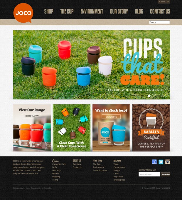
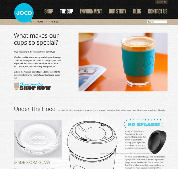
WooCommerce Customisations
On the surface the website is your standard blog/business/ecommerce setup. But as with every project, some curve balls were thrown in by the client throughout development.
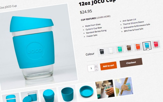
One of the more challenging requests was to configure multiple images per product variation. I initially hacked together a solution using Advanced Custom Fields and toggle techniques with Jquery & CSS but struggled integrating with some of the core WooCommerce functionality. I trawled through the forums but decided to reach out to a Affiliated Woo Worker to get expert assistance.
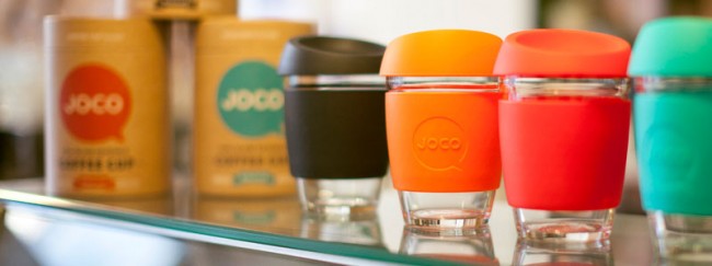
I was encouraged by the positive response and within 24 hours had James Kemp scope the work and estimate the hours required. The solution put together integrated perfectly and was exactly what I had envisioned. James has now released the work as an extension for the public. The Variation Swatches and Photos extension was also used to replace the colour swatch options with images of the different cup colour options.
Building Blocks & Plugins Used
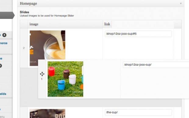
A lot of work was put into the templates to enable total administrative control over the frontend and it’s content. Feature slides, banners and custom aligned images we’re all configured using the Advanced Custom Fields plugin. In my opinion there is no better tool to work with when developing these CMS features.
Being a new business, contact forms were an essential part of the site. The Gravity Forms plugin makes the contact form development a breeze. From creating a form in the backend to styling it on the frontend the plugin saves you countless painful hours.
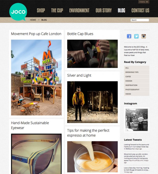
The blog section uses Jquery Masonry to dynamically positions posts as well as WooDojo to spit out Instagram & Twitter feeds from the brand.
Ongoing Challenges
Overall the feedback from the public and the initial orders have been really positive. But we’re still experiencing our fair amount of challenges as the website continues to evolve.
- Pay Pal – As Elliot Stocks blogged about, Pay Pal has been challenging to work with for the client. From getting their account approved to interface confusion, nothing has been easy.
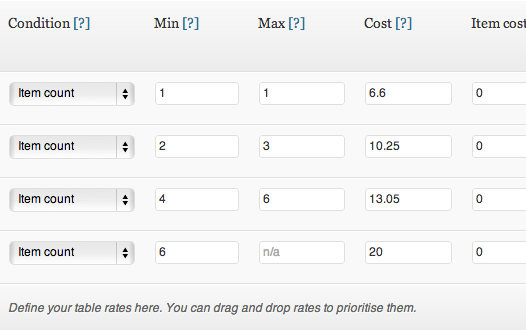
- Shipping – Configuring the shipping cost structure for around the world and keeping things simple for the end user has required a bit of configuring. The WooCommerce Table Rate Shipping had been a must-have plugin for this.
- Website Traffic – The initial conversion rate of the website has been high but the low amounts of traffic have made sales challenging. This will obviously build as the brand grows but it has been an initial challenge.
- SSL & Quickbooks Integration – The guys use Quickbooks for backend order and inventory management. There is a great plugin for communicating with WooCommerce but we are yet to fully configure this part. Main issues have been around SSL & matching offline Quickbooks configuration.
- Hacker Attack – Strangely the site has been the target of a common WordPress hacker talked about in this forum topic. The attack only disrupted the site for around 2 hours but caused some expected panic from the business. The loophole is currently being investigated but is thought to be from an insecure database password.
About



This design is sweet! I love the color scheme and vivid photos. By chance do you know what theme was used as a basis?
The theme has been built from scratch using the good old Sandbox (http://www.plaintxt.org/) as a starter
The design and colors are really attractive 🙂 a great case study
Very we’ll done! I’m going to have to order some of these cups for the rocketgenius (creators of Gravity Forms) office.
Just tried purchasing 8 cups for the rocketgenius office but it appears they don’t ship to the United States just yet. If anyone involved with Joco can gt in touch I’d love to arrange making a purchase.
Hey Carl,
Thanks for the props! The guys definitely ship to the US – just need to set it up for 8 cups… current limit was 6. Will shoot you an email shortly once the guys let me know who much to charge.
Boom, business happening! 😉
Suzy at Joco ended up getting in touch with me via email. They had not added shipping rates for the US yet so I couldn’t place the order. She added rates for the US and I was able to place my order for 10 mugs. Everyone in the rocketgenius office will be getting one.
Heh. One of my clients, W. A. Stark, had frontpaged Reddit in several subreddits awhile back and did not have shipping rates setup for anywhere but the United States. They now ship globally, after a Google Hangout meeting with me, where we went over global shipping through USPS and FedEx and setting those options up in WooCommerce.
Sometimes, I think, clients focus on where they’re from without regard to global shipping — they may think that nobody from a foreign country will buy from them or that its a major hassle to sell to a foreign country. Its ridicliously easy to set WooCommerce up to ship internationally, and most countries post services have apps to print customs forms, postage, and other required notifications on the box label from their website or a desktop.
They’re also my first client to use Gravity Forms for their contact form(s), which made me happy because I love to use Gravity Forms for intricate and complex forms in WordPress.
Glad the site is going down well, it was a pleasure to work on, the design and build are great!
Nice work on it James, glad to see some great work from our Affiliated WooWorkers!
The site looks broken ont the iPad.
Hey Rahul – The 100% header & footer widths was causing some layout breaks… I’ve added some media queries and set px widths so have another look and should now be pretty similar to desktop
The site looks great! As people said I love the colour scheme and photography.
One future modification I would love to see from WooThemes or a WooWorker is to have the option to show variations in the overall inventory.
For example if you go here: http://jococups.com/shop/
You can see that there is only one cup. But it has variations of different colours. An option would be to show all variations on the Product page. Also even variations have a separate URL but still linked to a hero product.
Simply an idea which could be expanded.
Overall love the site great job!
Chris
Great idea! I’d like to show all variations on the product page on my shop… WooThemes should release a plugin for that 🙂
Any plans for sizes other than 12oz?
Also, the pics load rather slowly. There is a noticeable pause. Optimizing them to low file size jpegs (from high file size png) should suffice for the web.
Bill – They’ve got a 8oz in the works so keep checking out the site.
It’s always a balancing act with web safe jpgs – because the product has so many minor details we wanted to make sure the images were crisp enough to highlight these… compressing any more takes away from this.
It amazes me how many product driven e-commerce sites have super-optimized images for their product pics that make the product look … cheap, inferior, gimmicky, pick a word.
I routinely have to tell clients who «did a photo shoot» before they signed on that their JPEGs sized to 800×600 are artifacted to hell and they need to redo the shoot, get a good camera, get a tripod and a light box, and send me the RAW files for processing. Most of them end up getting a professional photographer to do the shoot, which is great, but some… There can be a lot of «This, as well, does not meet the requirements.»
Optimising is not only about compressing. Mostly it is about using the right images (sizes in general).
For example; in Single Product Page:
http://jococups.com/shop/12oz-joco-cup/
Those 7 color-variation thumbnails are displayed as little as 42×42 pixels, BUT the images used are 1000×1000 pixels ~350k each and that makes only 1 of those 7-little thumbnails bigger than total of the rest of the images on the page.
It will be much more optimised to use small sized versions rather than fitting a large image in a small area…
btw, all those images are JPEGs, no PNGs, no transparency, etc…
Great job on the JOCO CUPS site! Really enjoying it – type, imagery, colors, textures – everything came together wonderfully. Pretty sure James Kemp’s extension will be getting some good use, too!
Great to see some fellow Melbournites being featured! Saw the Joco site a few weeks ago and loved the whole design and concept.
I’m sure traffic is on the up too – it’s just a matter of time and you’re going about it the right way. Keep up the good work!
Sprocket Networks
You really make it appear really easy together with your presentation however I to find this topic to be actually something which I feel I would by no means understand. It sort of feels too complex and extremely wide for me. I am looking forward in your subsequent put up, I’ll try to get the cling of it! Woothemes I like it.
This is the best website for anyone who desires to find out about this subject. You notice so much its almost onerous to argue with you (not that I truly would want…HaHa). You undoubtedly put a brand new spin on a topic thats been wrote about for years. Nice stuff, simply nice!
«One of the more challenging requests was to configure multiple images per product variation.»
– this is a major failing of Woo – multiple images are ESSENTIAL for succesfull ecommerce!
Very we’ll done! glad to see progress.
News
Ver todosStripe’s Agentic Commerce Suite launching with WooCommerce support from day one
By Jay Walsh •
WooCommerce and Mastercard accelerate digital acceptance for EMEA merchants
By Jay Walsh •
Reddit for WooCommerce: Bringing high-intent shoppers to your store
By Jay Walsh •
No te pierdas nada: únete a nuestra lista de correo
Introduce una dirección de correo electrónico válida.
Consulta nuestra Política de privacidad. Puedes darte de baja en cualquier momento.
Se produjo un error al suscribirse. Inténtalo de nuevo más tarde.
¡Gracias por suscribirte!
Los correos electrónicos se enviarán a
You're already subscribed!
Los correos electrónicos se envían a