This guest post was written by Nick Daugherty of Skyrocket Websites who has an impressive portfolio of clients and extensive WooThemes modifications.
To go along with the release of Canvas v4, the WooThemes guys asked me to write up a case study for some of my recent Canvas-based projects, which I’m absolutely thrilled to do.
My name is Nick, and I’m a full-time web designer from Los Angeles, California, USA. I’ve been a WooThemes user (and fan) since they first released the Vibrant CMS theme back in the dark ages of WordPress (2008 to be exact).
This post is all about TheButterflyCircus.com, which has been my most ambitious Child Theme modification to date.
So buckle up, grab a pencil, and put on your thinking caps. It might get nerdy.
Getting the Call

The Butterfly Circus is an award-winning short film seen now by more than 10 million people worldwide. It’s got an inspirational, heart-warming message about a man with no arms or legs who finds purpose and meaning in his life in the most unlikely of places a carnival sideshow.
The film’s creators called me late last year in a bit of a rush, because the film had been released and their website wasn’t quite ready. And they needed help. Fast.
We wanted to build it in WordPress, they told me. But we’e not sure WordPress can do what we want anymore. And now we’re stuck.
To Woo or Not to Woo
I’m always up for a challenge, and this sounded like a good one. So I jumped in the car and drove to their office in L.A. to see if I might lend a little assistance.
They had a very specific design concept for the website and wanted to make sure the site looked authentic to the time period. (Think 1930’s Great Depression era).
Another designer had actually started the project for them and ran up a huge bill trying to create his own custom WordPress theme from scratch, before getting frustrated and giving up.
My first decision as their new lead designer was whether to try and continue working with their existing code, or rebuilding everything within a WordPress theme framework I knew (and trusted) already.
A Canvas Child Theme
I opted to use the Canvas theme, and immediately created a child theme (using Magnus’ tutorial) to house the major styling/layout customizations that would be required. Then piece-by-piece, I extracted the graphical elements from the site, methodically adjusting the CSS and javascript until it looked right.
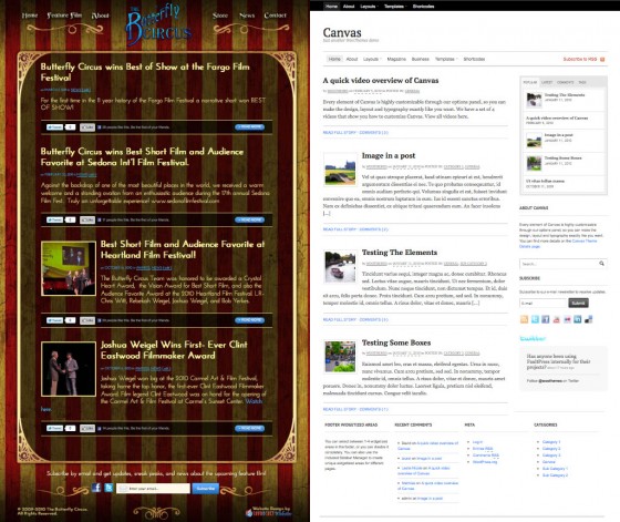
As you can see below, the Canvas theme looks vastly different to the end result of the Butterfly Circus child theme. These changes were a combination of overwriting the default Canvas element styling in the CSS, adding in some custom theme options, an animated homepage, and a few custom page templates.

The Ornate Frame, Circus Navigation, and Other Decorative Elements
My biggest challenge in developing the site was finding creative ways to manipulate the design using CSS only. For simplicity’s sake, I didn’t want to change the HTML or PHP code inside the Canvas theme’s default templates if I didn’t have to.
The Circus Navigation was accomplished by putting the logo in the Header Background Image box (under Header Styling) instead of the Custom Logo box (under General Settings) of the Canvas Theme Options.

Next, I created a custom menu (under Appearance >> Menus) and grabbed the IDs for each list item (using Firebug). That allowed me to add CSS position and background image elements for each item in the Navigation, and ultimately split the navigation in the center.

The Expanding Ornate Frame was central to the design, since it frames all the content for the site. This was tricky, since it required breaking up the frame into 3 parts:
- Top – the top of the frame hooks into the #main element of the page and uses a z-index call to keep it on top.
- Middle – this is the expanding part. It’s a repeating, semi-transparent black background that hooks into the #content element of the page.
- Bottom – this was the only part where
music downloads click Full Report software for download additional reading downloads
I had to add a new HTML element to the page. There were no viable CSS hooks to put in the bottom of the frame, so I made my own
and hooked it in with the woo_footer_top action hook inside my functions.php file. Finally, I added the CSS to call the background image and used a z-index call to layer it properly.
A Flashy Homepage Without Using Flash
It turns out that you don’t really need Flash to do some cool intro animations for your homepage. It’s totally possible with simple jQuery animations.
Don’t panic if you’ve ever animated a slide in PowerPoint, this is really similar. The trick is to work backwards.
Here’s how I did mine
- I created a custom page template called template-animation.php and added each of the HTML elements (mostly images) to the template.
- I positioned each of the images absolutely using CSS to put them into position.
- Once that was done, I turned to animating each element to either fade in or slide in.
- Using a little jQuery (in a file called homepage-animation.js) I broke up the animation into 5 phases that begin on page load. The syntax I used to make each element fade in looks like this: jQuery(‘#blueButterfly’).show().css({opacity:0}).animate({opacity:1},1200);
- Finally, I added a wp_enqueue_script call inside my functions.php file to call my custom animation javascript on the homepage.
Looks cool, huh? When you put it all together, it makes for a striking user experience.
Other notable additions/changes to the theme were:
- A photo scroller for the Cast page borrowed from the Object theme
- Google Font substitution throughout, we chose Josefin Sans since it provided the most authentic look and feel for the era
- A new custom page template for the Butterfly Circus short film
- Custom Post More section below each post, modified to show Facebook/Twitter buttons (using the built-in Woo Shortcodes of course).
- A custom footer widget for email signups that matches the look/feel of the site.
More Technical Additions: Custom Backgrounds
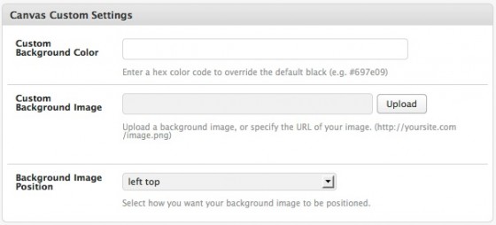
One of the client’s initial requests was to have custom background images for each page on the site. This seemed like a great opportunity to practice customizing theme options through a child theme.
After trying several options, I ended up with a custom metabox inside the WP page editor, like this:

Finally, I wrote a little function inside the child theme’s functions.php file to hook into the woo_head action hook, similar to the way the Custom CSS box inside the Canvas Theme Options works. (It dynamically puts your custom CSS inside the section of your theme’s header.php file.)
If you’re interested, there’s more on using hooks and filters in Mark’s tutorial.
E-commerce Facilities
Another major part of the website was having an online store where the filmmakers could sell copies of their DVDs directly to fans.
Being a follower of the guys over at WPMU DEV, I decided to use their new e-commerce plugin called MarketPress. I like it because it uses the built-in custom post types functionality in WordPress 3. No need for a bunch of messy MYSQL tables cluttering up the database anymore. Plus, it’s built to work natively with WP Multisite and BuddyPress, if you’re into that sort of thing.
MarketPress allowed us to create both internal and external (or affiliate) products in the backend, then quickly setup an entire store, complete with a shopping cart and custom coupons, by adding a simple shortcode to a WordPress page.

Now the filmmakers can sell DVDs direct to fans, as well as sell their soundtrack through iTunes — all the while keeping the user on the site, until it’s time to checkout (through PayPal Express Payments).
Other third party plugins
Like many other WooFans, I’ve come to love Gravity Forms. It lets me create advanced contact forms with multiple routing options in no time at all. The drag-and-drop interface is so intuitive a caveman can use it. Plus, it integrates nicely with Mailchimp and Campaign Monitor for email marketing.
We’re also using these plugins on the site:
- Analytics360 to pull Google Analytics and Mailchimp data directly into the WP dashboard
- Rank Tracker to show the filmmakers what keywords and position their pages are ranking for in Google
Conclusions
A few people have asked me why in the world I would start over on a project that was already halfway complete.
For me, the time and effort necessary to adjust the layout and graphical elements of a website is minimal compared to the time and effort (and hardcore coding knowhow) required to create a back-end framework that’s reliable, extensible, and easy for the client to use.
WooThemes’ code is written in a way that’s relatively easy to understand and modify. Plus, they’ve already done the heavy lifting with the WooFramework that powers the backend of their themes.
Finally, all the theme options, code hooks, and other goodies (like shortcodes) that Canvas gives me made it a snap to deliver a great-looking website in just over a week.
Things get a little nerdy sometimes, but with WooThemes you really don’t have to be an expert at HTML, CSS, PHP, or Javascript to deliver stunning results. However, I do recommend that you learn enough to be dangerous in each of these languages (in that order).
I think the best way is to start with a theme like Canvas and experiment with it. Get your hands dirty by playing with the code and let your imagination run wild.
Feel free to browse the site and watch the movie. Please post any questions you might have below, and I’ll do my best to answer them. And if you’d like to support the filmmakers, consider getting a copy of The Butterfly Circus DVD as well.
About


Awesome work 🙂
Wonderful work and beautiful effect! Thanks for such detailed post…many of your tips is very precious.
Thanks for sharing this. We’ve been a firm believer in Canvas and the same philosophy as it relates to starting over on a nearly complete site, coded by someone else, but with Canvas. I can honestly say the only time we didn’t do that ended up being a nightmare. We made the recommendation to the client to let us start from scratch with a new framework, rather than a mess of «customized» code but they felt that would be a waste of their initial investment. We should have passed on the job at this point, but we learned the valuable lesson of go with your gut, develop with what you know.
Excellent work and thanks again for sharing.
Thanks for the writeup… that is an amazing website and a great overview of how you bent canvas to suit your needs.
Well done!
Anyone with the Canvas Theme better bookmark this page everywhere they can. This is awesome!
This was a phenomenal job customizing the Canvas theme. I recently purchased the Canvas theme and I am going to lean heavily on this tutorial when customizing. Thank you for sharing generously.
useful…
Thanks.
Spectacular job!
How can I get a copy of the child theme ready to just plugin my own images for bg, logo, frame etc?
Your site is absolutely gorgeous. I am a total beginner using the Canvas theme for my own site – there’s no hope of anything so spectacular but this is an inspiration!
wow… feeling good about having just gotten my hands on canvas.. now for the «fun» part…
thanks for the inspiration!
ez
Canvas is awesome, look forward to seeing what you create with it. 🙂
Trackbacks/Pingbacks
News
Ver todosStripe’s Agentic Commerce Suite launching with WooCommerce support from day one
By Jay Walsh •
WooCommerce and Mastercard accelerate digital acceptance for EMEA merchants
By Jay Walsh •
Reddit for WooCommerce: Bringing high-intent shoppers to your store
By Jay Walsh •
No te pierdas nada: únete a nuestra lista de correo
Introduce una dirección de correo electrónico válida.
Consulta nuestra Política de privacidad. Puedes darte de baja en cualquier momento.
Se produjo un error al suscribirse. Inténtalo de nuevo más tarde.
¡Gracias por suscribirte!
Los correos electrónicos se enviarán a
You're already subscribed!
Los correos electrónicos se envían a