A rather confusing title I bet you’re thinking?
Back in June this year a freelance digital designer by the name of Bek, from Moscow, submitted a design to us called Olya. I had difficulty finding Bek’s full name (it would help if I understood Russian), or the meaning of Olya, but we loved the design submitted and were keen to develop it as a theme.
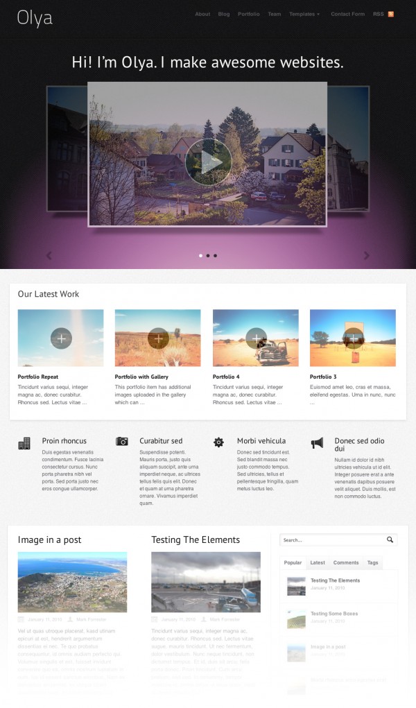
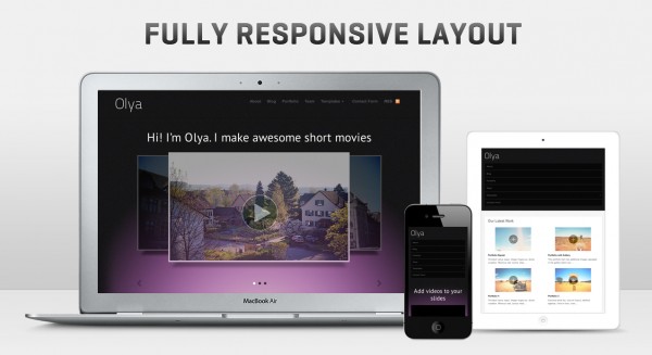
6 months later we’ve finally had the time to give it the TLC it deserves, and pack it full of useful features. Today we’ve launch this versatile AND responsive business/portfolio theme.
The homepage of Olya comes with a slider, powered by the FlexSlider script and it’s own custom post type. With some creative placements of imagery, videos and content (as you can see in the demo) the slider really can pull off quite a variety of tasks. All the while being viewed on most mobile devices. The homepage also allows you to display portfolio items, blog posts and featured content in “Mini-feature” modules.


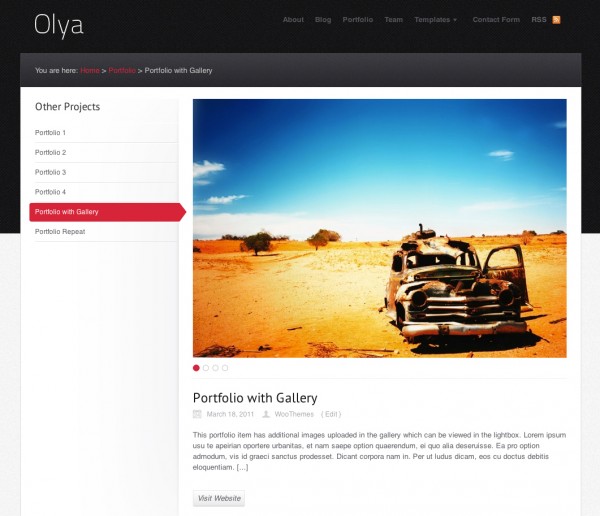
What also differentiates Olya from our other portfolio themes is it’s custom single portfolio post template. With a side menu to quickly navigate through individual portfolio items, and a tabber to get through imagery within a portfolio item.

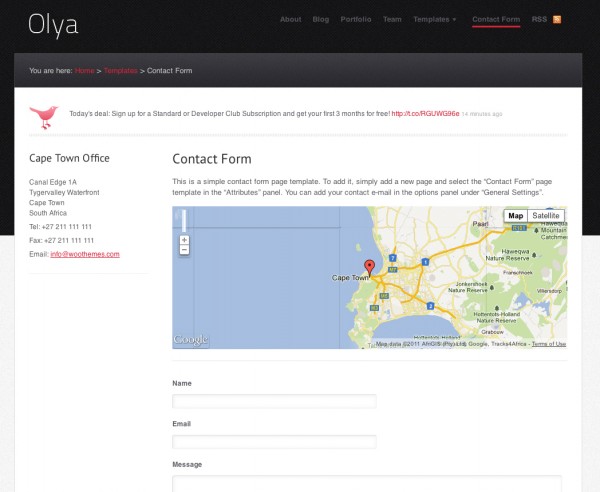
We’ve also ensured Bek’s vision of a slightly more custom contact page was developed in the theme. The contact page not only includes our standard contact form, but also the individual/company’s latest tweet, physical address and a Google Map showing the location.

Have a look at Olya’s complete feature set here or experience Olya in full on the demo before letting us know what you think.
About


let me preface this by saying I am a huge Woo fan — S0 then… I’m not sure this should be called a “business” theme and it reminds me of the uncountable similar themes on ThemeForest. Not very original for Woo, sorry guys.
Each to their own I guess, but this theme could quite easily be a business theme if you used the slider differently, if at all, to highlight services/products. Along with variations in the mini-features, widgetized regions or optional portfolio sections – all of which can be disabled.
well I’m loving the theme guys good work already using it in a project!
I´m sorry. This theme just doesn´t do it for me. I´ve never really liked sliders to begin with.
Having the mini features be used as a split between the portfolio and blog posts on the front page is also something I wonder why it is displayed like it is.
I like the team page and the change in design for the portfolio single. And overall the coloring and such. But the slider, the blog page and such isn´t my cup of tea.
Nice ideas though. Not the ordinary design with the usage of the images and such. I like that you are trying to move away from the ordinary style and design. But isn´t it just about time you started to remove the sliders?
I know I can remove the slider in the theme options. But so much of the design is focused on the slider it just doesn´t look as good without it.
Appreciate the feedback. You could easily move the small snippets of code in the index page to re-arrange the order of modules for it to flow exactly like you want, and as you said the slider can be disabled, still leaving it very slick looking in my opinion.
Indeed. I know it´s the simpliest thing in the world to move or edit to my liking. Sometimes when I buy a theme I just want it to work right out of the box 🙂
And I like the responsive design and those elements. Just that I´ve grown tired of seeing a big slider in just about every wootheme that is released.
Feedback is one of the things I can do 🙂 Now I just have to learn everything else in the busniess :p
Don’t forget, that you can easily disable the slider http://cl.ly/CjqA on all our themes if it doesn’t suit your project 🙂
I know I know 🙂
I´ve done it on my current page and will do it for when I change the theme to something completely different in the middle/late January(hint, it´s still a WooTheme but quite modified).
Hi, lads!
I quiet like it… it’s simple but thi’s ok. And I love the slider… I thins it’s a good move
Small annoyance when scrolling down the page to read the various content blocks, as the slider above is of various heights and so causes the entire page to bounce up and down.
I don’t know if there is a perfect way around this, unless forcing the slides to all be the same height.
But then people may complain about that. 😉
Beautiful theme, but the portfolio page is not resposible!?
Nicely spotted. I’ll release a fix in a couple of hours!
Thanks for reporting!
OK! And I have weird problems with Custom Typography options… it’s not the font sizes (9em), the fonts don’t appear right. Perhapy you can give it a try?
Could please post that one at the support forums? http://woocommerce.com/support-forum/
Thanks
I think it’s great. Looks really tidy, has a lot of excellent features and as per usual I am extremely frustrated that I don’t have a site to use it on right now!
I think you always need a list of site ideas ready to use our themes. 😉
I like this! I have client I’ll be showing it to this afternoon. Nice work Bek.
Gotta ask…Do you support LinkedIn on the Team Page? Fingers crossed.
Cheers
Steve
Not at the moment, I can add that for you though :). Check back in a couple of hours…
Great stuff guys.
I really appreciate the responsive designs. This is the way forward.
My dream would be all future Woo Theme releases are responsive 🙂
Every client I have now immediately views their site on their phone and wants it to look good on there first.
I hate to say it guys, but it feels like you’ve been phoning in the responsive themes a bit. I especially think the way some of the menus adapt to mobile devices needs some work. An excellent example of how a menu can be handled in a responsive layout can be found on Paul Boag’s blog: http://boagworld.com/ This method is much less obstructive to the content on mobile, don’t you think?
Most of the WooCommerce themes are nice, but the last few non-woocommerce themes (aside from the Wiki which seems pretty cool) feel rushed and not on par with your older work.
I’m not trying to be a jerk or anything, just giving some honest feedback. Still a big WooFan 🙂
Hi,
We think Boag’s blog is cool, but it eliminates pages of your navigation, which wouldn’t work for general use.
The last three theme releases have for us been the least rushed theme releases ever, where we’ve planned, developed, tested and finished the theme one week before release date. There is always room for improvement, but I hardly think these qualify as “rushed”.
We appreciate the feedback, just wanted to give my opinion on it 🙂
Magnus,
I honestly can’t pinpoint what it is about some of the recent non-WooCommerce themes that feels rushed. I think it’s mainly the way some of the menus adapt on mobile.
It might also be because in the past I haven’t installed and played around with themes as soon as they’re released, so I’m not used to the inevitable bugs that crop up when a theme is first unleashed on the public.
I can understand your point about the navigation since you guys develop for such a broad audience. Still, it would be nice to have a menu on a mobile device that doesn’t take up the entire display when you first hit the page. It just feels a bit cumbersome to me.
In any event, as always I’m a loyal Woo customer and I’m looking forward to what you guys produce as you continue to work in the mobile realm. If you haven’t already read it, I highly recommend Mobile First by Luke W. http://www.abookapart.com/products/mobile-first
Cheers! 🙂
The menu adapting on mobile looks perfectly fine to me and I would say rather not-rushed 😉 Obviously it would be cool to have a separate menu for mobile though, and maybe we can improve on that in the future.
All of our responsive themes adopt the mobile-first philosophy 🙂
That’s great to hear. Luke’s book and talks have really helped me understand the importance of mobile and are pushing me to broaden my thinking about web design in general.
Hope nothing I’ve said offended anyone, the reality is that whatever you guys push out is better than anything I’ve ever designed.
Working with your themes has been a huge help to me as a designer and a coder. Just thought I’d point out an area that seemed like it could stand some improvement in the future, that’s all. 🙂
I’m not if it’s on the cards, but I’d love to see Canvas go responsive… 😉
Nice theme, BTW.
It is on the cards, sometime soon I hope early in the new year. 😉
Super duper.
I think Olya is the best Woo-Business/Portfolio theme ever! Absolutely beautiful design and nice features.
Alright, someone for Olya! Thanks for the kind words David. 🙂
Well i like it – not necessarily for the design “as is” but for the features that come with it. Colour schemes, layout etc can all be changed, it’s the backend that i’m more interested in.
On a side note, it would be great to see backend functions made available as downloads, with instructions on how to integrate into themes. That way we could more easily make our own custom themes without having to rip-apart current themes and piecing them back together.
Overall I’m very pleased with the new responsive designs. The one area I would like to see improved is the menus. They become so dominant on mobile devices. Would it be possible to implement something like this jQuery Mobile Menu? https://github.com/mambows/mobilemenu
We are looking at improving the menus as we agree they are a bit dominant.
Over all work is smart, especially responsive design is very useful.
Trending
Why your store’s PHP version matters (and how to check it)
By Brent MacKinnon •
Accept Bitcoin with Square: A new way to take payments at checkout
By Dave Lockie •
What is branding? How to create a lasting ecommerce brand
By Mahrie Boyle •
Never miss a beat — join our mailing list
Please enter a valid email.
View our privacy policy. You can unsubscribe anytime.
There was an error subscribing; please try again later.
Thanks for subscribing!
Emails will be sent to
You're already subscribed!
Emails are sent to