A good navigation system helps customers find what they’re looking for quickly and efficiently, and improves the overall success of your store. In fact, your website only has a few seconds to grab a site visitor’s attention, so you better guide them to the information they need right away!
Even small differences in your primary navigation can significantly impact your customers’ ability to find products that fit their needs. If they can’t figure out what to do or where to go when they get to your site, they’ll quickly leave and shop somewhere else.
But how can you create effective navigation for your online store that increases sales and decreases bounce rate?
Navigation Menu Best Practices
↑ Back to top1. Use Clear and Meaningful Language
When it comes to your primary navigation menu, typically located in your website header, make sure your labels are clear and meaningful. A site visitor should know exactly which products are in a category or what information they’ll find when clicking on a drop-down menu just by reading the label. It may seem tempting to get creative with your wording, but that could just confuse your customers rather than enticing them to click.
For example, the primary navigation menu on fixjeiphone.nl is both clear and meaningful. You get a fantastic idea of what content or products will be on each page before clicking on a specific item.
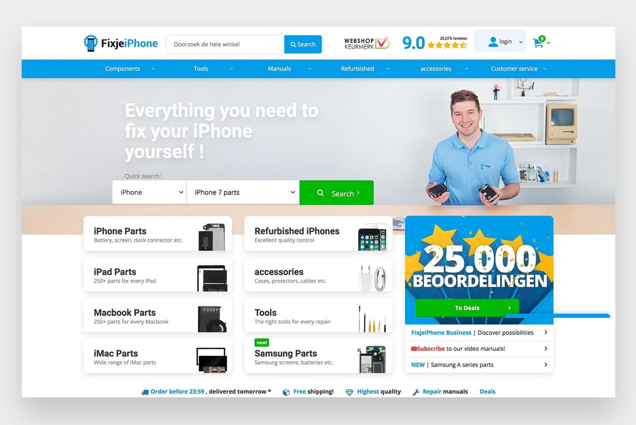
The items in the navigation menu are also directly related to the needs of FixjeiPhone’s customers. They know that people come to their site to buy parts or accessories, read phone manuals, or purchase a refurbished device. Each menu item is based off of those specific needs, so site visitors know where to click right away.
2. Make Top-Level Items Clickable
Some websites have top-level navigation items that only trigger a dropdown instead of also linking to a new page. But this can be confusing for website visitors, especially if they have trouble opening the dropdown for any reason.
If you list product categories in your menu, consider linking the top-level item to your primary category page, and include subcategories in dropdowns. This also gives users more options to find exactly what they’re looking for or browse entire categories.
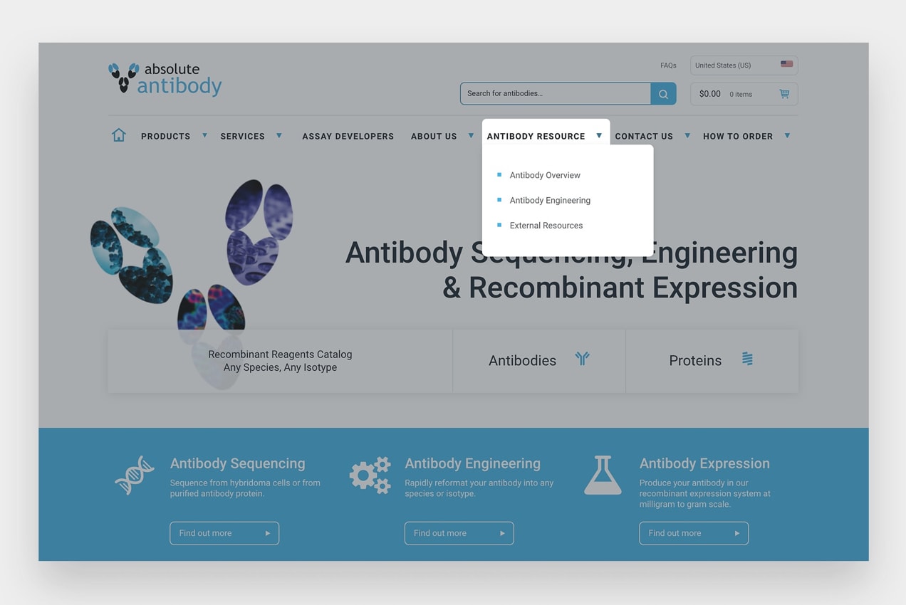
Absoluteantibody.com does an effective job of this. If you click on “Antibody Resource” in their main navigation menu, you’re taken to all of their information about antibodies. Or, you can click on more specific resources that are highlighted in the dropdown.
3. Add Dropdown Indicators
Absolutelyantibody.com and fixjeiphone.nl also implement dropdown indicators in their navigation menus.
Typically, dropdown indicators add an arrow next to each navigation label to show that the menu item expands. They help website visitors understand that there are more options available without having to hover over each individual item.
This is often an option in your theme settings, but you could also use a plugin like Menu Icons or edit your website code.
4. Stick to Standard Locations
Getting creative with your website design is a great way to stand out from the crowd. But if creativity causes confusion, you could lose both customers and sales.
It’s a good idea to put your navigation in a place where people expect to find it. Eye-tracking studies show that website visitors look at the top left of a page first. So keep your primary navigation in your header and put the most important items, like the home page, on the left side.
Users also look to the footer and sidebar for navigation. Consider linking to important pages in your footer, along with your return policy and terms. On your product and category pages, you might want to include a sidebar with links to related products, additional categories, and frequently asked questions.
While “hamburger” menus (which expand when customers click on a three-line icon) are great for simplifying mobile menus, they could be confusing on desktop computers.
Since the icon is so small, and usually tucked in the corner, it can easily be lost or overlooked by website visitors. It also doesn’t showcase your most important menu items and requires visitors to take one more step before finding what they’re looking for.
How to Use Breadcrumbs and Why You Should
↑ Back to topBreadcrumbs are secondary navigation systems that show a user’s location on a website. The name comes from the story of Hansel and Gretel, who drop breadcrumbs to find their way back through the forest. This method of navigation is especially helpful if you have a lot of pages or products.
A breadcrumb menu is usually showcased under your primary navigation, just above your website content. This makes it easy for your site visitors to utilize them without needing to scroll.
The Craft Can Directory website uses breadcrumbs to show their customers the page that they’re on and how to get back to their starting point. This allows them to go back just one page, or even skip several pages, without having to click the browser “back” button multiple times.
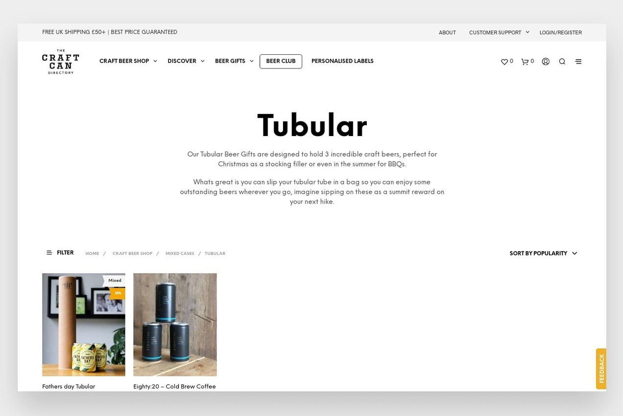
This is also useful when a shopper is browsing products or comparing items. If they want to buy a case of beer, but don’t like the options in the category they’re viewing, they can just click back to the Mixed Cases category to see other options.
Why Breadcrumbs Are Important
Breadcrumbs keep your customers from getting lost on your site. Without them, it’s much more difficult for someone to navigate back to previous pages or categories. Instead, a customer would have to click through your main menu again, search for a page, or use the “back” button.
Google also loves breadcrumbs because they help outline the structure and hierarchy of your website. Breadcrumbs can even be included in search engine results, which increases the chances of potential customers finding and clicking on your site pages.
How to Add Breadcrumbs to Your Site:
In many cases, breadcrumbs can be turned on in your theme settings. For example, the free WooCommerce Storefront theme has this functionality built-in for pages, products, categories, and more.
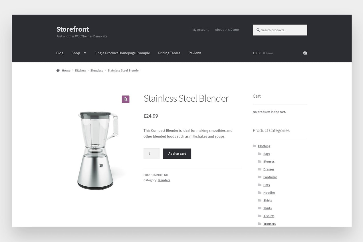
If your theme doesn’t include breadcrumbs or if you want to further customize them, there are two ways to add them to your site:
1. Use a Plugin:
There are several plugins you can use to turn on breadcrumbs with the click of a button. Jetpack, for example, allows you to use breadcrumbs on website pages, though not on product or category pages.
Each plugin will allow for different levels of customization, and setup will vary. For a full list of options, take a look at the WordPress plugin repository.
2. Add Breadcrumbs with Custom Code
To display WooCommerce breadcrumbs you can utilize the <?php woocommerce_breadcrumb(); ?> snippet to control where your breadcrumbs output.
You can also use filters and arguments to control things like the breadcrumb separator and the home text and link.
This custom argument will change the breadcrumb separator as well as the HTML displayed before the breadcrumbs:
/*
 Change breadcrumbs separator
 */
<?php
	$args = array(
			'delimiter' => '/',
			'before' => '<span class="breadcrumb-title">' . __( 'This is where you are:', 'woothemes' ) . '</span>'
	);
?>
<?php woocommerce_breadcrumb( $args ); ?>
This filter will change the default home text to whatever you specify:
/*
 Change Home Text in Breadcrumbs
 */
add_filter( 'woocommerce_breadcrumb_defaults', 'mm_change_breadcrumb_home_text',20);

function mm_change_breadcrumb_home_text( $defaults ) {
$defaults['home'] = 'Store';
return $defaults;
}
This filter will change the home URL link:
/*
 Replace the home link URL
 */
add_filter( 'woocommerce_breadcrumb_home_url', 'woo_custom_breadrumb_home_url' );
function woo_custom_breadrumb_home_url() {
    return 'https://woocommerce.com';
}
Check out all of the custom code snippets in the WooCommerce docs to help you make even more customizations.
What About Mega Menus?
↑ Back to topMega menus are a popular option for online stores. They allow you to give your customers a lot of choices in your primary menu, and even add photos or videos.
But the way you categorize your content and products is extremely important. You should utilize parent categories, subcategories, and hierarchies in a way that group relevant products together. This makes it easier for potential customers to find what they’re looking for and see different segments of products and options at a glance.
For example, The Craft Can Directory does a good job utilizing a mega menu in a way that helps guide customizers to the products they want to view.
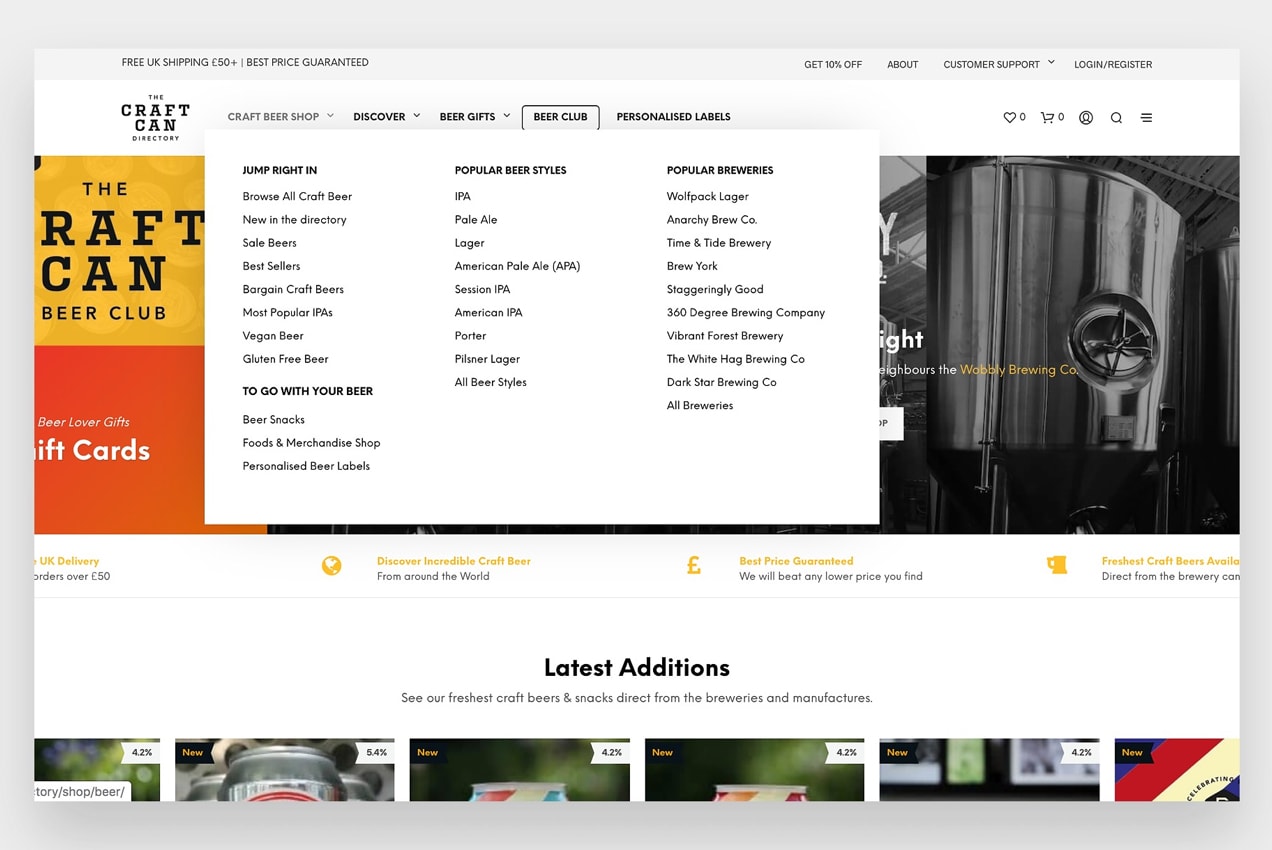
If you hover over “Craft Beer Shop” in their primary menu, you’ll see that parent categories are highlighted in a bold font, while subcategories are displayed in a body font, underneath each parent category.
If categories weren’t grouped in this manner, the mega menu could be even more confusing for customers than a standard navigation menu.
For users of the Storefront theme, WooCommerce offers a mega menu extension to simply the process.
Using Footer Navigation Effectively
Your footer should be a part of your website strategy, not an afterthought. Since it’s displayed on every single page and product on your site, it’s a valuable place to showcase your most important pages.
You shouldn’t create a massive, overwhelming footer that includes dozens of links, but it is important to make the most of the available space. Think of your footer as a catch-all. If a website visitor reads all the content on a page and scrolls to the bottom, what information would they find the most helpful?
In some cases, it could be similar to the links that are in your primary menu. Adding these options to your footer helps people find what they’re looking for without scrolling back to the top.
But don’t forget about the pages and content that website users expect to see in the footer of an online store. For example:
- Shipping information
- Return and refund policies
- A privacy policy
- Terms and conditions
- Customer service details
- FAQs
- Contact information
- A search bar
- Social media links
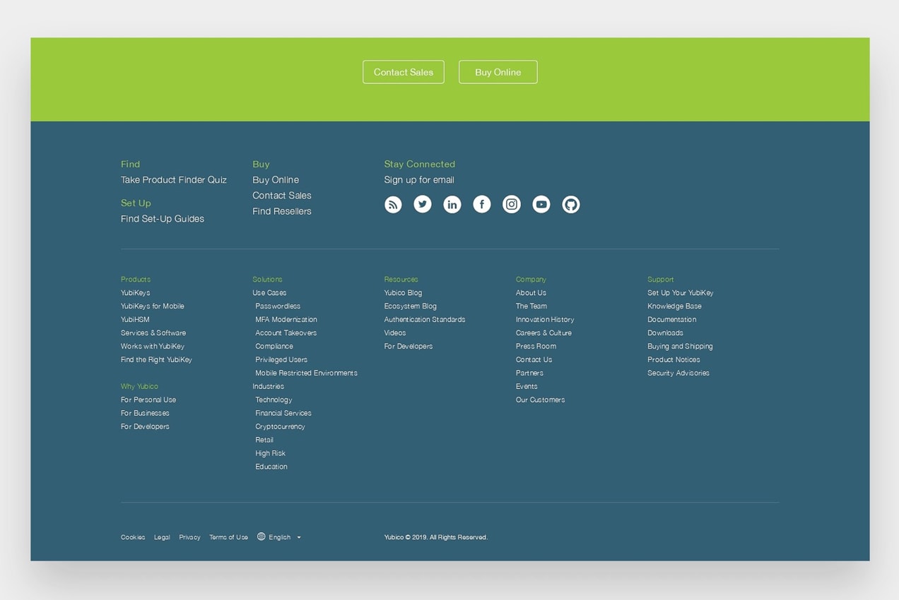
Yubico.com is a great example of an effective footer. Similar to their primary navigation menu, Yubico organizes important links and content in categories to make it easy for their website visitors to find information.
Depending on the size of your online store, you may only need some of these options. It’s not about the number of links; it’s about the strategy behind them.
Don’t Forget About Your Navigation
↑ Back to topWebsite navigation is one of the most overlooked aspects of an online store and is often taken for granted. The first step in creating effective navigation is to figure out what elements are most important to your customers.
How can you make it easy for them to browse your content, products, and offerings? What information would be the most helpful for them? If you have a large catalog of products, would a mega menu make sense?
Remember, if a potential customer can’t quickly find what they’re looking for, you may lose them to a competitor.
Do you want to test out different versions of your menu? Learn how to A/B test your navigation.
About


