When we are not designing themes here at Woo Headquarters we are tweaking and improving the process of delivering those themes to you. At least that’s what we were doing last week.
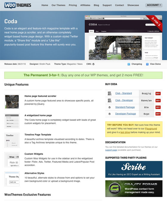
We thought it would be a good idea to document the changes we implemented last week with the honest reasoning behind the user experience tweaks. First let’s have a look at the theme listing page, as it was last week:

After much deliberation we decided we weren’t entirely happy with the user interaction process required when buying our themes, and the confusion of having four call-to-action buttons taking you to the checkout page.
Other noted problems with the theme listing user interface were:
- The Red “buy” buttons – The colour red has many connotations and invokes various emotions. Our feeling though was that it was making our buy buttons come across as rather alarming. We want to encourage our site visitors to click on the call-to-action button, and red is not a color you naturally navigate to, unless you want to delete or cancel something.
- The 3-for-1 banners – On our theme listing page you were presented with two promotional banners – one as a corner overlay on the theme screenshot, and one as a green banner across the full width of the page wrapper. The confusion that these messages broadcasted was that all our theme packages came standard with a 3-for-1 offer. Where in actual fact the developer package came with 3 bonus themes and the standard package came with 2 bonus themes.
- The Playground message – The yellow/tan styled playground message informing our users of our theme playground where you can test drive our themes came across to prominently. We obviously encourage our users to use this facility, but we don’t want this to deter from the fact that our main aim is to encourage potential WooTheme customers to buy our themes.
- The Supported Third Party Plugin Banners – Again, we felt these banners drew too much attention towards them, and away from our buy theme buttons. The eye naturally was drawn to these colourful and bold banners – if you were lucky enough to be on a big monitor and they appeared without vertical scrolling.
- The CMS switcher – Some of our themes have been ported to ExpressionEngine and Drupal. These themes, for platforms other than WordPress, can be navigated to via a small button/icon on the gray bar below the featured space. The button was often overlooked though, and users either missed it all together or ended up on the theme listings for the other CMSs and didn’t know where they were. Eventually buying themes for the wrong platform.
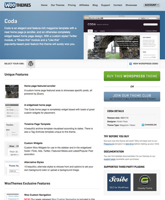
The revised theme listing page
Having taken into account the problems with the previous theme listing page Cobus pushed, squeezed, and chiseled pixels until we were happy with the proposed changes.

As can be seen above the theme listing page was simplified, yet it still remained consistent with other page styling and layout.
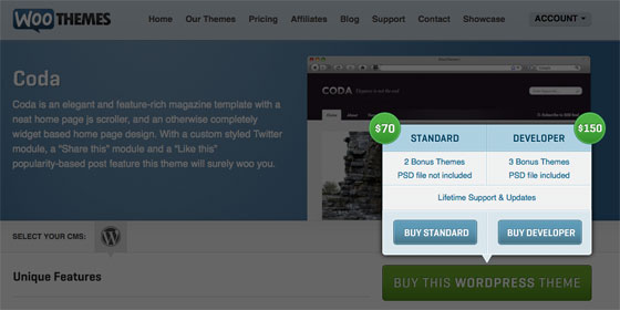
- The buy button, note singular, is now green and the obvious call-to-action, with a very neat pop-up/overlay box that appears when it is clicked on, with the two theme package purchase options.
- Some of the theme information, like the changelog, designer name, release date and theme type has been moved to the sidebar.
- The 3-for-1 banners have been removed and the bonus theme promotion message has been moved to the pop-up/overlay box.
- The playground message has been given the standard sidebar text styling – yet it is still prominently placed below the purchase options.
- The third party plugin banners have been re-sized, and re-styled more consistently, and placed in a two column structure in the sidebar.
- The CMS switcher is far more noticeable and it is clear which CMS theme listing you are viewing.

We sent a tweet out on Friday asking our community if they noticed any differences and the common response was “It looks a bit easier to read“.
So was the two days it took to study, brainstorm and overhaul the listing page worth it? For sure! Good design is invisible, it’s often a transparent process of revising and revising again.
We of course hope the web analytics and purchase conversions will read well too though 😉
About


Definitely a big improvement, but the “Changelog” link doesn’t work for me. 🙂
Thanks for pointing that out. We’ve just fixed the problem.
Certainly is easier to read and more “to the point”.
You may want to take a look at your home page: The Estate theme has the “3 for 1” banner. A little confusing once you get to its listing page stating that no extra themes are included.
Have you done some actual usability testing with real users, identifying real problems? If not, you may be simply moving sideways.
Yes we have. We’ve had numerous emails from our users and site visitors with feedback/complaints/feature requests, as well as thoroughly studied our Google Analytics reports.
I thought the old page design was just fine, but after the UI change, I’m not sure why I felt that way. What a huge improvement. I’m always impressed how small, targeted changes can make such a huge impact in a website. Well done guys and gals!
Thanks John. I guess it’s all to easy to sit back and relax after you’ve implemented a design, but it is hugely worthwhile to re-visit that layout/page every once and a while and see what you can improve on.
I always thought the four different options were clunky and one of my biggest issues was with the demo button overlay on the theme image, always seemed hard to find because it was faded out until hovering over the image. I think this is a great improvement. Good work fellas.
Thanks Chris. We definitely love the tweaks and now it feels like it was very much overdue… 🙂
would be interesting to know what the effect is on conversion rates in a month or so, and what you think the most significant improvements were. as with others, I think it’s a good, subtle improvement 🙂
Yep, most definitely.
These tweaks are never an exact science, so I guess the only way to really measure its significance and influence is to put it out there and see how it goes. Luckily though the conversions were great before, so if these tweaks work we’re hoping it’ll go to awesome. 🙂
I would suggest that the change log could have the same effect on “Buy this theme now” as it’s small info and we do not jump to a new page just to see plain courier font :-/
a nice div with a scroller and some transformation would please us more 🙂
Mmm… Some of the changelogs are pretty extensive though, but this is a good suggestion nonetheless. Will definitely work with the guys on a tweak in this regard.
GR8 IMPROVEMENT
Are your free themes 3.0 compatible? Have they been upgraded? Thank you 🙂
Most definitely yes! 🙂
Great Work! keep better …
Regardless, it is always good for getting an outsider’s perspective in web design. We are looking outward, from inside. Yet, our work has been intended for people who were from outside, but rarely have a time to “look inâ€. So being able to view how they see is worth our time. Too cool, I like them, thank you!
Trackbacks/Pingbacks
Trending
Best dropshipping products and ideas for 2026 and beyond
By Kathryn Marr •
No Pong: From startup to multinational business with WooCommerce
By Vanessa Petersen •
Use print-on-demand to scale your business without inventory risk
By Latoya Duffus •
Never miss a beat — join our mailing list
Please enter a valid email.
View our privacy policy. You can unsubscribe anytime.
There was an error subscribing; please try again later.
Thanks for subscribing!
Emails will be sent to
You're already subscribed!
Emails are sent to