
Averaged across all industries, roughly seven out of ten shoppers will abandon their cart. If this number seems shocking, you’ll be disappointed to know that mobile users abandon carts at a rate of almost 86%. You can always try to win those customers back with abandoned cart emails (and you should), but preventing cart abandonment in the first place should be a high priority.
There are a number of reasons shoppers might leave your store without finalizing their order. If your site loads slowly, isn’t optimized for mobile display, doesn’t attract the right kind of traffic, or lacks quality product images and descriptions, you’ll certainly want to work to improve these areas.
But creating a smooth, easy-breezy checkout experience is even more important. No matter how amazing your site is or how irresistible your products are, if you have a cumbersome or confusing checkout process, you’re going to lose sales.
Many problems with your checkout’s UX can be solved with some simple design changes, added functionality, or increased transparency. Here are seven ways to improve checkout UX:
Be transparent with taxes and shipping costs
↑ Revenir en hautEncountering unexpected costs is the number one reason customers jump ship during the checkout process.
Just over a decade ago, people in the U.S. were used to online purchases being tax-free. The 2008 landmark Supreme Court case South Dakota v. Wayfair changed all that and, gradually, state after state began adopting similar policies that required many online merchants to pay sales tax. By early 2017, Amazon made the decision to charge sales tax for all purchases from any U.S. state. This pushed a lot of major retailers to do the same and has normalized sales tax on online purchases to a great degree.
Some people may still be surprised by sales tax, however, especially when purchasing from smaller shops. Being clear that your price is exclusive of tax on your product page, either next to the price or in your short description, will help prepare the customer for additional charges at checkout.
And just as big players like Amazon have conditioned many consumers to expect sales tax, they’ve also accustomed folks to free shipping. In fact, a 2017 report found that 75% of consumers in the U.S. expect free shipping — even when they’re spending less than $50 on an order.
Depending on how you configure your shipping charges, there are a few approaches you can take to increase transparency:
- Include shipping costs in the product description. This is a great solution if you have just one or two flat rate shipping costs for all your products.
- Add a shipping calculator to your product page. If you charge different shipping rates based on location or methods, you might want to add a shipping calculator on your product pages.
- Simply mention “+ shipping.” This gives customers the expectation that shipping costs will be added to their total.
Allow guest checkout and single sign-on (SSO)
↑ Revenir en hautCreating an account can be annoying. Just when you’re ready to check out, you’re asked to enter your email address, wait on a confirmation email, and create a secure password. This is enough to keep 23% of site visitors from completing their orders.
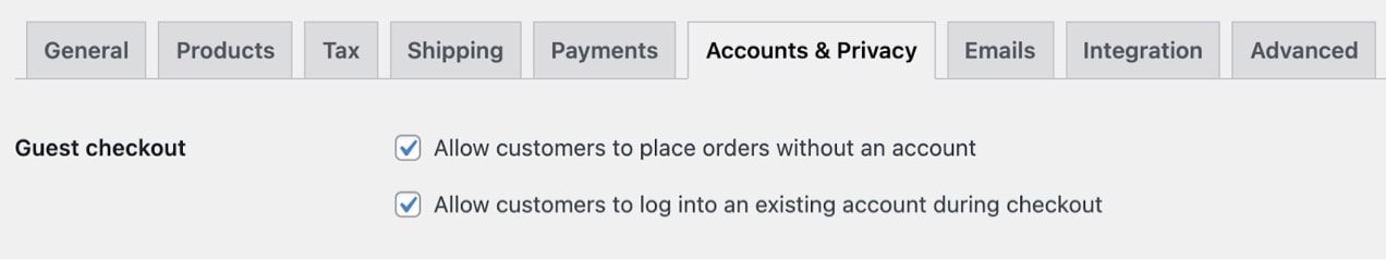
In WooCommerce, you can easily allow users to check out as guests in WooCommerce → Settings → Accounts & Privacy:
If you have products in your store that require an account (like software with license keys or wholesale products with restricted access), you can use WooCommerce Subscriptions and WooCommerce Memberships to manage these products and users without impeding checkout for everyone else.
However, you may still want to give customers the option to create an account for future use. In that case, make this as quick and painless as possible.
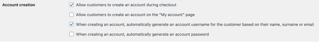
In your WooCommerce settings, enable the option “Allow customers to create an account during checkout.” This makes the account creation process as simple as clicking an opt-in style checkbox on the same page they enter payment information.
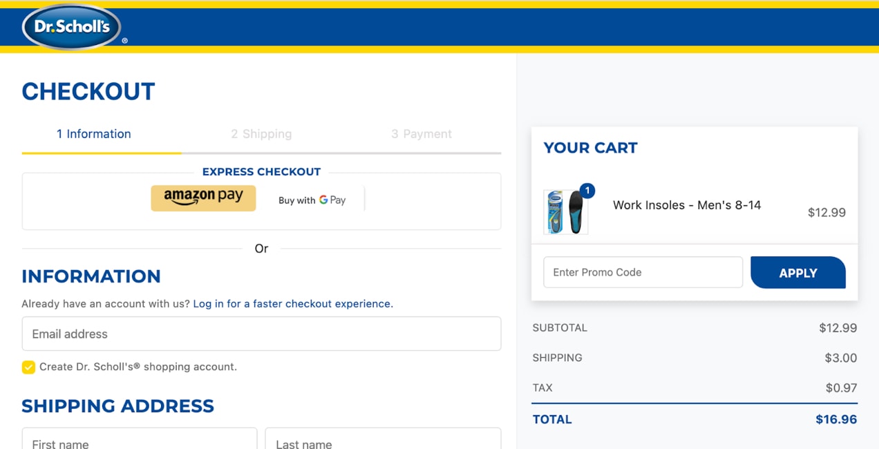
Below is an example of how Badeloft USA, an online retailer of unique, high-end bath fixtures, has made account creation an easy option. Customers can choose to create an account while they’re entering the rest of their information. The only added steps are checking the “Create an account?” box and adding a password.

Another great option is enabling single sign-on (SSO) through third-party accounts. Many consumers prefer this method in an effort to:
- Avoid filling out registration forms.
- Limit the number of usernames and passwords they have to remember.
- Use the same identity across multiple platforms.
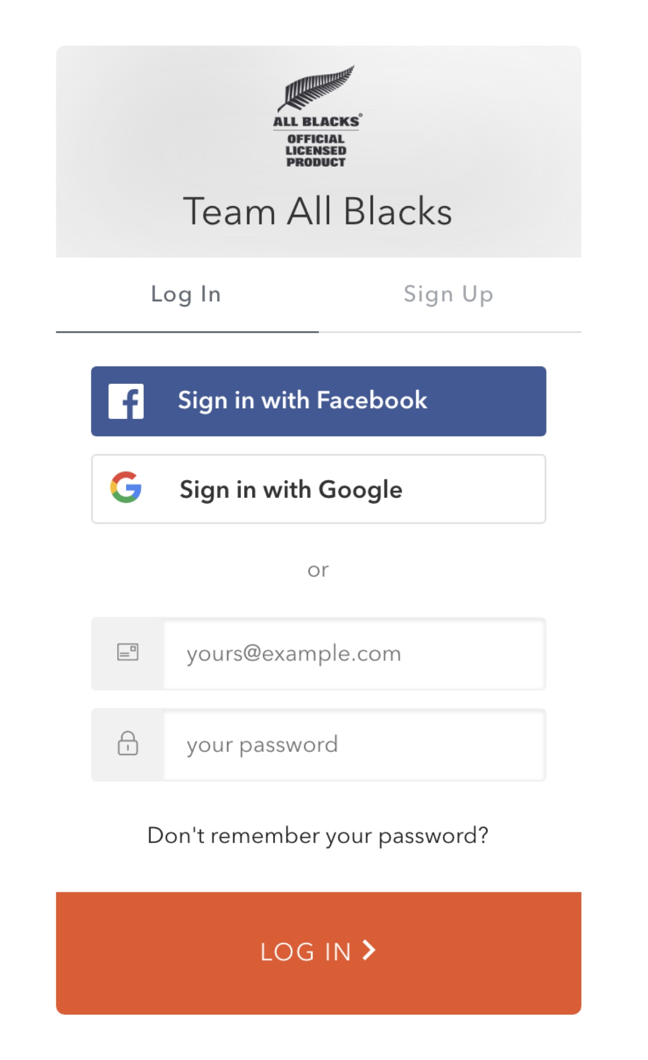
If you think SSO would be a good fit for your store, WooCommerce Social Login gives users the ability to sign in through their Facebook, Twitter, Google, Amazon, LinkedIn, PayPal, Disqus, Yahoo, or VK accounts.
Keep your checkout process clear and simple
↑ Revenir en hautLong forms and visual distractions are a conversion killer, so try to keep the customer focused on completing the transaction, not forcing them to jump through too many hoops.
Set expectations with clear cues and prompts. Guiding your customer through the order process can be extremely helpful, especially when you have a multi-page checkout. Using visual cues, like numbering the steps, can help visitors know what to expect.
Eliminate visual clutter. Remove navigation, footer menus, and other distractions from your checkout page so that the customer isn’t tempted to stray from completing their order.
Minimize checkout fields. Asking customers to input their email addresses or other information more than once might seem like a good way to guarantee accuracy, but it’s also a good way to annoy users. According to one study, 30% of shoppers said they would abandon their purchase if they had to re-enter details. Improve conversions by limiting the fields a customer must complete to only what is absolutely necessary.
Implement a one-page checkout. With WooCommerce One Page Checkout, implementing a simple shortcode will add a checkout form to any page. This keeps the customer focused on the offer in front of them and simplifies checkout.
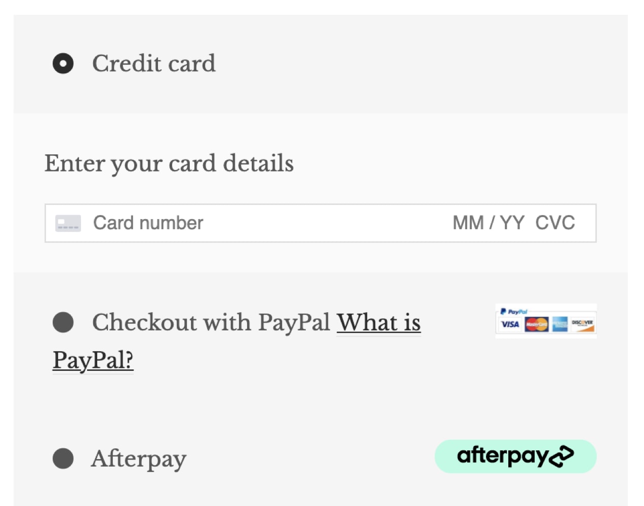
Allow customers to pay via convenient methods
↑ Revenir en hautAccept the payment methods that your audience prefers. This may mean offering several options to fit everyone’s needs, including:
- Credit cards. This is likely the most well-known payment method offered on eCommerce sites, but not everyone might have their card with them when making a purchase. Or, maybe they don’t have a credit card.
- Bank drafts (ACH). Some visitors might prefer to purchase directly with their checking account. An added benefit for store owners is that ACH payments often have lower merchant fees.
- Digital wallets. Digital wallets store payment information that can be accessed across multiple devices. They’re more popular than you might think — twice as many eCommerce transactions are made with mobile wallets than credit cards. And this disparity is only expected to grow. Apple Pay, PayPal, and Amazon Pay are some popular examples.
- Installment payments. If you have higher-priced items in your store or find customers prefer it, you might want to offer installment payments. PayPal provides installment solutions, or you can create your own custom plans with WooCommerce Deposits.
There’s no ideal number of options that any given store should offer. It’s completely dependent on what works best for your company and fits with the preferences of your audience. Whichever combination of payment methods you choose, you’ll want to make sure to present them clearly so as not to be overwhelming to the customer.
Provide a secure checkout experience
↑ Revenir en hautSome shoppers might abandon their purchase if they don’t feel like their information is safe. Providing a variety of payment options, as discussed above, can help people feel more confident in making a purchase, but there are also other things you can do to help:
- Use an SSL certificate. An SSL certificate encrypts and secures the data that you collect on your site, including credit card data, addresses, emails, and more. Not only is this a must from a security standpoint, it also goes a long way towards increasing customer perception. Why? Because, with an SSL certificate, your site will show a lock symbol in the browser URL bar while, without one, it will display as “not secure.”
- Highlight security features. Include reassuring badges and verbiage on your checkout page with terms like secure checkout and include badges for your accepted payment methods.
- Keep users on your site throughout the checkout process. Some payment methods direct customers away from your website to their own portal to complete checkout. This can be a jarring experience and cause them to lose trust in your business. Using a payment solution like WooCommerce Payments keeps customers on your site the entire time.
- Include product guarantees and statements of authenticity. If you have products that might be subject to high return rates or counterfeiting, consider adding reassuring icons or text to your checkout page. Remind visitors of your return policies or that items are guaranteed to be authentic.

Implement a hassle-free return policy
↑ Revenir en hautNot only should you create a return policy that’s cost-effective for your business, it should also be easy for your customers. Hassles with return merchandise authorizations (RMAs), multiple return stipulations, and making the buyer pay for return shipping, can all have a negative impact on your conversion rates.
Figure out a policy that’s simple for all parties to understand and accommodating to customers. Make it easy to find by listing it in a details tab on your product page, adding a link in your website footer, and including a brief summary on your checkout page.
Provide expedited delivery options
↑ Revenir en hautAnother thing customers have come to expect is lightning-fast shipping. But most smaller online retailers don’t have the capability to deliver as quickly as giant conglomerates. At best, you’re probably looking at delivery within three business days unless you use expensive shipping methods like Next Day Air.
You might think that since customers practically demand free shipping these days, that they might not want to pay for other shipping methods. However, if they need a product in a certain time frame (for a birthday or other special occasion), they’re probably willing to pay extra to get their order quickly. Offering expedited shipping may help you convert those customers that simply cannot wait more than two days for that Father’s Day gift that they definitely did not forget to order until the last minute.
Make sure your checkout is actually working
↑ Revenir en hautStore owners can sometimes get busy and not make a routine habit of checking site functionality. Maybe your recent plugin update caused conflicts with your theme or WooCommerce itself. Perhaps a payment gateway’s servers are down (it happens!).
Even if your checkout still works, you may find that updates to your site occasionally cause unexpected changes to forms that might make the order process more awkward. Create a backup of your site before updating, then test your checkout process afterwards to make sure everything appears in the correct format and operates smoothly.
These suggestions for improving your checkout’s UX may feel like a lot to digest, but just implementing a few of them can make a huge difference in your conversion rates. Start with the ones that are the quickest and easiest for you to carry out and see how those changes make a positive impact on your customers’ experience and your sales.

About
Thanks for posting this Great Content on Improving User Experience! It is almost exactly what I was looking for. Keep the great content coming…
Thanks Amelia! Glad you found it helpful!
Hi, who can we contact regarding the process to enroll as a payment gateways on WC?
Hi Tim! Here’s some documentation on joining the WooCommerce Marketplace: https://docs.woocommerce.com/document/marketplace-overview/
Is this a blog post supposed to help people design a better checkout process, or just a way to shill paid plugins? Cause besides stating the obvious, it’s all paid links🙄
P.S. Your comment form is broken, at least on safari mobile. Text doesn’t fit where it should and obscures email entry.
Hi Michael – thanks for taking the time to leave us a message.
One of the benefits of open-source software is that there are often multiple solutions to a problem or challenge. It gives folks the freedom to accomplish what they need in any way they choose – either through paid or free extensions or custom-coding one themselves.
While this post does reference paid extensions available on WooCommerce.com, there are other options out there – that’s the beauty of open-source, right? Our goal is to always educate folks on the “why” first – the “how” is up to them. We have our recommended solutions, but the freedom of choice always rests with you.
Appreciate the tip about the comment form on Safari for mobile. I’ll pass this info along.
Take care!
Tendência
How to start a pet business (best online tips and tools)
By Kathryn Marr •
AI is changing how shoppers find your products
By Julia Callicrate •
Best dropshipping products and ideas for 2026 and beyond
By Kathryn Marr •
Never miss a beat — join our mailing list
Please enter a valid email.
View our privacy policy. You can unsubscribe anytime.
There was an error subscribing; please try again later.
Thanks for subscribing!
Emails will be sent to
You're already subscribed!
Emails are sent to