We’ve all heard it before: “there’s no place like home.” “Home” means something different to all of us; to some of you store owners, it’s more than a place to rest — it’s also your business.
If you’re selling furniture, wall decor, or other interior or exterior accessories with WooCommerce — or planning to start — there are a few specific tips you should follow to set your store apart from the rest. You already know your products are the cream of the crop, so your store’s design and customer experience should be just as great.
From a business-defining homepage to filtering options to powerful extensions, here’s how you can take any WooCommerce-powered home goods store to the next level, and expertly show your shoppers the potential for beautiful homes filled with your products.
Use your homepage as the place to make your niche clear
↑ Volver al principioAs we mentioned in our recent post on industry-inspired homepage design, every store uses their homepage a little differently. It all depends on what your customers expect, what needs they’ve expressed, and how you can best help them get where they want to go.
For home goods stores, your homepage is a great place to add a “mission statement” that makes your niche or specific product offering crystal clear. This tells shoppers that they’ve come to the right place, and that you have exactly what they’re looking for, whether it’s an oversized leather sofa or a small wooden picture frame.
It’s rare for stores in your industry to sell everything. Even if you don’t sell a specific type of products, like couches or frames, you still likely have a niche. Take the Juliettes Interiors store, for example:
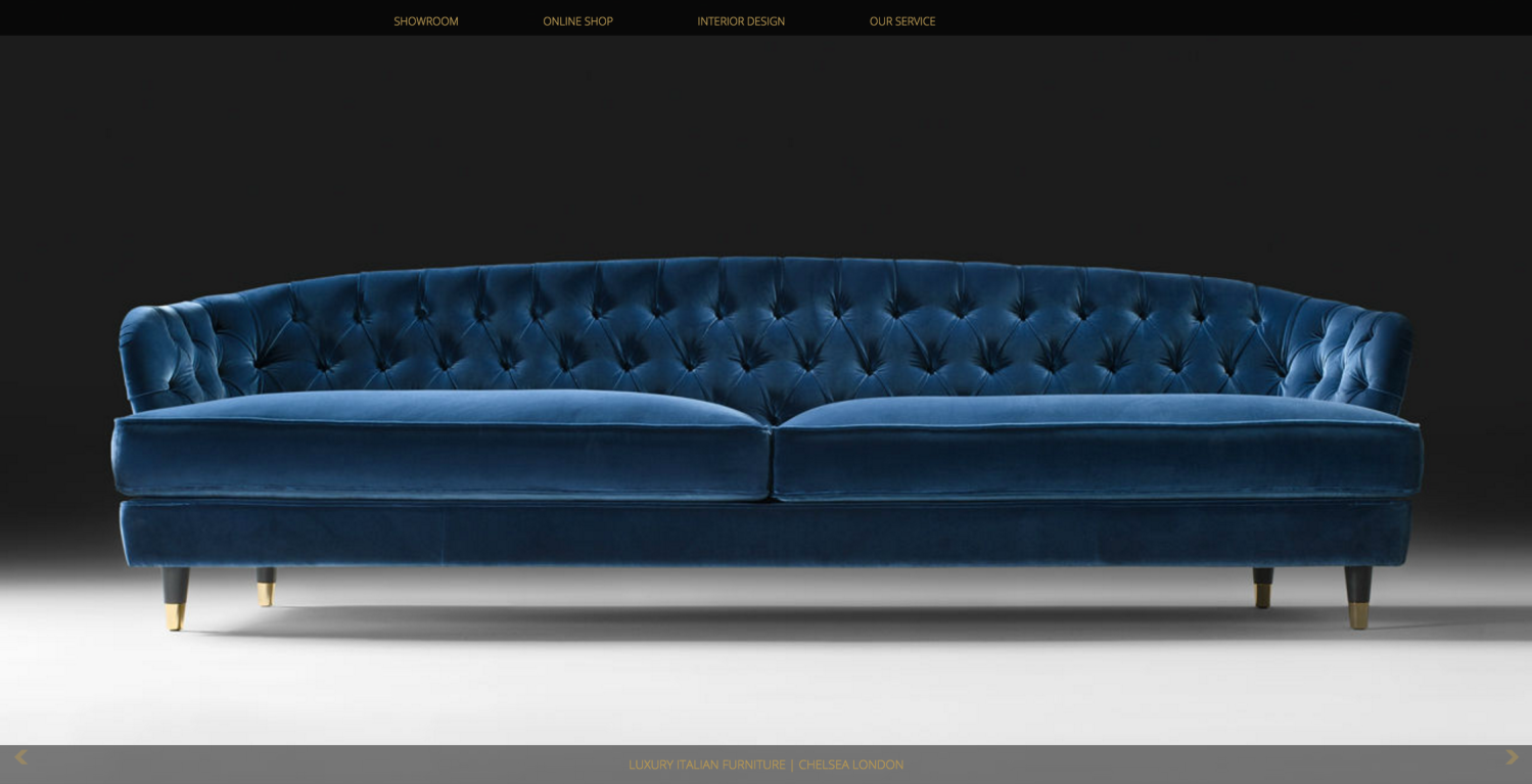
Even though Juliettes offers a wide variety of products, they fall under the same category: high-end, luxury furniture imported from Italy or London.
By making your specialty or niche clear from the very first page of your store, you can show potential customers that you have what they want — and if not, you’ll save them the time and frustration of looking around before they leave in a huff.
You can make your niche evident on your homepage by adding large photos, a “mission statement” as we mentioned above, or even using social proof. For more ideas, check out the home goods section of this post to learn how to customize your homepage to fit your specific industry.
Add plenty of high quality photos
↑ Volver al principioChoosing products for your home can be a sensitive task. Shoppers want to be certain they’re getting things just right — that their new curtains will match their couch, the coffee table will fit, and so on.
For some industries, high quality copywriting is the best way to convey a product’s details; coffee, for example, looks mostly the same in beans or ground form, but it’s the taste that shoppers are concerned with (and will only be able to learn about via text). But furniture and decor are better seen than they are described, and that makes high quality photography a must-have for your store.

Home goods stores commonly find that they need multiple photos of every product (including color and size variants) to properly show customers how something will look in their home. Common photos include:
- The product as it appears when fully assembled or applied on a neutral background
- The same as the above, but from multiple angles or showing important details that might otherwise be missed
- The product as it arrives (in the packaging, unassembled, or prior to application if it is wallpaper or flooring)
- The product as it looks in one or more sample environments
The combination of these photos is typically enough to give shoppers the information they need to make an informed decision on whether or not the product is right for them.
For crucial details that can’t be accurately or fully conveyed via a photograph — for example, exact size, or the amount of components required for assembly — these can be delegated to bullet points (e.g. item specifications) to ensure they aren’t missed. Finally, you can reserve your “Long Description” section for some copywriting that provides more information on the item’s story, like where it was made, how it came to be, what finishes or textures were used, and so on.
To learn more about adding beautiful photos to your online store, have a look at this post. And if you’re struggling with copywriting or creating appropriate item descriptions, this is the article for you.
Add search and filtering options to make finding the right item easier
↑ Volver al principioSometimes your shoppers come to your store with a need for red plates, but think they’ll look around a bit while they’re there. Sometimes they’re impatient and just want to know if you have those plates now!
Having multiple navigation options is the best way to suit these many different customer mindsets, whether they’re taking their time or in a hurry. And for home goods stores, it’s even more crucial to have a powerful site search that lets customers find what they’re looking for right away.

While the built-in search for WooCommerce is suitable for many stores, if you have a large number of products, you might want to add in a few more options. An extension like Product Finder will instantly add more options for shoppers, allowing them to quickly look for products in specific categories, with selected attributes (like color or size), or even in a specific price range.
Another option for appeasing customers is to add filtering to your category pages. Filtering allows shoppers to narrow down the displayed items by specific criteria, removing products that might not meet their color preferences or budget, for example.
Have a look at what pops up as you’re browsing through the CABLE DESIGN store. When you visit any given section — say, the bedroom category — you’re immediately presented with an option to filter the displayed products by color:
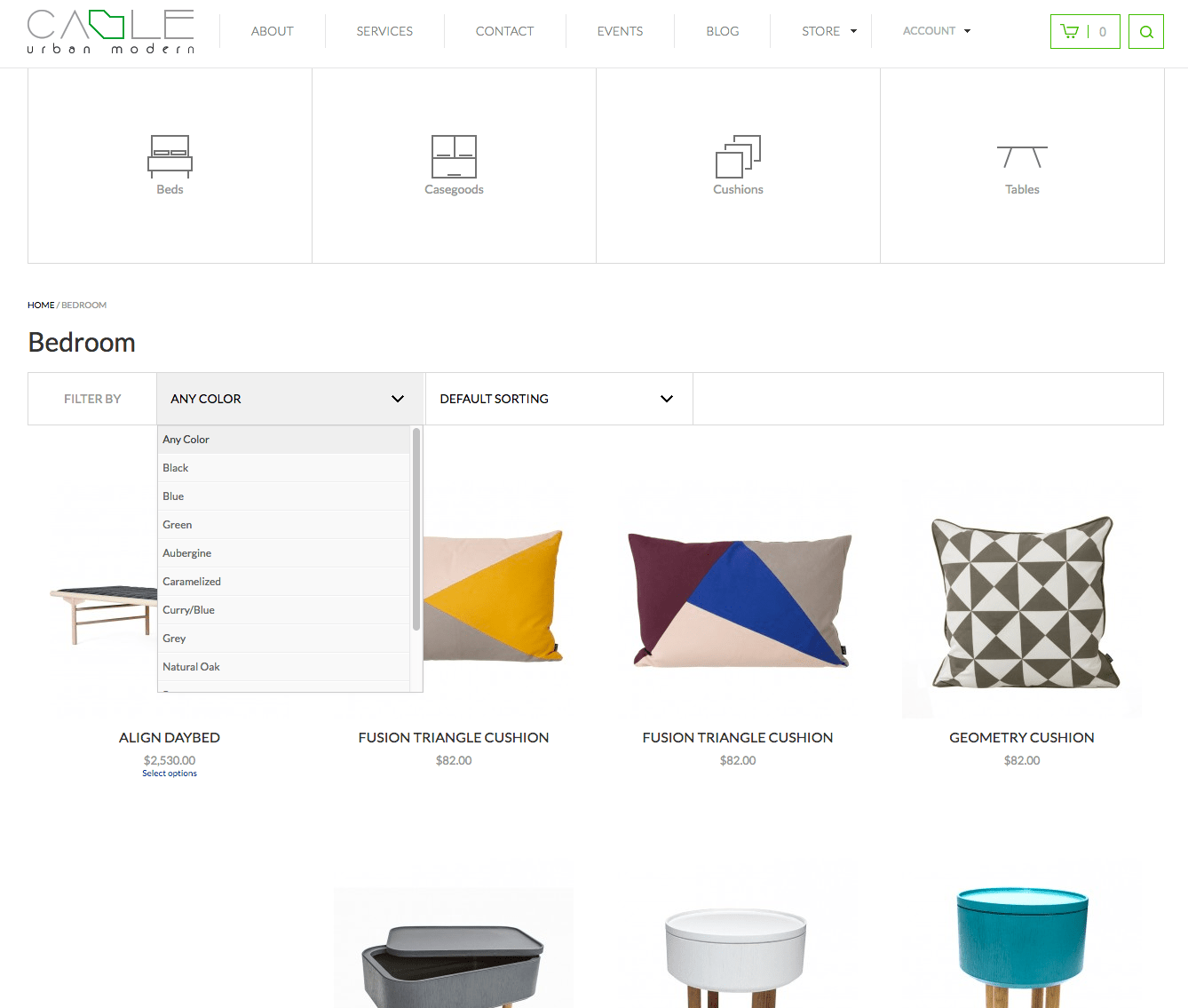
This feature can be useful whether you have a lot of products to sort through, or just tend to encounter shoppers who are in a hurry and don’t want to browse. Either way, filtering lets them get right to the point, and we think it’s a must-have for stores of this type.
[Tweet “Filtering lets your customers get right to the point, making it a must-have feature.”]
To add filtering to your WooCommerce store quickly, try out the layered navigation widget — it makes use of your products’ existing attributes like color, size, and shape to let shoppers filter results on the fly. It only takes a few minutes to set up and can be added to any widgetized area. Woo!
Add links to shipping and delivery information right up front
↑ Volver al principioDepending on what types of home goods you sell, shipping might be a… complex matter. Kitchen supplies? No sweat, just add some bubble wrap to the box. Imported kitchen tables made from solid pine? Ermmmm…
Your customers undoubtedly going to expect a different shipping and delivery experience, but the details of that experience shouldn’t come as a surprise to them. You should never run into a situation where you call to schedule a truck delivery or furniture assembly session and hear the words “but I thought it’d come in a box!”
Home goods stores are among the few that should absolutely have links to their shipping, delivery, and even returns information in their main navigation area. Your shoppers are going to want to learn about it in advance of a purchase, and you should make the process of finding that information as easy and fast as possible.
Additionally, you should consider asking or even requiring customers to read your shipping information before they make a purchase. You can always edit your checkout flow to add a field and link to these terms if you want to be sure this is happening, or you feel the information is getting missed.
Try these WooCommerce extensions to build an amazing home goods store
↑ Volver al principioFinally, there are some specific WooCommerce extensions we recommend trying out if you’re in this industry. These handpicked extensions will make your products look better, help your customers find what they’re looking for faster, and give you that little edge over your competitors you’ve been dying to find.
Try these on for size:
- WooCommerce Order Delivery — Let customers pick the best delivery date for them right at checkout — ideal for big items, furniture assembly services, or anything expensive that might require a signature.
- Variation Swatches and Photos — With this extension, you can replace variation drop-downs with swatches of color or thumbnails of your actual products, making it easier for shoppers to preview and choose the specific items they want.
- Measurement Price Calculator — Selling wallcoverings or flooring? This one is a must-have. Let customers calculate the amount of product they need to cover their space, plus display the total cost in a single area.
- Product Documents — If your furniture requires assembly, add instructions or guides right to your product pages so shoppers can download what they need either before or after purchase. (Bonus: save paper by keeping all your instructions online!)
- Cart Add-Ons — If someone’s buying a shelf, make sure they don’t forget the brackets! Add suggestions for products that appear in the shopping cart, preventing your customers from forgetting anything they might want or need.
- Product Bundles — Give shoppers a discount for purchasing four chairs with a table, a print with a frame, or any other combination you can dream of. Add and configure custom bundles and watch your sales rise!
With WooCommerce, you can show your customers the potential for their own beautiful homes
↑ Volver al principioCreating an inspiring home goods store with WooCommerce takes time and dedication, but we think it’s actually kind of fun! Between the beautiful photos on your homepage, the amazing extensions suited to your industry, and the options added to make finding that perfect piece a little easier, we know you can make something truly special that shows your customers the potential to create an incredible space with your help.
Have any questions about using WooCommerce to sell furniture, wall decor, or other home-related items? Leave a comment below and we’ll answer you as quickly as we can. Thanks so much for reading!
Recommended reading:
About


I want to create my new e commerce website like eBay so plz send me eBay and detail how I create website
Hi Aslam, if your aim is to allow multiple sellers to create product listings on your store, you would want to look into the Product Vendors extension: https://woocommerce.com/products/product-vendors/
If your intention is to allow shoppers to bid on products and set time limits (like the eBay auction model), we do not have an extension for that at this time, but you may be able to find a solution or some suggestions on how to create this with some custom code by searching online or consulting a WooExpert.
Please let us know if you have any further questions 🙂
Hi Aslam, there are few free & premium plugins for making auction website with WC. Try Google : https://www.google.com/?q=woocommerce+auction
Those points were very helpful for any store specially filtering & shipping,delivery information.
This is a very useful post. I was looking for it for a long time. Thx. I like to use your products.
Glad we could help you Dmitriy 🙂
Nicole, I like your search and filtering information because of by adding search and filtering options in our store, we can easily convert those visitors who are impatient and this thing really can double the sale of our website. Search and filtering option is the most user friendly and we must apply to our stores.
Really Wonderful post and information. I am also WooCommerce plugin developer and this information is totally worth to me. Thanks for sharing effective info.
Thank you kindly for the praise Jigar, I’m glad you could take something away from this. 🙂 If there’s anything you’d like to see us write about that would be of use either to you or your clients, just let us know at any time.
Angesagt
How to start a pet business (best online tips and tools)
By Kathryn Marr •
AI is changing how shoppers find your products
By Julia Callicrate •
Best dropshipping products and ideas for 2026 and beyond
By Kathryn Marr •
Never miss a beat — join our mailing list
Please enter a valid email.
View our privacy policy. You can unsubscribe anytime.
There was an error subscribing; please try again later.
Thanks for subscribing!
Emails will be sent to
You're already subscribed!
Emails are sent to