Theme Installation
↑ Back to topYou can install the theme via two methods.
Automatic Installation
↑ Back to top- You may follow the WooCommerce instruction here.
- Once you connect to the WooCommerce.com account, you’ll receive a notification when the update is available.
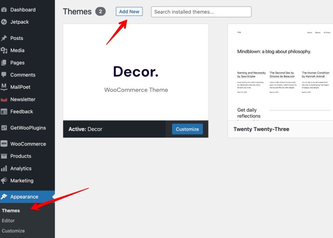
Manual Installation
↑ Back to top- Download the zip file you purchased.
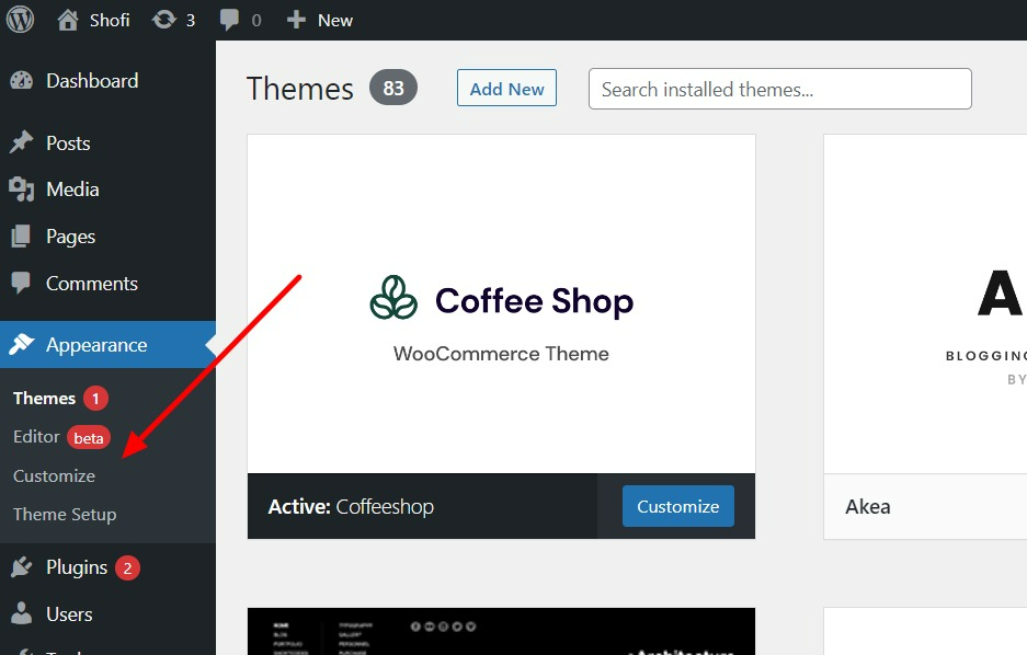
- Go to “Appearance > Themes > Add New”
- Upload The zip file
- Activate the theme.
Importing demo
↑ Back to topImporting demo
↑ Back to top- After activating the theme, you’ll be redirected to Theme Setup page. ( You can also find it at “Appearance > Theme Setup” )
- Follow the steps to install Child Theme, Plugins and Import The Demo Content
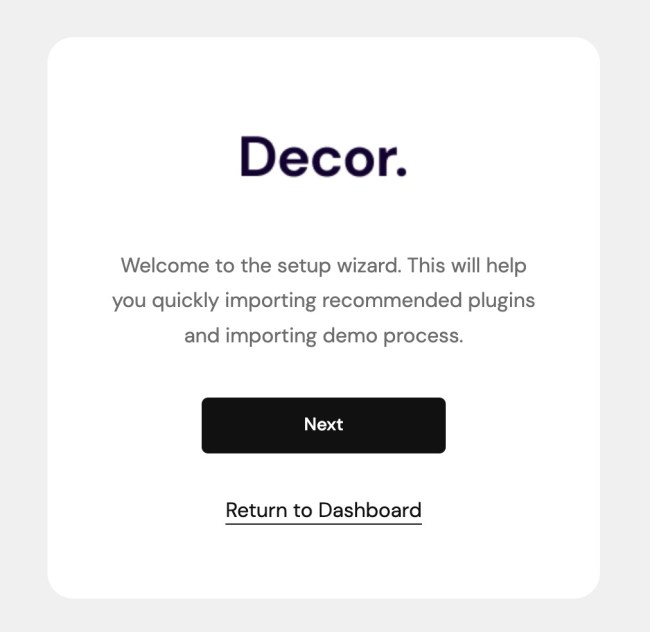
- After you finish importing the demo content, there are two more things that you have to do. Please check the points below.
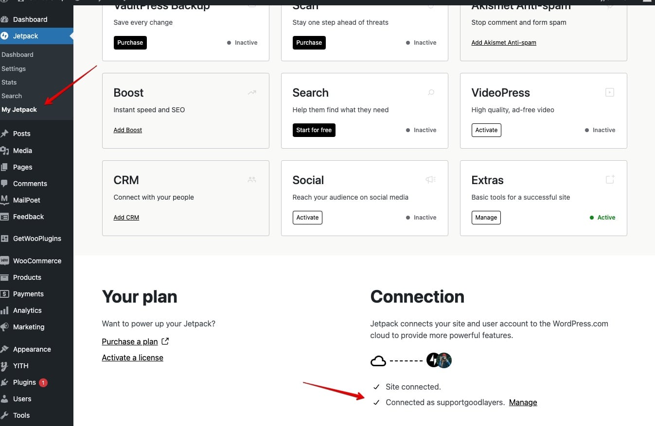
Contact Form
↑ Back to top- You have to connect your site with Jetpack. Go to ‘Jetpack > My Jetpack’ and check the Connection section at the bottom.
- The reason to do this is because after you import the demo content, the contact form won’t appear yet unless you enable the extra items by connecting to Jetpack. Otherwise, you can choose to use other contact form plugins such as Contact Form 7.
Subscription Form
↑ Back to topMailPoet doesn’t provide the option to export/import the email subscription form, hence you will need to set it up manually.
- Go to ‘MailPoet > Forms’ and add new form
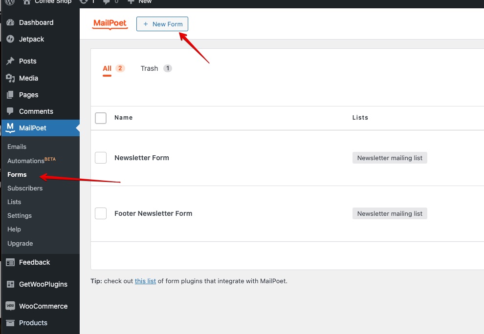
- Select ‘Skip, start with a blank form’ button.

- Then you can start customizing the form from there. And below are the settings of the hero subscription form and footer subscription form that you can follow.
Footer Section
Wrapper setting in footer section

*You must put this custom CSS at the bottom as well.

Email field setting in footer section

/* form */

.mailpoet_form { padding: 0px !important;

}

.mailpoet_form input[type="email"] {

    box-sizing: border-box;

    border-width: 0px 0px 1px !important;

    padding: 15px !important;

}

/* columns */

.mailpoet_column_with_background {

  padding: 10px;

}

/* space between columns */

.mailpoet_form_column:not(:first-child) {

  margin-left: 20px;

}

/* input wrapper (label + input) */

.mailpoet_paragraph {

  line-height:20px;

  margin-bottom: 20px;

}

/* labels */

.mailpoet_segment_label,

.mailpoet_text_label,

.mailpoet_textarea_label,

.mailpoet_select_label,

.mailpoet_radio_label,

.mailpoet_checkbox_label,

.mailpoet_list_label,

.mailpoet_date_label {

  display:block;

  font-weight: normal;

}

/* inputs */

.mailpoet_text,

.mailpoet_textarea,

.mailpoet_select,

.mailpoet_date_month,

.mailpoet_date_day,

.mailpoet_date_year,

.mailpoet_date {

  display:block;

}

.mailpoet_text,

.mailpoet_textarea {

  width: 200px;

}

.mailpoet_checkbox {

}

.mailpoet_submit {

}

.mailpoet_divider {

}

.mailpoet_message {

}

.mailpoet_form_loading {

  width: 30px;

  text-align: center;

  line-height: normal;

}

.mailpoet_form_loading > span {

  width: 5px;

  height: 5px;

  background-color: #5b5b5b;

}
Button setting in footer section
*At the bottom, Fill the Additional CSS class name as well > ‘has-text-align-right’

Theme Customizations
↑ Back to top- Customizer allows you to change theme basic settings, such as Top Bar, Site Width, Font Style, Element Colors
- You can access Customizer at “Appearance > Customize”
- If you need to add extra css to style the theme, you can add it to the “Additional CSS” area.

Site Editor
↑ Back to top- “Site Editor” is a tool that is used to modify specific parts of the site (Eg. Header, Footer, Single Page or Product Page)
- You can also use a “Site Editor” to create a custom template if you need the layout of the Header/Footer to be different on any specific page as well.
- You can access site editor at “Appearance > Editor”

Page Components
↑ Back to topHeader
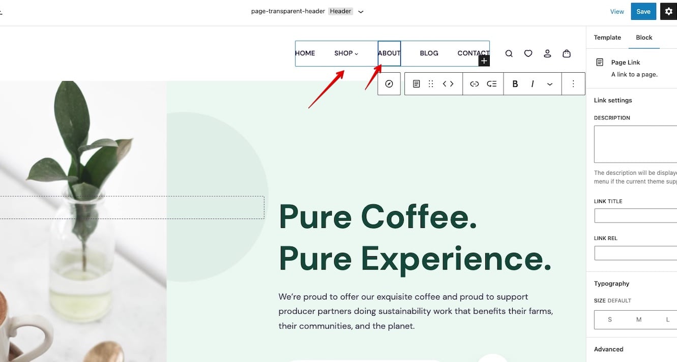
↑ Back to top- Header is a section that appears at the top of every page on the site.
- Header can be changed at the “Site Editor Navigation > Template Part > Header”
- You can edit “Logo & Navigation” directly using wordpress block editor.


- If you need to use a different header for a specific page, first, you have to create a new Template Parts first for your new header style. Then you have to create new Templates and combine the new Template Parts(header) that you create with content area and footer. After that, in the specific page, you can choose the new page template that you created(which consists of the new Template Parts which is your new header).
Menu
↑ Back to top- You can manage the menu in ‘Appearance > Editor’. Click on the menu item to customize it(change links, texts, etc.) then click ‘Save’ to save the work. Read more: Navigation Block.
Footer
↑ Back to top- Footer is a section that appears at the bottom of every page on the site.
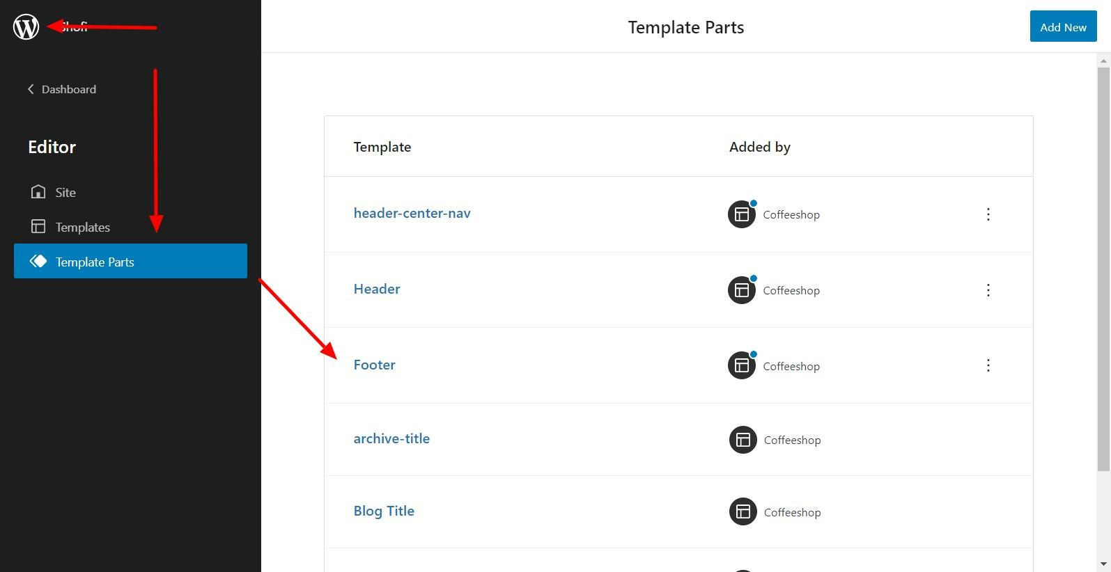
- Footer can be changed at the “Appearance > Editor”
- Go to “Site Editor Navigation > Template Part > Footer”
- You can edit “Columns, Widget and Copyright” directly using WordPress Block Editor.

Page Template
- Page template is an option to change the layout of the page to be different. ( E.g. Hide Title, Transparent Header )
- You can select a page template when you edit each page.

Blog List & Pagination
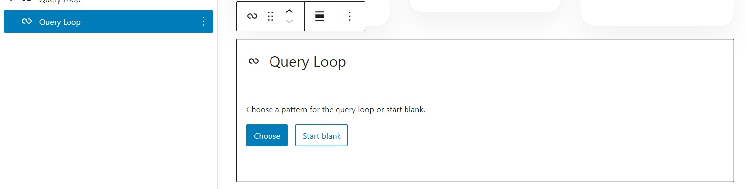
↑ Back to top- Blog List can be created using the “Query Loop” component.
- Click the “Choose” button and select the blog list style you want to display.
- You can add “Pagination” inside the “Query Loop” item to display pagination.
- If you could not find the “Pagination” component, please make sure to add it under the “Query Loop” item since it could not be added elsewhere.
- You can also select the carousel option on the “Query Loop” item to make blog appear as “Carousel Slider”
- Carousel bullets can be added using the “Slider Controls” component by filling “Bullet ID” option with the ID you filled at “Slider Controls” component.


Product List
↑ Back to top- You can create a product list view using the “Product By Category” component.
- You can also select different styles & layouts in the item option area.

Group Custom
↑ Back to topGroup Custom
↑ Back to top- “Group Custom” is a component that behaves the same way as “Group” component, but with more varieties of options. Ex. margin, padding & background image on different screen sizes for mobile responsive support, radius border, shadow effect.
- You can enable “Group Custom” by installing “Goodlayers Gutenberg Plugin”
Group Custom Carousel
↑ Back to top- You can also use “Group Custom” to create a custom carousel component.
- First, use “Group Custom” as the parent component
- Then, create a children component ( Can be normal group component )
- And select the layout in the parent component to “Carousel”


- Slider Bullet can be assigned using “Slider Controls” component
- Fill the id of “Slider Controls” component to “Bullet ID” fields of the “Group Custom” parent component.

Built-in CSS Classes
↑ Back to top“decor-sync-height”
- Sync height between an item that has the same class
- Use for syncing the height of “Blog Template” on the demo page.
“decor-center-middle-element“
- Mainly used for header center style.
- Add this class to center the middle element of “Row” ( group component ) when there’re 3 child elements.
“decor-tablet-left-padding0”
- Set left padding in tablet size to 0
“decor-tablet-right-padding0”
- Set the right padding in tablet size to 0
“decor-hover-shadow“
– add a hover shadow effect over the element that includes this class
“decor-full-height”
– apply CSS height: 100% to the element
“goodlayers-title-wrap”
- Add default title background to the section.
“goodlayers-list-link”
- Use to style list elements to plain style ( as in the footer of the demo site )
“goodlayers-column-tablet-break”
- Add to “Columns” component to break column on tablet size ( 999px )