
People are spending more time on their phones than ever before. We use them for almost everything — banking, investing, checking the weather, monitoring workouts, listening to music, navigating, and, of course, shopping.
Nearly 55% of website traffic comes from mobile devices, and 60% of online shoppers use their phone to find a product first. If your store doesn’t provide a seamless user experience on mobile, you risk losing a big chunk of your potential customers.
But how can you optimize your online store to increase mobile conversions?
Start with a responsive WordPress theme
↑ Back to topA high-quality WordPress theme is the perfect starting point for a responsive online store. Your theme is the foundation of your entire site, so choose one that offers a great experience on devices of all sizes.
Here are a few tips for evaluating a theme:
- Test the theme demo on tablets and phones. Since you probably don’t own devices in all possible screen sizes, you can use a site like Website Responsive Testing Tool to simulate the experience. Demo elements should look good on all screen sizes — nothing should be cut off, difficult to read, or hard to use.
- While looking at the theme demo, resize your browser window. Content should adjust accordingly and nothing should be cut off.
- Look for responsive features in the theme description. It should specifically mention “responsive design” or discuss how the theme adjusts for mobile devices.
- Run the theme demo through Google’s mobile-friendly testing tool.
- Check the reviews. Read ratings and reviews from theme users. Watch out for any negative comments about responsive design.
It’s also important that your theme integrates with WooCommerce. This will prevent responsivity issues along with any other potential conflicts.
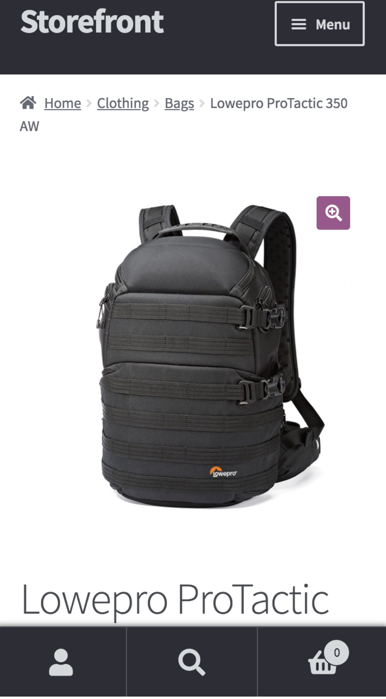
The Storefront theme satisfies all of the above and is flexible and easy to customize. Plus, it has a variety of child themes designed for specific industries — fashion, toys, digital products, bookings, and more.
Keep mobile usability in mind
↑ Back to topUsability is how effectively and efficiently shoppers can interact with your website. Poor usability negatively affects sales, conversions, brand perception, and SEO. When reviewing your mobile experience, usability should be your top priority. Consider the following:
- Think with your thumb. Mobile users will interact with your website using only their thumbs. All clickable elements — links, buttons, menu items, images — need to be large enough for a site visitor to easily tap. If they’re small or too close together, someone might click the wrong thing by mistake.
- Avoid pop-ups and other distractions. Since mobile screens are so small, it’s important to prioritize what you show visitors. Pop-ups that cover the entire mobile screen can disrupt your users’ experience and even have negative effects on your search engine rankings; the same thing goes for ads and other notifications. If you decide to use this type of content, make sure it takes up only a portion of the screen and is easy to dismiss.
- Implement product filters. If you offer lots of products, an online shopper might have to scroll for a while to find what they’re looking for. This can be particularly difficult on mobile screens that only display a couple of products at a time. Your customers might get frustrated and give up before making a purchase. Filters help them narrow the selections based on what they’re looking for. Try an extension like WooCommerce Product Filters to provide sorting functionality.
- Use sufficiently large fonts. If your website text is too small, it can be very difficult for mobile users to read anything — they shouldn’t have to pinch and zoom to learn about your products. Depending on your site and font choices, you may need to set different font sizes for mobile devices.
- Break up text. If you have pages with lots of information, break it up into smaller segments that are easier to navigate on small screens. You can do this with accordions, toggles, or bullet points. In long blog posts, add links to subsections that allow users to jump directly to interesting topics.
Simplify the checkout page
While shopping on mobile devices has increased significantly over the years, conversions aren’t so great. In fact, the average eCommerce conversion rate on mobile is only 2.03%, compared to desktop at 3.83%.
Your checkout process plays a critical role in making sales. Make it as simple as possible on mobile devices to improve conversion rates. If it takes too long for your customers to make a purchase, they’ll give up and shop elsewhere.
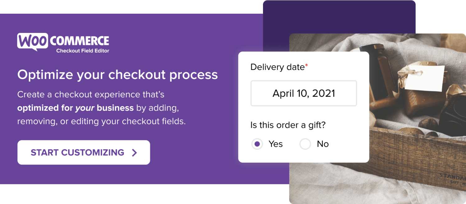
Remove unnecessary fields
Start by taking a close look at the information you require for checkout. Is everything necessary? You’ll probably find that there are fields you can remove:
- If you don’t sell to businesses, remove the Company Name field.
- If you can’t think of a scenario in which you might need to call your customers, remove the Phone field.
- If you don’t accept notes, remove the Order Notes field.
The fewer fields the better, especially on mobile. Read more about how to customize WooCommerce checkout fields.
Allow guest checkout
Customer accounts are great and speed up checkout for returning shoppers by auto-filling their information and saving their credit card data. But what about new customers?
Not everyone wants to create an account on your store, especially on mobile devices where they want to check out as quickly as possible. In fact, requiring customer accounts is thought to contribute to 35% of abandoned carts.
To allow guest checkout with WooCommerce:
- Navigate to WooCommerce → Settings → Accounts and Privacy.
- Select Allow customers to place an order without an account.
- Click the Save Changes button at the bottom of the page.
Learn how to determine if guest checkout is right for your store.
Accept social login
Your customers are probably logged into social media accounts on their mobile devices. Enabling social login on your site lets them log in using Facebook, Twitter, Google, Amazon, and more to simplify checkout and keep them from having to create a new account.
Enable WooCommerce Social Login.
Accept multiple payment options
Accepting more than one form of payment speeds up checkout. While you might also allow credit card transactions, enabling options like PayPal or Amazon Pay lets customers pay using existing accounts rather than pulling out a credit card and typing in all the details.
View WooCommerce payment gateway integrations
Make checkout fields tall enough
It’s important that customers can easily fill out the checkout fields on your site. Make sure that fields are tall enough for them to tap and fill in information without having to zoom in. You can do this with some simple CSS.
Start by using the browser inspector on your checkout page. This will help you identify the class of each individual field. Then, use the following code for each specific class; the Email field is used in this example.
/**
 Customize height of checkout fields
 **/

input[type='email'].input-text{
	padding: 100px !important;
}
Adjust the padding based on your specific site and current settings; you may need to play a little to find what works. You can also customize the specific devices this code applies to by using media queries.
Note: If you are unfamiliar with code and resolving potential conflicts, you may want to select a WooExpert or Developer for assistance. We are unable to provide support for customizations under our Support Policy.
Edit product pages
↑ Back to topIt’s important that your individual product pages are responsive as well. Customers should be able to read product details, flip through photos, and add items to their cart.
Make the Add to Cart button sticky
A sticky Add to Cart button follows a shopper down the page as they read product information. If they’re convinced to buy, they don’t have to scroll all the way back up to make a purchase. In fact, a sticky Add to Cart button has been shown to increase orders by 7.9%! Add this CSS to make your button sticky on mobile devices:
/**
 Make the Add to Cart button sticky
 **/

@media only screen
  and (max-width: 900px) {

	.cart {
	    position: fixed;
	    bottom: 0;
	    background: #ffffff;
	    width: 100%;
	    z-index: 3;
	}
}
You may need to play with the CSS a bit, depending on your theme and website design. But if you don’t want to edit code, you can also use a plugin like Sticky Add to Cart for WooCommerce.
Make images intuitive
When shoppers land on a product page, they expect to be able to swipe your image gallery to view more photos and use their fingers to zoom in on an item. These mobile gestures are so intuitive that they’re made almost subconsciously. Make sure your site supports them.
Add arrows or dots to indicate when there are multiple photos. Otherwise, your mobile users might not even know they can swipe!
Prioritize important information
Make sure customers can view critical product information without having to scroll very far. Prioritize prices, variations (color, size, etc.), discounts, reviews, and other details that are specific to your products: If you sell clothing, the material might be important. Or if you’re an electronics store, you might want to highlight the warranty that comes with each purchase.
Additional information like full product descriptions and specs (washing instructions, SKUs, ingredients, etc.) can fall further down the page. This way, if your customers want more information, they can easily find it, but if they’re happy with just the basics, they won’t be overwhelmed.
Simplify your mobile menu
↑ Back to topKeep your primary menu on mobile devices as simple as possible. A long list of pages will overwhelm and confuse site visitors. Narrow it down to the essentials, then prioritize the order they’re listed in, with the most important pages first.

The Good Batch shortens their mobile menu to include just five pages in addition to Login and Cart links. It’s simple and to the point.
If you do need to include a lot of pages, try using submenus with expandable toggles. Limit primary menu items and show submenu items when a user expands each one. Make sure to use symbols like arrows to indicate that a menu expands!
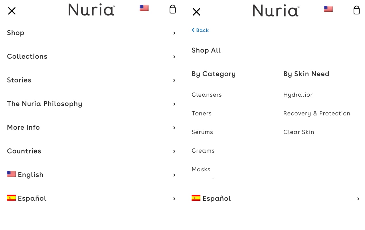
Nuria offers five primary menu items on mobile with arrows next to each one, indicating that there are more options. When a user clicks, the primary menu slides to reveal a submenu with a clear “back” button. This allows them to display all the necessary options without overwhelming their customers.
There are several ways to display mobile menus, so choose the one that’s best for your audience. They include:
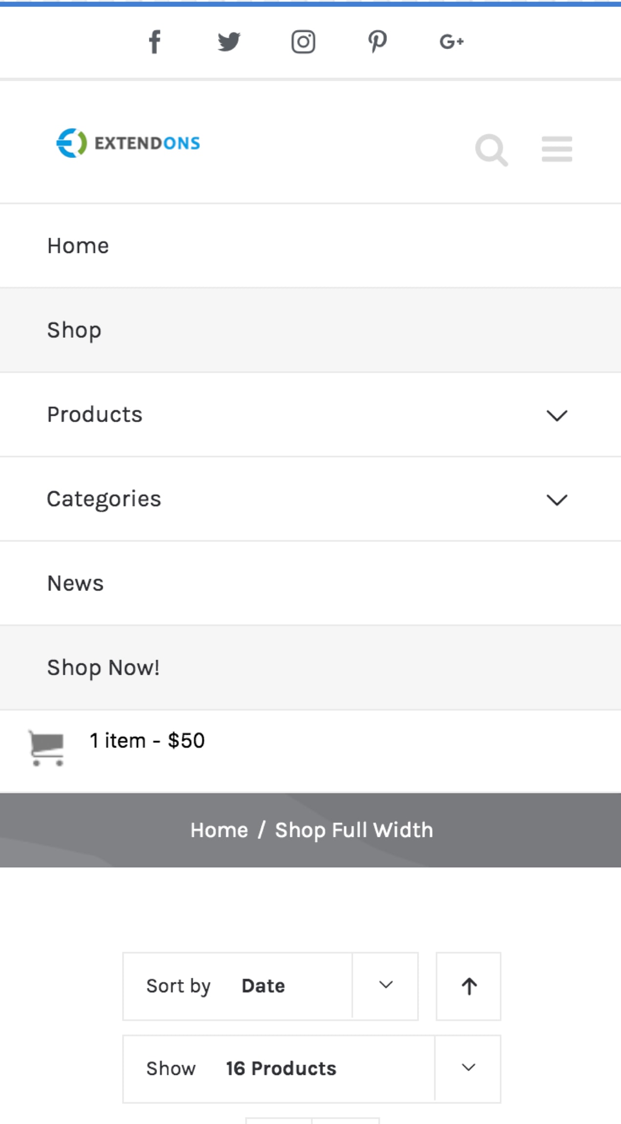
- A hamburger menu. The hamburger symbol is three lines stacked vertically on top of each other. The menu is hidden until a user clicks on the symbol. This is a great option for sites with a lot of pages but can be harder for site visitors to find.
- A tab menu. This closely resembles typical desktop navigation and lists menu items horizontally across the top of the site. This should only be used for menus with minimal links; users shouldn’t have to zoom or scroll to view all items.
- A floating action button. A button with a menu icon floats on the page and follows a user when they scroll. When clicked, it expands to show the menu. This is a good way to keep your primary menu accessible, but can be distracting or cover up content.
- A dropdown menu. A menu bar at the top of the page opens when clicked to reveal page options. It takes up a bit more space than the hamburger menu but may be more easily seen by site visitors.
Typically, your theme will include responsive menu styles. If it doesn’t, or if you want to go with a different option, check out these plugins:
Whichever option you choose, make sure that it’s easy for your customers to use and fits their needs. And remember, that may mean creating an entirely separate mobile menu!
Make important features easy to find
With the limited screen space on mobile devices, it’s easy for items to get lost. Make sure visitors can find critical functionality quickly.
Make the search bar visible
Many websites include a search box in their sidebar, but it’s typically pushed to the bottom of the page on mobile devices. Search functionality in your desktop header might not fit in the same space on a phone. But it’s critical functionality for online shoppers, who can benefit from the ability to look for the product they want.
A great solution is to include the search bar in your mobile menu, where it’s easily visible to shoppers. Some themes offer a setting for this functionality, but if yours doesn’t, you can achieve the same thing using custom code.
Open your header.php file and add the following function: <?php get_search_form(); ?>. Then, you can style it according to your needs using CSS.
And if you don’t want to touch code, a plugin like Ivory Search achieves the same functionality.
Display contact information clearly
If you include contact information in a footer or sidebar, mobile users will have a hard time viewing it because they have to scroll to the bottom of the page. Counter that with a visible link to your contact page in the menu.
You may also want to include a clickable phone number and/or email address in your primary menu so that users can easily get in touch. To do this:
- Navigate to Appearance → Menu in your WordPress dashboard.
- In the dropdown next to “Select a menu to edit,” choose the correct menu. This would either be your primary menu or your mobile menu, depending on how you have things set up.
- Expand Custom Links in the left column.
- In the URL box, add the appropriate link. For a phone number, add tel:+18005553927, replacing the numbers with your number. Make sure there are no spaces or other symbols. For an email address, add mailto:john@example.com.
- In the Link Text box, add the text that will display on your menu. For example, you might say, “Call Us,” or “Call 800-555-3927.”
- Click the Add to Menu button and drag to your chosen location.
- Click the blue Save Menu button in the bottom right corner.
When a user clicks the phone number on their mobile device, it will automatically call you. When they click your email address, it will open a new email to you in their default email app.
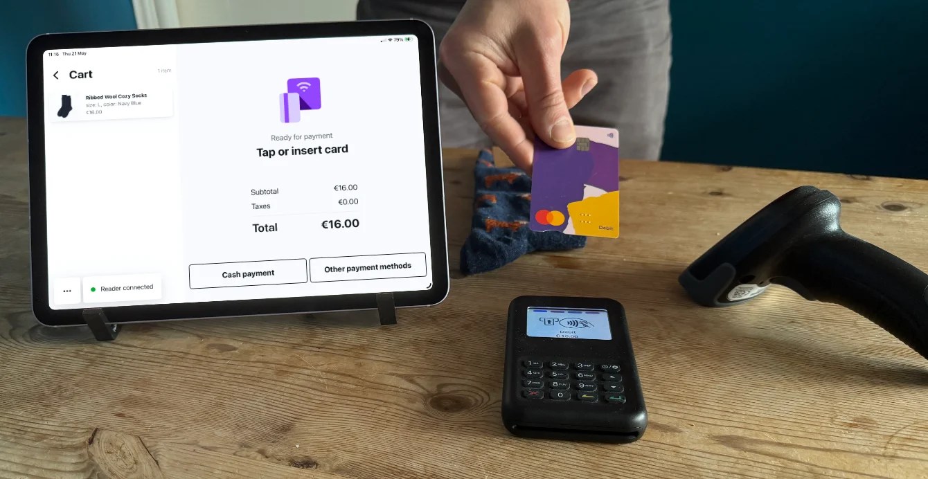
Make the cart easily accessible
If a customer wants to keep shopping after adding a product to their cart, it’s important for them to be able to edit that cart and check out later.
The Mini Cart Plugin for WooCommerce adds a cart option to both the desktop and mobile versions of your website. On desktop, the cart includes the item names, photos, and prices, and allows shoppers to edit quantities without leaving the page. On mobile, it shows the number of items in their cart and the order total. Plus, shoppers can get to the Cart page in one click.
Focus on website speed
↑ Back to topWhile website speed is important on any device, it’s arguably more so for small devices. Mobile shoppers often use slower internet connections or cellular data to browse, so you should do everything you can to make sure your site loads as quickly as possible. 53% of mobile users abandon a site if it takes more than three seconds to load, and Google’s new mobile-first indexing prioritizes the mobile version of your website.
Start by understanding the current load time of your site. GTMetrix and Pingdom Website Speed Test can help you understand your site speed and offer recommendations for improvement. Google PageSpeed Insights even offers a test specifically for mobile devices.
Then, use the following resources to optimize your site:
- How to Optimize Images to Speed Up Your Online Store
- First Things to Consider with WooCommerce and Speed
- Why is My WooCommerce Site Slow and How to Fix it
- How to Achieve a High Performance Score on Google PageSpeed Insights for WooCommerce
- Speed Up Your WooCommerce Site with these Jetpack Features
You may also want to consider enabling AMP (Accelerated Mobile Pages), a framework built by Google to create lightweight, streamlined mobile experiences. It’s a great way to speed up blog posts, especially for certain online stores. Learn more about improving site speed with AMP.
Test your online store on mobile
↑ Back to topIt’s important to regularly test your store and understand how everything functions on mobile devices. The process for your site is similar to the steps listed above for testing theme demos — use a combination of tools like Google’s mobile-friendly test and manual methods like resizing your browser window.
Test everything! Click on every link; scroll through every page; and check every piece of functionality. All aspects of your site should be easy to view, read, and navigate on phones and tablets.
A few small changes on mobile can make a big difference in customer satisfaction and conversions. Looking for more tips? Read How to Unlock the Power of WooCommerce on Mobile.
About