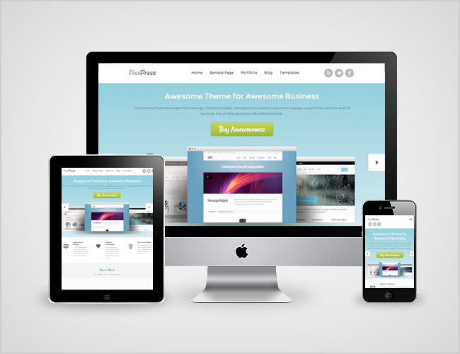
Designed by Paresh Khatri, PixelPress is a responsive business/portfolio/WooCommerce theme that follows in the footsteps of our other popular business themes.
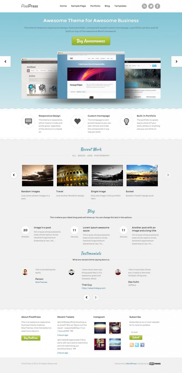
PixelPress has all the great features of previous themes, like the custom homepage which includes a portfolio as well as features, blog and testimonial components. Included on the homepage, as well, is a featured slider which uses our own FlexSlider.
As with our recent FlipFlop theme release and Canvas theme update, PixelPress has custom styling for WooDojo and it’s bundled features, to enhance your website with a tabs widget, Twitter stream, Instagram photo stream widget and more.
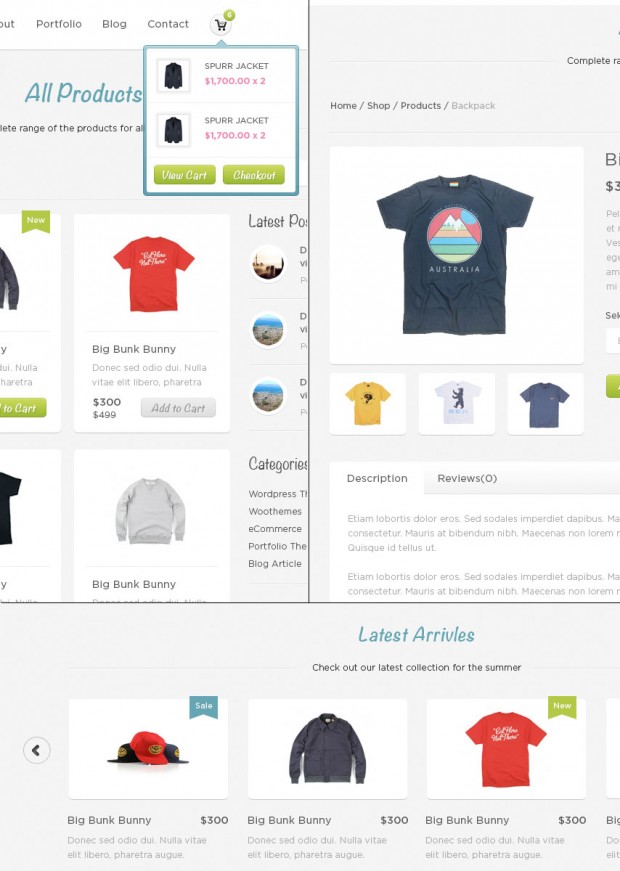
This theme will also support WooCommerce through a child theme which will be released in a weeks time, which will give you the ability to add e-commerce to your site. The WooCommerce child theme will also include a component for the homepage. Here is a little teaser while you wait for the child theme:

There truly is loads to this theme so check out the demo. As always let us know your thoughts, we always value your feedback and strive towards fulfilling as many of your requests as we possibly can.
Grab this theme with a 12% discount coupon, valid until 24th July, 2012. Just use PIXELPRESS12 as your coupon code on checkout.
About


Looks great but the demo links to FlipFlop at the moment!
That may be a cache issue, try force refreshing your browser for the demo. I’ve just purged all the caches on the demo servers 🙂
excellent… i havent seen that before my website creation 🙁 im hoping to use it as my next template!
Great! We look forward to seeing your PixelPress-powered website. Be sure to submit it to our showcase: http://showcase.woocommerce.com/. 🙂
Nice theme, fellas. Like it.
Its looking nice but a small suggestion.. what you think about making the top menu stick and visible all over when you scroll? I
I believe you can do that with CSS if you want 🙂 I think most would like it the standard way.
I like it. It’s simple but well designed. I was bemoaning your offerings recently but I must say these last 2 have been superb, well done guys.
Nice looking theme. Why do you generally make your responsive themes so narrow? Its roughly 685px wide + padding. Miles to narrow, should be 940 min. Also makes the p copy very small (9px) difficult to read.
It’s all about the legibility of copy and the relationship between the typographical scale and the layout proportions. There’s no point having a super wide web site with small copy. All that serves to do is produce a large typographical measure which isn’t easy to read.
I’m not sure how you’re getting to 685px? For me the full width layout in this theme is ≈ 911px and the font-size ≈ 12px.
If you want it to be wider, all you need to do is change the font-size on the body. The default is 1.2em, change it to 1.4em or something and the entire layout will scale in harmony with the typography. Have a play around in Chromes Inspector or Firefox’s Firebug to demo the effects of changing the font-size.
“Have a play around in Chromes Inspector or Firefox’s Firebug to demo the effects of changing the font-size.”
This is the best advice that anyone can receive about a wootheme. Many times, if I don’t like how something looks or the typography, there’s always a typography tab available in the theme settings to deal with that.
WooTheme’s demo server is getting hit pretty hard right now, I imagine, so I’m waiting for some elements on the page to load, but on a 1280×1024 display I’m seeing 1263px width at 1.2em font size, which is more than enough for me. It min-width’s out at 635px, which is acceptable to my phone (Motorola DROID RAZR using Chrome for Android).
I was thinking of switching from Swatch to Inspire for my company website, but honestly… I may put Inspire down (Even though I’ve dropped money on it) and go with PixelPress. Its clean and “business-ey” (That’s a word now) like Swatch, and its a modern WooTheme with all the enhancements that I expect.
Im unable to scroll down when checking it out on an iPad 2 ?
You’ll need to click the red X to remove the style switcher frame on iPad.
When you go responsive the menu’s go poor!
An Average theme
Actually some time browser goes crazy when you check the designs in different devices 🙂 like when i was checking this design in iphone it was working well (regarding fonts yes those fonts are too small to read) but when I have checked this in my galaxy s2 menu goes bit crazy 🙂
Thanks Paresh. We’ll take a look at this and log this with the developer. 🙂
Yes I have this type of problem too- menu works well on iPhone but on my Android the hotspots aren’t lined up vertically with the text. In fact it happens with all hyperlinks on every page, not just the menu navigation. When I touch any link on Android, the focus box is about 10px higher than it should be. Any idea what is causing this?
Oops- I was talking about what happens with the Shelflife theme, not this one. But maybe it’s a universal problem.
I found out what was happening.
The problem seems to have come from the following CSS rule:
text-rendering: optimizeLegibility;
Removing this rule in my CSS restored the tap accuracy on the Android device.
Beautiful! Something tells me this will be your number one Woocommerce theme (this theme + Woocommerce child) in no time. Can’t wait to see the ecommerce version!
Some feedback from the user :
Love the design. But as an ex-developer I have some feedback on the coding:
Recent work & testimonials sections aren’t responsive. Probably the items in there need a “float: none;”, “display: block;” or both.
Also the header fader is a bit wonky. Animate the height of the container while fading out/in the images. Makes for quite the smoother experience. And put the background on the container, not on each item, you can see white gaps during the fade now.
Example (took me 5 tries, sigh…):
http://cl.ly/image/3d0X2D1G112s
Thanks for your feedback on this, Paresh. Tiago will be looking into these items over the next few days. 🙂
As someone who is waiting to throw money at you, all I can say is:
Release that Xero integration extension!!!
😀
Great looking theme BTW.
I hope we can get that out for you ASAP! 😛
1. Looks Great
2. Again, I think I have mentioned this many times. The idea that anyone has only 3 or 4 menu items and a small logos to left is ridiculous. As soon as you have 5 menu items the whole header area breaks and looks silly.
Your designers have got to learn that
1. Most Logos are bigger than in their perfect design (most a much bigger)
2. Menu items should sit perfectly to the right (as launched), or under the logo depending on the amount of items in menu – it is customers fault if they want too many and the bleed into a second line. But it is designers fault (usability) if you can only have 4 main menu items. Sure it can be fixed in CSS , but how many people buy these themes that know CSS?
Last time I made this comment many people agreed, yet the designers still live in perfect pixel world. I rarely make negative comments on this site. But really such a great theme out of the box is ruined by the designer not thinking like their market!
Yes, I agree. The problem with more menu items exists also in your another themes. After having 4 or 5 items, the menu breaks into two lines and starts overlaping with other elements. This is terrible.
One extra point that I’d mention – I’d be nice to have more color options to choose for styles, including some strong (live) colors (like pure yellow, red, blue, green, orange, etc.)
I agree with you that the menu should look good no matter how many items you’ve got, and we’ll look into improving that.
Hi Magnus,
You have a REAL winner with PixelPress – I’m SOOO looking forward to using it soon.
NAVIGATION FEEDBACK – WOO uses two different navigation methods for responsive themes on mobile: 1) Navigation Button (Merchant, Canvas, etc) or 2) Three horizontal lines (PixelPress, Whitelight, etc).
The three lines overlay the logo in all my mobile tests resulting in unusable navigation because pressing the lines instead sends the user to the Homepage because they are actually pressing the logo.
Also in my surveys the three line approach is not intuitive to my clients – they MUCH prefer the clearly labeled Navigation Button a la Merchant.
Hoping you’ll update the PixelPress navigation to be a button like you did with Responsive Canvas which as I recall started with just the lines. I was never able to use Whitelight for this reason – I am hoping PixelPress can become my go-to-theme.
Cheers,
Steve
Hey Steve,
Thanks for the feedback! We’ll be implementing the mobile navigation like in Canvas5 in version 1.0.1 🙂
Is there a chance that you could update whitelight to the navigation button?
I’m going to have to agree here. I’ve done several CSS modifications to both my own and client websites to get the menu to play nice with larger header images and multiple menu items.
As far as the “how many people who buy these themes that know CSS,” I have to ask: Are WooThemes marketed to end users, or to developers who fine tune the template and deliver a finished product to a client? If I wasn’t a developer, I think I’d go glaze over at all the modifications I make to WooThemes stuff.
@Peter Ricci,
thanks for such points and I do agree if you want to add more than 5 to 6 links it will goes on another line and make the theme look crapy.. But as you know you cant satisfy each and every person so if someone have only three or 4 links and if you have them under the logo it will ruined the look of the theme and wont look good and become kind of standard theme which you will find all over other sites and thats what I was worried for while making it.. and I got an option if you have more links you can add them under the sublinks which is the best idea to have as many links you want 🙂 but I will keep your suggestions in mind while making some other theme 🙂
( P.S. Sorry for my bad links)
The theme is lovely but seriously what’s the piont to offering themes if your not offering support anymore?
You guys have gone from providing the best support out there ( the reason for your success ) to providing none at all.
You need to review your new policy, systems and staff and make your support forum the priority it needs to be. Until then im done with woothemes.
Since when don’t they support?
Are you referring to the themes they dropped support for?
Hi Dave,
I’m sorry, but I’m not sure what you are referring to.
Can you elaborate?
I vouch for WooThemes support. It has been great in all my experiences! The solutions are often posted already, but if not, I have always received the help I was looking for. Thanks Woo.
Right, when did they stop providing support, and why haven’t the rest of us been informed about this?
I’ve used WooThemes support recently, and they responded quickly and did what they needed them to do — both via e-mail and on the support forums.
Are you referring to support moving from the forums to the uservoice system? I find the new ticketing system pretty good and seem to get the right answers. I would like a place to refer to previously answered questions like the forums – is this coming?
With UserVoice, we’ve moved away from the forum logic of having all tickets viewable, and instead we’ll be focusing on extending our Knowledgebase with a lot of good articles. All your personal tickets should be available to you in your mailbox.
I woud like to see the user forum back. 99% of the time I had an issue or wanted to make a modification the same issue already came up and was resolved and all I had to do was take the time to look for the answer. In fact I learned allot from the forum and and cant believe you would remove it and make all tickets private. Now you will receive the same questions over and over since the answer is not searchable. Very bad move imo.
Thanks Woo! First one I’ve really liked in a while! 🙂 Keep more like this coming.
Love this theme. Woo Gorgeousness!
I do not know if I’m weird, or I have bad taste, but I do not like the theme, nor the later work of Woo. I think they’ve focused so much on woocommerce and extensions that have lowered the quality of work for the conventional blogs.
I agree with the suggestions of Peter Ricci, but add others:
1. Why are so stubborn in place so narrow themes, and then the area of the post, even with a narrower left sidebar useless? Themes would be welcome wider, with more room for the post.
2. The page layout “blog” is identical in all themes, just change the cover, and that’s all.
3. Adapt the theme to the themes are not bad by resizing the logo that you place. It’s annoying adapt our logo to your size.
1. Have a read of this comment. You can easily change the width of the theme by changing the font size or with 4-5 lines of css. It’s not really a big deal.
2. If you have any interesting suggestions for blog post design then let us know. I agree to an extent that blog design has become somewhat homogenised, but there’s only so much you can do with a headline, a few meta details and post content without confusing people. Blogs are generally there to be read, not stared at as though they’re works of art.
3. Big logos are generally a bad idea. We can’t make the themes work with every dimension of logo imaginable, but I agree that themes such as PixelPress could be improved from the logo perspective. If you’re comfortable with HTML then it wouldn’t be a big job to restructure the header a little bit to give the navigation more room…
Thank you for feedback =) the best of woo is support an feedback
Why no dark style from the get go?
We’ll include that in v1.0.1 for you 🙂
Sweet!
Because dark styles are hard on the eyes and hurt your user’s head … please stop using them. http://uxmovement.com/content/when-to-use-white-text-on-a-dark-background/ http://www.joedolson.com/articles/2006/08/on-the-readability-of-inverted-color-schemes/ Honestly if I click on a site with reverse text, I just click off. It’s poor design and causes me physical pain.
Take some ibuprofen and go away.
Portfolio schmortfolio! When can I haz a new magazine theme!
Was FlipFlop not your thing? 😛
Not really, too newsy not enough magaziney. I’m still using Newspress on http://www.essexdaysout.com and it’s something along those lines I’m after.
Great combination of advanced work and and creative look. I am sure it can rock any business or portfolio website
I sent a message last night but not sure if you got it … I still have no side scrolling arrows in the slider when I view in Safari. I tried restarting everything but there are still not there. Is it just me?
I love the theme though, and disagree with some of these comments. This is not meant to be a magazine theme … your nav bar shouldn’t have 50 items on it, that makes for a sucky user experience. If you can’t narrow it down to a few choices for the user, you have too many. And the theme is beautiful.
Hi Magnas
Love the theme when will v1.0.1 be released?
Thanks
Steve
Should be out on Monday.
Brilliant – Thanks Magnus 🙂
I think the font is way too small on a desktop browser. Responsive designs shouldn’t abandon the desktop and it’s easy to make the font bigger and site wider for just desktops. As it is, it’s unacceptable for client work who need users of different ages and eye sights to be able to read it comfortably. I thought in the last few years of UI design best-practices we’ve been through this.
Nice theme. Great!
I have tried many brands of TV led, phones, computers, etc. But the fact that none compare with apple, applications and presentations that have are wonderful, and also all works of luxury. For example I have tried other brands tactile cell, and when the finger squeeze it never work well, rather than a commodity becomes a problem …
Regards.
I’ve looked throughout the docs, but cannot find anything about the “blog alt” element in the homepage widget. Can someone tell me what I’m missing?
Trackbacks/Pingbacks
Trending
AI is changing how shoppers find your products
By Julia Callicrate •
Best dropshipping products and ideas for 2026 and beyond
By Kathryn Marr •
No Pong: From startup to multinational business with WooCommerce
By Vanessa Petersen •
Never miss a beat — join our mailing list
Please enter a valid email.
View our privacy policy. You can unsubscribe anytime.
There was an error subscribing; please try again later.
Thanks for subscribing!
Emails will be sent to
You're already subscribed!
Emails are sent to