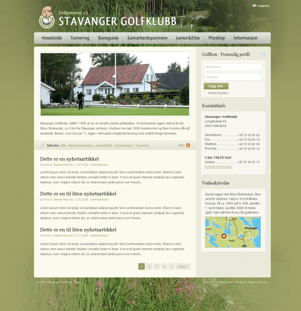
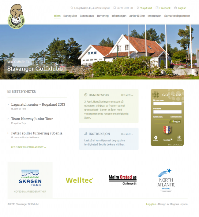
When I was asked to redesign the website for my local golf club a couple of months ago, I knew it was time to update the theme too. I wanted to create the new design using a child theme, and the obvious choice for a parent theme was Canvas. Canvas is our most versatile theme that works great for quickly putting together a website with a child theme.


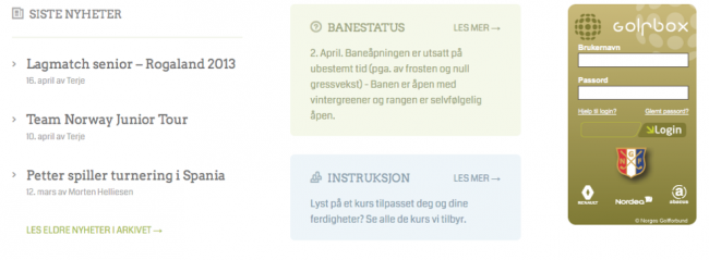
I wanted the new design to have a bit more professional style, and they had specific needs for the homepage layout. I needed to create a custom homepage template which consisted of a image slider, news area, course info, Golfbox login and sponsors.
After designing the site in Photoshop, I was ready to start coding. I installed Canvas as the parent theme, and started with a child theme consisting of style.css, functions.php and a custom.css. See our tutorial for more info on child themes if you are new to this.
I’ll go through each customized area of the site to try to explain what I did, and you can view the project on GitHub to learn from the code yourself.
Getting Started with Canvas
I wanted to include only the things I needed, so the first task was to remove unwanted things in functions.php:
- Remove feedback javascript
- Remove site width from options
- Remove output of custom styles from options
- Remove meta tags with theme / framework info
- Move the navigation inside header
Other things I added in functions.php:
- Setup link to my logo image as I didn’t want to use options panel
- Add Coda and Arvo Google fonts
A Simple Header

For the header, I wanted to have logo and navigation, and an additional contact area above the navigation. I added this contact area with header_address() in functions.php, which basically outputs the HTML in the woo_header_inside hook.
A Customized Homepage

For the homepage, I created a new home.php in my child theme and copied the index.php from the parent theme, where I added the code for the various parts. The news section is a regular custom query which excludes one category. The course info parts are normal page queries. For both these areas, I use the more tag inside the page and only show what is before the more tag on the homepage.
For the main image slider, I used the tutorial on how to add the business slider to the default WP homepage. I wanted the slider to have full width images, so I needed to add quite a bit of custom CSS to accomplish that, which was probably the most tricky part of coding this theme.
The sponsor slider uses Flexslider like the main slider, and I generate the sponsor images using the WP125 plugin.
I also wanted to use some nice icons in the design, which I accomplished with adding a web-font called EightyShades in my style.css. These icons are easy to use, by simply adding a icon class where you want to use it. We include FontAwesome in Canvas so you can do the same in your website!
Adding plugins
I used a few plugins on the site:
- Better WP Security for making the site more secure
- Codestyling Localization to translate to Norwegian. See our tutorial.
- W3 Total Cache to speed up the site
- WooSidebars to add custom sidebars for the individual pages
- WordPress SEO to improve my page titles and description
- WP125 for the management of sponsor ads
Conclusion
I designed and built this site over a weekend, spending probably 10 hours overall which for me is fairly quick compared to previous projects. I used the Canvas tutorials to help me along the way. I hope the child theme is helpful, and if you are new to child themes, I suggest starting with our tutorial. If you have any question, fire away in the comment section.
About


Aren’t you a wiz! Good job!
Nice touches and the full-width slider looks super.
Any tips on why you use W3 Total Cache instead of WP Super Cache?
I see you’re having the same type of troubles as I am with small-size responsive views. The nav menu overlays the squirrel, and then, once the mobile nav menu appears, it doesn’t shift over the main page. It just overlays.
Cheers!
No particular reason for using W3TC, I think any caching plugin is better than no plugin.
I’ve set the option to “Enable Fixed Mobile Layout” in my options so the site shows in full size on mobile devices: http://d.pr/i/ogyF/5URzyIIY
It will still show the responsive parts if you change the width of your desktop browser, but it looks fine on the mobile devices, so I haven’t paid any attention to the placement of the responsive navigation etc.
Liking these case studies! Have there been any issues with Better WP Security and Canvas or other Woo Themes? I’ve started using it in a couple of sites.
I haven’t experienced any issues 🙂
Nice Magnus, any chance you will add a full-width slider option to Canvas core? 🙂
I’m planning to spend some time to try at least. Hopefully it won’t be too tricky.
Thats great news Magnus! Those of us that have voted for this feature would really appreciate it!
http://ideas.woocommerce.com/forums/72423-general-ideas-/suggestions/3623520-option-for-full-width-slider-in-canvas
Thumps up to a full width slider option – that would be a beautiful addition to canvas
Hey… I missed an easter promotion for 13′ : (
Nice job with your golf theme though
Great read! … but the responsiveness of that site is broken.
It works fine on mobile devices. It is only on the desktop it looks broken if you resize your window, but that is fine.
http://woocommerce.com/2013/04/case-study-stavanger-golf-club/#comment-505223
I didn’t want the site to be responsive on mobile, which is why I enabled the option to set it to fixed width.
What a beautiful transformation. Thanks for sharing your process.
Hi Magnus,
Thank you for share this case study. I used the methods here for a client site–looks good on the desktop. I want the layout to be responsive on a mobile phone. Can you please share how we can accomplish that? I am imagining maybe moving the menu out of the header and back to default but really want to use the header space for the menu. Please advise. Thank you.
I just wanted to type a quick comment to appreciate you for these magnificent tricks you are sharing on this website. My long internet research has at the end been honored with brilliant strategies to exchange with my visitors. I ‘d assume that we website visitors are very much blessed to live in a useful site with many awesome professionals with useful tricks. I feel very much blessed to have encountered the web pages and look forward to many more exciting times reading here. Thanks again for all the details.
I know that this will embarass my son, but ………….attaboy Mag
Trending
How to write product descriptions for SEO, AI agents, and shoppers in 2026
By Vanessa Petersen •
How to prepare your store for AI-driven commerce
By Julia Callicrate •
High-converting landing page design for ecommerce (with examples)
By Erika Ellacott •
Never miss a beat — join our mailing list
Please enter a valid email.
View our privacy policy. You can unsubscribe anytime.
There was an error subscribing; please try again later.
Thanks for subscribing!
Emails will be sent to
You're already subscribed!
Emails are sent to