If your business is based on the subscription model, or you offer subscriptions on your store, this is a reality you already know: the path to acquiring a subscriber is a long and tedious one.
Shoppers can take a long time to make up their minds about spending money, but that goes double for an investment over many weeks or months. The task of convincing someone that they need your product or service on a recurring basis isn’t easy, either — even if it’s something they really enjoy, like chocolate or coffee.
So what’s a subscriptions site to do if they want to shorten this path to acquisition? For starters: take a long, hard look at your store’s homepage and the role it’s playing in convincing potential subscribers to sign up.
Your homepage is the first thing most potential customers see, after all. And if it’s not making a compelling enough argument about the benefits of your products, a subscription model, or your company, you can kiss the promise of recurring revenue goodbye.
Let’s explore some of the best practices you should follow for customizing the homepage of a subscription site, and discuss how they can ultimately help you secure more subscribers.
Start by showing off your products — the core of your subscription
Before you can convince a shopper to opt in to a subscription, you have to convince them to opt in to your products. After all, products are the core of your subscription plans — if you can’t show potential customers why they’re worth a shot, you won’t be able to get very far with your subscriptions, either.
[Tweet “Convincing customers to subscribe starts with convincing them your products are worth a buy.”]
Remember that the vast majority of visitors to your store will be new to both your products and your subscription service. So you should customize your homepage to:
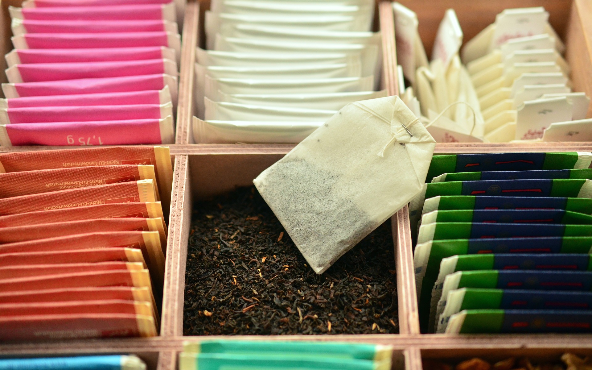
- Show large, beautiful photos of the types of products offered with your subscriptions
- If the products vary or are a “mystery,” show photos or share values of what customers have received previously so new subscribers have a better idea of what they’re getting into
- Use short pieces of copy to describe the value of these items (that is, the value they can bring to customers’ lives)
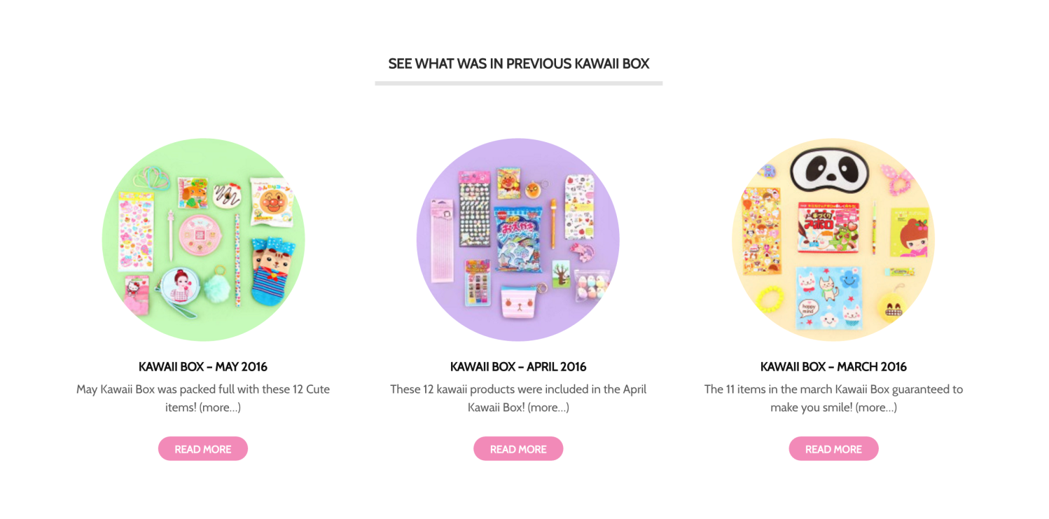
Kawaii Box, a service offering an assortment of cute products from Japan and Korea each month, knows that potential customers won’t sign up unless they have a better idea of what they’re paying for. So the contents of the previous months’ boxes are displayed right on the homepage:
If you lead with the value of your products, it will make it easier to convince a shopper that there’s value in a subscription as well.
But that’s another task altogether.
Make the benefits of a subscription model clear up front
↑ Back to topDepending on what you offer, it might not be too difficult to convince a shopper to buy your product once. Buying your product over and over, though? That’s a harder sell.
Your homepage is an ideal spot to make the benefits of buying on subscription clear. Whether those benefits are cost savings, convenience, or access to something exclusive, you should aim to let visitors know why a subscription is worth it — and do so right away.
This is what you’ll encounter at Salt & Straw, a shop offering ice cream subscriptions with five tasty flavors sent monthly through the mail:
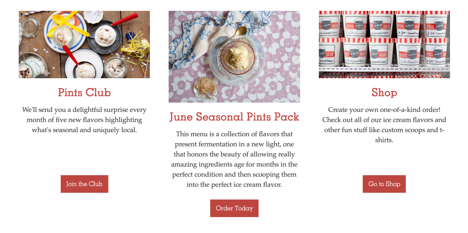
The appeal of an ice cream subscription is likely obvious, but Salt & Straw clearly explains why their ice cream subscription is the one worth buying: with their Pints Club, you get five new flavors to try each month. It’s a crystal clear sales pitch that sets them apart.
Note also that Salt & Straw uses a combination of images and text to make their point clear. You’ll see the same theme repeated with many of the other sites highlighted here. You can say whatever you like about your products or the benefits of a subscription model, but great photos are ultimately one of the best ways to drive your point home.
Place your pricing right on the homepage — don’t make visitors dig for information
Pricing is a common element to find on the homepages of traditional eCommerce stores — it’s coupled with the products themselves. Yet if you head over to many booking, subscription, or membership sites, you might find yourself digging for those numbers.
A word of caution: your potential customers don’t like digging for information, especially pricing. In fact, if some shoppers can’t find how much a product — or subscription — costs right away, they’ll get frustrated and abandon your site.
The solution? Add the prices for your subscriptions somewhere on your homepage, even briefly. “Starting from $19.99 per month,” will work, as will “plans available for $5, $10, and $20 weekly.” You can then add a link to a page with a full pricing plan.
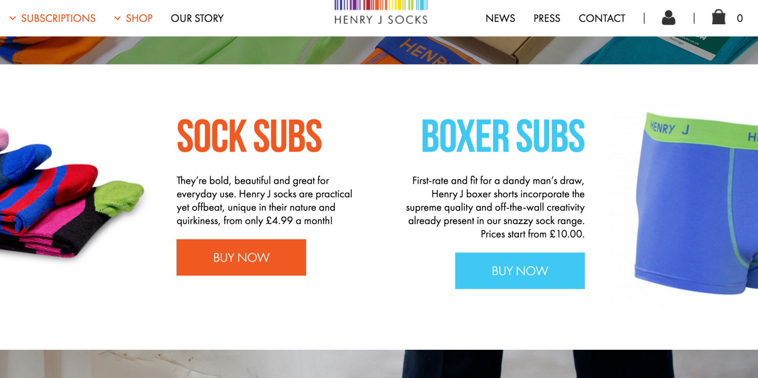
Henry J Socks makes the matter of finding prices for their socks and boxer subscriptions easy: scroll down the homepage and they’re right there, with easy links to access full details for each.
Supercrown Coffee Roasters also has an amazing tool on their homepage used to show you the exact price you’ll pay when you select the coffee volume and delivery frequency you prefer:
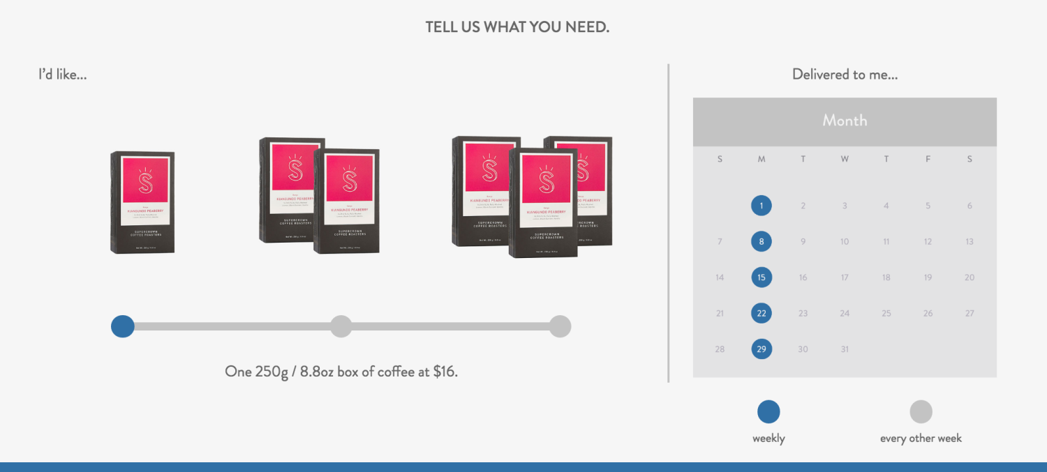
This transparency goes a long way to keeping potential customers satisfied… and on your site.
Don’t forget to mention your subscription frequency options, either
Pricing is one of the details that’s most commonly hidden on homepages, no matter what is offered by the store, but it’s not the only one.
You might unintentionally be losing potential customers by not mentioning the frequency with which you can send your products. Many shoppers assume that subscriptions are a monthly deal only (it’s become the default), and if they don’t see you specify something different, they might say “I can’t afford this!” and jump ship.
But if you have bimonthly delivery options, twice a year subscriptions, or even more frequent delivery plans, you should mention those right up front.
Daily Harvest does an excellent job of doing both this and sharing pricing information, showing how often you can have their fresh ready-to-blend smoothie mixes delivered, and how much you’ll pay:
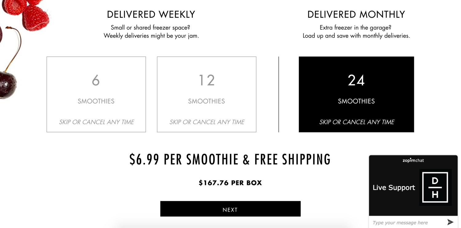
The copy above each option is a nice touch as well, suggesting which delivery frequency might suit you best depending on the amount of space in your fridge or freezer. We give that a hearty thumbs up.
If subscriptions aren’t your only offering, give them enough real estate to stand out (and catch the eyes of repeat customers)
Our final bit of advice goes out to those of you creating a store with both stocked and subscription products, or considering adding subscriptions to an existing store to boost your revenue.
First things first: give your subscriptions enough real estate on your homepage to be noticed. Even if the majority of your revenue doesn’t (yet!) come from subscribers, you won’t do yourself any good to hide the option away.
Secondly, if your store’s been around for a while and subscriptions are a new option, add graphics, banners, or some more beautiful photos to your homepage letting existing customers know they can now get your products automatically. Again, if you hide the option away, they won’t know about it — and you won’t make any money.
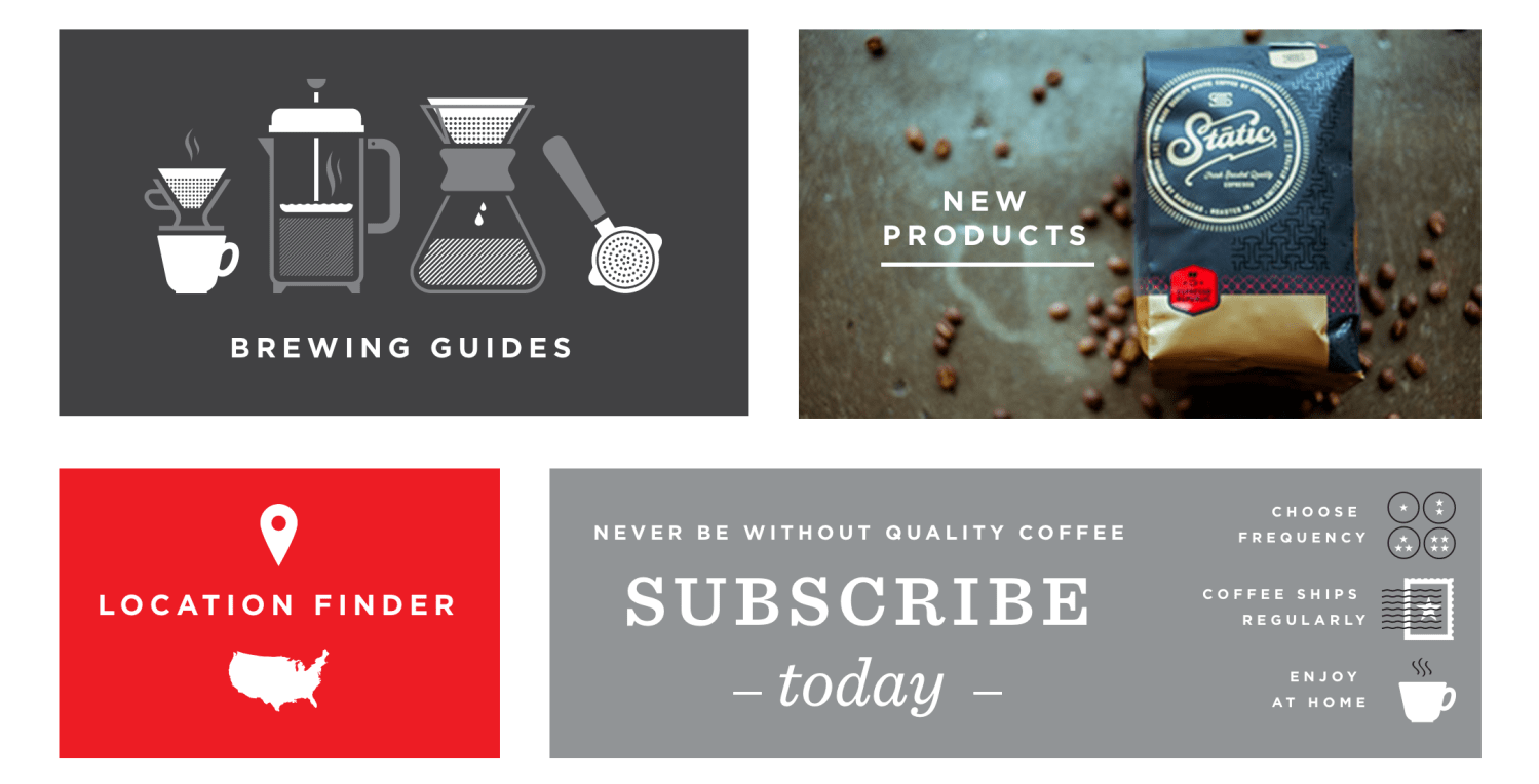
Espresso Republic has their coffee subscription option linked from a spot right at the bottom of their homepage, which is a nice spot for repeat customers to find it:
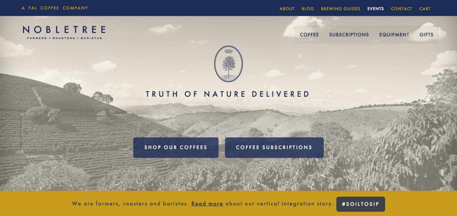
Another coffee store, Nobletree Coffee, does the same from the very start, placing convenient links to both their shop and their subscription options at the top of their site — so whether you’re new to their coffee or a longtime drinker, you know the option’s available.
The process of acquiring a new subscriber starts on your homepage
↑ Back to topThe journey from visitor to longtime customer starts at your homepage, and that’s why it’s crucial to make this first experience count. If you can’t impress them visually, it may create doubt that you can impress them with your deliveries, too.
We hope this advice for improving the first page of your subscription site has proven helpful. If you have any questions, comments, or tips for us, feel free to leave them in the comments!
Related reading:

About
Totally agree with you that acquiring a subscriber is truly long and monotonous way; I have found some best information through this post and it looks perfect to customize subscription.
And one thing more which one I like a lot and that is “Showing off products”; it’s really amazing way to convince shopper. Thanks for providing useful information through this blog. You are really awesome.
Currently, I am planning on working a model just as you have mentioned in the article. I will surely try to incorporate it into the same. After all, the number of subscriptions made Microsoft’s Bill Gates to acquire hotmail.com at a way lower price whereas made the current CEO of Microsoft, Satya Nadella acquire LinkedIn by paying a premium of 50% of the current deteriorated share price of LinkedIn. Subscriptions play a vital role for any business.
Thanks for this tips! I need customizing my subscription zone
Thank you for the presenting the Big Picture on subscriptions. I am currently in the process of redesigning my site from a one page “above the line” to longer more easy to read pages.
Good helpful information!
You are most welcome David 🙂 We’d love to see your site when it’s finished!
Fantastic post, very much useful information for customizing woocommerce home page, we are web development company and your all articles are very helpful for us when you got any trouble regarding woocommerce then we evey time we found solution here.
Thanks
Trending
How to start selling online: Nail the decisions that matter most
By Brent MacKinnon •
AI is shifting commerce — here’s what 225 leaders told us they’re betting on
By Tamara Niesen •
Ecommerce SEO in 2026: What to know when you’re starting out
By Kevin Bates •
Never miss a beat — join our mailing list
Please enter a valid email.
View our privacy policy. You can unsubscribe anytime.
There was an error subscribing; please try again later.
Thanks for subscribing!
Emails will be sent to
You're already subscribed!
Emails are sent to