 Mark Copeman shares his experiences of project managing a site rebuild using PixelPress for Customer Thermometer’s 2nd birthday.
Hi, I’m Mark Copeman. I’ve been working online for the last 4 years and I’m the founder of two businesses. 8:45TV video production and online training business and Customer Thermometer, a customer satisfaction survey tool. I’d class myself as an online entrepreneur of the most dangerous type. I know a little about design and a little about development and have been known to attempt a bit of both when needed. A little knowledge does have its uses though.
This case study is a little different to some of the others here on the blog. I wanted to describe the process I went through to deliver Customer Thermometer v2.0 from a founder / project manager’s perspective.
Background
Customer thermometer was born in December 2010. After a 6 month concept to build phase, we had developed an application which addressed the problem of no one having time to fill in customer satisfaction surveys, yet everyone wants to receive feedback. Customer Thermometer is one click email response customer satisfaction survey tool.

Back in September 2010 we designed and built a brand new WordPress theme, which at the time we thought would get across the messages we needed to deliver and would begin the process of converting visitors into customers.
We made a conscious decision to design and build a theme from scratch we wanted to look unique and not like other sites which appeared “out of the box”. In hindsight, it was the wrong decision. I’ll explain why later.

As you would expect, we spent a lot of time on the original site, from both a content and design perspective, with only a little understanding of conversion at the time. The theme was built from scratch and whilst it was OK, it wasn’t built using any form of framework and so things started to niggle when we wanted to keep things moving and changing. You realized there wasn’t functionality for something I’d become useful with a commercial theme or you’d realise that there wasn’t CSS support for a certain type of bullet you’d never used before.
From a designer’s perspective, there’s nothing worse than someone tinkering with a homepage or layout, we’ll just do this/we’ll just do that, and before you know it, it looks amateur. We were guilty as charged.
In July 2012 we made a decision to rebuild the site, based on extensive Google Analytics and PPC data. We now knew what was important to visitors and what wasn’t. We could see the number of tablet visitors rising and so we could now make some informed decisions about how to redesign the site and make it responsive too.
Our approach
Having been a staunch Woo user over the last 3 years, building sites for my other business, I decided we needed to go back to basics and use a Woo Theme. Why? Because the framework is solid and because if it’s been designed, tested and used by experts, then surely it has to be a better starting point than a brand new design. Why reinvent the wheel?!
My approach might draw criticism, but this is how we moved the site forward:
- We set a deadline of 1 September 2012
- We re-built our site map on paper
- I chose a WooTheme I felt would work
- We revised our site map to fit the theme
- Our designer designed the layouts
- We tweaked the CSS created shortcodes for the layouts so that they could be easily manipulated
- I then built the site with existing and revised content
- We integrated Optimise.ly
- We relaunched on 11 September
Typically you’d decide on a sitemap and then design the site accordingly, however I wanted to fix a starting point and so re-engineered content and layout to fit the theme. For us it worked. For others, it might not.
We chose PixelPress, because we felt it would was a great theme to show off our application.
Content and layout thoughts
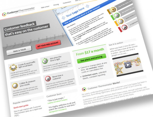
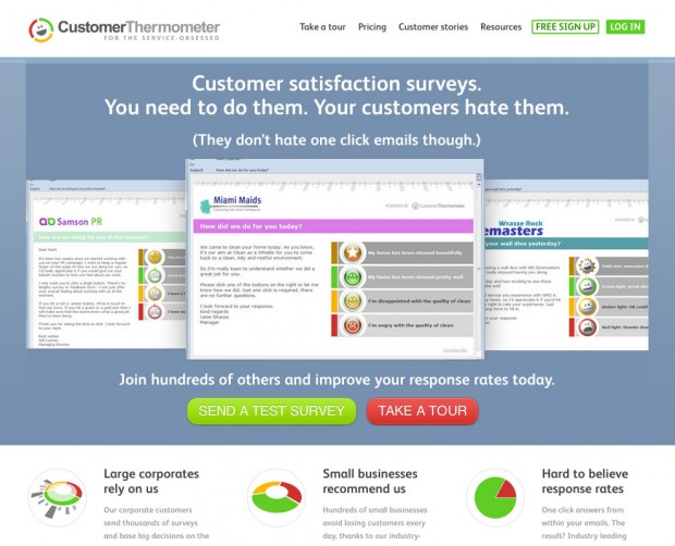
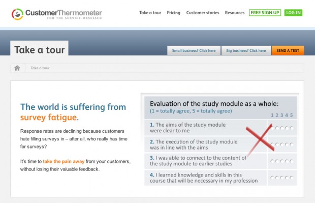
We learnt a lot from our research of other SaaS sites, cut down the amount of words we were using from the previous iteration and added a lot more imagery. The layout is big, bold and simple. We believe we get messages across faster – because people don’t stay for long.

We decided to remove the sidebar layout. Providing lots of options and paths for visitors at first we thought was helpful. In hindsight, it was confusing. If you take control of visitor’s paths through your site, then you have a better chance of taking them through to conversion.
Instead, we’ve added a sticky top navigation, with minimal options to branch, but always available and relevant to visitors depending on the page they’re on. We see sticky nav becoming a trend in user experience going forwards and I suspect Woo will consider building it into themes as an option before long. They should do!


Results
It’s early days, but the analytics and signups are showing that visitors are finding the new site much easier to navigate. We’ve had some great feedback from users too on the new site and as founders, we’re now proud of our shop window, as opposed to being slightly reticent about it – and you can’t put a value on that.
Next steps
It’s time to switch on Optimise.ly, we’ve got a few slides now ready to test on the homepage, which was straight forward to integrate into the theme. We’ve also got to port our blog site over to the new theme too. All in all we’re delighted with the results and would recommend a WooTheme to a non-developer, non-designer like me, any day of the week.
About


I’m currently working with PixelPress for my website’s next evolution, and also found that the sidebar on most pages is distracting. Thankfully, with how WooThemes and WordPress work, its not too hard to remove it for all but the blog pages.
Mark has always shouted about Woothemes and because of him I use the themes for some of my clients.
Mark was instrumental in me moving from Joomla CMS to WordPress and Woo helped with my transition. It isn’t the only theme house I use but with UK (pretty much instant) support, it is one of my favourites.
Probably the most critical thing I had about WordPress was the ever present sidebar and how to not have it on your theme EVER! With Woo themes its easy to get rid of what I feel is the most intrusive element of a WordPress framework.
By the way – I also recommend Customer Thermometer – it’s the coolest customer satisfaction survey tool out there.
Part of my wish list for WOO – Paypal – so much easier to pay and in my view will get more developer sign up too.
I, too, went from a Joomla! developer to a WordPress developer. WooThemes helped the transition immensely, as they are what I consider the “RocketTheme” of WordPress: They have pretty themes (as opposed to templates), nice plugins (as opposed to modules), and a good framework (WooFramework, as opposed to RocketTheme’s Gantry for Joomla! / WordPress) that doesn’t throw a kitchen sink at you in one go (like Gantry for WordPress.)
On the other hand, I can see why WooThemes does not wish to use PayPal. The concept of giving money to a non-regulated entity (they are not regulated as a bank in the United States and several other countries), an “Uncle Larry” if you will, who can randomly decide to levy reserves or account seizures (and does, with alarming frequency, once you hit the $1500 USD per month level) is daunting.
It used to be that PayPal would allow us (business/premier accounts) to use virtual credit card numbers to interface with CC only. This allows merchants who did not wish to use PayPal due to risk factors, or ideological reservations, to still accept PayPal, as well as allowed PayPal users to spend money literally anywhere.
If you are in a country that PayPal allows, there’s always the PayPal debit card.
Trackbacks/Pingbacks