
Overview
↑ Back to topKadar is a WooCommerce block theme for photographers and creators who sell presets, LUTs, prints, courses, and other visual products. It includes six style variations, more than 60 block patterns, nine ready-made pages, a demo content importer, and a fully styled shop, product page, cart, checkout, and My Account.
This guide explains how to install Kadar, import the demo, build your pages, set up your shop, and change the design. You don’t need to write code for any of it.
Requirements
↑ Back to top- WordPress 7.1 or later
- PHP 7.4 or later
- WooCommerce 9.0 or later (tested up to 11.2) for shop features. Kadar also works without WooCommerce as a portfolio and blog theme.
Installation
↑ Back to top- Go to your WooCommerce.com account Downloads page. Click the download icon to get a compressed fuel.zip file on your computer.
- On your website, go to Appearance > Themes and click the Add New button.
- Click Upload to upload the kadar.zip file you downloaded in step 1.
- Go to Appearance > Themes to Activate.
If you are updating an older copy by uploading the zip, choose Replace current with uploaded when WordPress asks.
Getting started
↑ Back to topYou can start in two ways:
- Import the demo content to get the same pages, products, and posts as the live demo, then replace them with your own.
- Start from scratch. Every template already uses Kadar’s patterns and bundled photos, so your site looks complete right after activation. Edit the templates and pages as you go.
Import the demo content
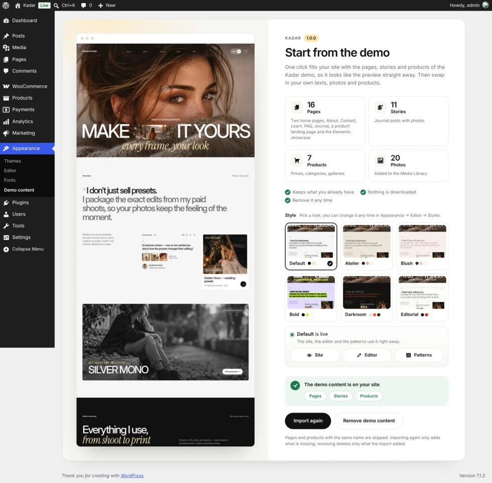
↑ Back to top- Go to Appearance > Demo content.
- If WooCommerce is not installed, leave Install and activate WooCommerce ticked to have Kadar install it from WordPress.org. Untick it to import only pages and posts.
- Click Import demo content and wait for the progress bar to finish. It usually takes less than a minute.
- Optional: pick a style on the same screen. The large preview follows the style card you hover.
The import adds 16 pages (two home pages, About, Contact, Learn, FAQ, Journal, a product landing page, and the Elements showcase), 11 Journal posts, 7 products with prices, categories, and galleries, 20 photos in the Media Library, and the dark and light logo. It sets Home as your front page and Journal as your posts page only if your site still shows the latest posts on the front page. It never overwrites existing pages with the same slug.
Remove the demo content
↑ Back to topOn Appearance > Demo content, click Remove demo content. Kadar deletes only what the import added, restores the settings it changed, and switches the style back to Default unless you made your own style changes. You can import again at any time; only missing items are added.
Pages and patterns
↑ Back to topKadar builds pages from block patterns. A pattern is a ready-made section, such as a hero, a reviews slider, or a FAQ, that you insert and then edit like any other block.
Insert a pattern
↑ Back to top- Open a page in the editor.
- Click the + (Block Inserter) in the top toolbar and open the Patterns tab.
- Choose a category that starts with Kadar, for example Kadar · Hero.
- Click a pattern to insert it, then replace the text and images.
Kadar pattern categories:
- Hero: 11 openings, including a photo slider, a shoppable hotspot, a collage, moving photos, big type, and a one-product before/after
- Features: bento grid, icon cards, photo with numbered list, sticky heading with rows, steps, lessons, and logo strips
- Story and gallery: about, numbers, milestones, masonry, and portfolio galleries
- Reviews, Pricing, and FAQ
- Shop, Journal, and Call to action
- Header (6 layouts) and Footer (5 layouts)
Use a ready-made page
↑ Back to top- Go to Pages > Add New Page.
- In the Choose a pattern window, pick one of the Kadar pages: Home, Home with slider, Product landing page, About, About with photo, Learn, Contact, FAQ, or Journal.
- Edit the content and publish.
Pages that start with a full-width photo use the Landing page (header over image) template automatically, so the header sits over the photo.
Page templates
↑ Back to topIn the page settings sidebar, under Template, you can choose:
- Page: the standard page with a title
- Page without title: for pages built entirely from patterns
- Landing page (header over image): the header sits over a full-width photo at the top of the page
- Page with photo header (header over image): the featured image, page title, and excerpt form a dark header band
Set your home page
↑ Back to topGo to Settings > Reading, choose A static page, and select your Home page as the homepage and Journal as the posts page.
Header and menu
↑ Back to topEdit the header in Appearance > Editor > Patterns > Template parts > Header.
Choose a header layout
↑ Back to top- Open the header in the Site Editor.
- Click an empty spot in the header so the sidebar shows Template Part, then open the Design panel.
- Click a layout to switch to it. Your logo and menu links stay the same.
The layouts include logo left with the menu in the center, a centered logo, a minimal bar, a shop header with search, and a header with an announcement bar.
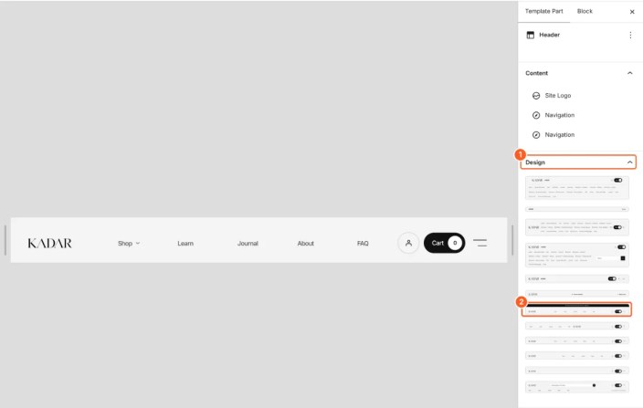
The Header over image template part is the white version that sits over the photo at the top of the home page and landing pages. Edit it the same way.
Sticky header
↑ Back to topSelect the header group and open When the page scrolls in the sidebar. Choose a compact bar that stays at the top, or one that appears when visitors scroll up.
Logo
↑ Back to topKadar uses the WordPress Site Logo block, so you upload the logo once and it appears in every header, the footer, and the menu panel.
Add your logo
↑ Back to top- Go to Appearance > Editor > Patterns > Template parts > Header.
- Click the logo (or Site Logo under Content in the sidebar).
- Click Replace in the toolbar and upload your logo, or choose one from the Media Library.
- Set the size with Image width in the sidebar, then click Save.
Until you add a logo, Kadar shows your site title as text in its place.
For the sharpest result, use an SVG, or a PNG or WebP at least twice as wide as the width you set.
Logo over photos
↑ Back to topSome pages start with a full-width photo, and the header sits over it in white: the home page, landing pages, and pages that use the Landing page (header over image) template. A dark logo would be hard to see there, so Kadar gives you two options in the Logo over photos panel of the Site Logo block:
- Choose a light logo. Upload a white or light version of your logo. Kadar shows it over photos and your regular logo everywhere else.
- No light logo. If your logo has a transparent background (SVG, or a transparent PNG or WebP), Kadar shows it in white over photos automatically. To keep its own colors over photos, turn off Without a light logo, show this logo in white.
A logo with a solid background, such as a JPG, always keeps its own colors, because turning it white would make a white box.
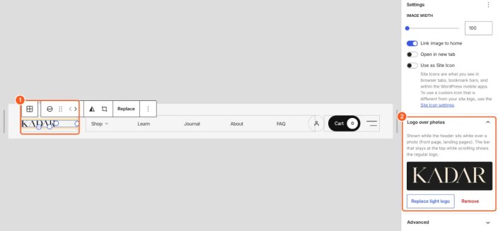
When visitors scroll, the header turns into a light bar that stays at the top, and the regular logo comes back. The Darkroom style is dark everywhere, so it uses the light logo on every header.

Menu
↑ Back to topThe header has two menus:
- The main menu in the middle of the header. Edit its links in the Navigation block. Submenus open as a small card with a description under each link; add the description in each link’s settings.
- The menu button (the two lines on the right). It opens the full-screen Mega menu panel.
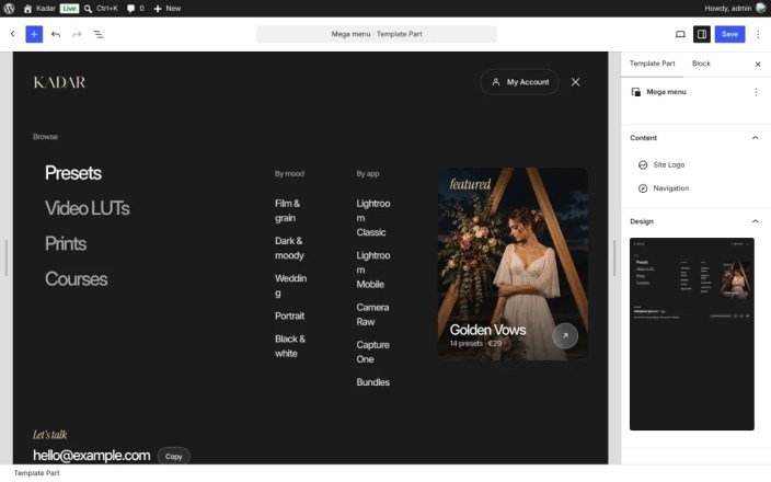
What is in the mega menu
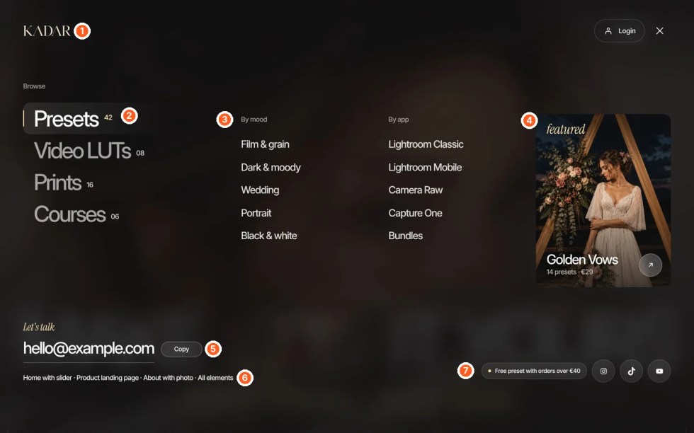
- Top bar: your logo, a My Account or Login link, and the close button.
- Categories: large tabs on the left. Hovering or tapping one switches the links and the featured product on the right. The small numbers are product counts that you type in yourself.
- Links for the selected category: two short lists with a heading each, for example By mood and By app.
- Featured product: a photo card with a product name, a short line such as “14 presets · €29”, and an arrow link.
- Contact: a heading and your email address with a Copy button.
- Page links: a row of extra links. In the demo, this row shows only while the demo pages exist.
- Badge and social links: a short promo line and your social icons.
Edit the mega menu
↑ Back to top- Go to Appearance > Editor > Patterns > Template parts > Mega menu.
- Click any text to change it, or select a link and change its URL in the toolbar.
- Categories: the tabs are a Tabs block. Click a tab name to rename it. To add a category, select the Tabs block and add a tab, then fill its panel with the same columns. In the sidebar, Hover highlight sets the highlight style and line color.
- Links: each list is a List block. Press Enter at the end of a line to add a link, and use the link button in the toolbar to set where it goes.
- Featured product: the card is a Cover block. Click Replace to change the photo, then edit the title, the line under it, and the link.
- Email: edit the address and its link. Select the paragraph to show or hide the Copy button and change its labels in the sidebar.
- Social links: select the Social Icons block and set your profile URLs.
- Click Save.
The menu on phones
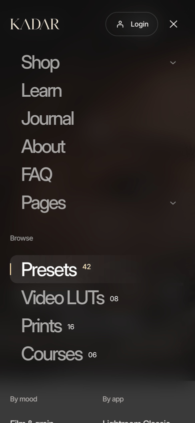
↑ Back to topOn phones and small tablets, the main menu doesn’t fit in the header, so the menu button opens the same panel with your main menu at the top as large, easy-to-tap rows. Submenus open in place. You don’t need to set this up: Kadar copies the links from the header’s main menu automatically, so you edit them in one place only.
Announcement bar
↑ Back to topInsert the Announcement bar header pattern and edit the text. Visitors can close the bar; it stays closed until you change the text.

Turn on the announcement bar
↑ Back to top- Go to Appearance > Editor > Patterns > Template parts > Header.
- Open the Design panel and choose the layout with the dark bar at the top (Header — with announcement bar).
- Click the text in the bar and write your message. Select the words that should be a link and set the URL.
- Click Save.
How it works for visitors
↑ Back to top- Visitors can close the bar with the × button.
- Once closed, it stays hidden on every page for that visitor.
- When you change the text, the bar comes back for everyone, because it is a new message.
To remove the bar, choose another header layout in the Design panel.
Footer
↑ Back to topEdit the footer in Appearance > Editor > Patterns > Template parts > Footer. To switch layouts, insert a pattern from Kadar · Footer: Newsletter, Dark columns, Big call to action, Light with wordmark, or Minimal. The newsletter form works with the Jetpack Subscribe block or any form block you prefer.
Shop
↑ Back to topKadar styles WooCommerce out of the box. Follow the WooCommerce setup guide for payments, shipping, and taxes; the theme reads those settings automatically.
Add a product
↑ Back to top- Go to Products > Add New Product.
- Add the title, price, description, a short description, and the product image.
- Add more images to the Product gallery.
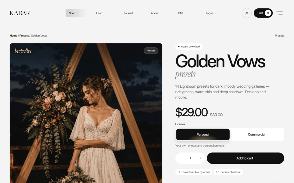
- For files, tick Virtual and Downloadable and upload the file. The product page then shows Instant download and Download link by email.
- For physical products, enable Manage stock in the Inventory tab. The product page shows In stock, Only N left (at your low-stock amount), On backorder, or Out of stock.
Before/after slider on a product
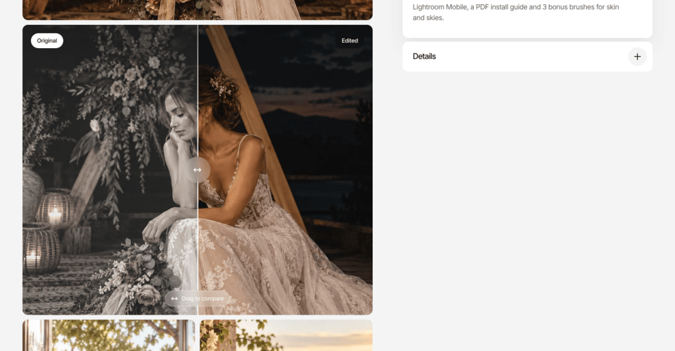
↑ Back to topThe product page can show a slider that customers drag to compare a photo before and after your edit. It is the first image in the gallery below the main product photo, and it is the quickest way to show what a preset or LUT does.
Set it up
You need two versions of the same photo: the original (before) and the edited one (after).
- Go to Products and open your product.
- In the Product gallery box on the right, click Add product gallery images and select both photos. Put the edited photo first and the original after it, then add any other photos.
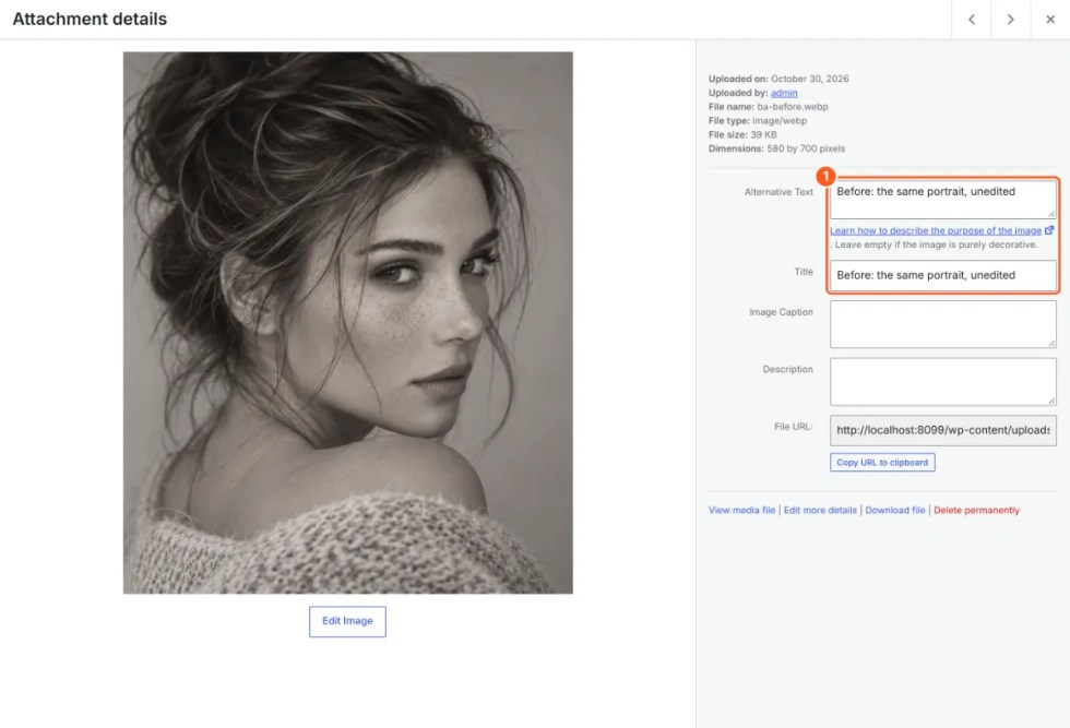
- Mark the original as the “before” photo. In the Media Library window, click the original and start its Title, Alternative Text, or Caption with the word Before, for example “Before: the same portrait, unedited”.
- Click Update.
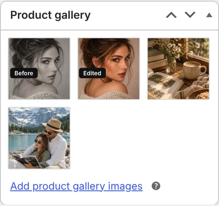
Kadar finds the photo marked Before and pairs it with the first other photo in the gallery. The slider shows the labels Before and After. Up to four more gallery photos appear under the slider, two per row.
Good to know
- The order of the before photo in the gallery doesn’t matter. Only the word Before does.
- The before photo is never shown on its own: it is left out of the photo grid and of the review photos.
- Use photos with the same size and crop, so the two sides line up exactly.
- No before photo? The slider still appears with the first gallery photo and a muted copy of it, labeled Original and Edited, so the layout never looks broken. Add a before photo to show your real edit.
- No gallery photos? The slider and grid are hidden, and the product page shows only the main product image.
- If your site is in another language, the translated word for “Before” also works.
Licence or variation switch
↑ Back to topCreate a variable product (for example, Personal and Commercial licences). Kadar shows the variations as a pill switch above the Add to cart button.
Reviews
↑ Back to topTurn on reviews in WooCommerce > Settings > Products. The product page shows the average rating, a reviews slider, and up to four gallery images under each review. The section is hidden when reviews are off.
Shop, cart, checkout, and My Account
↑ Back to topThe Shop and category pages, mini cart drawer, cart, checkout, order received page, and My Account use Kadar’s design automatically. The cart and checkout use the WooCommerce blocks, so payment gateways and extensions work as usual.
Blog (Journal)
↑ Back to top- Go to Posts > Add New Post, write your story, choose a category, and set a Featured image.
- The Journal page lists posts with a featured story and reading time. Journal sections on other pages show only posts that have a featured image.
- To add a Journal to any page, insert a pattern from Kadar · Journal.
Styles and fonts
↑ Back to topStyle variations
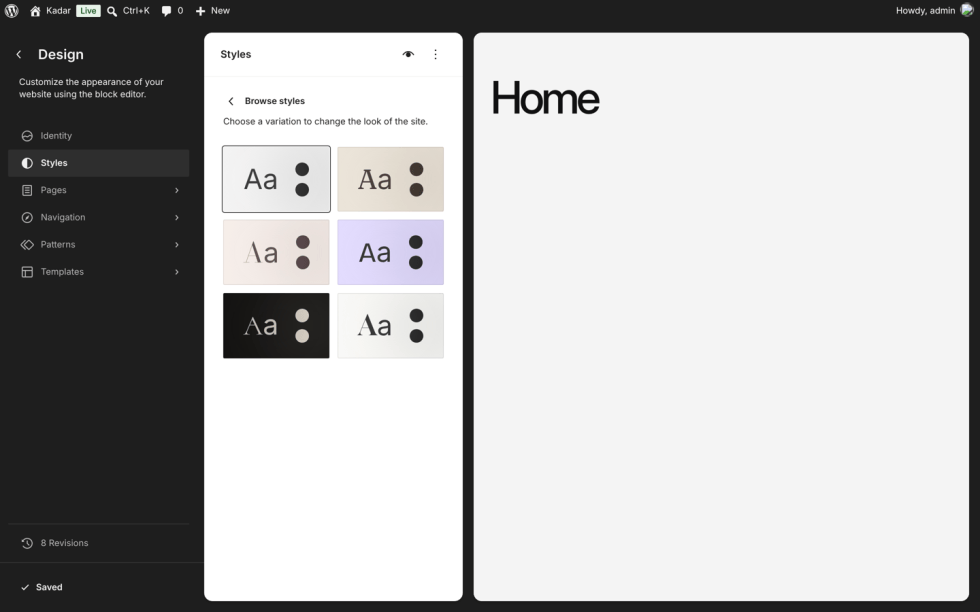
↑ Back to topGo to Appearance > Editor > Styles and choose one of six styles:
- Studio (default): soft gray, ink, and a warm cream accent
- Atelier: linen and espresso, Fraunces and Manrope
- Bold: lavender, black, and lime, condensed uppercase headings, square shapes
- Darkroom: dark background with a safelight red accent, Cormorant and DM Mono
- Blush: powder pink and plum, Bodoni Moda and Nunito, arched portraits
- Editorial: paper white and black, Gloock and Newsreader, one red accent
You can also pick a style on Appearance > Demo content.
Colors, fonts, and buttons
↑ Back to topIn Appearance > Editor > Styles, change the palette under Colors, the fonts under Typography, and the button look under Blocks > Button. Your choices always take priority over the theme’s defaults, including on WooCommerce buttons. All fonts are included with the theme and load from your own site.
Mobile and tablet settings
↑ Back to topKadar supports the WordPress responsive controls. Values you set for Mobile or Tablet in the block sidebar always win over the theme’s own mobile layout.
Block options added by Kadar
↑ Back to top- Hover text (Buttons): select a button and click the roll icon in the toolbar. Enter a second label; it rolls in on hover.
- Hotspot position: select the hotspot (Details block, Hotspot style) and move the Hotspot position sliders to place the dot on your photo.
- Hero slider: each Cover block is a slide. Set Seconds per slide in the Slider panel. Use ‹ Slide › / + Slide in the toolbar to move between slides in the editor.
- Slider arrows: show or hide arrows on review sliders in the Slider arrows panel.
- Image styles: Polaroid and Zoom on hover, in the Image block’s Styles panel.
- Navigation and Tabs: choose the highlight style and line color in the block sidebar.
Translation
↑ Back to topKadar is translation-ready. The POT file is in kadar/languages/kadar.pot. Translate it with a plugin such as Loco Translate, or place your .mo file in wp-content/languages/themes/. Right-to-left languages are supported.