Landing pages are excellent tools for driving sales any time of the year, but can be particularly effective during the holidays. Throughout the gift-giving season, shoppers are bombarded with hundreds of offers and may find themselves endlessly scrolling through online stores’ catalogs to find the right gifts. A landing page about just one product or gift package can be a good way to focus a customer’s attention and nudge them to make a purchase.
What is a landing page?
↑ Back to topLanding pages are a single page that concentrates on converting customers for a specific offer. They may be used to generate leads, collect email addresses for a newsletter, gather market research information, or capture direct sales of goods and services.
The key element of a landing page is that it eliminates as many barriers to conversion as possible by removing distracting navigation, visual clutter, competing offers, and — in the case of product sales-focused landing pages — providing a quick and seamless checkout.
How is a landing page different from a product page?
↑ Back to topA product page is part of a broader catalog on your site. Product pages are dynamic and can be sorted and filtered. They usually include a variety of options for interaction like “add to wishlist”, “add to cart”, “share”, and “buy now”. On product pages you’ll be able to see the site’s header, footer, and site navigation, and be able to access multiple areas of the site. Product pages might also show you related products or “frequently bought together” suggestions.
Landing pages are static, don’t use header or footer navigation, and are free from sidebars that promote other products. Most of the time, a landing page will focus on a single offer, but may include limited upsells during the checkout process or offer “good, better, best” package options. They also aim to make checkout as quick and easy as possible. Often the offer and checkout will be on the same page, or the “buy now” button may skip the cart and go straight to a single checkout page.
While landing pages are usually tied to specific marketing campaigns, they can also be used in lieu of product pages depending on the nature of your business. For instance, if you run a service-based business and only offer a handful of packages, you may do well to use landing pages for each one instead of using standard product pages. If you run a store with hundreds of shippable products or digital downloads, however, you’d be better off using landing pages only for targeted advertising campaigns.
Best practices for creating holiday landing pages that convert
↑ Back to topThe hardest part is creating your first one. Once you’ve done that, you can use it as a template for future landing pages. Even if you completely change your content from one landing page to another, the basic principles of good design remain the same. By using the following tips, you’ll have the best chance of getting your landing pages right the first time.
Keep your landing pages simple and easy to navigate
Eliminate distractions on your landing pages. Remove header and footer navigation menus, sidebars, sticky share buttons, related products, and any other content that’s not relevant to the offer you’re promoting.
Make the order of information easy to follow on both desktop and mobile. Consider hiding some information blocks on mobile devices that may be of lesser importance in order to reduce the amount of scrolling.
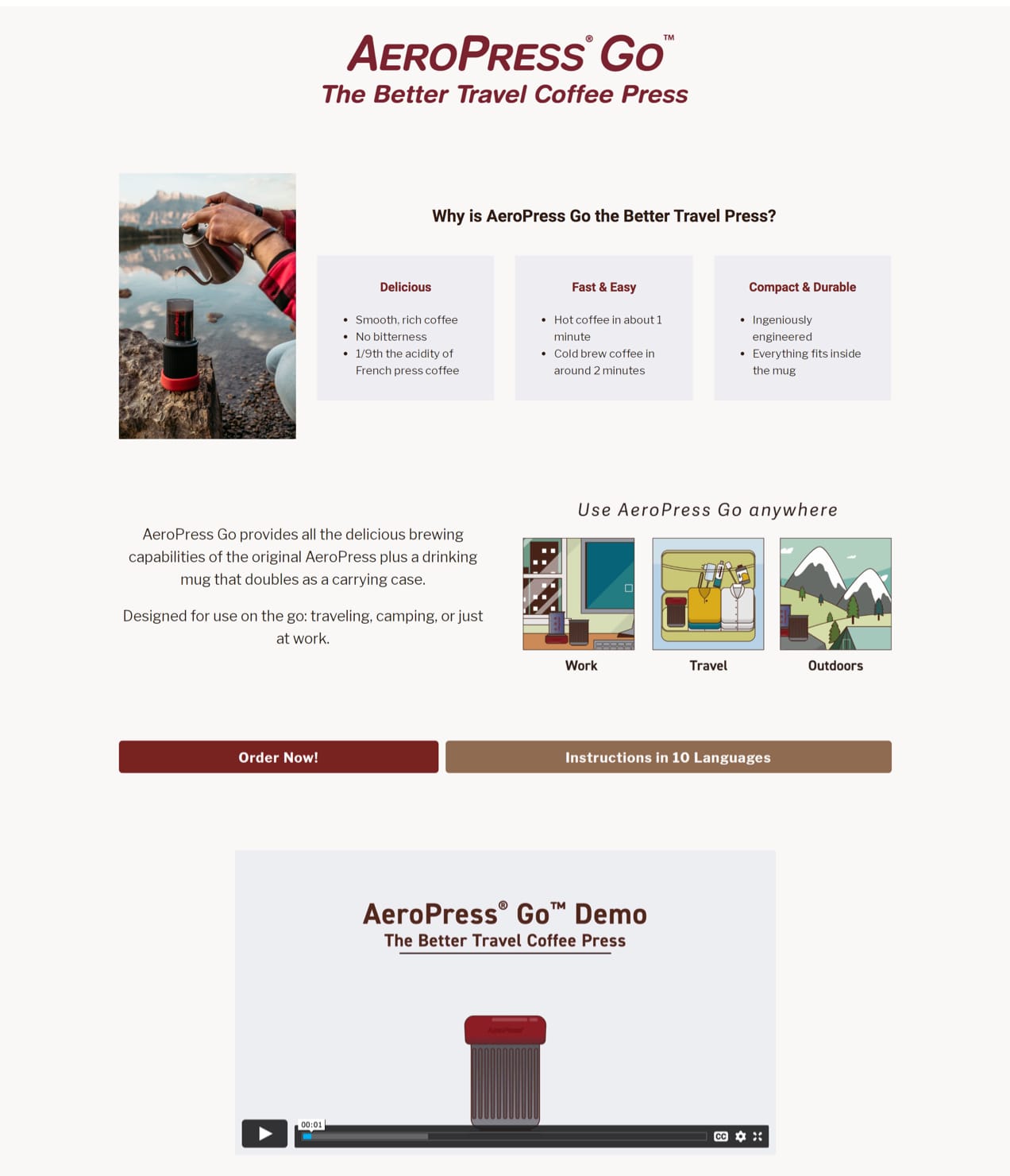
Lead your layout with an attractive image and enticing call to action (CTA). Include a “buy now” button near the top for shoppers who don’t need much convincing to make a purchase. Some people will come to your landing page ready to buy, so make it easy for them to do so.
Make sure your landing page loads quickly
Nothing sends customers away from your page like long load times. Make sure that it loads quickly across different device types by checking your speed with free tools like Google Lighthouse, Pingdom Tools, or GTMetrix. Your landing page should load in two seconds or less. If you notice that it’s loading a little slowly, take the time to optimize your landing page for better loading speeds.
Write compelling CTAs
Not only should you place a strong CTA at the top of your landing page, but you should add compelling CTAs with varied messaging that might appeal to different types of buyers. Your first CTA might be fairly generic, focusing on price or creating a sense of urgency with a sale deadline. Secondary CTAs might focus on special product features or create more emotional connections with buyers.
For instance, if you’re promoting an offer for a handmade soaps and body care package, you might structure your CTAs as follows:
Leading CTA: “Get the complete luxury body care package for only $39.95.” [BUY NOW BUTTON]
Second CTA: “Gentle on the skin. No harsh chemicals. Infused with refreshing citrus and vanilla essential oils.” [BUY NOW BUTTON]
Third CTA: “Our products are made by hand in our workshop in Arrow Rock, Missouri. 5% of each purchase is donated back to support the Missouri Rural Health Association.” [BUY NOW BUTTON]
Use high-quality photos
If you’re selling a physical item, it’s important to use high-quality photography that shows your product from multiple angles. Lifestyle photos that showcase your product in use can help customers envision how they (or their gift recipient) might benefit from your item. If your product requires assembly, instructional photos of how it fits together, or what parts or accessories are included may help purchasers feel secure.
Be careful not to overwhelm visitors with too many photos, though. Focus on the images that are most important for conveying the necessary information about your product. Consider putting additional images in an optional carousel that shoppers can choose to browse if they’re so inclined.
Consider including a video
If photos and text don’t feel adequate to tell the story of your product or offer, consider using a video. A short 30 second to one-minute video may help better explain your product or offer, increase emotional connection with customers, and create more excitement or urgency.
And with the Vimeo for WooCommerce extension, you can easily turn your product photos into engaging videos, no experience required. With just a click of a button, Vimeo will automatically pull your content into a ready-to-publish video that you can embed on product pages or other important pages on your site.
Offer (limited) add-ons, upgrades, and cross-sells
Help shoppers find the gifts they’re looking for by providing suggestions for other products they might be interested in instead of, or in addition to, the one they’re currently looking at.
- Add-ons. Give customers the option of gift wrapping, personalized messages, or other add-ons with the WooCommerce Product Add-Ons extension. You can offer these add-ons for free or increase your average order value by charging a little extra.
- Upgrades. Offer your customers more expensive gift packages or variations of the main product on the cart page or at checkout using the One-Click Upsell Funnel for WooCommerce extension.
- Cross-sells. Suggest accessories or complementary products during checkout with the Order Bump for WooCommerce extension.
Be descriptive while keeping copy brief
Landing pages give you the opportunity to explain features and benefits of your product in a detailed way, but be careful to not over-explain. Shoppers only have so much available attention — especially during the holidays. Be as informative as you can while keeping your copy short and easy to read.
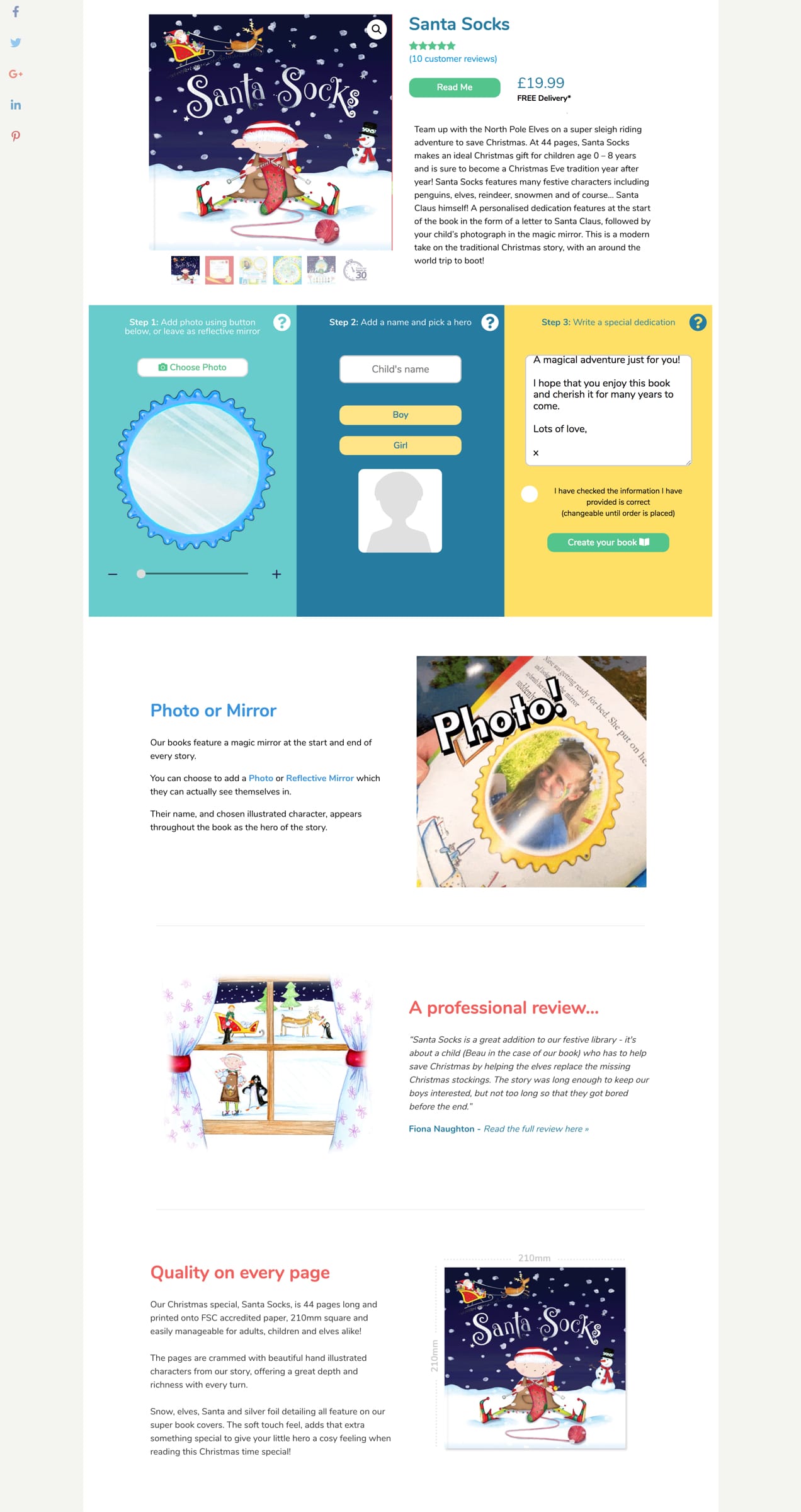
Use headings and subheadings to convey main points. Keep paragraph text brief and use bullet points to highlight the key selling points of your product.
Create urgency
Include clear shipping deadlines. Calling attention to shipping options and delivery times during the holidays can incentivize sales and cut down on customer inquiries. Let shoppers know that they need to order by a specific date to guarantee delivery by the holidays. This will not only create a sense of urgency but also help manage customer expectations.
Use a countdown timer. Countdown timers are great for creating a sense of urgency during holiday sales. The Sales Countdown Timer for WooCommerce extension gives you the option to display countdowns on product pages and your shop page. You can customize your timer — use holiday-themed colors or just style it to match your brand — and choose its position on the product page.
Include offer expiration date. If your sale ends on a certain day, call attention to it in your CTAs or at the top of your landing page. Make it clear to shoppers that the offer is only for a limited time.
Emphasize scarcity. Using language like “while supplies last” or “limited to 250 editions” can encourage customers to make a purchase immediately instead of leaving the site to think it over.
Tie your landing pages to ad campaigns
Don’t forget to connect your landing pages to your advertising campaigns so that you can track their effectiveness. Make sure the correct tracking pixels are installed on your site and that you’re using your landing page’s URL as the final destination for your ad.
Not only should your landing page be literally connected to your ad campaigns, you should also make sure that the imagery, branding, and messaging match so that customers have a consistent experience and know they’ve arrived at the right place.
Use social proof and trust badges
Include reviews, testimonials, star ratings, and trust badges to help boost your credibility. Since landing pages may look different than your website, customers familiar with your brand may initially be suspicious of a page that doesn’t look quite the same. Including reviews from your product pages and social media as well as trust badges that promise a secure transaction experience can help shoppers feel more confident about buying.
Add checkout directly to your page
Make the path to conversion short and sweet by adding WooCommerce One Page Checkout to your landing page. A fast and simplified checkout experience is especially important during the holiday rush. Try to minimize any extra steps during the checkout process that might discourage customers from making a purchase.
Asking customers to create an account, confirm their email addresses, or include fields like “company name” may annoy customers and lead to more cart abandonment. With the Checkout Field Editor extension, you can remove unnecessary fields (or even add custom ones like an optional gift message).
Offer convenient payment options
Make checkout quick and convenient for customers by offering a few different payment options. If your customers are already logged into your website, WooCommerce Payments lets them use saved payment methods. It also gives customers the option to pay with Apple Pay.
Amazon Pay and PayPal are two other widely-used payment gateways that many shoppers already have accounts with. When a customer doesn’t have to fumble around for their wallet to make a purchase, that’s one less thing keeping them away from the “buy now” button.
Make it festive
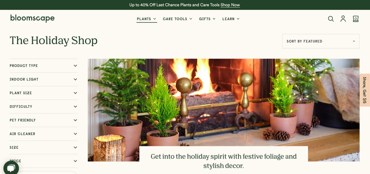
Lastly, your holiday landing pages should include a variation of the messaging and graphics that you’re using on the rest of your website. Not only does this provide branding consistency, customers usually expect to see some seasonal theme when they visit websites to check out their holiday sales. Using holiday-themed photos, graphics, and language where appropriate can help get shoppers into the gift-giving (and gift-buying!) spirit.
A/B test and analyze the data
If you’re just getting started with landing pages, you may not want to overwhelm your marketing to-do list with multiple variations. You might just start with one and see how it goes, but you’ll get a better read on how effective your offers and page designs are if you create an A/B test.
For an A/B test, create two different landing pages and only change one variable at a time. Perhaps you want to test a pricing offer or shipping options. Maybe you want to test a shorter landing page against a longer one.
Changing one variable at a time will help you identify exactly what’s performing well and what isn’t. Send an equal amount of traffic to both pages using the same ad campaigns and audiences to make sure there aren’t variables on the advertising end that are affecting conversions.
Take what you learn and, if you have time, tweak your landing pages throughout the holiday sales season. If your sale periods are quite short, you can at least use your learning to inform next year’s campaigns.
Make your pages twinkle
↑ Back to topLanding pages are an excellent way to drive holiday sales because they remove distractions while still providing all the information shoppers need. But at the end of the day, it’s all about communicating your offers clearly, keeping things simple for customers, and sprinkling in some holiday cheer.
Have you created any festive landing pages this year? Share them in the comments!
About


