Location: SensAI > Design & Appearance
Customize the chat interface to match your brand and provide a consistent user experience.
Enable Chatbox
↑ Back to topPurpose:
Show or hide the chat bubble on your website.
Options:
- ON (purple): Chat bubble appears on the frontend
- OFF (gray): Chat bubble is hidden (useful for testing)
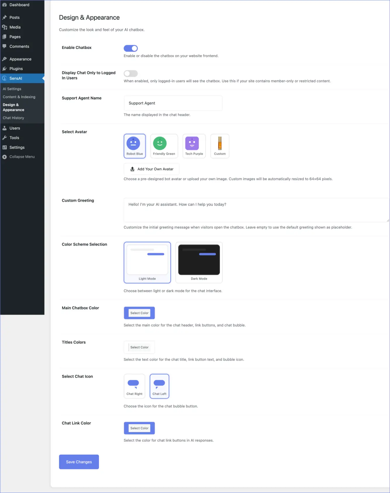
Display Chat Only to Logged-In Users
↑ Back to topPurpose:
Restrict chatbot visibility to logged-in WordPress users.
Default: OFF – Everyone can see and use the chatbot
ON: Only logged-in users see the chatbot
When to Use:
- Membership sites with restricted content
- Private communities or internal sites
- Customer support portals
- Sites where AI support should be limited to members only
How it Works:
- Non-logged-in visitors: Chatbot is completely hidden (no button, no assets)
- Logged-in users (any role): Chatbot is visible and functional
Support Agent Name
↑ Back to topPurpose:
The name displayed at the top of the chat window.
Default: “Support Agent”
Examples:
- “Alex”
- “Customer Support”
- “Help Assistant”
- Your brand name
Select Avatar
↑ Back to topPurpose:
Choose the profile picture displayed in the chat header.
Options:
- Robot Blue: Friendly robot avatar
- Friendly Green: Welcoming bot
- Tech Purple: Modern tech assistant
- Custom: Upload your own image
Custom Avatar Instructions:
- Select Custom
- Click Add Your Own Avatar
- Choose an image from your media library or upload a new one
- Image is automatically resized to 64×64 pixels
- Works best with square images
Custom Greeting
↑ Back to topPurpose:
Set the first message visitors see when they open the chat.
Default:
“Hello! I’m your AI assistant. How can I help you today?”
Tips:
- Keep it friendly and welcoming
- Mention what you can help with
- Use your brand voice
- Keep it under 2–3 sentences
Examples:
- “Hi! I’m here to help you find the perfect product. What are you looking for?”
- “Welcome! Ask me anything about our services and I’ll point you in the right direction.”
- “¡Hola! Estoy aquí para ayudarte. ¿En qué puedo asistirte?”
Color Scheme Selection
↑ Back to topPurpose:
Choose between light or dark mode for the chat interface.
Options:
- Light Mode:
- White background
- Bright, traditional look
- Better readability in sunlight
- Dark Mode:
- Dark background
- Modern, trendy aesthetic
- Easier on eyes in low-light environments
Preview:
Mini previews show how each mode looks before saving.
Main Chatbox Color
↑ Back to topPurpose:
Set the primary color used throughout the chat.
Default: #667eea (purple)
Used For:
- Chat header background
- Chat bubble button
- Active states and accents
Tips:
- Use your brand’s primary color
- Ensure good contrast with white/black text
- Test in both light and dark modes
Titles Colors
↑ Back to topPurpose:
Text color for chat title and bubble icon.
Default: #ffffff (white)
Used For:
- Chat header name (“Support Agent”)
- Icon inside chat bubble
Tips:
- Use white for dark main colors
- Use dark colors for light main colors
- Test readability on different screens
Select Chat Icon
↑ Back to topPurpose:
Choose the icon inside the chat bubble button.
Options:
- Chat Right: Speech bubble facing right
- Chat Left: Speech bubble facing left
Tip: Both options work well; choose based on preference.
Chat Link Color
↑ Back to topPurpose:
Set the color of clickable link buttons in AI responses.
Default: #667eea (matches main color)
Used For:
Buttons like “View Product” or “Read More” in AI responses.
Tip:
Match your Main Chatbox Color for consistency.