NOTE
This product is no longer available on WooCommerce.com. This document has been left available for existing users, but will no longer be updated.
The QODE Quick View for WooCommerce Pro allows your WooCommerce store to provide visitors with handy pop-up product previews on the product listing pages, complete with image galleries, detailed product descriptions & lots more.
Installation
- Download the qode-quick-view-for-woocommerce-pro.zip file from your WooCommerce account.
- Go to: WordPress Admin > Plugins > Add New > Upload and select the ZIP file you just downloaded.
- Install Now and Activate the QODE Quick View for WooCommerce Pro extension.
More information at: Install and Activate Plugins/Extensions.
Updates
Connect your site to its WooCommerce account to receive extension updates automatically via the WordPress admin. We recommend installing updates as soon as they become available.
Global Settings
↑ Back to top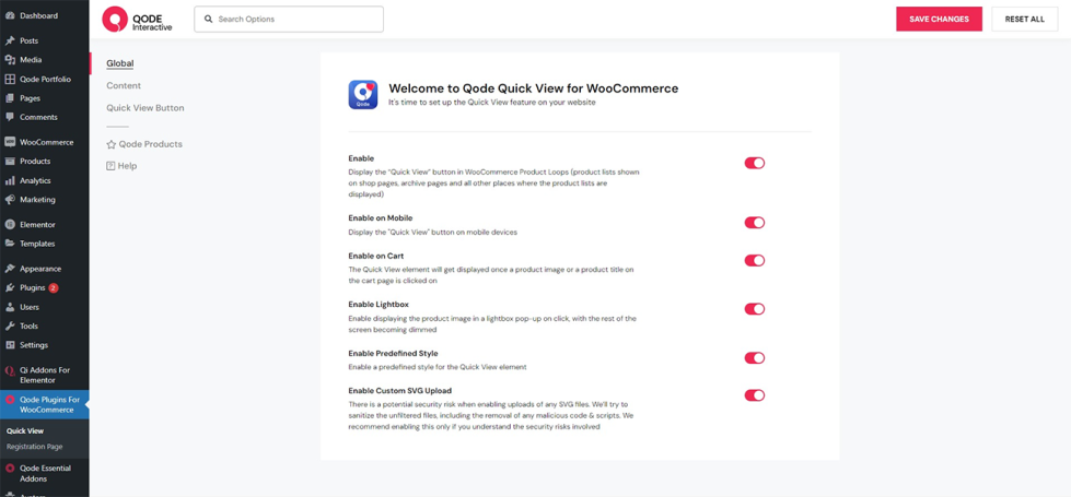
In the Global section of the plugin options you are presented with options for making general adjustments to the plugin functionalities.
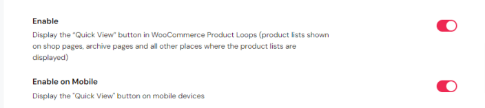
Here you can enable the Quick View button in product lists, and enable the same functionality for mobile devices as well.
You can also enable displaying the Quick View for products on cart pages and Wishlist pages (this option only takes effect if you have installed and activated the QODE Wishlist for WooCommerce Pro plugin).
In addition to this you can enable the lightbox feature for the Quick View (this enables opening product images from the Quick View element in lightbox pop-ups on click, with the rest of the screen becoming dimmed).
Next up, you can also choose whether you wish to apply a predefined style to the Quick View elements on your site here.

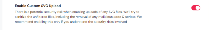
This is also where you can enable custom SVG uploads (please make sure you are familiar with the security risks this process involves first).
Quick View Content Settings
↑ Back to topIn this section of global plugin settings you get a large selection of options related to the Quick View content and its appearance.
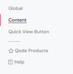
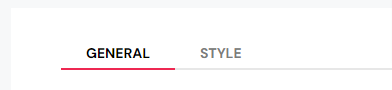
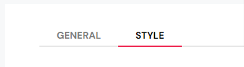
There are two tabs in this section: General and Style.
First off, let’s go through the General tab of the Content section and all the options found there.
General
Layout
First off, you can choose the type of the Quick View element you’d like to use.
There are three types of the Quick View element you can select: Pop-up (essentially a classic modal Quick View), Drop (which gets revealed below the corresponding product on click), and Sidebar.
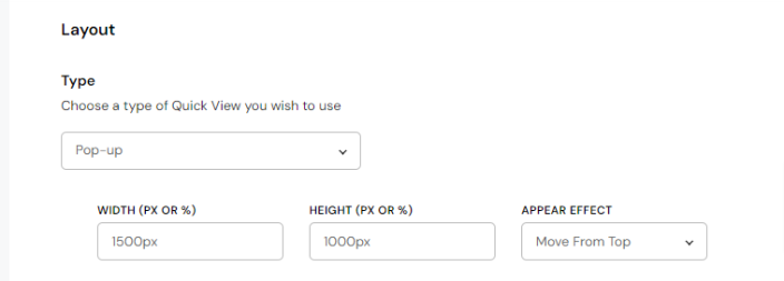
In the event that you select the Pop-up Quick View type, you will get presented with options for adjusting the modal width, height, and you can also choose one of 8 appear effects which you can apply to the pop-up.
If you selected the Sidebar Quick View type, you can configure the Quick View element width and choose where you wish to position it (left or right).
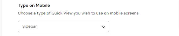
The option that follows lets you choose a Quick View element type you wish to use on mobile devices.
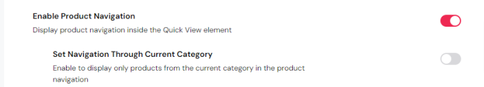
This is also where you can enable the product navigation inside the Quick View element, which you can optionally limit only to the current product category.
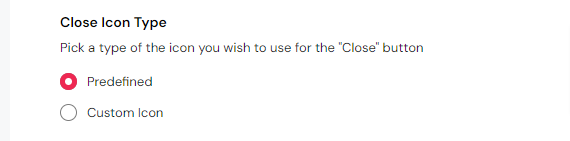
Another option found here lets you choose between using a predefined Close icon for the element, and uploading a custom Close icon of your own choosing.
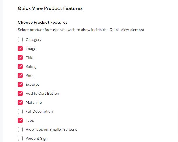
Quick View Product Features
Here you can enable displaying the relevant product information of your choosing in the Quick View element, including the product category, image, title, rating, price, excerpt, the ‘Add to Cart’ button, the ‘Wishlist’ button, product meta info, full description, product tabs, and a percent sign.
There’s also an option for enabling an image zoom on hover feature inside the Quick View, and you can enable instantly loading AJAX-powered adding to cart straight from the Quick View form.
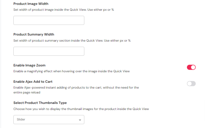
On top of that you can alter the product image and product summary width, choose between two product thumbnail image types (gallery or slider), and choose a position for the thumbnail images relative to the featured image.
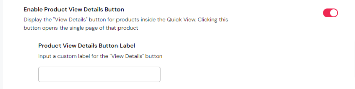
Moreover, this is where you can enable a fixed ‘View Details’ button for products, and optionally input a label of your own for the button. By clicking this button, the user gets presented with a single page of that specific product.
You can also enable and configure certain additional features to be shown inside the Quick View element. You can display suggested products, additional details items, as well as the social share feature.
Suggested Products
If you enable displaying Suggested Products, you can choose which products you wish to show: Related Products, Upsells Products, and Cross-sells Products.
In addition to this, you can input a title for the suggested products section, and set a heading tag for the title text.

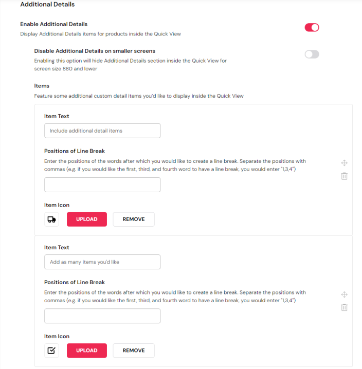
Additional Details
In the event that you decide to include Additional Details items, you can add some text, input positions of line break in said text, and upload an icon for each of the items you wish to feature.
You can also disable showing additional details on smaller screens here.
Share
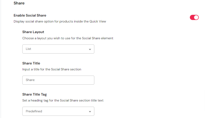
If you enable the Social Share feature, you get presented with a set of options relating to the social share, including choosing between dropdown and list social share layouts, selecting a dropdown hover behavior, inputting a title for the social share section, and setting a heading tag for the title text.
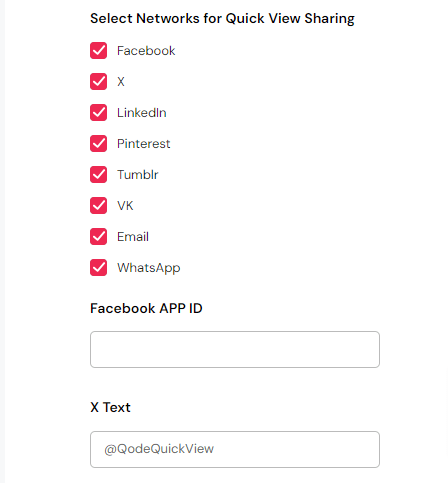
Here’s a list of social media and platforms which you can enable sharing for: Facebook, X, LinkedIn, Pinterest, Tumblr, VK, Email, and WhatsApp.
Style
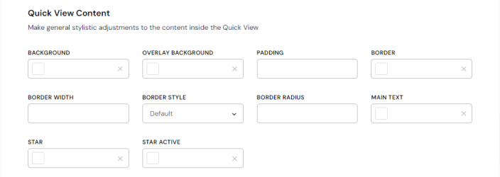
Quick View Content
This is where you can set up the appearance of your Quick View element.
Firstly, you can set the background color, overlay background color, padding, border color, width, style and radius, star color, and finally star active color.
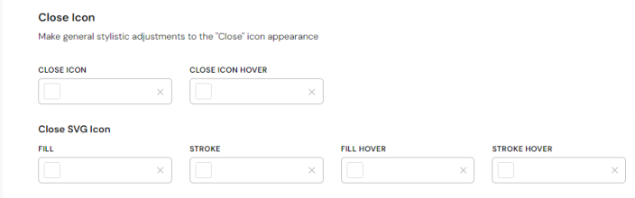
Close Icon
Next up, you can make visual adjustments to the Close icon.
You can set a close icon color, hover color, as well as fill color, stroke color, fill hover color, and stroke hover color for the close SVG icon.
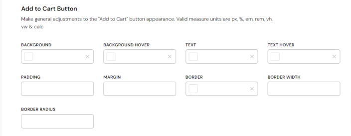
Add to Cart Button
The set of options that follows lets you configure the Quick View ‘Add to Cart‘ button appearance.
You can set a background color, background hover color, text color, text hover color, padding, margins, border color, border width, and border radius for the ‘Add to Cart‘ button.
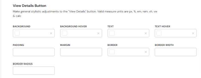
View Details Button
After that, you can make adjustments to the ‘View Details’ in the event that you enabled it.
You can adjust the ‘View Details’ button background color, background hover color, text color, text hover color, padding, margins, border color, border width and border radius.
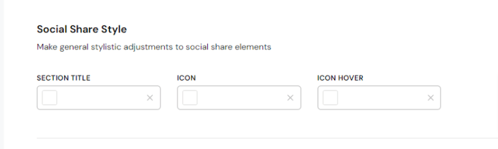
Social Share Style
The set of options found here let you adjust visual aspects of the Social Share section inside the Quick View.
You get options for modifying the section title color, icon color, and hover color.
Social Network Custom Style
The final set of options found here lets you choose between predefined and custom icons for each of the social platforms you enabled, and configure the icon fill color, stroke color, fill hover color, and stroke hover color for each respective social network.
Quick View Button Settings
↑ Back to topIn this final section of Quick View Options you can make adjustments to the ‘Quick View‘ button itself.
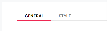
There are two tabs in this section: General and Style. First off, lets go through the General tab of the Quick View Button section and all the options found there.
General
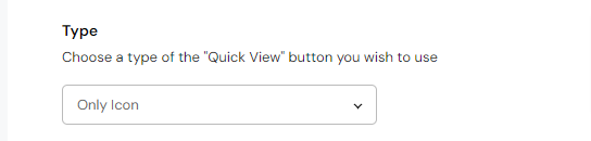
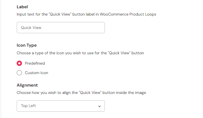
This is where you can make basic adjustments to the ‘Quick View’ button appearance. First off, you can choose a type of the button you wish to use: Icon With Text, Only Icon, and Only Text.
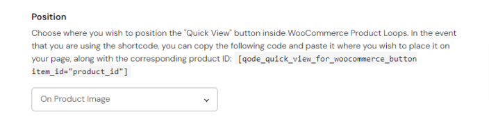
After this, you can choose where you wish to position the ‘Quick View’ button in WooCommerce product lists.
You can also input a custom label for the button, choose how you wish to align the button inside the image (in the event that you selected the ‘On Product Image‘ ‘Quick View‘ button type), and you can use either predefined ‘Quick View’ button icon or upload a custom icon of your own.
Style
Here you can make further stylistic modifications to the ‘Quick View’ button.
Button Appearance
Here you can set a button background color, background hover color, text color, text hover color, padding, margins, border color, width, style and radius, as well as the size of the space between the button icon and text (in the event that you selected the ‘Icon With Text’ button type).

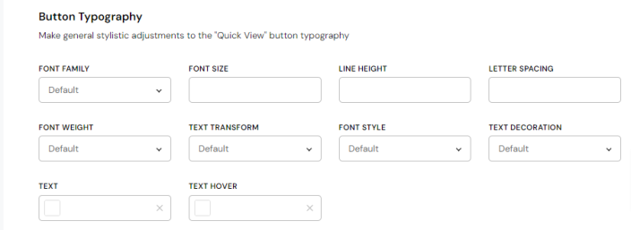
Button Typography
Next up, you can make adjustments to the button typography.
You can choose a font family for the text, as well as font size, line height, letter spacing, font weight, text transform style, font style, text decoration, and text color & hover color.
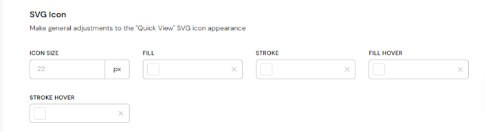
SVG Icon
The final set of options provides you with settings related to the SVG icon. Here you can set a fill color, stroke color, fill hover color and stroke hover color for the SVG icon.
Need help?
If you still need help, click the link below to open a support ticket and we’ll get back to you as soon as possible: