Web design trends are ever-evolving — especially when it comes to ecommerce, where staying ahead of the curve is essential for success.
Whether you’re creating your very first online store or redesigning your current one, it’s critical to research what other online businesses are doing to draw inspiration. By looking at some of the best ecommerce website examples in your industry and adopting similar features and design elements, you’ll set yourself up for a better performing ecommerce store right from the start.
In this article, we’ll explore six exceptional and innovative ecommerce websites — each from a different industry. From cutting-edge user interfaces to seamless customer experiences, these online stores are setting the benchmark for ecommerce excellence.
As we discuss each of these ecommerce website examples, we’ll explore principles of visually-appealing and user-friendly website design, as well as key elements that set these websites apart from other online storefronts. We’ll also provide valuable insights into the latest trends, strategies, and WooCommerce extensions that can elevate your ecommerce game.
1. SOCKBOX
↑ Nach oben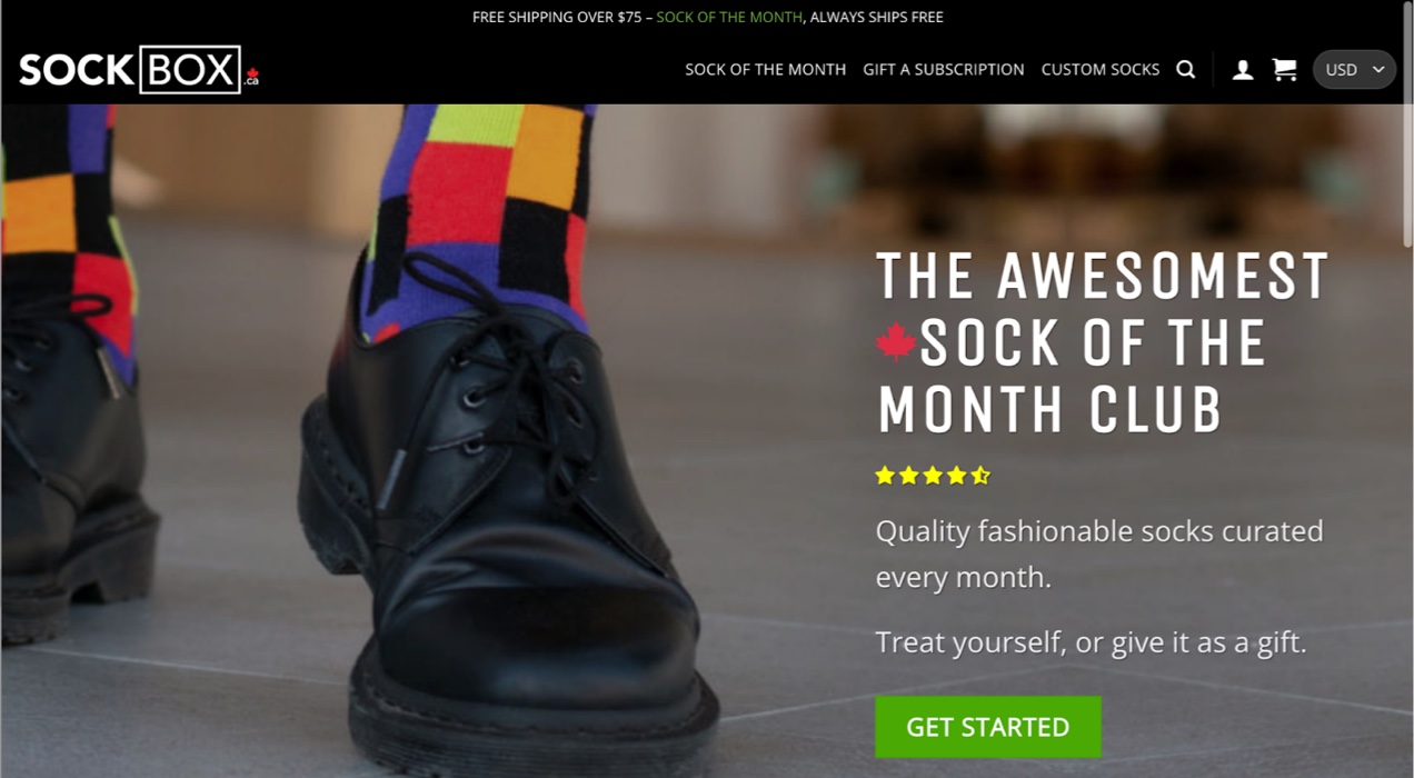
Industry: Online fashion
Use case: B2C subscriptions for physical goods
Featured extension: Woo Subscriptions
SOCKBOX is a Canadian sock of the month club that ships out thousands of pairs of socks each month to customers in both Canada and the U.S. The founder, Marshall Stevenson, started SOCKBOX in 2014 out of frustration with retail shopping experiences and the lack of fun and interesting sock designs available in Canada at the time.
SOCKBOX sources socks from a variety of manufacturers and offers unique monthly subscription boxes that guarantee a different sock design every month — no duplicates. They also offer custom-designed socks.
Design elements that stand out
Simplified navigation
SOCKBOX features just three product page links in their primary navigation to focus on their core offerings — their Sock of the Month subscription, gift subscriptions, and custom sock design services.
By keeping the main navigation simple, it helps customers find what they’re looking for more quickly and guides them towards products SOCKBOX wants to promote which can improve user experience and have a positive impact on conversion rates.
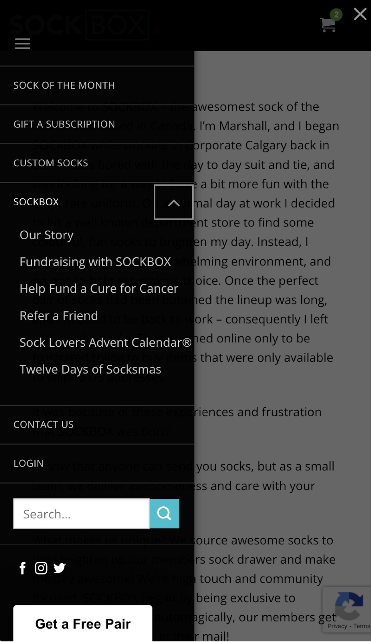
Their mobile navigation is actually more detailed than the desktop version. This makes sense when the menu isn’t very extensive to begin with and you want to save the user the time of lengthy scrolling, which is often one of the biggest issues of navigating an ecommerce site on mobile devices. Every menu item fits neatly into the above-the-fold view. This strong menu organization contributes to its place as one of the best ecommerce website design examples.
On-brand graphic accents
Below the hero image and above the footer, SOCKBOX uses a subtle color bar that features a multi-color palette, reflecting the variety of colors and styles in their sock collections.
When developing your own ecommerce website design based on these examples, consider how using accent colors and graphics that align with your branding can enhance user experience and help customers form emotional connections with your online business.
Product reviews front and center
The hero image on the home page features a clear call to action along with their average star rating. Without having to read through any lengthy reviews, visitors are immediately made aware of the high level of customer satisfaction with the company. This is social proof at its finest.
Individual customer reviews are also featured prominently halfway down the home page and just below the fold on each product page. Giving high visibility to their large volume of positive reviews helps to build trust with their customers and encourage new subscriptions.
Functionality highlights
Subscriptions
Subscriptions are a great way to generate recurring revenue (which is usually more dependable month-to-month than individual sales). However, when it comes to socks, most people are used to being able to make individual purchases. Some of us already have over-full sock drawers — but we still like cute socks!
Since the SOCKBOX business model centers almost exclusively around their monthly subscription box, they’ve made their subscription plans flexible to meet the needs of those of us who only need a few socks, while also catering to people who might want a different pair of socks for every day of the year.
Subscribers can pay on a month-to-month basis and cancel at any time — so they could theoretically only subscribe for one month and get one pair of socks — as well as 6, 12, and 24 month subscriptions.
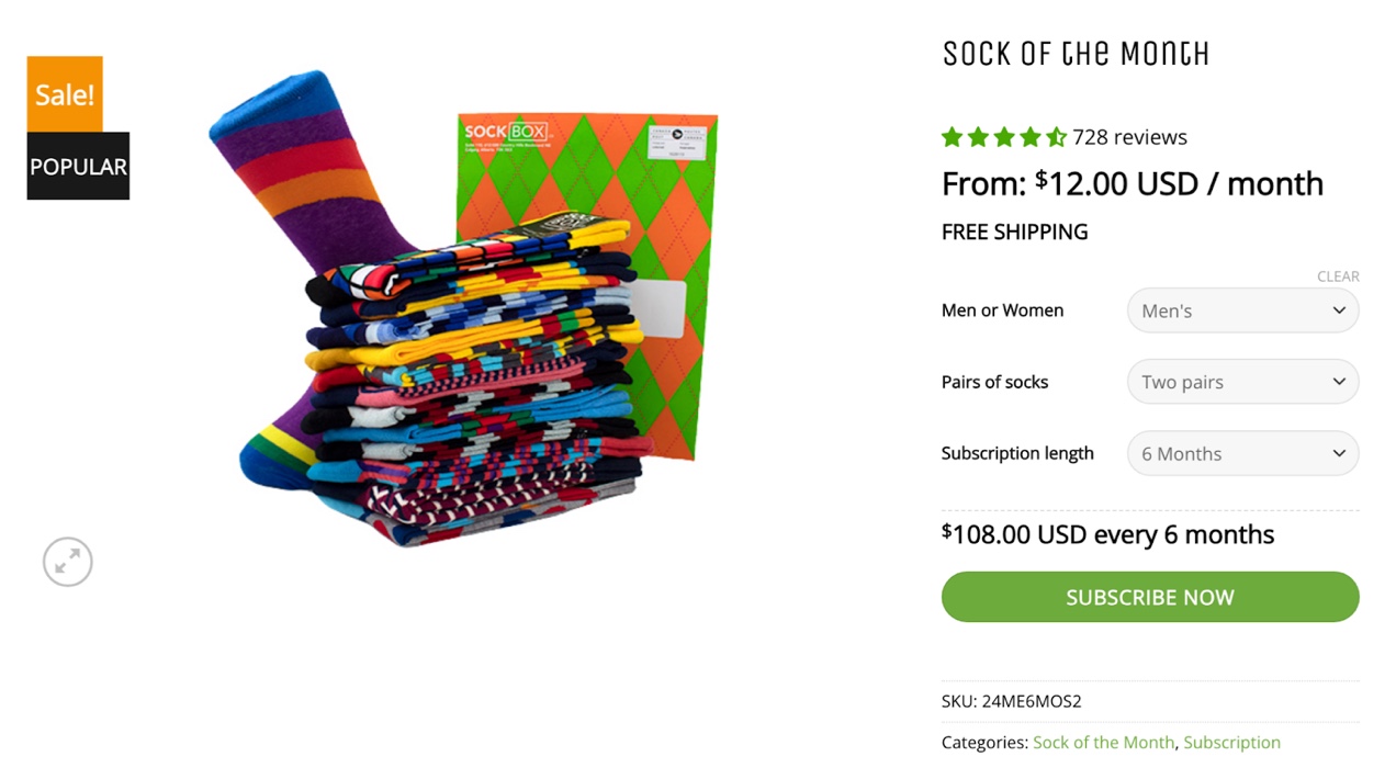
Interested in using a subscription model for products on your ecommerce site? Check out Woo Subscriptions to see how you can turn these ecommerce website examples into real-world profits.
With Woo Subscriptions, you can create multiple billing schedules, integrate with most payment gateways, and give subscribers the ability to manage their subscription plans on their own.
Automated renewal notifications will keep you and your customers aware of renewing payments, subscription upgrades, downgrades, and cancellations so there are no surprises.
Woo Subscriptions also includes detailed reports so you can keep track of recurring revenue and customer subscription status, helping you spot trends in your subscription products so you know which offers are and aren’t working for your customers and online business.
Gift messaging and packaging
When you buy a gift for someone online, you expect to be able to add a special message or even gift wrap your purchase.
Sometimes, this option is offered at the cart level so that every item in your purchase is wrapped and one gift message is included to a single recipient. However, since SOCKBOX offers a specific gift subscription product, they include this at the product level instead of at checkout.
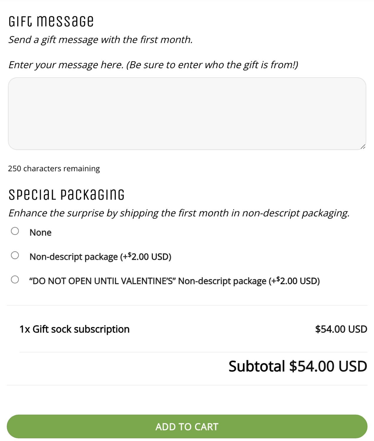
Including gift messaging and special packaging as product add-ons instead of at checkout makes sense in a couple of scenarios.
In the case of SOCKBOX, they have only one product that they offer as a gift. If you are also adding a subscription for yourself, you don’t necessarily want a gift message or special packaging for your subscription — only for the gift subscription that you ordered.
Adding these options at the product level is also useful if you are ordering multiple gifts for different individuals from one online shop.
Let’s say you are buying holiday gifts for your niece and nephew and you want to make sure they each get the right gift — you’d want a custom message for each gift-wrapped item so the 16-year-old doesn’t end up with the toddler stacking toy and the two-year-old doesn’t end up with the oversized hoodie.
Referral program
Word of mouth is still one of the best and most cost-effective ways to market your ecommerce business. SOCKBOX knows this and offers customers a $5 credit for each friend that joins.
With extensions like Automate Woo’s Refer a Friend add-on, you can offer referral rewards to your customers, too. Referral programs are a great way to demonstrate social proof, build loyalty, increase sales, and diversify your marketing strategy.
What we can learn from SOCKBOX
Simplicity in web design
SOCKBOX’s ecommerce website design is uncomplicated and easy to navigate. They only use the plugins and extensions that they need to sell their core products and grow customer relationships.
Keeping your site infrastructure lean and focusing on drawing attention to your most profitable products will keep your management costs lower, drive sales to the products you want to focus on most, and create a better shopping experience for your customers.
Low-cost marketing strategies
Using low-cost marketing techniques like referral programs can help businesses of any size, but especially small businesses, expand their customer base. So don’t let low-hanging fruit lie. Invest in word of mouth marketing and other low-risk, cost-effective advertising methods like email marketing, Google Shopping, and social shopping.
2. Magna-Tiles®
↑ Nach oben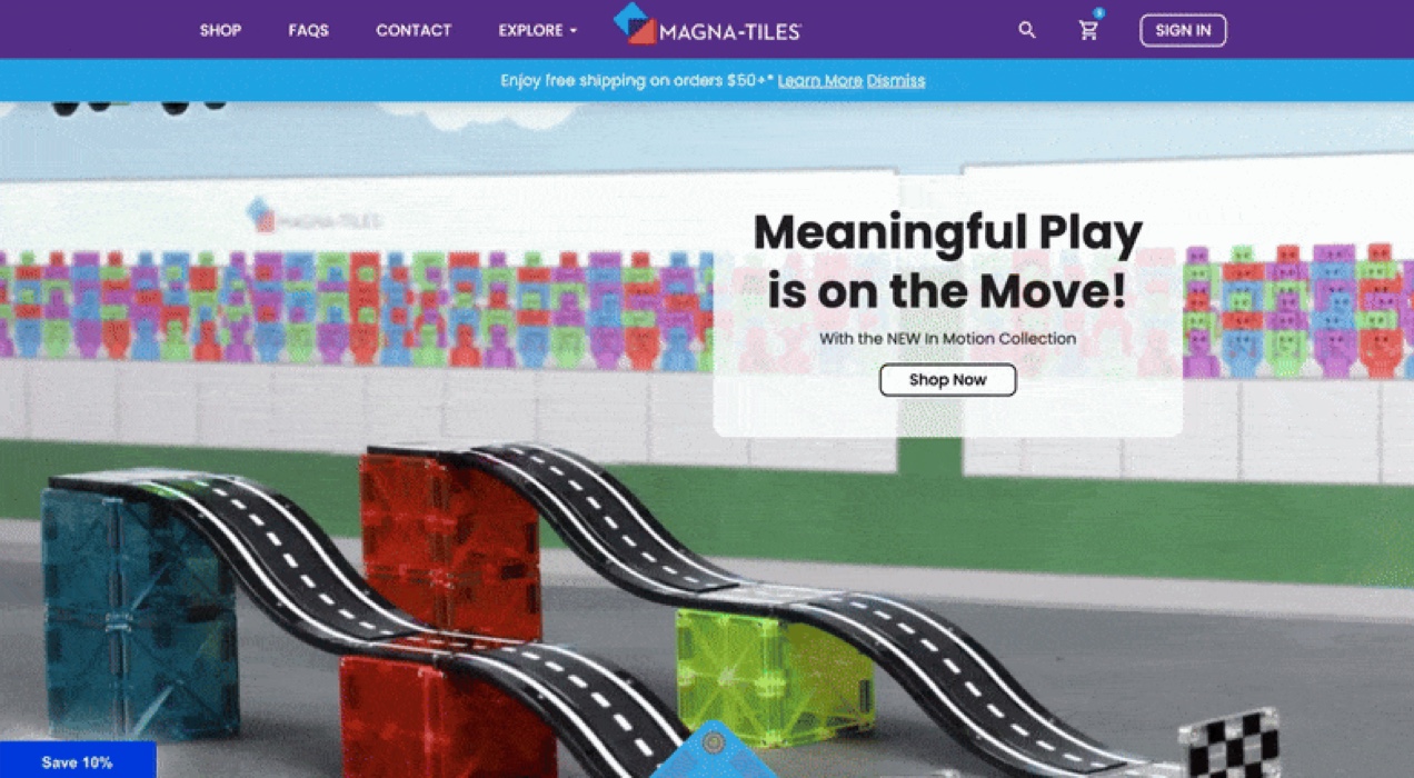
Industry: Construction toys
Use case: B2C ecommerce
Featured extension: Product Filters for WooCommerce
Magna-Tiles started out in 1997 as a tool for educators and has gradually grown to become an iconic consumer brand in the construction toys space. Their magnetic tile construction sets began as a series of simple shapes and have branched out into themed playsets, similar to the evolution of Lego.
Design elements that stand out
Bold, branded ecommerce design
The Magna-Tiles ecommerce website features bright, contrasting colors, and bold sans-serif typography in large, readable font sizes. Throughout their site, they use playful graphic elements that reflect their brand and their products.
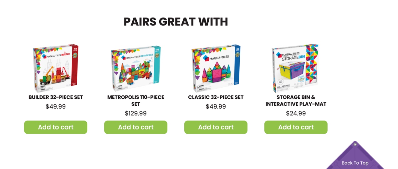
From little details like their “Back To Top” button that uses a corner of a Magna-Tile as a background, to interactive elements like CSS animations of their toys on their product category landing pages, Magna-Tiles has put concerted effort into creating a fun, branded, shopping experience on their ecommerce website design.

Engaging product videos and high-quality photos
When you’re selling a product that requires assembly, creativity, and moving parts, it can be challenging for customers to envision how your product should be used. This is especially so for a company like Magna-Tiles that advertises “no instructions included” as a feature.
Including high-quality images and short, well-produced product videos on their product pages helps to give visitors an idea of the ways in which the Magna-Tiles can be used while inspiring their own personal creativity.

WooCommerce lets you add multiple product images and video content to your product pages out of the box, but that’s not the only place you should be showcasing your products’ features. Don’t forget to use professional product photography, videos, and other motion-oriented graphics like GIFs or CSS animation to demonstrate how your products work — or simply add a bit of fun to the user experience.
Functionality highlights
Product filters
Even though Magna-Tiles doesn’t have thousands of products, they still make use of handy product categories and filters so that customers can sort products by a variety of attributes like brand, product type, category, interest, and color.
As their catalog expands, customers will continue to be able to easily sift through the types of products they and their child are most interested in using the product filter system Magna-Tiles has established.

While people who shop online expect to see product categories and filters like this from big box stores or apparel companies whose offerings may have a lot of specific attributes like color, size, and style, it’s not as common to see this on an ecommerce website with a limited number of products. But seeing product filters in action on the Magna-Tiles site demonstrates that shops with fewer SKUs can also benefit from a more granular approach to product search and navigation.
Multi-step checkout page
There are a few different approaches to the checkout process used by successful ecommerce businesses. Sometimes a one-page checkout that reduces the number of page loads will convert site visitors the best. Other times, a multi-step approach that breaks the checkout process into digestible chunks makes for a better ecommerce journey.
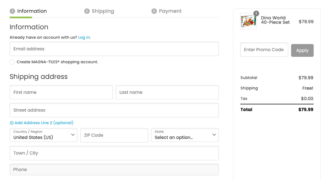
Magna-Tiles has opted for a multi-step checkout that doesn’t overwhelm the customer with too many fields on each screen, keeping every step of checkout mostly above the fold. To optimize checkout further, they have removed unnecessary default fields like “Company” and minimized the secondary, optional address field to further eliminate distraction.
Looking to customize and optimize checkout on your ecommerce website? Try the Checkout Field Editor extension. You can add, edit, remove, and change the order of fields to create a custom checkout form tailored to your needs.
What we can learn from Magna-Tiles
Magna-Tiles’ entire ecommerce website is clean, vibrant, and easy to navigate. It appeals to children and parents alike through consistent, playful branding. They’ve made it easy to understand how their products work with short, high-quality product photos and videos featured on product pages and each category’s landing page.
Their product filters make it simple to find just the right toys for a particular child’s interests and preferences while staying within each customer’s budget. And checkout is a breeze with an uncluttered, multi-step experience.
When building your online store, consider this ecommerce website design example and how you can use simplicity and playfulness in your presentation to engage visitors. Think about whether or not your products would benefit from including videos and, if so, come up with a plan for producing videos that are informative, on-brand, user friendly, and representative of the quality of your products.
As you begin designing your store’s catalog, pay careful attention to how you categorize products and what attributes they share. Even if your store is only starting out with a handful of items, it’s good to get in the habit of using accurate categorization as your store grows so customers can easily find the products they’re looking for and you can recommend related products based on past purchases.
Test different types of checkout strategies to see which one works the best for your ecommerce business and make sure it includes any special features you may need like shipping to multiple addresses, custom checkout fields, extra shopping cart features, or multiple payment options.
3. PHLEARN
↑ Nach oben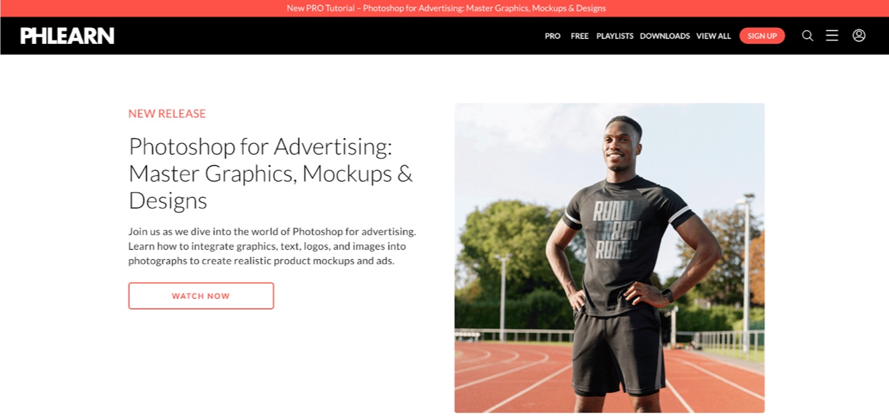
Industry: Online learning
Use case: Memberships for digital downloads and video on demand
Featured extensions: WooCommerce Memberships, Woo Subscriptions, WooCommerce Social Login
PHLEARN is an online learning website that provides continuing education for photographers, digital artists, and graphic designers on topics related to Adobe programs like Photoshop, Lightroom, and After Effects. In addition to their video tutorials, they offer digital downloads of Photoshop brushes, actions, and presets.
The company founder, Aaron Nace, started PHLEARN to help make photography education more fun and affordable while building a community of students who support one another in their creative pursuits.
Website design elements that stand out
Animated thumbnails
PHLEARN cleverly makes use of animated GIF thumbnails on some of their tutorials that demonstrate the technique that will be covered in that video. They also use animated GIF thumbnails on many of their digital download products to demonstrate the effects that you can achieve by using that particular brush or preset. This helps members quickly understand whether the tutorial or download is of interest to them so that they can quickly find the content they want.

A simple, modern design style
When your website is focused on your image and video content, you want to let those elements shine. Using too many colors or highly-stylized graphic elements can detract from your products and give a cluttered appearance that’s difficult to visually navigate. PHLEARN uses a simple black and white color palette with a single color accent — a coral red tone — throughout the majority of the website.
The homepage is set up with several calls to action in sections organized by product type as well as categories of interest (called Learning Paths). In sequence, these sections tell a complete story of all that the website has to offer, while also giving customers the opportunity to learn more about their free and paid services and downloads before deciding to join.
While it presents quite a bit of information, the layout uses staggered repetition within a grid system that works to create visual balance. Keeping the content of each section confined to one, two, or five column layouts and generous white space helps visitors anticipate how sections throughout the site will be organized and improves the user experience while navigating their extensive library of content.
Functionality highlights
Simple membership plan
Some online learning platforms offer a tiered membership structure that gates access to different products and content depending on the tier you’re subscribed to. While this might make sense for those companies, it can also be a lot to manage.
The PHLEARN ecommerce website example keeps it simple by offering some free beginner content and a single paid membership tier that can be paid for monthly or annually, making content organization less complicated and customer service regarding membership less time-consuming.
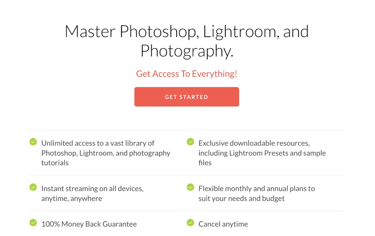
Want to add membership functionality to your ecommerce site? With WooCommerce Memberships you can create both simple and complex membership tiers.
Not only can you restrict content to members at different tiers, but you can also schedule that content to be delivered at a certain time (e.g. providing additional content after 90 days of membership) or expire access to content after a certain period (e.g. expiring access after a 14-day free trial). You can also provide members with exclusive rewards like product discounts and free shipping.
Accessibility
Designing a website to meet the Americans with Disabilities Act (ADA) standards can be expensive and time-consuming. If you don’t have a lot of technical expertise or budget to hire someone that has a deep understanding of how to build websites that comply with ADA requirements, then even your best efforts may fail to meet legal standards.
To meet these needs, companies like AccessiBe, Recite Me, Equal Web, and Max Access formed to provide interactive overlays for websites that can be used by site visitors to adjust display and functionality to meet each individual’s needs.
Content scaling, changing the size and alignment of text, muting sound, hiding product images, and stopping animations are just a few features that help make websites more accessible.
PHLEARN uses AccessiBe to offer these features to site visitors and also uses closed captioning, playback speed adjustment, and written transcripts with screen captures and infographics for their tutorials as an alternative to their video content.
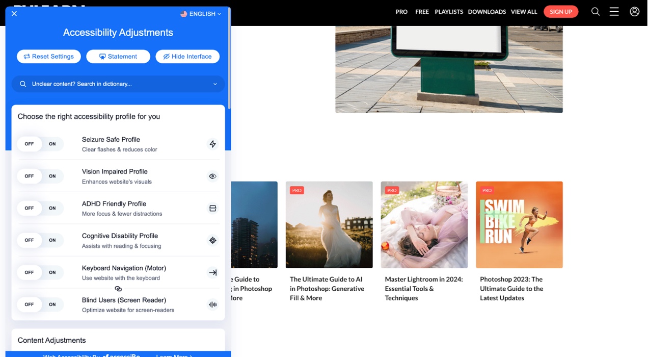
When building your website, consider ways that you can make it more accessible. If you are on a tight budget, you can use free plugins like WP Accessibility to get a variety of useful accessibility features.
Interested in learning more about creating an ADA compliant website? Our article Building for Accessibility: How to Make Sure Everyone Can Use Your Online Store is filled with great information to help you create a compliant, accessible web shop that shines as brightly as the ecommerce website design examples in this article.
Single sign-on (SSO)
PHLEARN prioritizes SSO in their registration/login form, encouraging users to quickly sign up with their Facebook, Twitter, or Google accounts. No need to remember yet another password.
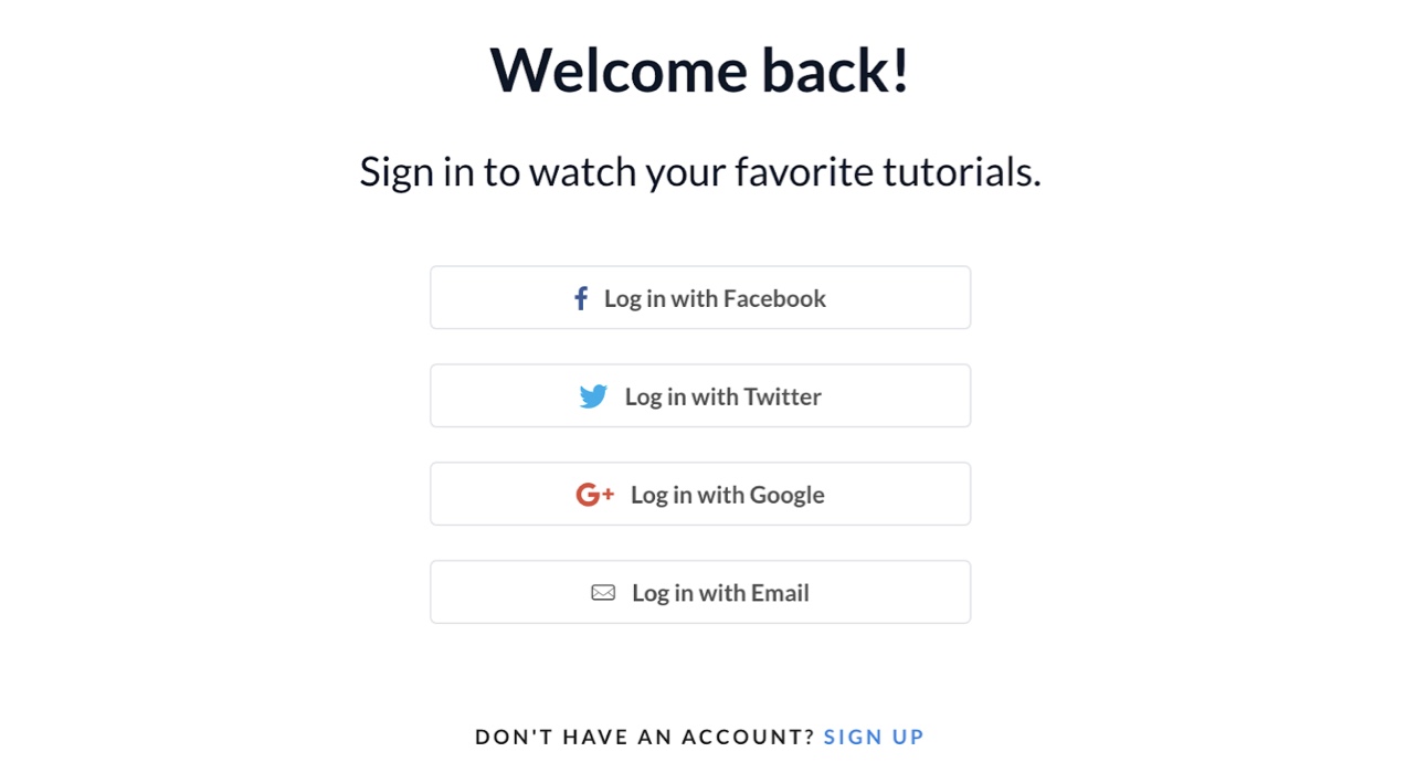
SSO is a convenient way for people to register for your website while also keeping user accounts more secure. SSO uses a centralized authentication process that enables users to access multiple websites and apps with a single set of login credentials. Often it’s a social media, Google, or Amazon account that is used to authenticate and register the user, but other account types can be used as well.
What we can learn from PHLEARN
PHLEARN keeps their ecommerce strategy simple and streamlined so that they can focus on providing exceptional educational tutorials and professional tools for photographers, digital illustrators, and graphic designers. They use a limited color palette that lets their content be the focus and staggered repetition to create a visual hierarchy that makes navigating their large library of resources easy and intuitive.
If you’re creating an educational membership site, prioritize clean website design, consistent presentation, and thoughtful organization. Use tools like WooCommerce Memberships, Woo Subscriptions, and secure credit card payment processors like WooPayments that support recurring payments.
If you plan to deliver a lot of video content, use an external video hosting service like Jetpack VideoPress to reduce the strain on your server and keep your site loading quickly.
Offer SSO for account creation and login to improve security and convenience for your members, and make sure your content is accessible to individuals with disabilities.
4. Phi Phi Pirate Boat
↑ Nach oben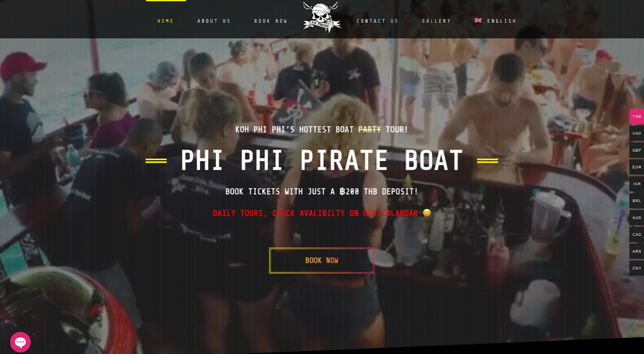
Industry: Travel and leisure
Use case: Online booking
Featured extension: WooCommerce Bookings
Phi Phi Pirate Boat is an all-inclusive tour and party boat service in Koh Phi Phi, Thailand. Their custom-built pirate ship takes tour groups around the Phi Phi islands to explore caves, beaches, and marine life with activities like snorkeling, kayaking, and paddle-boarding. They also provide food and beverages as part of their full-day tour package.
Design elements that stand out
Bold use of color and playful, retro design
Phi Phi Pirate Boat’s target demographic is clearly younger adults. Not only do their videos and images show groups of young people dancing and enjoying beach excursions, their overall ecommerce design aesthetic is tailored to the retro vibes that are popular with Gen Z and younger Millennials.
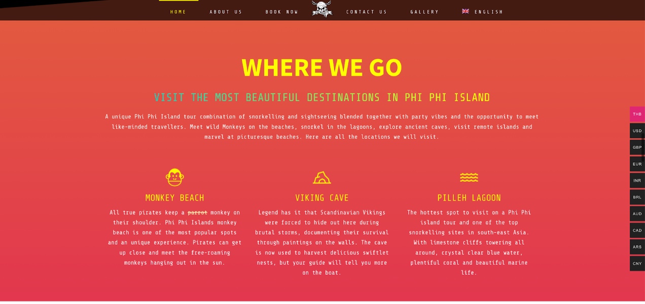
Rainbow gradients, pixelated fonts, bold primary colors and harsh lines evoke a hint of circa 2000 web design. But this retro aesthetic is creatively overlaid on a modern web design framework with parallax background scrolling, responsive design, and an easy-to-read grid-based layout.
Limited pages
When you are selling a single product, you probably don’t need endless pages for prospective customers to scroll through. Phi Phi Pirate Boat puts all the important information you need to book your tour right on the home page.
Navigation items in the main menu link to their respective sections on the home page, allowing visitors to find the information they need quickly without waiting for additional page loads.
Functionality highlights
Online booking
Phi Phi Pirate Boat uses WooCommerce Bookings so that customers can easily make reservations for a tour. The ability to make reservations for travel and schedule appointments for other service-oriented businesses is expected by most consumers, so if your ecommerce business will be taking any kind of appointment, you should include an online booking tool on your ecommerce site.
Not only is online booking more convenient for customers, it saves your business time and money.
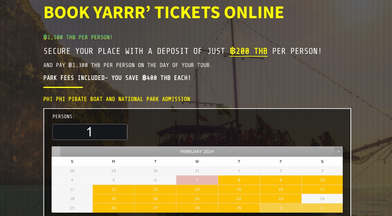
With WooCommerce Bookings, customers can make reservations, appointments, and even rent equipment without you having to answer an email or pick up a phone.
You can set fixed time slots or let customers choose their own times, block off unavailable times, and set bookable time slots in increments of minutes, hours, and days. You can also allow multiple people to book a time slot or limit it to a single person and sync Bookings with Google Calendar so you can easily keep track of your appointments and reservations.
Social chat
WhatsApp and Facebook Messenger are the most popular messaging apps in the world, so it’s no wonder that Phi Phi Pirate Boat has opted to use these tools for their customer service chat. Using instant messaging services that most of their target customers are already using makes the experience feel more informal and approachable.

Multilingual and currency switching
Because Thailand is a popular destination for international tourism, Phi Phi Pirate Boat has made their website available in multiple languages to make the booking experience easy, no matter what country their customers are coming from. They’ve also included a currency switcher so visitors can easily understand the cost in their native country’s currency before booking.
What we can learn from Phi Phi Pirate Boat
Phi Phi Pirate Boat knows its audience and has created an engaging site design to appeal to their target demographic. Their site is also easy to navigate so tourists can quickly book their excursion without having to leave the home page. Customer service is provided with familiar social chat tools that most of their passengers already use.
The key takeaway from Phi Phi Pirate Boat’s ecommerce design example is that there’s no need to go overboard with pages and pages of information when your company has limited offerings.
When designing a site that accepts reservations or appointments, make the booking process effortless. Don’t bury your booking form several pages into your website — feature it prominently on the home page. That way, if customers already know what they want, they can book quickly and get back to their day.
Also, don’t be afraid to be a little wild in your aesthetic. Let your design match your target audience as well as how you feel about your brand. Get weird. Add some neon. Skulls can be cool (especially if you’re a pirate) — we promise!
5. Tonal
↑ Nach oben
Industry: Health and fitness
Use case: Ecommerce platform for premium fitness equipment
Featured extension: Affirm Payments
Tonal is an AI-powered home gym and workout video subscription service designed by engineer Aly Orady. It features a large, wall-mounted display screen and uses electromagnetic weights instead of the standard weights you would find in cable machines, free-weights, or barbells.
Because it’s a complex and highly-engineered product, Tonal comes with a hefty price tag. It also requires a monthly subscription fee to be able to watch Tonal’s live and on-demand workout videos.
Design elements that stand out
In-depth, well-organized product and landing pages
When shoppers are considering high-dollar online purchases, they usually take their time to make a decision. If you’re buying a new car, for instance, you don’t usually go to a dealership and buy the first car a salesperson shows you. You consider your needs, the car’s features, reviews of different makes and models, and your budget.
The same holds true if you’re thinking of spending several thousand dollars on a piece of home exercise equipment.
Tonal knows that their target customers need to understand how their product works, what features it includes, how it’s installed, and the results that they can expect from using Tonal. But they also are aware that overly-detailed explanations and long blocks of text can cause decision fatigue and lost sales.
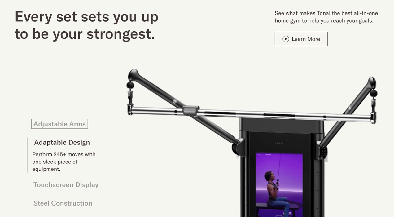
Their design approach breaks information up into easily-digestible sections. Using a combination of bullet-point style navigation items that work as accordions or sliders, short feature descriptions, professional photography, infographics, animations, and video, Tonal manages to present a great deal of information while minimizing scrolling and visual overwhelm.
For those who need a more hands-on experience with Tonal before committing to purchase, they offer both in-person and virtual demonstrations which they promote at the bottom of all their product-related pages.
Functionality highlights
A distraction-free checkout
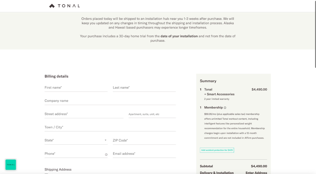
A $4,000 piece of fitness equipment is a big commitment. Once their customers get to the checkout page, they want to make finalizing the sale as easy as possible. Tonal’s distraction-free checkout removes header navigation so customers can focus their full attention on completing their purchase.
Affirm payments
While Tonal’s products are aimed at more affluent individuals, not everyone wants to spend thousands of dollars up-front and may prefer to pay over time to better work within their monthly budget. Financing purchases in-house can be an expensive and risky endeavor for most businesses.
This is where companies like Affirm, Afterpay, and Klarna, come in. Tonal uses Affirm to offer customers up to 48 months of 0% interest financing on their purchase. This allows Tonal to capture a broader demographic of customers and makes a luxury fitness product more affordable to those with less monthly expendable income.
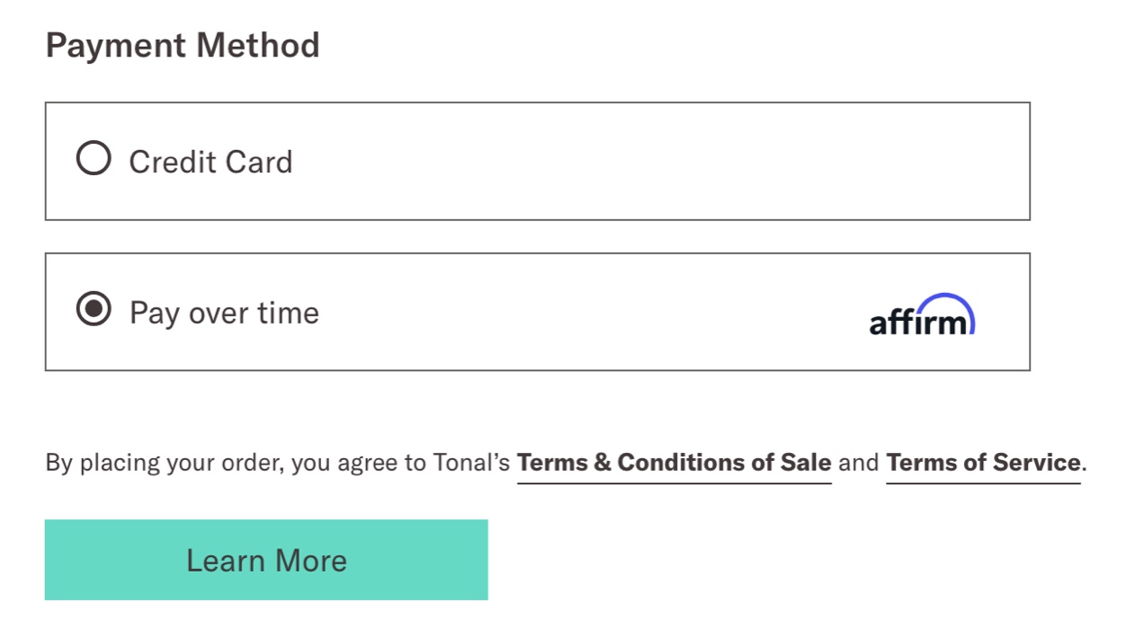
If you’re building an ecommerce site that offers more expensive products like fine jewelry, original art, antiques, or electronics, you should consider integrating a financing program as one of your payment options to increase sales.
The best part about third-party financing programs for your business is that most payment companies will pay you the full amount, minus their percentage, immediately — you won’t have to wait for customers to complete their payments. The financing company then takes on the responsibility of collecting payment from your customers.
What we can learn from Tonal
You can sell big-ticket items online. Some people still want to walk into a brick-and-mortar store to feel and experience a product for themselves. But other people either can’t get to a physical store or simply prefer online shopping, no matter what the product is that they are purchasing. Tonal does have some in-person showrooms, but there are only 20 nation-wide. The majority of their sales are done online.
Tonal makes purchasing online feel safe and secure by offering a 30-day money back guarantee, 0% financing through Affirm, and free professional installation and product demonstration. They also provide lots of information about their product in a well-organized way so that shoppers can truly understand what they’re purchasing.
Here are some other ways that you can encourage customers to purchase more expensive products in your online store:
Using augmented reality (AR) product visualization tools
Want to demonstrate what a chair or painting looks like in your customers’ living room? You can use AR tools like CartMagician PRO for WooCommerce Augmented Reality (AR) to let customers virtually view your products in their own environments.
Providing detailed measurements and sizing charts
Clearly list product dimensions and label your product images with length, height, and depth indicators. For clothing, provide a detailed sizing chart that shows measurements at varying parts of the garment like inseam and overall length, as well as hip, chest, waist, neck, and arm circumference.
Including animations and videos to show assembly and usage instructions
Sometimes customers may be hesitant to buy an expensive product because they aren’t quite sure how to assemble it or even operate it. While you should always include instructions when the product is delivered, it’s also helpful to give customers the chance to review these instructions before they make their purchase.
6. Forest Whole Foods
↑ Nach oben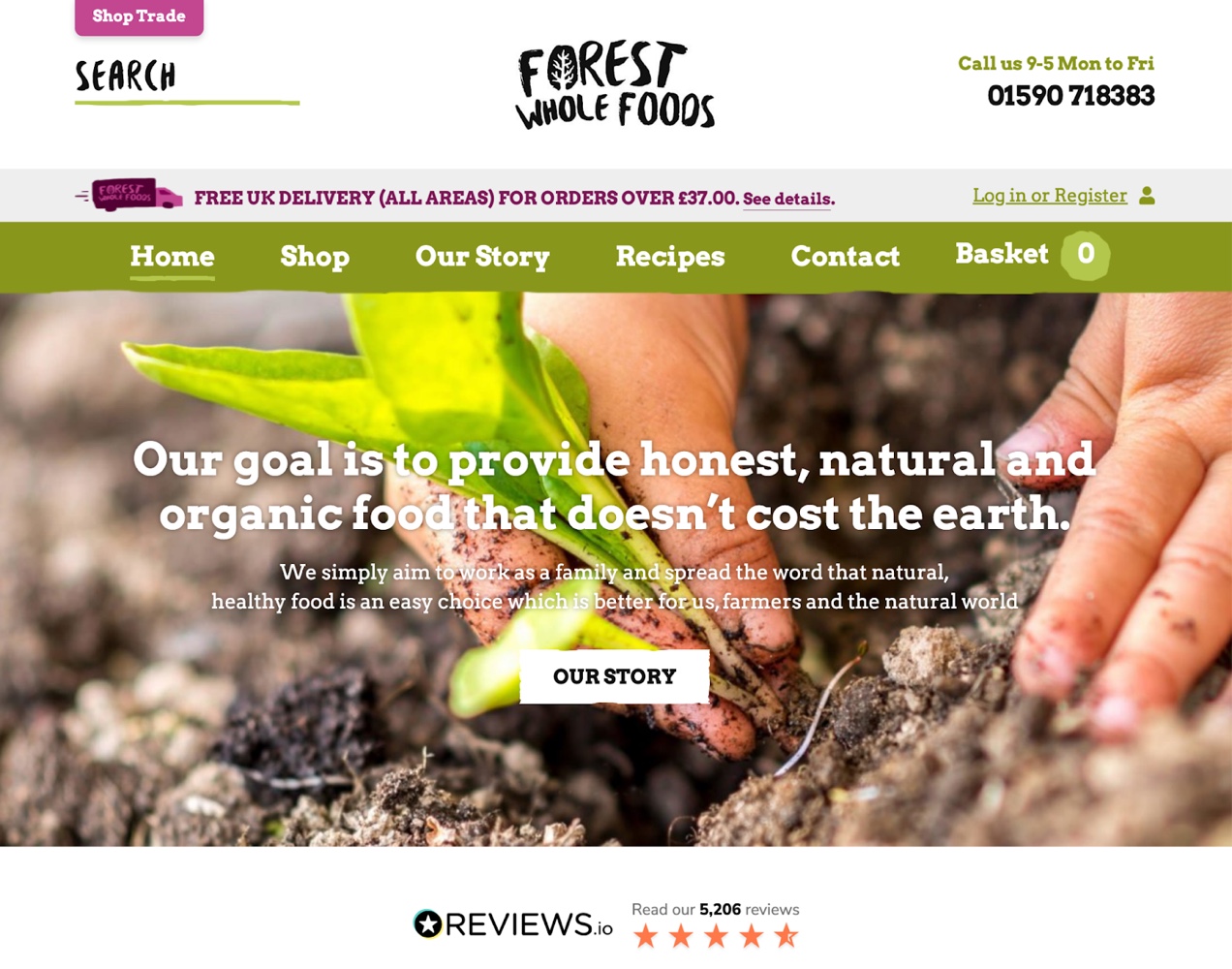
Industry: Consumer Packaged Goods (CPG)
Use case: B2C ecommerce
Featured extension: WooCommerce Waitlist
Forest Whole Foods is a UK-based company that sells organic certified whole grains, flours, nuts, seeds, dried fruits, and other shelf-stable pantry staples. They focus on minimizing packaging and offering ethically-sourced products that meet strict industry standards.
Forest Whole Foods’ goal is to provide high-quality products to families that value sustainable, organic food production at the lowest possible cost so that cooking healthy meals from scratch is more accessible to more people.
Design elements that stand out
Chunky, rough design elements with a nature-inspired color scheme
Forest Whole Foods uses branding that evokes elements of tree bark, foliage, and berries. It has a playful, nature-inspired feel that is unpretentious and approachable, while maintaining a thoughtful and cohesive appearance.
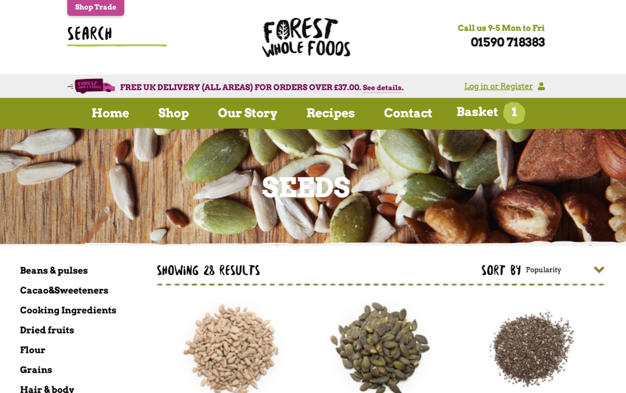
Bold serif fonts contrast with the handwriting-style logo, giving an informal feel. They occasionally use the same handwriting font that’s featured in the logo. Doing this in key areas — like the search bar and product search results header — helps call attention to these elements, so customers find what they’re looking for faster.
Custom product tabs
When it comes to how you should display your product information, there’s no hard-and-fast rule for every online store. Even if you offer the same products as other ecommerce shops, you may want to include special information that your competitors don’t, in order to set your store apart. You don’t have to follow these ecommerce website examples exactly.
Forest Whole Foods is a gr using customized product tabs. Not only do they include the information you might expect to find from an online food retailer — like reviews, detailed product descriptions, and nutritional information — they also include storage recommendations and family tips. Some of their products also include cooking instructions.
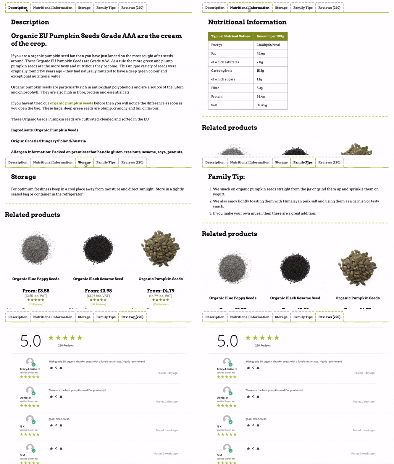
Consider using customized product tabs on your ecommerce website to include unique information that can help better inform your customers and provide a more personal experience with your brand. You can include things like sizing charts, instructional videos, suggested uses, DIY product hacks, recipes, additional background on the history of your product, and details on material content.
Take a look at some of the best ecommerce website design examples in your industry. Research what they are doing and think about the kinds of information you wish they would display on their product pages. Take those ideas and implement them on your own ecommerce site and get an edge over the competition.
Functionality highlights
Waitlist for out-of-stock products
Certain industries are more susceptible to supply chain fluctuations. Food products, especially, can fall victim to the whims of mother nature which can affect production and limit supply.
Forest Whole Foods uses a waitlist option for their products. For instance, teff flour is currently out of stock. By offering a waitlist option, customers can opt in to automatic back-in-stock notifications so they don’t miss out when a product in short supply becomes available again.
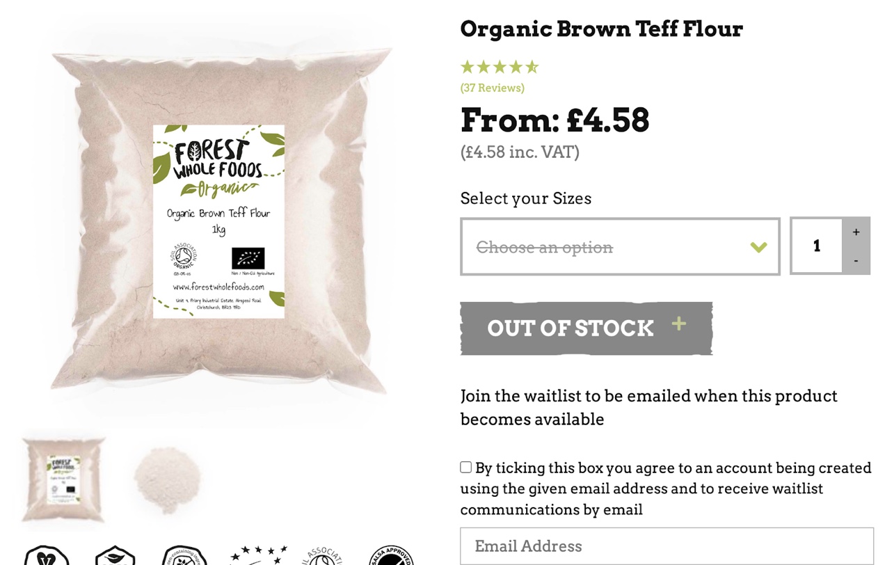
If a customer signs up to be on your waitlist, they’re probably highly interested in that product. This means they’ll be more likely to purchase an item they’ve intentionally signed up to be reminded about than if you sent them a general marketing email about one of your other products.
The best part about marketing using a waitlist is that the email notification is automated so there’s no extra work on your part.
Submit your own recipe
User generated content is an extremely important driver of sales for ecommerce brands. When people see photos, videos, and stories from real people that are using a product, it feels more authentic and inspires more trust than a company-designed ad campaign.
A great example of the subtle use of user generated content is Forest Whole Foods’ Recipes page. In addition to their own recipes, they encourage community participation by prompting customers to submit their own recipes that use Forest Whole Foods’ ingredients.
This free content not only provides social proof that can boost sales, it helps with search engine optimization (SEO) and provides useful information to other customers.

What we can learn from Forest Whole Foods
Express your brand’s personality through design
Forest Whole Foods does a great job with creating an expressive brand through using a color palette inspired by nature, blocky and hand-written letter forms, and textural edges on graphic components. Dotted horizontal rules are reminiscent of perforated receipts, coupons, recipe cards and DIY crafts. These elements work together to create an informal and approachable design that reflects the company’s desire to make their products accessible to a wide demographic.
When thinking about your brand’s look and feel, it’s important to consider what your audience might like, but it’s equally important to take your own preferences and how you want your brand to be seen into account. It’s your company, after all. And, at the end of the day you need to be able to look at your logo, your color scheme, and your typography and love it.
Don’t be afraid to put movement, emotion, and quirkiness into your website’s design if you think it could work for you.
Encourage user generated content to develop a community around your products
While Forest Whole Foods accomplishes this with their customer-submitted recipes, you can solicit user generated content in a variety of other ways, including:
- Embedding an Instagram feed on your online store that showcases customer images and glowing reviews of your products.
- Sharing customer product hacks that illustrate creative uses of your products.
- Encouraging customers to submit their own how-to videos and tips and including them on your product pages.
- Creating a Facebook Group, Subreddit, or Discord community around your company.
Create great ecommerce website design with WooCommerce
↑ Nach obenWe’ve looked at some of the best examples of ecommerce websites in the WooCommerce showcase, demonstrating a variety of aspects of modern web design. Hopefully these visually-appealing, user-friendly, and feature-rich online stores give you some ideas and serve as website design examples to inspire ecommerce design for your small business or enterprise marketplace.
Now, the next step is evaluating ecommerce website platforms and deciding which one to use to build your online storefront.
No matter what design style you’re dreaming of or features you are looking for, WooCommerce can help you create it. Thousands of small business owners and enterprise-level companies trust WooCommerce to help them sell online.
WooCommerce itself is free and built especially for WordPress (also free!). You can host your ecommerce website with any web hosting provider that supports WordPress, giving you control over monthly hosting costs.
It’s an open source ecommerce solution, so you have complete ownership over your content and control over design and functionality. Whether you use a block theme like Twenty Twenty-Four or code a custom theme from scratch, building ecommerce stores on WordPress and WooCommerce allows for infinite extensibility.
There are thousands of free plugins in the WordPress plugin library and 850 free and premium extensions available through WooCommerce, giving you the flexibility to build the exact online store you need. Check out these online business examples for inspiration!
Are you a business owner looking to launch your store quickly? Try Woo Express. With Woo Express, you can start selling online in just a few days with the ability to grow and expand over time. You’ll get everything you need to build a successful ecommerce business — from hosting to secure payment processing and dozens of extensions that help you customize and optimize your site.
About


Great roundup! What is the them being used by Fitger’s Brewhouse? Is it a Wootheme?
Hi there,
It looks like they are using a custom rolled theme based on bootstrap. Just to guess based on their naming scheme. 🙂
http://cld.wthms.co/1k2vd
Hi,
Thanks for elaborating it in detail. Is there any thing else I need to install other than the wootheme plugins and theme my site to look exactly like the edible blossom.
Great roundup! There is so much you can do with WooCommerce! Here is a client site I developed using WooCommerce and a custom developed mobile responsive theme: http://rivercityridewear.com
Thanks for the great plugin guys and keep up the good work!
We are also using woo for our website and it’s awesome. Easy to use, free, some extension are paid but worth it. That are even some plug-in for custom design which is what we are installing and working on now which we didn’t find for any other ecommerce.
http://creativesilhouettes.ca/
Trending
High-converting landing page design for ecommerce (with examples)
By Kathryn Marr •
How to start a pet business (best online tips and tools)
By Kathryn Marr •
AI is changing how shoppers find your products
By Julia Callicrate •
Never miss a beat — join our mailing list
Please enter a valid email.
View our privacy policy. You can unsubscribe anytime.
There was an error subscribing; please try again later.
Thanks for subscribing!
Emails will be sent to
You're already subscribed!
Emails are sent to