Checkout Custom Fields Builder Pro for WooCommerce lets you fully customize your store’s checkout process. With an intuitive drag-and-drop builder, you can reorder fields and add custom ones. It allows you to show certain fields to create a personalized experience for your customers.
The extension helps you add various types of fields, such as drop-downs, radio buttons, and date pickers, to gather the precise information you need for each order. Whether you’re collecting customer preferences, additional shipping details, or specific product information. You can collect what matters most without extra effort.
System Requirements
↑ Back to topHere are the system requirements you need in order to use Checkout Custom Fields Builder for WooCommerce and avoid any technical issues. We kindly ask you to contact your host if you are not sure whether your server supports the plugin requirements listed below:
- WordPress version 6.7 or higher
- PHP version 7.4 or higher
- MySQL version 5.6 or higher
- Installed and activated WooCommerce 9.0 or higher
In addition to these requirements, please verify that your Web Hosting meets the WordPress minimum requirements.
Installation
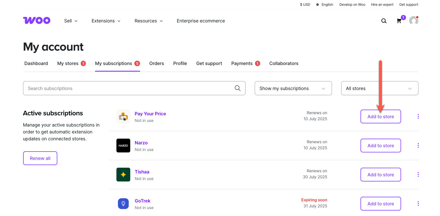
↑ Back to topTo start using a product from WooCommerce.com, you can use the “Add to store” functionality on the order confirmation page or the My subscriptions section in your account.
- Navigate to My subscriptions.
- Find the Add to store button next to the product you’re planning to install.
- Follow the instructions on the screen, and the product will be automatically added to your store.
Alternative options and more information at:
Managing WooCommerce.com subscriptions.
Both the free and Pro plugin files will be added when installing from the order confirmation page. If you manually install and activate the Pro plugin only, a notice will appear on your WordPress dashboard.
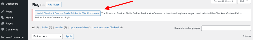
Simply click the “Install Checkout Custom Fields Builder for WooCommerce” button to install the free core version of the plugin.
Setup & Configuration
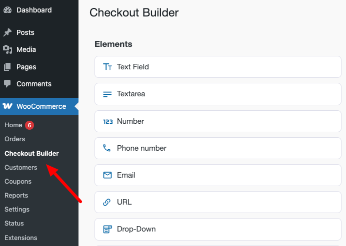
↑ Back to topTo reach the Checkout Builder, follow these steps:
- Navigate to the WordPress Dashboard.
- Go to WooCommerce.
- Select Checkout Builder.
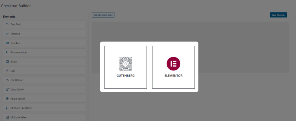
When you click the Checkout Builder menu, a pop-up will appear asking you to choose between Gutenberg and Elementor.
- Select Gutenberg if you want to use the default WooCommerce Checkout Block.
- Choose Elementor if you’d like to create a custom checkout page.
How to Manage Fields
↑ Back to topThe interface will vary depending on whether you choose Gutenberg or Elementor. The following instructions are for the Elementor option. Here, you’ll learn how to add custom fields to your WooCommerce Checkout page.
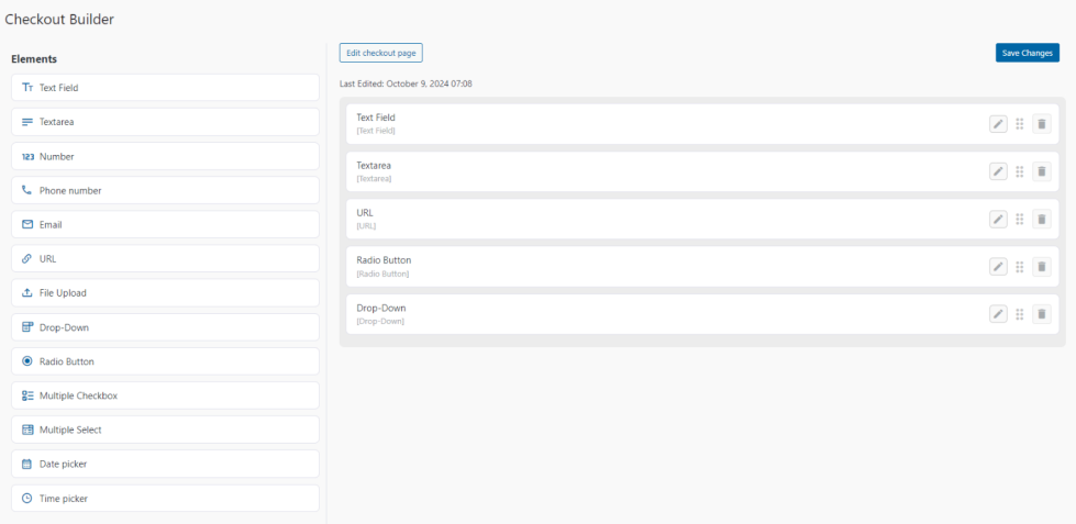
The Checkout Builder interface is divided into two main sections:
- Left Side: Contains the available fields that you can use to build your checkout form. Use the drag-and-drop functionality to add fields from the left side to the form on the right side.
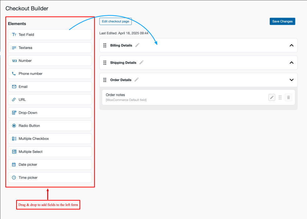
- Right Side: Displays the WooCommerce checkout form sections. You can rename these sections and change their order, but you cannot delete or hide them.

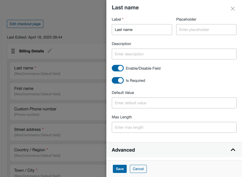
Edit WooCommerce Default Fields
↑ Back to topThe right side contains the default WooCommerce sections and the fields associated with them. These default fields are labeled as “WooCommerce default field.”

To edit a default field, simply click on it. The field settings will appear on the right side of the screen. The field settings allow you to change the default name, set placeholder text, and add a description. Additionally, you can enable/disable the default field and make it mandatory or optional, set a default value, and define a maximum length limit.
Add Custom Fields
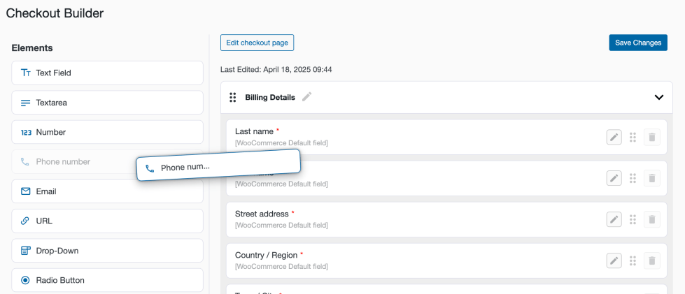
↑ Back to topTo add a new field to the checkout form, simply drag the desired field type from the list on the left and drop it into the section on the right.
Remove Fields
↑ Back to topTo remove a field, click the trash icon. WooCommerce default fields cannot be deleted, but you can disable them in the settings instead.

Elementor Checkout Page
↑ Back to topAfter building your own checkout form using Checkout Builder, you have to add the special Elementor widget
to your WooCommerce Checkout page. This guide provides step-by-step instructions on how to add the
Elementor widget to the WooCommerce Checkout page using Elementor.
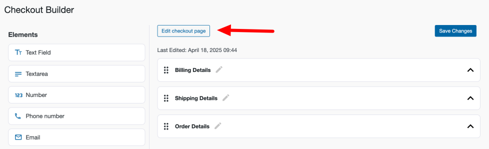
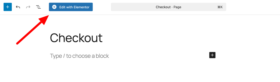
Click on the Edit checkout page button to open the WooCommerce Checkout page.
On the WooCommerce Checkout page, click on the Edit with Elementor button.
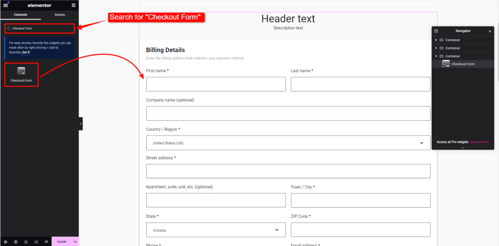
Add the Checkout Form Widget:
- In the Elementor editor, use the search bar to search for the “Checkout Form” widget.
- Drag and drop the “Checkout Form” widget onto the desired section of the page.
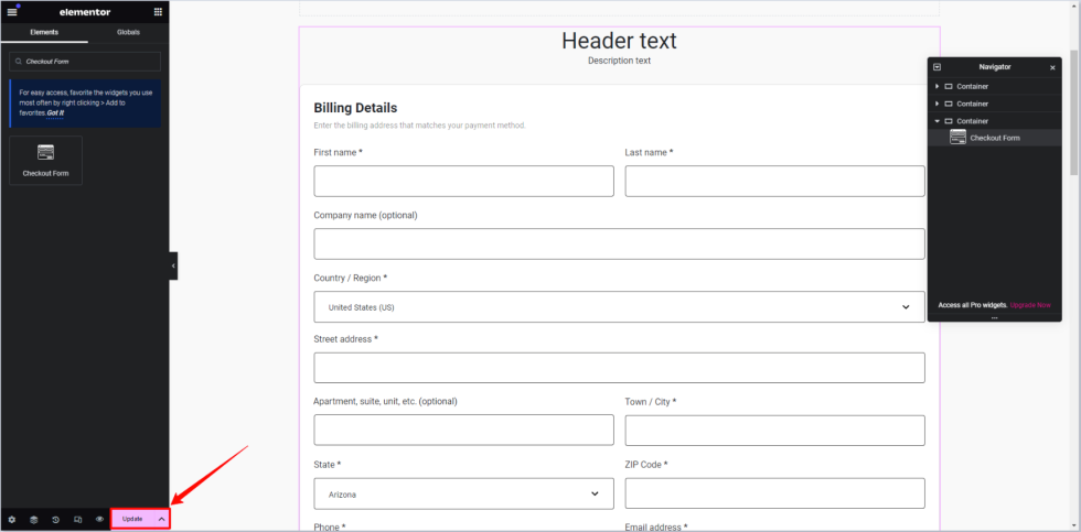
After adding the Checkout Form widget, make sure to save your changes by clicking the Update button in Elementor.
Widget Parameters
↑ Back to topAfter adding the widget to your WooCheckout page, you can modify its look by its parameters in Elementor:
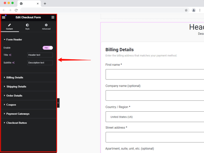
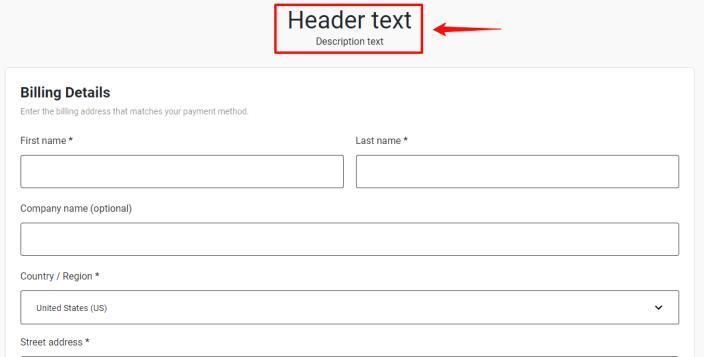
Form Header
↑ Back to topThe Form Header section is responsible for changing the texts in the Header part of the Checkout form:
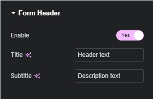
Here is the result:
Fields and Sections
↑ Back to topIn the next settings, you can set the width of the fields in different sections—Billing Details, Shipping Details, and Order Details—relative to the width of the form. All the newly added custom fields will be available in the list:
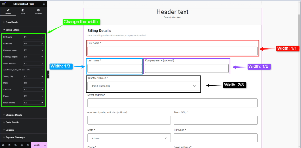
Available widths are:
1/1(full width)1/2(half-width)1/3(one-third width)2/3(two-thirds width)
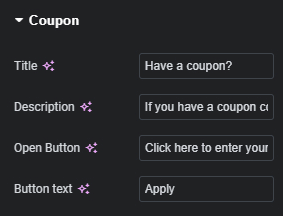
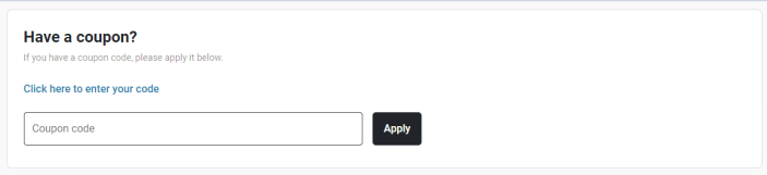
Coupon
↑ Back to topIn the Coupon section, you can modify the text for the special section used for entering discount coupons in WooCommerce:
Here is how it will look in the front:
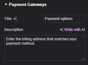
Payment Gateways
↑ Back to topIn the Payment Gateways section, you can modify the text for the special section used for selecting payment methods in WooCommerce:
Here is how it will look in the front:
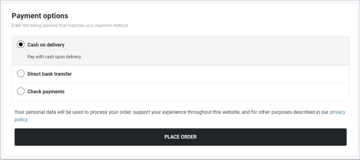
There is also an option to change the text of the Checkout Button (‘Place Order’ in the previous screenshot).
WooCommerce Checkout Block
↑ Back to topCheckout Custom Fields Builder PRO for WooCommerce plugin has been integrated with the default WooCommerce Checkout Block.
Once you select the Gutenberg option, you will get the Checkout Builder page:
Note: default sections and fields aren’t available in the Checkout Builder. You can edit them directly in the WooCommerce Checkout Block.
Once you add or edit the elements, you get the setting Position. You have to select one of the available predefined sections of the Checkout Block of WooCommerce where the element should be displayed:
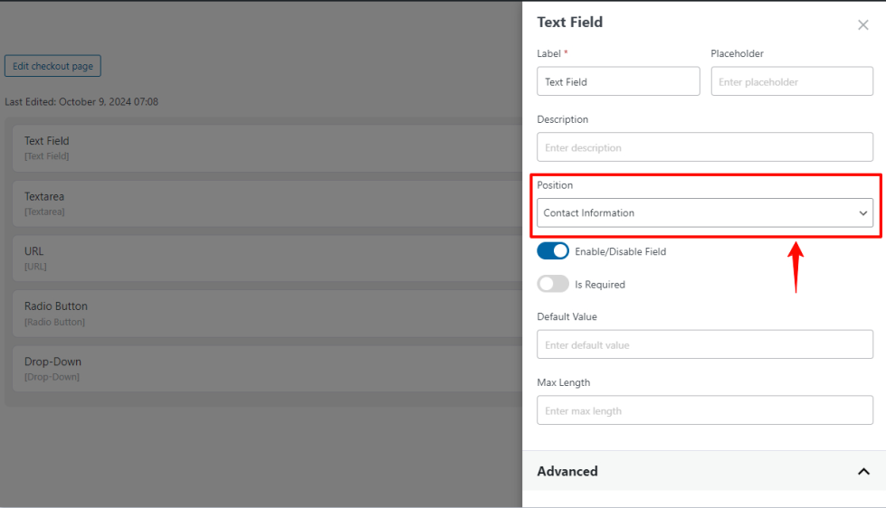
Available Positions are:
- Contact Information
- Billing Adress
- Shipping Adress
- Shipping Methods
Note: Added custom fields are not visible in the Checkout Block, and they cannot be edited due to limitations of WooCommerce Checkout Block.
List of Field Types
↑ Back to topCollect necessary and additional information with 12 flexible field types.
Text Field
↑ Back to topThe Text Field allows you to collect basic input from users. It can be used to gather information such as names, addresses, or any other single-line text data. You can customize the label, placeholder, and other settings to match the specific needs of your store’s checkout process.
Sample Use Cases
- Collect customer first and last names during checkout.
- Gather short feedback or additional notes from customers.
- Use for custom fields like referral codes or promo codes.
Text Field Settings
- Label – The name of the field displayed to the customer on the checkout page.
- Placeholder – The text that appears inside the input box before the customer types anything.
- Description – Additional information or instructions about the field, displayed below the input box.
- Enable/Disable Field – Allows you to enable or disable the field based on your needs. If it is disabled, the element will not be displayed in the checkout form, you can enable it anytime from the checkout builder according to your needs.
- Is Required – If enabled, the customer must fill in this field before proceeding with checkout.
- Default Value – The pre-filled value that will appear in the field when the page loads.
- Max Length – The maximum number of characters that the customer can enter in this field.
Advanced Settings
- Custom Class Name – Add custom CSS classes to the field for styling or functionality.
- Allowed Characters (Regex) – Set a regular expression to define allowed characters that can be input into this field.
- Error Message – Customize the error message that appears if the validation for the field fails.
Textarea
↑ Back to topThe Textarea field is used for collecting longer inputs from users, such as addresses, detailed instructions, or comments. It allows multi-line text, offering flexibility in gathering extended information compared to a standard text field.
Sample Use Cases
- Collect shipping or billing addresses from customers.
- Request additional order instructions or comments.
- Provide a space for feedback or special requests from customers.
Textarea Field Settings
- Label – The name of the field displayed to the customer on the checkout page.
- Placeholder – The text that appears inside the input box before the customer types anything.
- Description – Additional information or instructions about the field, are displayed below the input box.
- Enable/Disable Field – Allows you to enable or disable the field based on your needs. If it is disabled, the element will not be displayed in the checkout form, you can enable it anytime from the checkout builder according to your needs.
- Is Required – If enabled, the customer must fill in this field before proceeding with checkout.
- Default Value – The pre-filled value that will appear in the field when the page loads.
- Max Length – The maximum number of characters that the customer can enter in this field.
- Rows – Determines the visible height of the text area by specifying the number of rows. This can be adjusted based on how much space you expect the customer to need for input.
Advanced Settings
- Custom Class Name – Add custom CSS classes to the field for styling or functionality.
- Allowed Characters (Regex) – Set a regular expression to define allowed characters that can be input into this field.
- Error Message – Customize the error message that appears if the validation for the field fails.
Number
↑ Back to topThe Number field allows users to input numerical data during the checkout process. It can be used to capture values such as quantities, order numbers, or any other relevant numerical information.
Sample Use Cases
- Collect the number of items for a custom order.
- Specify an order reference or ID number.
- Gather quantity details for bulk purchases.
Number Field Settings
- Label – The name of the field displayed to customers on the checkout page.
- Placeholder – The text that appears inside the input box before the customer enters any number.
- Description – Additional information or instructions that will appear below the input box.
- Enable/Disable Field – Allows you to enable or disable the field based on your needs. If it is disabled, the element will not be displayed in the checkout form, you can enable it anytime from the checkout builder according to your needs.
- Is Required – Makes the field mandatory for customers before completing their purchase.
- Default Value – Pre-fill the number field with a default value when the checkout page loads.
- Min. Value – Specify the minimum value that can be entered in this field.
- Max. Value – Specify the maximum value that can be entered in this field.
- Step Value – Define the step increments for the numbers (e.g., increase by 1, 15, 30, etc.).
Advanced Settings
- Custom Class Name – Add custom CSS classes to style or further customize the field.
Phone Number
↑ Back to topThe Phone Number field is used to collect phone number information from customers during the checkout process. It ensures that the input matches the format for valid phone numbers, improving communication and order management.
Sample Use Cases
- Collect customer contact details for order confirmations.
- Request phone numbers for delivery coordination.
- Gather contact information for customer service follow-up.
Phone Number Field Settings
- Label – The name of the field displayed to the customer on the checkout page.
- Placeholder – Text shown inside the input box before the customer enters a phone number.
- Description – Additional information or instructions about the field that appears below the input box.
- Enable/Disable Field – Allows you to enable or disable the field based on your needs. If it is disabled, the element will not be displayed in the checkout form, you can enable it anytime from the checkout builder according to your needs.
- Is Required – When enabled, customers must fill in this field before completing their purchase.
Advanced Settings
- Custom Class Name – Add custom CSS classes to style or further customize the phone number field.
- Validation Error Message – Set a custom message to be displayed if the phone number input doesn’t meet the validation requirements.
The Email field is designed to collect email addresses from customers during checkout. It ensures that the input matches the format for valid email addresses, facilitating communication and order confirmations.
Sample Use Cases
- Collect customer email addresses for order confirmation and updates.
- Request email information for marketing or newsletters.
- Use for contacting customers in case of order-related inquiries.
Email Field Settings
- Label – The name of the field displayed to the customer on the checkout page.
- Placeholder – The text that appears inside the input box before the customer enters their email.
- Description – Additional information or instructions about the field, displayed below the input box.
- Enable/Disable Field – Allows you to enable or disable the field based on your needs. If it is disabled, the element will not be displayed in the checkout form, you can enable it anytime from the checkout builder according to your needs.
- Is Required – When enabled, customers must provide their email address before completing the purchase.
Advanced Settings
- Custom Class Name – Add custom CSS classes for styling or additional customization of the email field.
- Validation Error Message – Set a custom error message to display if the email entered does not meet validation requirements.
URL
↑ Back to topThe URL field allows users to input website addresses in a valid URL format. It is useful for collecting specific links from customers, such as personal websites or social media profiles.
Sample Use Cases
- Collect personal or business website URLs from customers.
- Request URLs for specific instructions, such as portfolio links or event registration pages.
- Gather links to social media profiles or other relevant online platforms.
URL Field Settings
- Label – The name of the field displayed to the customer on the checkout page.
- Placeholder – The text that appears inside the input box before the customer types anything.
- Description – Additional information or instructions about the field, are displayed below the input box.
- Enable/Disable Field – Allows you to enable or disable the field based on your needs. If it is disabled, the element will not be displayed in the checkout form, you can enable it anytime from the checkout builder according to your needs.
- Is Required – If enabled, the customer must fill in this field before proceeding with checkout.
- Default Value – The pre-filled value that will appear in the field when the page loads.
Advanced Settings
- Custom Class Name – Add custom CSS classes for additional styling or functionality of the URL field.
File Upload
↑ Back to topThe File Upload field allows users to upload files during the checkout process. It supports multiple file formats and can be configured to limit the number and size of files uploaded. This is useful for collecting documents, images, or other relevant files from customers.
Sample Use Cases
- Collect ID verification documents from customers.
- Request product images or documents for custom orders.
- Gather digital files needed for service fulfillment.
File Upload Field Settings
- Label – The name of the field displayed to the customer on the checkout page.
- Description – Additional information or instructions about the field, displayed below the file upload button.
- Enable/Disable Field – Allows you to enable or disable the field based on your needs. If it is disabled, the element will not be displayed in the checkout form, you can enable it anytime from the checkout builder according to your needs.
- Is Required – When enabled, customers must upload a file before completing the checkout process.
- Selected Files Limit – The maximum number of files customers can upload (e.g., 2 files).
- Allowed File Types – Specify the allowed file formats by entering a comma-separated list (e.g., png, jpg, jpeg).
- Max File Size in MB – Set the maximum file size for each upload, in megabytes.
Advanced Settings
- Custom Class Name – Add custom CSS classes for additional styling or customization of the file upload field.
Drop-Down
↑ Back to topThe Drop-Down field allows users to select an option from a predefined list during checkout. It is useful for offering a selection of predefined choices without requiring the customer to manually input text.
Sample Use Cases
- Offer a selection of shipping methods.
- Provide a list of countries or regions for delivery.
- Allow customers to select a preferred option from a custom list (e.g., t-shirt sizes, gift wrap options).
Drop-Down Field Settings
- Label – The name of the field displayed to customers on the checkout page.
- Placeholder – The text that appears inside the dropdown before the customer selects an option.
- Description – Additional information or instructions about the dropdown, displayed below the field.
- Enable/Disable Field – Allows you to enable or disable the field based on your needs. If it is disabled, the element will not be displayed in the checkout form, you can enable it anytime from the checkout builder according to your needs.
- Is Required – When enabled, customers must select an option from the dropdown before completing their purchase.
- Options – Customize the available options by setting the Label (what the customer sees) and Value (backend value associated with each option). You can add, edit, or delete options as needed:
 – use the drag-and-drop function to reorder options
 – use this to delete the options
- Add new – use this button to add new options
- Default Value – Set a default selection that will appear automatically when the page loads.
Advanced Settings
- Custom Class Name – Add custom CSS classes for styling or additional functionality for the dropdown field.
Radio Button
↑ Back to topThe Radio Button field allows users to select a single option from a set of predefined choices. Unlike checkboxes, only one option can be selected at a time. This is useful for offering mutually exclusive options to customers during the checkout process.
Sample Use Cases
- Offer a choice between different options.
- Allow customers to select a delivery option (e.g., standard or express).
- Provide a set of options where only one can be chosen (e.g., Yes or No).
Radio Button Field Settings
- Label – The name of the field displayed to customers on the checkout page.
- Description – Additional information or instructions about the radio button selection, displayed below the field.
- Enable/Disable Field – Allows you to enable or disable the field based on your needs. If it is disabled, the element will not be displayed in the checkout form, you can enable it anytime from the checkout builder according to your needs.
- Is Required – When enabled, customers must select one option before proceeding with checkout.
- Options – Customize the available options by setting the Label (what the customer sees) and Value (backend value associated with each option). You can add, edit, or delete options as needed:
- – use the drag-and-drop function to reorder options
- – use this to delete the options
- Add new – use this button to add new options
- Default Value – Set a default selection that will appear automatically when the page loads.
Advanced Settings
- Custom Class Name – Add custom CSS classes for additional styling or functionality for the radio button field.
Multiple Checkbox
↑ Back to topThe Multiple Checkbox field allows users to select one or more options from a list of predefined choices. This field is useful when customers need to make multiple selections or when you want to give them the flexibility to choose more than one option during checkout.
Sample Use Cases
- Allow customers to select additional services (e.g., gift wrapping, expedited shipping).
- Provide an option for selecting multiple preferences (e.g., product categories, special requests).
- Let users opt into multiple promotional offers or newsletters.
Multiple Checkbox Field Settings
- Label – The name of the field displayed to the customer on the checkout page.
- Description – Additional information or instructions about the checkbox, shown below the field.
- Enable/Disable Field – Allows you to enable or disable the field based on your needs. If it is disabled, the element will not be displayed in the checkout form, you can enable it anytime from the checkout builder according to your needs.
- Is Required – When enabled, customers must select at least one checkbox before proceeding with checkout.
- Options – Customize the available options by setting the Label (what the customer sees) and Value (backend value associated with each option). You can add, edit, or delete options as needed:
- – use the drag-and-drop function to reorder options
- – use this to delete the options
- Add new – use this button to add new options
- Default Value(s) – Pre-select one or more options by setting them as default values when the page loads.
Advanced Settings
- Custom Class Name – Add custom CSS classes for further styling or additional functionality for the checkbox field.
Multiple Select
↑ Back to topThe Multiple Select field allows users to choose more than one option from a multiple-select field. This field is ideal when you need to provide customers with the ability to select multiple options from a predefined set during checkout.
Sample Use Cases
- Allow customers to select multiple product preferences.
- Provide an option to choose several delivery or packaging methods.
- Let customers pick multiple subscription preferences or product features.
Multiple Select Field Settings
- Label – The name of the field displayed to the customer on the checkout page.
- Placeholder – The text is displayed inside the dropdown before the customer makes a selection.
- Description – Additional information or instructions about the multiple select fields, are shown below the dropdown.
- Enable/Disable Field – Allows you to enable or disable the field based on your needs. If it is disabled, the element will not be displayed in the checkout form, you can enable it anytime from the checkout builder according to your needs.
- Is Required – When enabled, customers must select at least one option before proceeding with checkout.
- Options – Customize the available options by setting the Label (what the customer sees) and Value (backend value associated with each option). You can add, edit, or delete options as needed:
- – use the drag-and-drop function to reorder options
- – use this to delete the options
- Add new – use this button to add new options
- Default Value(s) – Pre-select one or more options that will appear as default selections when the page loads.
Advanced Settings
- Custom Class Name – Add custom CSS classes for further styling or additional functionality for the multiple select fields.
Date Picker
↑ Back to topThe Date Picker field allows users to select a specific date from a calendar during checkout. It helps schedule delivery dates, book appointments, or collect any date-related information from customers.
Sample Use Cases
- Allow customers to schedule a delivery or pick-up date.
- Let users choose a preferred date for services or appointments.
- Collect date-related information, such as birthdates or event dates.
Date Picker Field Settings
- Label – The name of the field displayed to the customer on the checkout page.
- Placeholder – The text that appears inside the input box before the customer selects a date.
- Description – Additional information or instructions about the date picker, shown below the field.
- Enable/Disable Field – Allows you to enable or disable the field based on your needs. If it is disabled, the element will not be displayed in the checkout form, you can enable it anytime from the checkout builder according to your needs.
- Is Required – When enabled, customers must select a date before proceeding to checkout.
- Default Value – Pre-fill the field with a default date value when the page loads.
- Block Days – Select specific days of the week to block (e.g., block weekends if your store doesn’t deliver on those days).
Advanced Settings
- Custom Class Name – Add custom CSS classes for further styling or additional functionality for the date picker field.
Time Picker
↑ Back to topThe Time Picker field allows users to select a specific time during the checkout process. It is ideal for scheduling appointments, setting delivery or service times, or any other situation where precise time selection is required.
Sample Use Cases
- Allow customers to choose a delivery time slot.
- Let users schedule service times for appointments or consultations.
- Collect preferred time information for event or service planning.
Time Picker Field Settings
- Label – The name of the field displayed to the customer on the checkout page.
- Placeholder – The text that appears inside the input box before the customer selects a time.
- Description – Additional information or instructions about the time picker, displayed below the field.
- Enable/Disable Field – Allows you to enable or disable the field based on your needs. If it is disabled, the element will not be displayed in the checkout form, you can enable it anytime from the checkout builder according to your needs.
- Is Required – When enabled, customers must select a time before proceeding with checkout.
- Default Value – Pre-fill the field with a default time value when the page loads.
Advanced Settings
- Custom Class Name – Add custom CSS classes for further styling or additional functionality for the time picker field.
Questions and support
↑ Back to topAlready purchased and need some assistance? Please get in touch via the help desk.