Installation
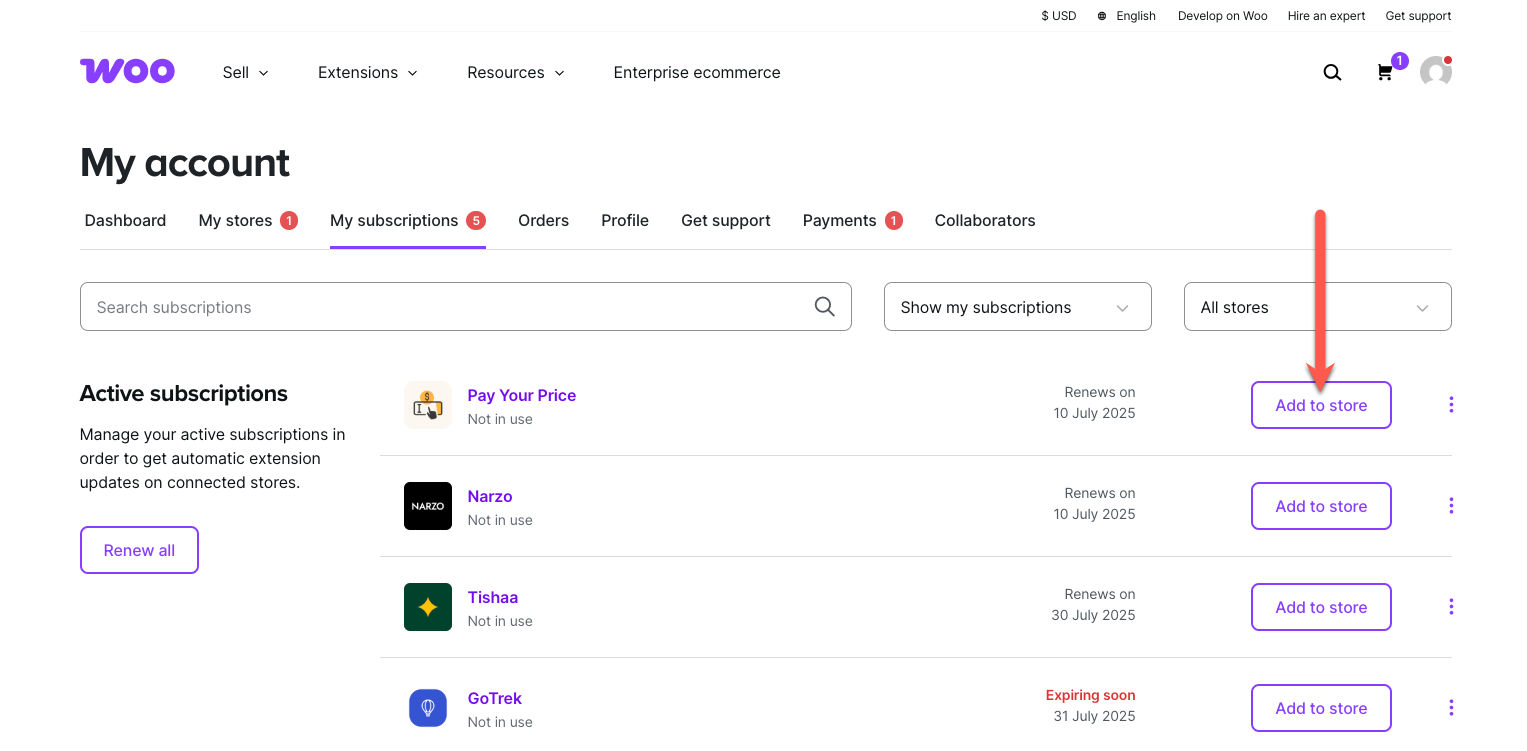
↑ Back to topTo start using a product from WooCommerce.com, you can use the “Add to store” functionality on the order confirmation page or the My subscriptions section in your account.
- Navigate to My subscriptions.
- Find the Add to store button next to the product you’re planning to install.
- Follow the instructions on the screen, and the product will be automatically added to your store.
Alternative options and more information at:
Managing WooCommerce.com subscriptions.
Updating
↑ Back to topConnect your WooCommerce.com account to your site in order to get updates properly from your WordPress dashboard.
1. Connect your site & WooCommerce.com account
↑ Back to top- Logged into your site, head to WooCommerce > Extensions
- Select the WooCommerce.com Subscriptions tab
- Select the Connect button and log into your WordPress.com
- Click the Approve button to connect your site to your WooCommerce.com account
This helps make sure all update checks will go directly to WooCommerce.com and there will be no glitches when updating the extension.
2. Install the update
↑ Back to topOnce your site is connected to your account, from this screen you can:
- Download product .zip files to manually install the new version on your site; OR
- Get updated by clicking on update now.
More information at: Install and Activate Plugins/Extensions.
Products Layout Block
↑ Back to topProducts selection
↑ Back to topProducts can be chosen in two ways. One choice is automatic selection, which shows products based on query settings like ordering and filtering by categories. The other option is to hand-pick particular products. In Inspector Control sidebar, open “Products” section to choose your preferred product selection.
Automatic (query based) products
Query based product selection lets you set up products based on several criteria. These include products belonging to one or more categories. It also involves ordering criteria, such as displaying new or old products first. Another option is to order products by title, either descending or ascending. If, under the “Products” sidebar section, you choose a “Automatic” option, the ordering and categories options will display:


Ordering and category options can be merged. For example, you can choose to show best selling products from a certain category.
Hand-picked products
The other choice is to hand pick product to create completely customized Products Layout. Products can be selected in Inspector Controls sidebar (after you choose “Hand picked” instead of “Automatic”) , or in each layout item, by clicking on + button:

NOTE: if the product is deleted, it will be missing from the layout. Also, if product ID is changed, it won’t have any fallback product displayed. Use hand-picked product choice for regularly curated layouts.
Starter layouts
↑ Back to topWhen Products Layout block is added to a page via block inserter, it will already have a basic layout. This layout includes 3 items in a row. It also has a default style, as seen in the example from the top of this page.
Starter layouts can be selected in the Inspector Controls in the right sidebar, or in the block controls:


These layouts are simply a starting points to kick start your layout creation. Layouts are created with 3 or 4 items in various layout configurations.
NOTE: Any added item or changed layout will be overwritten if you switch starter layouts after the edits.
Starter styles
↑ Back to topLike Starter layouts, Starter styles serves as a kick-starter for styling products. We predefined the styles for the most common visual styling. Use starter styles as starting point, and apply your style changes to fit your desired preference.


NOTE: Like starter layouts control, switching starter styles will overwrite any style changes made in the “Product styles” section
Editing layout
↑ Back to topAfter the starter layout is chosen, items in layout can be rearranged, resized, added, or removed. It’s enough to hover the item, and the resizing or moving handles will show up, enabling handling the item.
Adding or removing layout items
To add items, click on “Add grid item” in block controls. Alternatively, use the Inspector Controls sidebar and navigate to Grid settings, then click on Add grid item.
Removing items can be done by clicking on red “X” on each item (when hovered):


Move and resize items
Rearranging the layout is straightforward. When a product item is hovered, the handles for resizing the item will show up. Item will resize by dragging the handles.
You can move items to any position. Simply drag and drop item when the cursor is set to the move icon.
Item toolbar
Each item has a small toolbar, appearing on item hover. The toolbar’s content depends on the type of product query, whether automatic or hand-picked. It also depends on the grid settings, like “Allow overlapping items” (more about “Grid settings” section bellow). The toolbar holds z-index control and hand-picking product control. There is also the option to remove the item from the layout. It includes the item id info.

The “Z-index” control will place the item in front or behind other items. This setting appears only if “Allow overlapping items” in “Layout and grid settings” sidebar section.
Edit the product style
↑ Back to topIn “Product style settings” sidebar section there are controls for changing visual aspects of products. Font sizes and colors, spacing, alignments, backgrounds, borders, shadows, and visibility per devices, and product elements ordering. There are also a couple of special controls. These include product short description number of lines (truncating). They also cover rating stars size and sale badge appearance. Custom “Add to Cart” button styles and featured image resolution are also included.
More about customizing “Add to Cart” here.
Text sizes, shadows …
The first tab in “Product style settings” covers text sizes. It includes the product title, price, short description (or excerpt), categories, and “Add to cart” button.
To adhere to the principles of intrinsic web design, font sizes are fluid. This choice avoids excessive settings for various devices. Font size will adapt and stretch to size between the least and greatest size, in rem units.
With the “Truncate short desc.” and “Truncate lines” the short description can be shorten, given the number of lines.
Text shadows are useful for better visuals, and to improve readability.
Layout, alignment, spacing
The second tab in “Product style settings” is related to product layout styles:
“Product layout type” drop-down provides several options. You can place the product image on the left, right, top, or bottom. Alternatively, use product image as a product background image.
Horizontal and vertical align buttons will align product elements compared to each product container box.
Padding and elements spacing controls use a fluid size system. This system sets the minimum and maximum values, (according to the intrinsic web design principles). Padding applies to product content box, elements spacing applies to product elements (title, price, short description …).
Two extra controls in the layout tab are the “Rating stars size” and the “Image size“. The “Rating stars size” control will apply if the product has ratings. Also, the visibility must be set in the last tab, “Product elements visibility and sorting”.
The “Image size” resizes the product image in percentages, compared to product content box.
Element colors
The third tab in “Product style settings” holds controls for font and background controls. If (product image) overlay color is set, the overlay opacity can be controlled. Additionally, background color controls includes the gradient colors choice. The “Overlay blend mode” can change the overlay blending with the image, giving special visual style to image.
Border and shadows
Fourth tab holds settings for product box container border and shadows. Border settings include width, color, and style, as well as border radius (“Rounded corners” setting).
The box shadow can add shadow to product container box, and it also includes inset shadow.
Sale badge settings
The sale badge is a product element which appearance depends on whether the product is on sale. It also depends on whether the visibility is set, in the “Visibility and sorting” tab.
The Sale badge settings include the background color, position (top / left), and the badge shape. When changing the badge background color, the font color will automatically change for the best visibility contrast.
Positioning sale badge is determined with the percentage from the top and left side of product content box.
The Sale badge shape options are square, circle, rounded, tag, and starburst.
Visibility and sorting
The last tab in “Product style settings” deals with product element visibility and sorting. Visibility can be toggled per device (desktop, tablet, or mobile). Sorting elements can be done using drag and drop handle with the up/down arrows.
Additional settings
There are two extra settings for the product: the “Add to Cart” button style classes and the Product image resolution.
The “Custom Add to Cart” toggle changes the style of the “Add to cart” button from the block’s style. It can be toggled to use theme, WooCommerce, or custom CSS class names. When “Custom classes” is toggled on, a choice of commonly used classes is offered. This helps match the button style to the rest of WooCommerce styling or theme styling.

The “Product image resolution” sets the product image quality. The “Automatic” setting is recommended as it uses the “srcset” image HTML attribute with responsive image sizes.
Style settings per item
↑ Back to topEach item in the “Products Layout” block can have its own style, which overrides general style settings.
In the “Style settings per item” click the toggle “Override settings” to enable styling controls for that item. The controls per item are the same as for the product style settings in general (the “Product style settings” section).
NOTE: If many items are added to the grid, it can get complicated. Each item having its own custom styling contributes to this complexity. Thus, we recommend using styling per item sparingly.
When style override for is activated, the default style will apply to that item.
To match the current general style, use the “Apply current global settings”, available in the copy/paste toolbar.

Additionally, item override includes Style switcher. It allows starting with predefined styles. There is also a copy/paste mini-toolbar to copy and paste styles between general and item styles overrides.
Style copy/paste
↑ Back to topWe have added a small utility tool for copying and pasting styles. You can copy styles from general style settings to individual item or vice-versa. It is also possible to copy styles temporarily to easily switch back to the last satisfying style.
You can find the copy/paste toolbar above the “Product style settings” tabs. It is also available in each item style tab in “Style settings per item“.
As mentioned above, to apply the current general style settings, each item has additional toolbar button “Apply current global settings“.


Saving layout and style sets
↑ Back to topA powerful tool for quickly changing the look of your products is the My layout and style setups section.
This utility lets you save as many setups as you want to the database. This means those setups can be reused in any other Products Layout block instance.
NOTE: Saved setups can only be used within block instances of the same type. You cannot apply saved Products Layout setups to Categories Layout or Single Product Builder blocks.
Layout grid settings
↑ Back to topThe base for creating Products Layout block is a grid system which controls the placement of product items. Grid enables easy snapping and aligning items, even for more free and creative layouts.
Grid layout settings controls grid row height, grid spacing (affects products spacing), items overlapping toggle, and items compaction type. It also includes a grid helper – a visual aid for easier layout editing.
Compaction type will make items “gravitate” to the top or to the left side. This depends on whether horizontal or vertical compaction type is selected. Compaction will also allow space between the item only for the set margin size.
Categories Layout Block
↑ Back to topThe “Category layouts” block shares a lot of controls with the “Product layouts”.
Categories selection
↑ Back to topProduct categories can be chosen in two ways. One choice is automatic selection, which shows categories based on ordering query settings. The other option is to hand-pick particular categories. In Inspector Control sidebar, open “Categories” section to choose your preferred category selection.
Automatic (query based) categories
Query based product categories selection lets you set up categories based on following criteria – alphabetically or by count of products in category (ascending or descending). The layout will be automatically filled with categories by selected criteria.


Hand-picked categories
The other choice is to hand pick category by category, to create completely customized categories layout. Categories can be selected in Inspector Controls sidebar (after you choose “Hand picked” instead of “Automatic”) , or in each layout item, by clicking on + button:

NOTE: if the category is deleted, it will be missing from the layout. Also, if category ID is changed, it won’t have any fallback category displayed. Use hand-picked category choice for regularly curated layouts.
Starter layouts
↑ Back to topWhen Categories Layout block is added to a page, it will already have a basic layout. This layout includes 3 items in a row. It also has a default style, as seen in the example from the top of this page.
Starter layouts can be selected in the Inspector Controls in the right sidebar, or in the block controls (images bellow):


These layouts are simply a starting points to kick start your layout creation. Layouts are created with 3 or 4 items in various layout configurations.
NOTE: Any added item or changed layout will be overwritten if you switch starter layouts after the edits.
Starter styles
↑ Back to topLike Starter layouts, Starter styles serves as a kick-starter for styling categories. We predefined the styles for the most common visual styling. Use starter styles as starting point, and apply your style changes to fit your desired preference.


NOTE: Like starter layouts control, switching starter styles will overwrite any style changes made in the “Category style settings” section
Editing layout
↑ Back to topAfter the starter layout is chosen, items in layout can be rearranged, resized, added, or removed. It’s enough to hover the item, and the resizing or moving handles will show up, enabling handling the item.
Adding or removing layout items
To add items (category), click on “Add a category” in block controls. Alternatively, use the Inspector Controls sidebar and navigate to Layout and grid settings, then click on Add item.
Removing items can be done by clicking on red “X” on each item (when hovered):


Move and resize items
Rearranging the layout is straightforward. When a product item is hovered, the handles for resizing the item will show up. Item will resize by dragging the handles.
You can move items to any position. Simply drag and drop item when the cursor is set to the move icon.
Item toolbar
Each item has a small toolbar, appearing on item hover. The toolbar’s content depends on the type of product query, whether automatic or hand-picked. It also depends on the grid settings, like “Allow overlapping items” (more about “Grid settings” section bellow). The toolbar holds z-index control and hand-picking product control. There is also the option to remove the item from the layout. It includes the item id info.

The “Z-index” control will place the item in front or behind other items. This setting appears only if “Allow overlapping items” in “Grid settings” sidebar section.
Edit the category style
↑ Back to topIn “Category style settings” sidebar section there are controls for changing visual aspects of categories. Font sizes and colors, spacing, alignments, backgrounds, borders, shadows, and elements visibility. There are also a couple of special controls. These include category description number of lines (truncating), title and description shadows, etc.
The best way to start may be to select a starter style, and then use above mentioned controls to customize the categories look:
Text sizes, shadows …
The first tab in “Category style settings” covers text sizes. It includes the category title, description, and products count.
To adhere to the principles of intrinsic web design, font sizes are fluid. This choice avoids excessive settings for various devices. Font size will adapt and stretch to size between the least and highest size, in rem units.
With the “Truncate description” and “Truncate lines” the short description can be shorten, given the number of lines.
Text shadows are useful for better visuals, and to improve readability.
Layout, alignment, spacing
The second tab in “Category style settings” is related to product layout styles:
“Category layout type” drop-down provides several options. You can place the category image on the left, right, top, or bottom. Alternatively, use it as a category background image.
Horizontal and vertical align buttons will align category elements compared to each category container box.
Padding and elements spacing controls use a fluid size system. This system sets the smallest and the highest values (according to the intrinsic web design principles). Padding applies to category content box, elements spacing applies to category elements (title, description …).
The “Image size” control resizes the category image in percentages, compared to category content box. Category image uses the “srcset” image HTML attribute with responsive image sizes.
Element colors
The third tab in “Category style settings” holds controls for font and background controls. If (category image) overlay color is set, the overlay opacity can be controlled. Additionally, background color controls includes the gradient colors choice. The “Overlay blend mode” can change the overlay blending with the image, giving special visual style to image.
Border and shadows
Fourth tab holds settings for product box container border and shadows. Border settings include width, color, and style, as well as border radius (“Rounded corners” setting).
The box shadow can add shadow to product container box, and it also includes inset shadow.
Visibility and sorting
The last tab in “Category style settings” deals with product element visibility. Visibility can be toggled per device (desktop, tablet, or mobile).
Style settings per item
↑ Back to topEach item in the “Categories Layout” block can have its own style, which overrides general style settings.
In the “Style settings per item” click the toggle “Override settings” to activate styling controls for that item. The controls per item are the same as for the category style settings in general (the “Category style settings” section).
NOTE: If many items are added to the grid, it can get complicated. Each item having its own custom styling contributes to this complexity. Thus, we recommend using styling per item sparingly.
When style override for is activated, the default style will apply to that item.
To match the current general style, use the “Apply current global settings“, available in the copy/paste toolbar.

Additionally, item override includes Style switcher. It allows starting with predefined styles. There is also a copy/paste mini-toolbar to copy and paste styles between general and item styles overrides.
Style copy/paste
↑ Back to topWe have added a small utility tool for copying and pasting styles. You can copy styles from general style settings to item style override or vice-versa. It is also possible to copy styles temporarily to easily switch back to the last satisfying style.
You can find the copy/paste toolbar above the “Category style settings” tabs. It is also available in each item style tab in “Style settings per item“.
As mentioned above, to apply the current general style settings, each item has additional toolbar button “Apply current global settings“.


Saving layout, style sets
↑ Back to topA powerful tool for quickly changing the look of your categories is the My layout and style setups section.
This utility allows you to save as many setups as you want to the database. This means those setups can be reused in any other Categories Layout block instances.
NOTE: Saved setups can only be used within block instances of the same type. Saved Category Layout Setups can’t be applied to Product Layouts or Single Product Builder blocks.
Layout grid settings
↑ Back to topThe base for creating Categories Layout is a grid system which controls the placement of product items. Grid enables easy snapping and aligning items, even for more free and creative layouts.
Grid layout settings controls grid row height, grid spacing (affects products spacing), items overlapping toggle, and items compaction type. It also includes a grid helper – a visual aid for easier layout editing.
Compaction type will make items “gravitate” to the top or to the left side. This depends on whether horizontal or vertical compaction type is selected. Compaction will also allow space between the item only for the set margin size.
Single product layout block
↑ Back to topWith the “Single product layout” block you can create unlimited custom single product layouts.
Product selection
↑ Back to topOnce the Single Product Layout block is added to a page, popup modal will automatically offer a selection of products. If you decide to replace the product, you can use the product selector. It is available in the Inspector controls sidebar or block controls. You can see this in the image below.

Starter layouts and styles
↑ Back to topWhen the Single Product Layout block is added to a page, it will already have a basic layout and style.
Starter layouts and styles can be selected in the Inspector Controls in the right sidebar, or in the block controls (images bellow):


You will notice that colors and other styles are changing when switching the starter layouts. Unlike the Products Layout block, the Single Product block unifies the starter layout and styles in one control.
NOTE: Any added item or changed layout will be overwritten if you switch starter layouts after the edits.
Editing layout
↑ Back to topAfter the starter layout is chosen, elements (product title, price, image etc.) in layout can be rearranged, resized, added, or removed. It’s enough to hover the item, and the resizing or moving handles will show up, enabling handling the item.
Move and resize items
Rearranging the layout is straightforward. When a product element is hovered, the handles for resizing the item will show up. The element container will resize by dragging the handles.
You can move elements to any position. Simply drag and drop item when the cursor is set to the hand icon.
Notice how each element has outline with labels, appearing on block hover. These outline serve as a helping tool for easier placement and resizing of elements. Outline and labels appear only when editing the product layout. They will show if you select either “On block hover” or “Always” as options. You can find these options in “Layout and grid settings” > “Helper outline and labels” within the Inspector controls sidebar.
Grouping elements
Product elements can also be grouped in a special, group item. You can add this from the Block controls toolbar by clicking on “Add group“. Each group element has a control to add title, price, or other elements into a group. A control appears on group element hover, and opens a popover with elements to add.
When an element is added to a group, it is removed from the main layout. Conversely, when it is removed from the group, the element returns to the main layout.:
When more groups are added, elements can switch their positions between groups. They can also be “returned” back to the main layout. Other controls include Remove (or delete) group button, and a elements sorting and visibility control:


Each group element can be styled in sidebar Inspector > Product style settings, where other elements styling can be done. Elements in group can change styles the same way as when they are outside the group element.
Block controls toolbar
↑ Back to topAs any other block, the “Single product layout” has a block controls toolbar when the block is selected. Block controls toolbar includes the following controls:
- Block alignment (editor default)
- Device preview control
- Layouts and styles control
- Elements visibility per device
- Elements z-index control (for stacking elements bellow or above)
- Add/Change product control
- Add group element control


The “Z-index” control will place an element in front or behind other items. This setting appears only if “Allow overlapping items” in “Grid settings” sidebar section.
Product style settings
↑ Back to topControls are contextual, depending on type of element (text, image, button …). For example, each textual element (title, price, short description) has font size, color, shadow, and alignment controls
In “Product style settings” sidebar section there are controls for changing visual aspects of product elements. Style controls are grouped under elements (title, price, etc.), within the popup modal which appears when clicked on element name.

To make editing element styles experience easier, every element’s container style can be copied and pasted between the elements. Each element has it’s container, and container style settings, like border, padding, background color, can be shared between containers.
Reminder: To adhere to the principles of intrinsic web design, controls for font sizes, padding, and spacing are fluid. This choice for controls avoids excessive settings for various devices. Font, padding, or spacing size will adapt and stretch to size between the least and highest size, in rem units.
Bulk editing styles for elements
To change styling properties of multiple elements, use the “Bulk edit styles for elements” control. This allows shared properties like container padding, text color, and background to be changed for all elements. You can also modify the border, box shadow, or alignment of all elements.
Not every style setting will apply to every element. For example, padding won’t apply to image. Use the “Product style settings per element” section to change individual element style.

Elements Visibility
Every product element has controls over visibility on devices (desktop, tablet, mobile). To change element visibility, go to Inspector sidebar > Product style settings > Elements visibility and click on devices icons to toggle visibility, per device (desktop, tablet, and mobile)

Saving layout and style sets
↑ Back to topA powerful tool for quickly changing the look of your products is the Saving layout and style setups section.
This utility allows you to save as many setups as you want to the database. This means those setups can be reused in any other Mosaic Products Grid block instances.
NOTE: Saved setups can only be used within block instances of the same type. Saved Single product Setups can’t be applied to Product Layouts or Category Layouts blocks.
Layout grid settings
↑ Back to topThe base for creating Categories Layout is a grid system which controls the placement of product items. Grid enables easy snapping and aligning items, even for more free and creative layouts.
Grid layout settings includes controls for row grid height, and a grid spacing. Both settings affect the layout size). Extra settings are grid helpers – a visual aids for easier layout editing.
If set, Grid helper will show a grid in front, or behind elements. Helper outline and labels can help recognize elements in a layout.
Layouts Carousel Block
↑ Back to topWith the “Layouts Carousel” block you can create a carousel with any of Mosaic Product Layouts blocks – Products Layout, Categories Layout, or Single Product Layout.
Carousel, slides, and blocks
↑ Back to topOnce the Layouts Carousel block is added to a page, it will have only one slide added to a carousel. The slide will be empty, with a block inserter (black square button with white “+”) appearing when the slide is selected (click on empty slide)

When clicked on block inserter button the selection of Mosaic Product Layouts blocks will appear – clicking on one of block icons will insert the block in slide.

To add more slides to carousel, click on Add Slide button in Layouts Carousel sidebar settings.
To access the settings, click on parent block icons in block controls toolbar (above the block, or on top of editor), until Layouts Carousel settings appear in the editor sidebar.


Alternatively, use the Document Overview to see all blocks in a list view, navigate through blocks structure, and select Layouts Carousel block to access it’s controls:

Carousel and slide settings
↑ Back to topSlides list
Slides are actually inner blocks, and the list shows only those inner blocks, with the possibility to re-order inner blocks using little arrow buttons.
Add / remove slides
When clicked on Add slide button, empty inner block will be added to a Layouts Carousel block containing only a block inserter button (as shown above).
To remove the slide, in slide block controls toolbar or block options in Document Overview > List view, click on three dots and then Delete.
While adding slides, and changing their order, or inner Mosaic Product Layouts blocks in the slider – it is recommended to use List View and it’s intuitive and simple drag and drop capabilities.
Loop slides
If Loop slides toggle is on slides will rotate in infinite loop; if toggle is off, slides will change from first to last, back and forth.
Autoplay slides and Autoplay delay
When Autoplay slides toggle is on the slides will automatically change, without user interaction with back/forward or position dot buttons. If Autplay toggle is off, the delay and duration settings won’t show or apply.
The Autoplay delay is time between slide transitions, set in seconds, with decimals.
Scroll duration
NOTE: Layouts Carousel uses the Embla Carousel library, and this is a note for Embla Carousel documentation regarding the scroll duration:
Scroll duration is not in milliseconds because Embla uses an attraction physics simulation when scrolling instead of easings. Only values between 20-60 are recommended.
The approximate scroll duration shown is activated on back/forward or position dot buttons for reference.