Installation
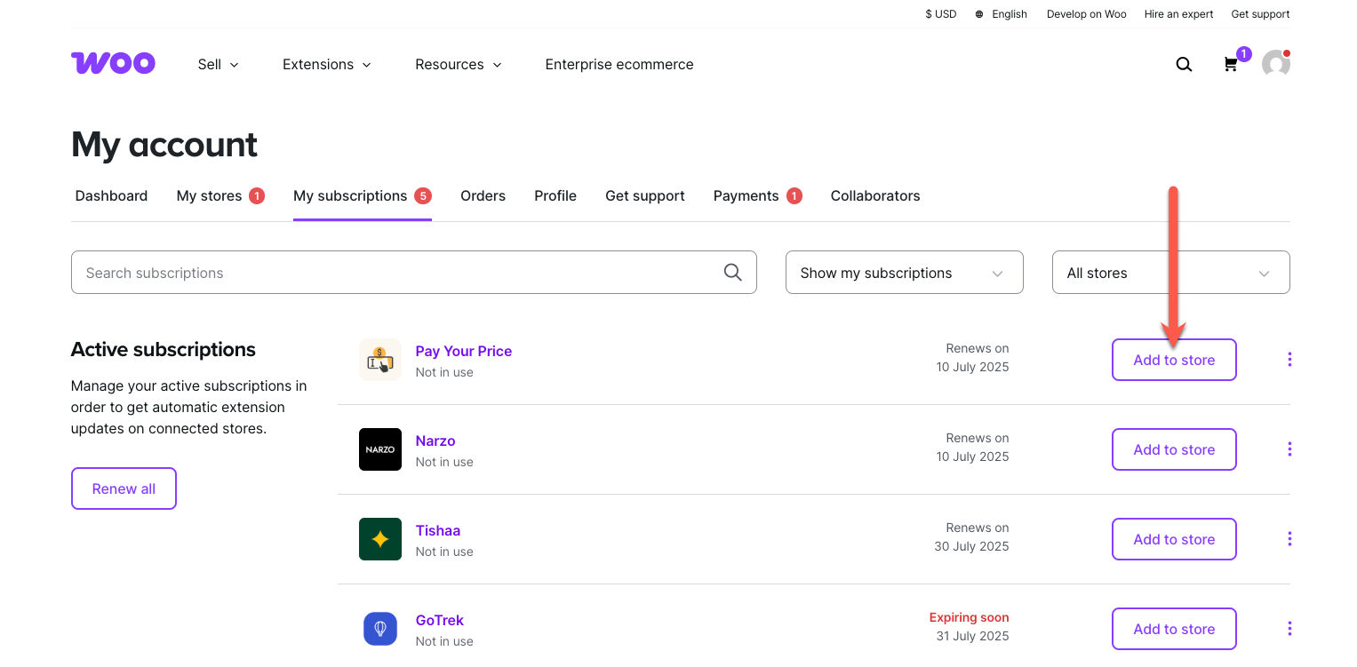
↑ Back to topTo start using a product from WooCommerce.com, you can use the “Add to store” functionality on the order confirmation page or the My subscriptions section in your account.
- Navigate to My subscriptions.
- Find the Add to store button next to the product you’re planning to install.
- Follow the instructions on the screen, and the product will be automatically added to your store.
Alternative options and more information at:
Managing WooCommerce.com subscriptions.
Common Settings
↑ Back to top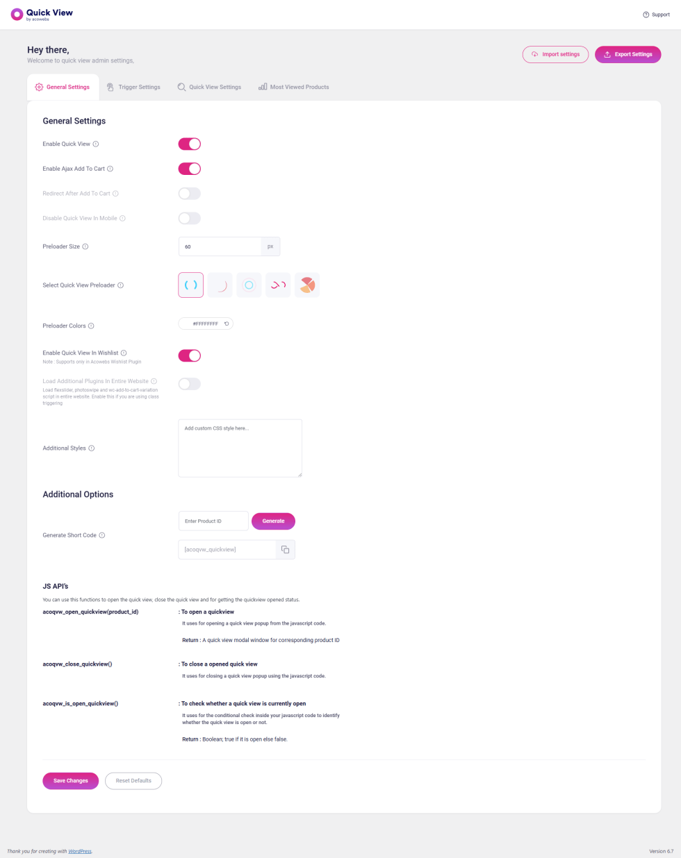
General Settings
↑ Back to topEnable Quick View:
Allows you to click a button on your product archives for a specific product and instantly view a popup with that product’s details, including an “Add to Cart” button.
Enable Ajax Add To Cart:
Adds a button that uses an AJAX call to add products to the cart without reloading or leaving the page, enhancing the shopping experience.
Disable Quick View In Mobile:
Provides the option to enable or disable Quick View functionality on mobile devices for improved usability on smaller screens.
Preloader Size:
Use this field to set the size of the preloader in pixels, ensuring it fits seamlessly into your site’s design.
Preloader Colors:
Customize the color of the selected preloader to match your website’s branding.
Enable Quick View In Wishlist:
Displays the Quick View button within the wishlist, supported only with the Acowebs Wishlist Plugin.
Load Additional Plugins In Entire Website:
Enable this option to load scripts like FlexSlider, PhotoSwipe, and WC-Add-to-Cart-Variation across your entire website. This is useful if you are using class triggering.
Additional Styles:
Add any custom styles you need in this section to further enhance the appearance of your website.
Additional Options
↑ Back to top- Generate Short Code:
Enter a product ID and click “Generate” to create a shortcode for a specific product. If you leave the product ID field empty, the generated shortcode can be used within a product loop.
JS API’s
↑ Back to top- acoqvw_open_quickview(product_id):
Opens a Quick View modal window for the specified product ID. - acoqvw_close_quickview():
Closes the currently opened Quick View modal window. - acoqvw_is_open_quickview():
Checks whether a Quick View is currently open. Returnstrueif open andfalseif closed.
Trigger Settings
↑ Back to top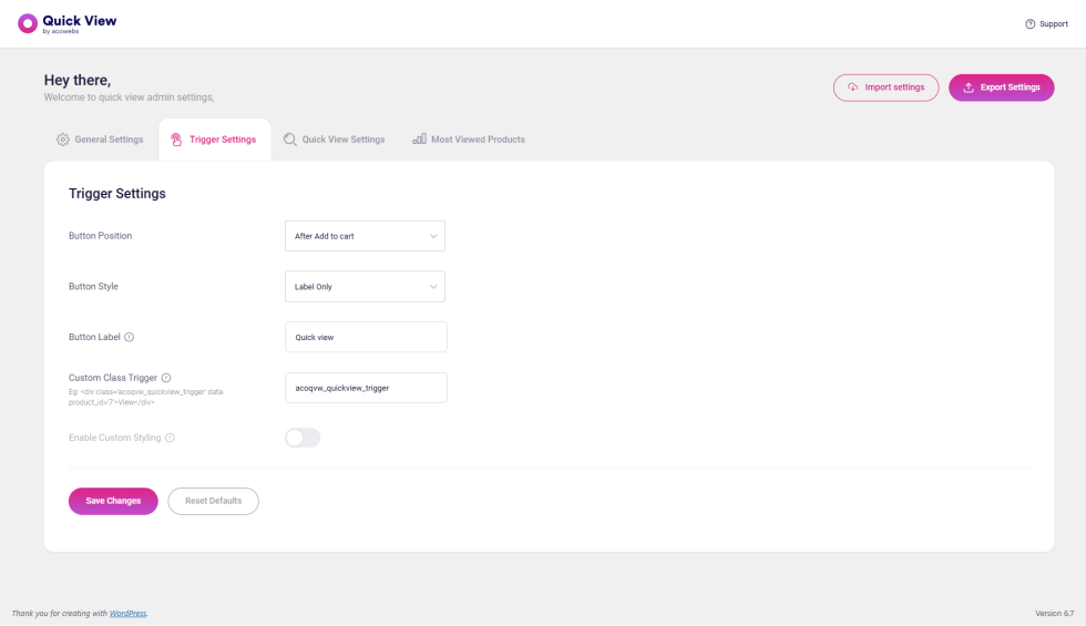
Button Position:
Determines where the Quick View buttons are placed on your product listings.
Button Styles:
Choose the style of the Quick View button:
- Icon Only: Displays only an icon.
- Label Only: Displays only text.
- Icon + Label: Displays both an icon and text together.
Select Quick View Button Icon:
Allows you to choose the icon for the Quick View button.
Custom Class Trigger:
Add a class to trigger Quick View functionality via a custom HTML element.
Example:
<div class='acoqvw_quickview_trigger' data-product_id='7'>View</div>In this case, the Quick View modal will display details for the product with product_id='7'.
Enable Custom Styling:
Enable this option if you want to style the Quick View icon. Once enabled, a styling area will appear, allowing you to customize the icon’s appearance and color.
Quick View Settings
↑ Back to top
Basic Settings
↑ Back to top- Quick View Style:
Select the desired Quick View style from the list of available options. - Modal Width:
Set the width of the modal box. This setting applies only to the Quick View style set to “Modal.” - Quick View Animation:
Choose the animation style for the Quick View window. For example, select “Zoom” for a zoom effect. - Choose Quick View Close Icon:
Pick the icon to be used for closing the Quick View window. - Elements To Show In Quick View:
Select the specific elements you want to display in the Quick View window if the feature is enabled. - Enable Social Media Sharing:
Toggle this option to display a button for sharing the product on social media platforms. - Choose Social Media Sites:
Select the social media platforms you want to include for product sharing. - Enable View Detail Button:
Adds a “View Detail” button near the “Add to Cart” button in the Quick View window. Enable this option if you want the button displayed; otherwise, disable it. - View Detail Button Label:
Enter the desired text to display on the “View Detail” button. - Close Popup After Add To Cart:
Enable this setting to automatically close the Quick View popup after adding a product to the cart. Works only with AJAX Add to Cart. - Enable Product Navigation In Popup:
Toggle this option to display “Next” and “Previous” navigation arrows within the Quick View window. - Select Product Navigation Arrow:
Choose the style of the navigation arrows for the Quick View window. - Navigation Arrow Color:
Select a color for the navigation arrows by clicking the color picker button.
Gallery Settings
↑ Back to top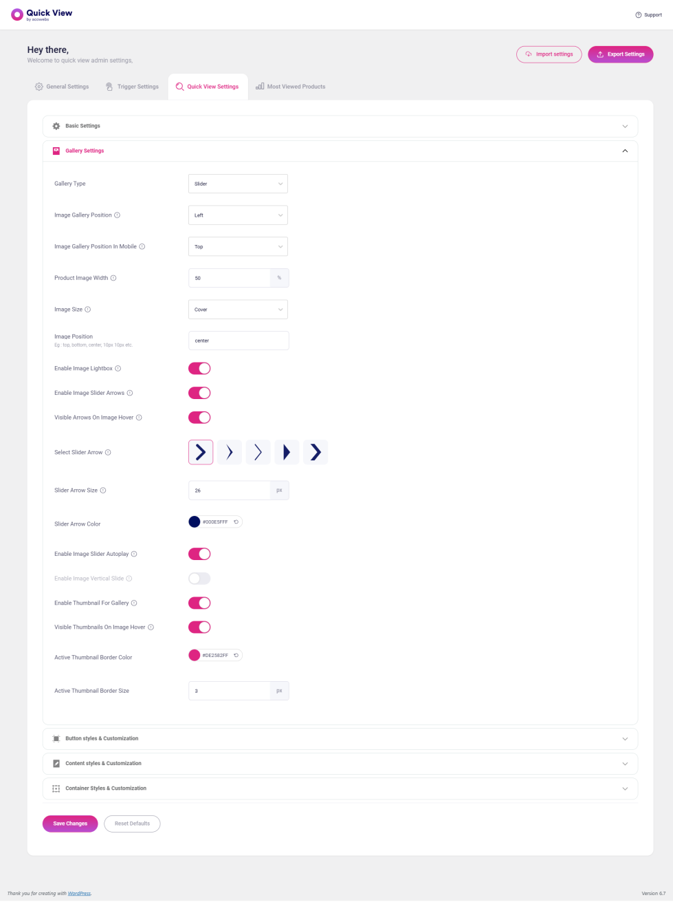
- Gallery Type:
Choose the display style for the Quick View window gallery, such as a slider or thumbnail view. If you don’t want to display a product image, select “Do Not Show.” - Image Gallery Position:
Select the position where the product image will appear in the Quick View window. - Image Gallery Position In Mobile:
Set the position of the image specifically for mobile devices (only applies to devices with a width less than 768px). - Product Image Width:
Adjust the width of the image section in percentage for better responsiveness. - Image Size:
Set the size of the image relative to its container. Note: This only applies when the gallery and content are displayed side by side. - Image Position:
Specify the position of the image. For example, “10px 10px” will adjust the image’s position by 10px from the top and 10px from the right. - Enable Image Lightbox:
Enable this option to add an image block or double-click an existing image block to open the product image in a lightbox. - Enable Image Slider Arrows:
Show image slider arrows on top of the gallery by enabling this option. - Select Slider Arrow:
Choose the style of the arrows for the image slider. - Slider Arrow Size:
Set the size of the slider arrows. This will only take effect when image slider arrows are enabled. - Slider Arrow Color:
Select the color of the slider arrows using the color picker. - Enable Image Slider Autoplay:
Enable autoplay for the image slider, where the images automatically change at set intervals. - Enable Image Vertical Slide:
Display the image slider in a vertical orientation. - Enable Thumbnail For Gallery:
Enable this option to display a thumbnail slider in the product gallery. - Visible Thumbnails On Image Hover:
Show thumbnail images when hovering over the main image by enabling this setting. - Active Thumbnail Border Color:
Choose the color of the border around the active thumbnail. - Active Thumbnail Border Size:
Set the width of the active thumbnail’s border.
Button styles & Customization
↑ Back to top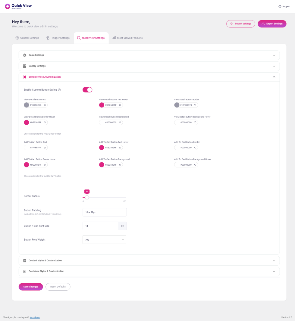
- Enable Custom Button Styling:
This option allows you to style the ‘Add to Cart’ and ‘View Detail’ buttons. - Border Radius:
Rounds the corners of an element’s outer border edge. Set a single radius value (from 0 to 100) to create circular corners. - Button Padding:
Adjusts the space between the button text and the border. For example, the default value 10px 22px means there’s a 10px distance on the top and bottom and a 22px distance on the left and right of the button text. - Button / Icon Font Size:
Specify the font size to control how large the text or icon is displayed on the screen. - Button Font Weight:
Adjust the weight (boldness) of the button text to make it lighter or bolder.
Content Styles & Customization
↑ Back to top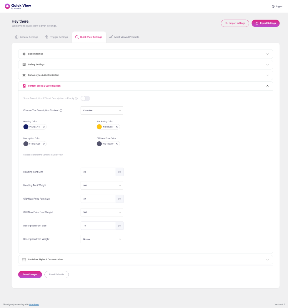
- Show Description If Short Description Is Empty: If the short description field is empty then enable the button for displaying description.
- Choose The Description Content: If you want to display a full description, select ‘complete’. If you want to display some starting content from the description select ‘excerpt’.
- Choose colors for the Contents in Quick View: Put the color of product name, Star Rating Color, Description Color, Old/New Price Color.
- Heading Font Size: Put the value for how large the product name displayed the on a screen.
- Heading Font Weight: This is for setting the weight (boldness) of the product name.
- Old/New Price Font Size: Put the value for how large the old & new product price displayed the on a window.
- Old/New Price Font Weight: This is for setting the weight (boldness) of the product price.
- Description Font Size: Put the value for how large the product description displayed the on a window.
- Description Font Weight: This is for setting the weight (boldness) of the product description.
Container Styles & Customization
↑ Back to top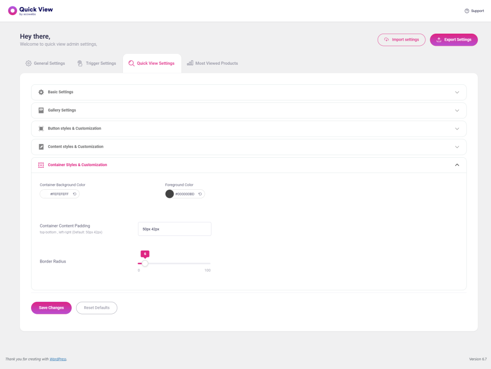
- Container Background Color: Select the color for container background color.
- Foreground Color: Select a color for the quick-view window outer area.
- Container Content Padding: The value indicates the top-bottom and left-right space in between the content and container. The default value 50px 42px means, the top-bottom distance between the content and container is 50px and the left-right distance between content and container is 42px.
- Border Radius: The value given for rounds the corners of the container.
Most Viewed Products
↑ Back to top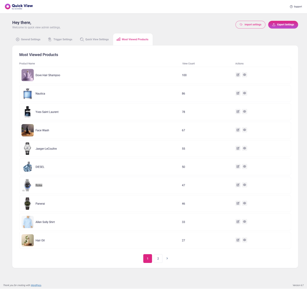
Here listing products based on the most viewed products. The first column, the product name, the second column, the view count, and the third column contains two actions: edit and view the quick view page of the corresponding product.