Installation
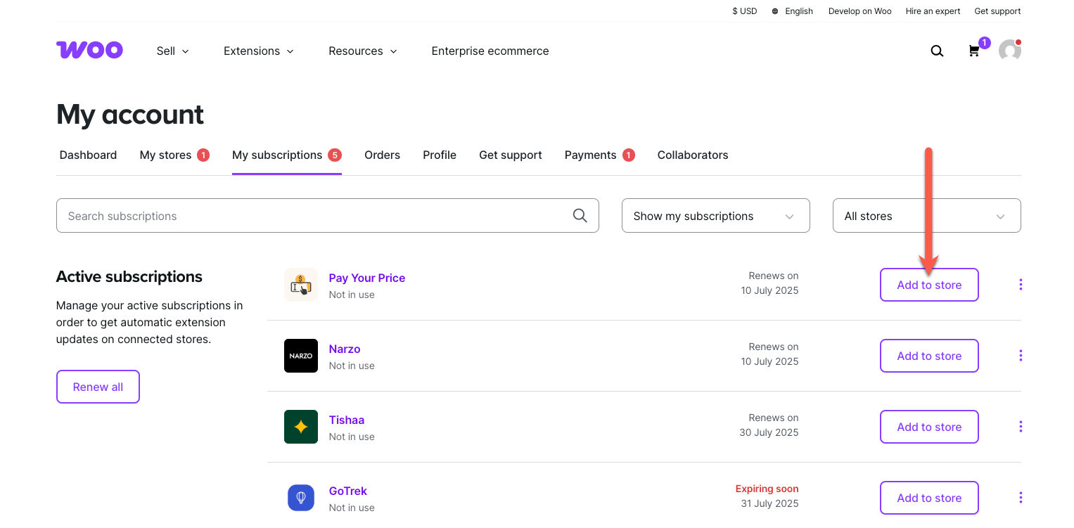
↑ Back to topTo start using a product from WooCommerce.com, you can use the “Add to store” functionality on the order confirmation page or the My subscriptions section in your account.
- Navigate to My subscriptions.
- Find the Add to store button next to the product you’re planning to install.
- Follow the instructions on the screen, and the product will be automatically added to your store.
Alternative options and more information at:
Managing WooCommerce.com subscriptions.
Configuration
↑ Back to topAfter you have installed and activated the Multistep Checkout for WooCommerce extension, Go to WooCommerce > Settings > Multistep Checkout tab here you have multiple tabs which are General, Checkout Steps, Display Settings, Advanced Settings and Button Settings.
General Settings
↑ Back to top- Enable / Disable: Enable multistep checkout to break down the checkout process into organized, user-friendly steps.
- Include Cart Step: Add a cart review step to the checkout process
- Include Login Step: Add a customer login/registration step to the checkout process
- Include Coupon Step: Add a dedicated coupon application step to the checkout process
- Combine Billing & Shipping: Merge billing and shipping information into a single step

Checkout Steps
↑ Back to topIn this section you can edit default checkout steps and also create new custom steps with custom content. For custom steps click on a Add New Step Button and configure the following settings.
- Enabled: Check box option to enable this step.
- Name: Enter the name of the step.
- Step Title: Enter a title for this step.
Index Type:
- Text Index: Choose this option to use a text index.
- Icon Index: Choose this option to use a Icon index.
- Enable Content Settings: Check this option to enable additional content settings for this step.
- Custom Background Color: Choose a custom background color for the content.
- Custom Font Color: Choose a font color for the content.
- Use only custom content for this step: Check this option to use custom content in this step.
- Custom Content: Enter any custom content you want for this step.

Display Settings
↑ Back to topMultistep Layout:
- Layout: Select the layout for the given ones.
- Layout Design: Select a design based on the layout type.
- Tabs Position: Set the position of the tabs left, right or center.
- Step Background Color: set the background color for the steps.
- Step Background Color Active: select the active background color for the steps
- Step Text Color: Choose the text color of the steps.
- Step Text Color Active: Set the active text color for the steps.
- Content Background Color: Select the background color of the content.
- Step Font Size (px): Set font size for the steps label.
- Step Line Height (px): enter the line height in px.
- Step Font Weight: Select font weight normal or bold.
- Step Padding: Enter padding value for the top, right, bottom, left in px.

Progress Bar:
- Show Progress bar: Display progress bar to track checkout completion.
- Progress Bar Color: Select the color for the progress bar.
- Progress Bar Background Color: Set the background color for the progress bar.
- Progress Bar Height (px): Set the height of the progress bar in px.

Step Index Style:
- Step Index width/height (px): Set the height and width of the step index in px.
- Step Index Roundness (px): set the roundness of the step index in px.
- Index Font Color: Choose the font color of the step index.
- Index Font Color Active: Set the active color of the step index.
- Index Border Color: Select the border color of the step index.
- Index Border Color – Active: Choose the active border color for the step index.
- Index Background Color: Set the background color for the step index.
- Index Background Color Active: Set the active background color for the step index.

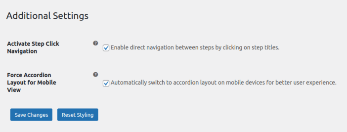
Additional Settings:
- Activate Step Click Navigation: Enable direct navigation between steps by clicking on step titles.
- Force Accordion Layout for Mobile View: Automatically switch to accordion layout on mobile devices for better user experience.
Button Settings
↑ Back to topNext and Previous Button Settings:
- Previous Button Text: Enter the text for the previous button.
- Next Button Text: Enter the text for the next button.
- Button Position: Set the position of the button above or below tab.
- Button Alignment: Select button alignment left or right.
- Hide the previous button on first step: Hides the previous navigation button only on the first checkout step for cleaner initial navigation.
- Hide the next button for the last step: Hides the next navigation button only on the final checkout step.
- Activate button styling: Enables custom styling options for the next/previous navigation buttons including colors, borders and hover effects.
- Font size (px): Set the font size for the button text.
- Font Color: Set the font color of the buttons.
- Font Color Hover: Select hover font color for the buttons.
- Background Color: Select the background color for the buttons.
- Background Color Hover: Set the Hover Background color for the buttons.
- Border Style: Select the border style of the button.
- Border width (px): Set the border width in px for the buttons.
- Border Color: Choose border color for the buttons.
- Border Radius (px): Set the border radius in px.

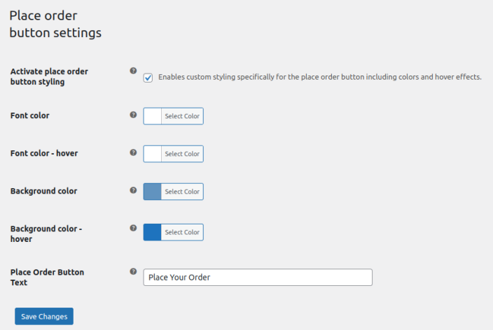
Place Order Button Settings:
- Activate place order button styling: Enables custom styling specifically for the place order button including colors and hover effects.
- Font Color: Set the font color of the place order button.
- Font Color Hover: Select hover font color of the place order button.
- Background Color: Set the background color of place order button.
- Background Color Hover: Choose the background hover color of place order button.
- Place Order Button Text: Write the text for the place order button.