WooCommerce Product Gallery Slider enables you to upgrade your WooCommerce product gallery with sleek sliders, zoom, lightbox, thumbnails, and social sharing—all fully customizable. Boost engagement and showcase your products in style with just a few clicks.
Installation
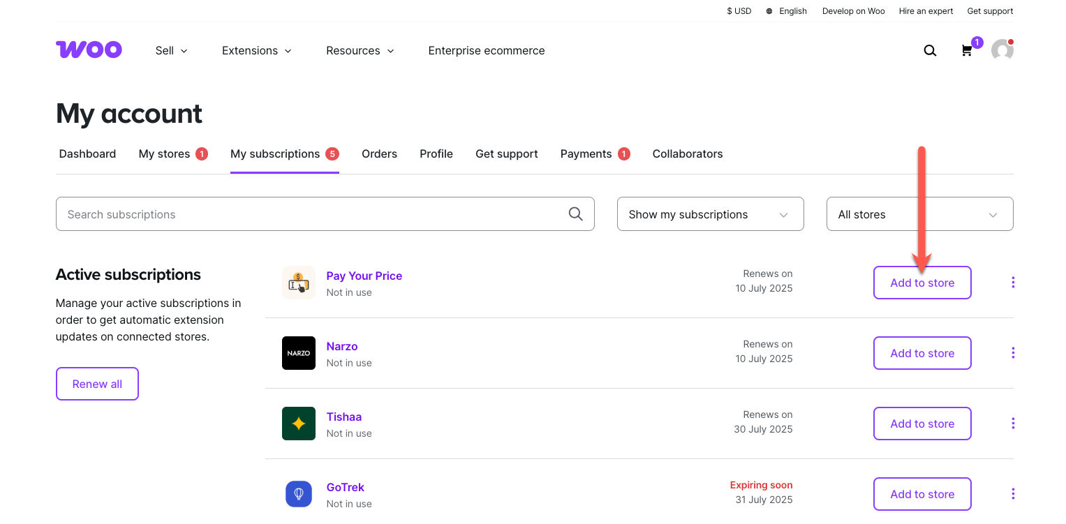
↑ Back to topTo start using a product from WooCommerce.com, you can use the “Add to store” functionality on the order confirmation page or the My subscriptions section in your account.
- Navigate to My subscriptions.
- Find the Add to store button next to the product you’re planning to install.
- Follow the instructions on the screen, and the product will be automatically added to your store.
Alternative options and more information at:
Managing WooCommerce.com subscriptions.
Configurations
↑ Back to topGo to WooCommerce > Gallery Slider. Here, you will find all the configuration settings for the Gallery Slider plugin to control the behavior of the product image gallery on product pages.
General Settings
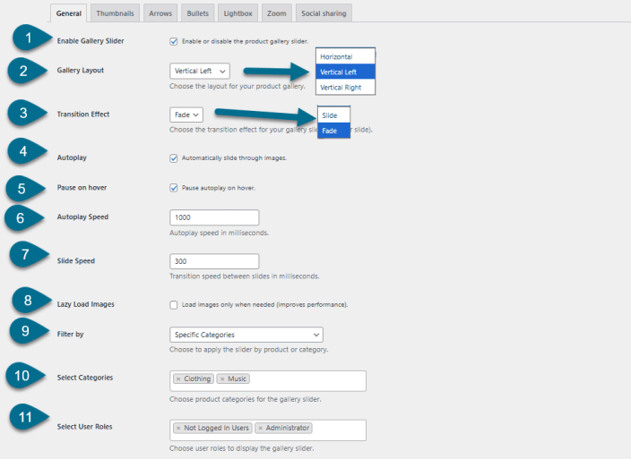
↑ Back to topGo to WooCommerce > Gallery Slider and Click General Settings Tab.
- Enable Gallery Slider – Enable or disable the custom product gallery slider functionality on product pages.
- Gallery Layout – Choose the layout for the gallery slider like
- Horizontal
- Vertical Left
- Vertical Right
- Transition Effect – Select the animation style for transitioning between images.
- Fade
- Slide
- Autoplay – Automatically advance through gallery images without user interaction.
- Pause on Hover – Pause the autoplay feature when the user hovers over the gallery.
- Autoplay Speed – Set the duration each image is displayed before moving to the next in autoplay mode. Set value like 1000 milliseconds.
- Slide Speed – Set the transition speed between individual slides. Set value like 300
milliseconds. - Lazy Load Images – Improve performance by loading images only as they come into view.
- Filter by – Choose whether to apply the gallery slider to Specific Categories or specific Products.
- Choose Category or Product – Select the product categories or specific products where the gallery slider should be active.
- Select User Roles – Restrict gallery slider visibility to specific user roles.
Thumbnail Settings
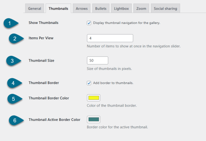
↑ Back to topHead to WooCommerce > Gallery Slider > Click Thumbnails Tab
Here, you can control how thumbnail images look and behave on single product pages.
- Show Thumbnails – Enable or disable thumbnail navigation below or beside the main
product image. - Items Per View – Define how many thumbnails are visible at once in the navigation slider.
- Thumbnail Size – Set the width and height (in pixels) for each thumbnail.
- Thumbnail Border – Enable this option to apply a border around each thumbnail image.
- Thumbnail Border Color – Choose the color of the border applied to inactive thumbnails.
- Thumbnail Active Border Color – Set the border color for the currently active (selected) thumbnail image.
Arrows Settings
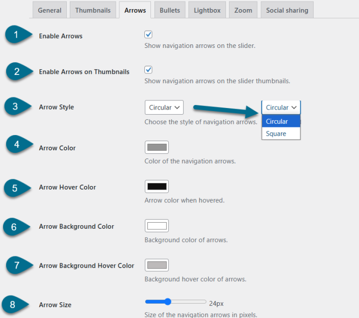
↑ Back to topBrowse to WooCommerce > Gallery Slider and Click Arrows Tab
Customize the navigation arrows for both the main gallery slider and the thumbnail slider here.
- Enable Arrows – Show or hide navigation arrows on the main product gallery slider.
- Enable Arrows on Thumbnails – Display arrows for navigating the thumbnail slider (useful when thumbnails exceed the visible area).
- Arrow Style – Select the visual style of the arrows.
- Circular
- Square
- Arrow Color – Set the default color of the navigation arrows.
- Arrow Hover Color – Define the arrow color when hovered over by the user.
- Arrow Background Color – Set the background color behind the navigation arrows.
- Arrow Background Hover Color – Set the background color of the arrows when hovered.
- Arrow Size – Specify the size of the arrows in pixels.
Bullets Settings
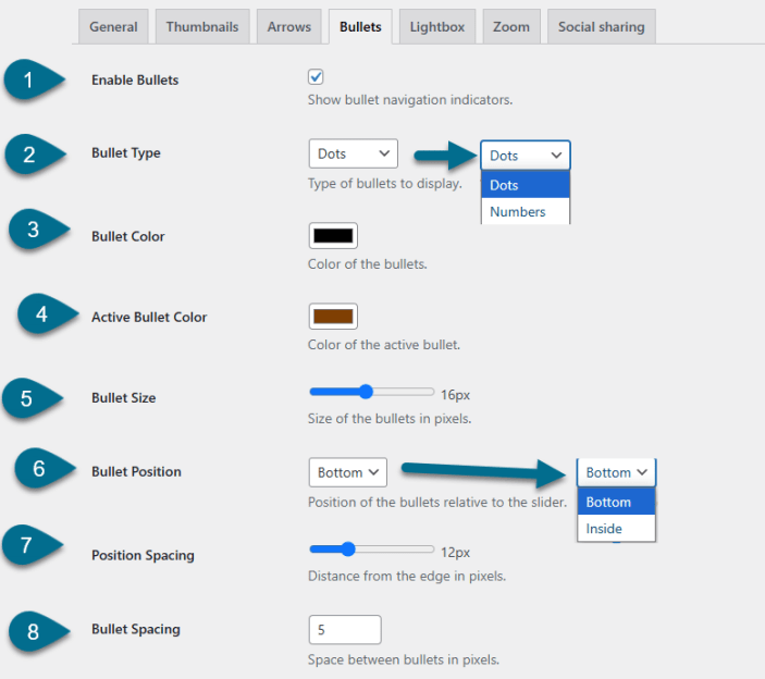
↑ Back to topGo to WooCommerce > Gallery Slider > Click Bullets Tab.
Configure the display and style of bullet (dot) navigation indicators for the product gallery slider here.
- Enable Bullets – Toggle to show or hide bullet navigation indicators beneath the product gallery.
- Bullet Type – Choose the style of bullet indicators:
- Dots
- Numbers
- Bullet Color – Set the default color for inactive bullets.
- Active Bullet Color – Define the color of the currently active (selected) bullet.
- Bullet Size – Set the diameter of the bullets in pixels.
- Bullet Position – Choose where bullets are displayed in relation to the slider.
- Bottom
- Inside
- Position Spacing – Define the spacing between the bullet group and the edge of the slider container.
- Bullet Spacing – Set the space between each bullet.
Lightbox Settings
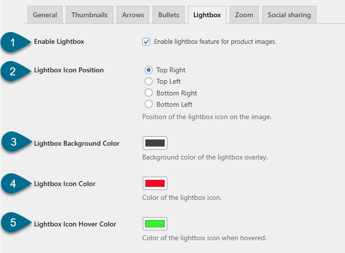
↑ Back to topNavigate to WooCommerce > Gallery Slider > Click Lightbox Tab.
Personalize the lightbox functionality for product images. When enabled, clicking a product image opens it in a full-screen overlay for better viewing.
- Enable Lightbox – Enable or disable the lightbox feature for product gallery images.
- Lightbox Icon Position – Set the position of the lightbox icon overlay on product images.
- Top Right
- Top Left
- Bottom Right
- Bottom Left
- Lightbox Background Color – Choose the background color of the lightbox overlay that appears behind the image.
- Lightbox Icon Color – Set the default color of the lightbox icon.
- Lightbox Icon Hover Color – Define the color of the lightbox icon when hovered over.
Zoom Settings
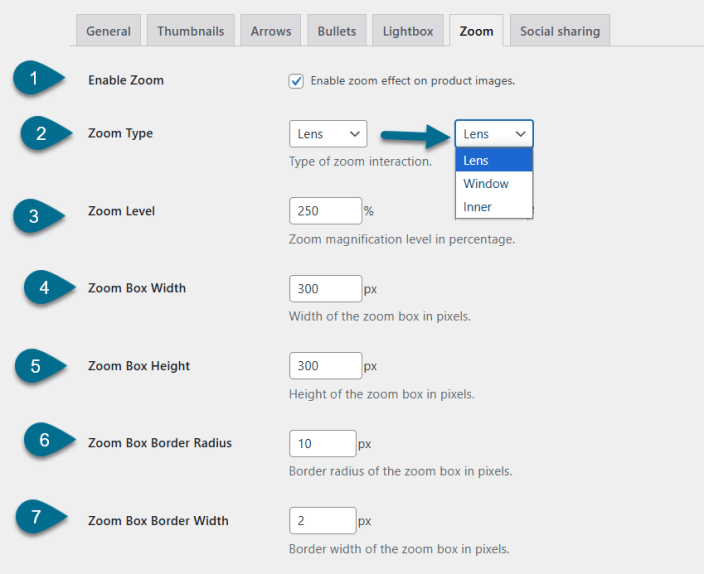
↑ Back to topBrowse to WooCommerce > Gallery Slider > Click Zoom Tab.
Here, you can enable and adjust zoom on product images to improve user interaction and detail visibility.
- Enable Zoom – Toggle to enable or disable the zoom effect on product images.
- Zoom Type – Choose the style of zoom interaction.
- Lens
- Window
- Inner
- Zoom Level – Set the magnification level for the zoom, expressed as a percentage.
- Zoom Box Width – Define the width of the zoom preview box (in pixels).
- Zoom Box Height – Define the height of the zoom preview box (in pixels).
- Zoom Box Border Radius – Set the border radius for the zoom box corners (in pixels).
- Zoom Box Border Width – Set the thickness of the zoom box border (in pixels).
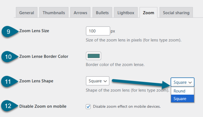
- Zoom Lens Size – Specify the size of the lens area (in pixels) used in lens-style zoom.
- Zoom Lens Border Color – Set the border color of the zoom lens.
- Zoom Lens Shape – Choose the shape of the lens for lens-style zoom.
- Square
- Round
- Disable Zoom on Mobile – Disable the zoom feature for users on mobile devices, improving usability on touch screens.
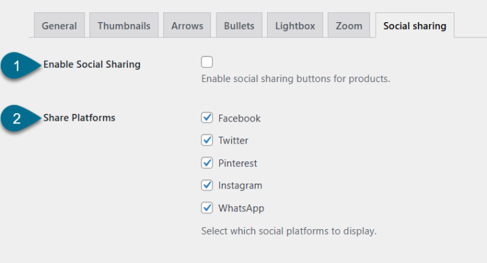
Social Sharing Settings
↑ Back to topAccess WooCommerce > Gallery Slider > Click Social Sharing Tab.
Here you can enable and configure social media sharing buttons for product pages, making it easy for customers to share products with their networks.
- Enable Social Sharing – Toggle to enable or disable social sharing buttons on product pages.
- Share Platforms – Select which social media platforms you want to display for product sharing. Options are Facebook, Twitter, Pinterest, Instagram, WhatsApp.