REES – Real Estateree is a versatile WordPress plugin developed for creating comprehensive real estate websites and portals. It provides aesthetically pleasing and uncluttered property templates with special features such as Property Types, Gallery, Google Maps with property location markers, detailed graphical representations, Virtual tour, Mortgage Calculator, Supplementary files or documents, promotional materials related to the property, user-friendly settings, and a variety of other functionalities.
Furthermore, it functions as a Property Management System within WordPress, allowing you to create and manage a real estate marketplace.
Installation
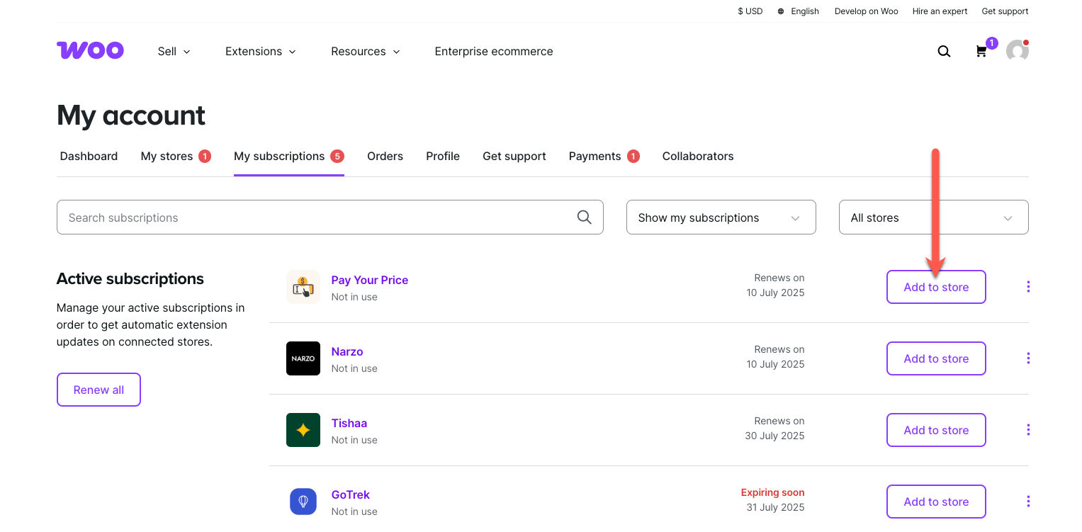
↑ Back to topTo start using a product from WooCommerce.com, you can use the “Add to store” functionality on the order confirmation page or the My subscriptions section in your account.
- Navigate to My subscriptions.
- Find the Add to store button next to the product you’re planning to install.
- Follow the instructions on the screen, and the product will be automatically added to your store.
Alternative options and more information at:
Managing WooCommerce.com subscriptions.
Setup and Configuration
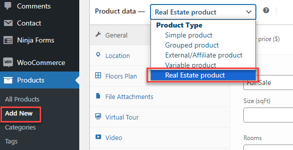
↑ Back to topCreate Real Estate products
↑ Back to topYou need to go to Dashboard > Products > Add New, select “Real Estate product” in Product data to create Real estate products.
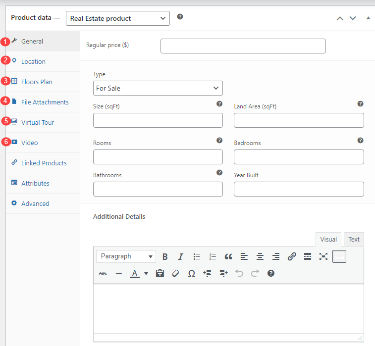
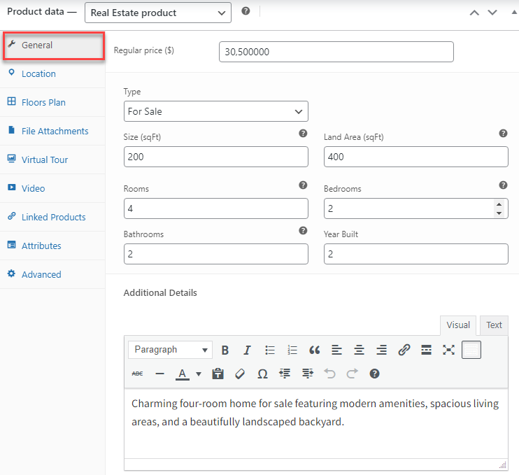
After creating the Real Estate product type, you will configure properties for this real estate product including General information, location, floor information, file attachments, virtual tour, and video.
Furnish General Information
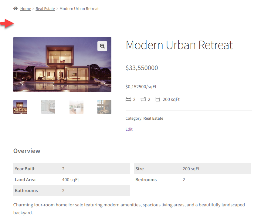
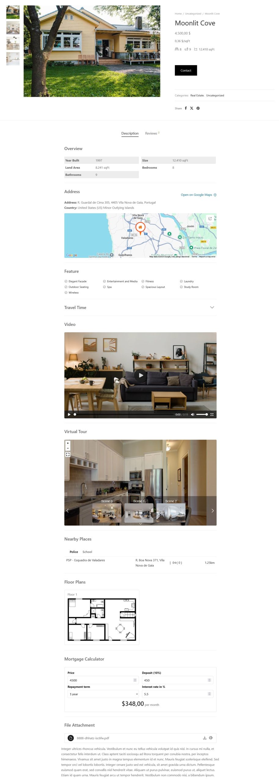
↑ Back to topThe overview provides a concise summary of the property, including essential details such as price, type, size, number of rooms, and year built. It serves as a quick reference point for potential buyers or renters to assess whether the property meets their criteria.
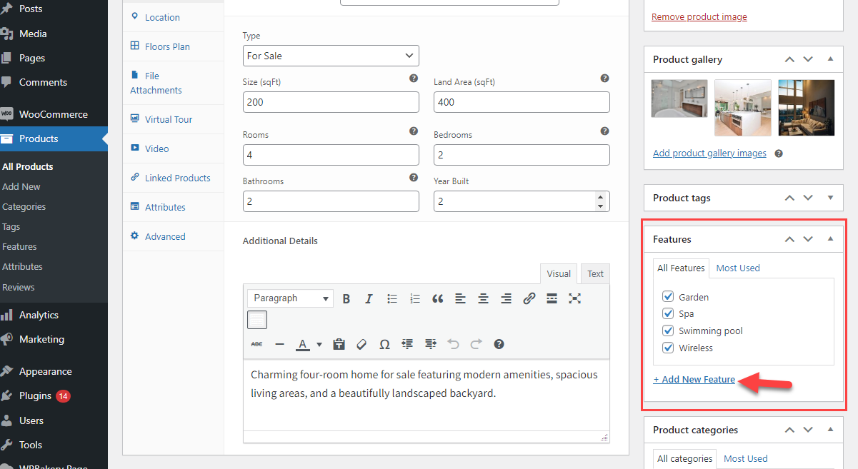
Go to the Product editing page > In the Product data > General: Furnish information about this real estate including price, type, size, land area, number of rooms, bedrooms, bathrooms, year built, and additional details
To change the measurement units of the property size and land area, go to WooCommerce >> Settings >> Rees settings > General
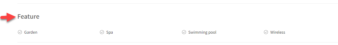
In addition, you add features for the property
Go to the Product editing page > Features, add new features and save
Location, Travel Time and Nearby Places
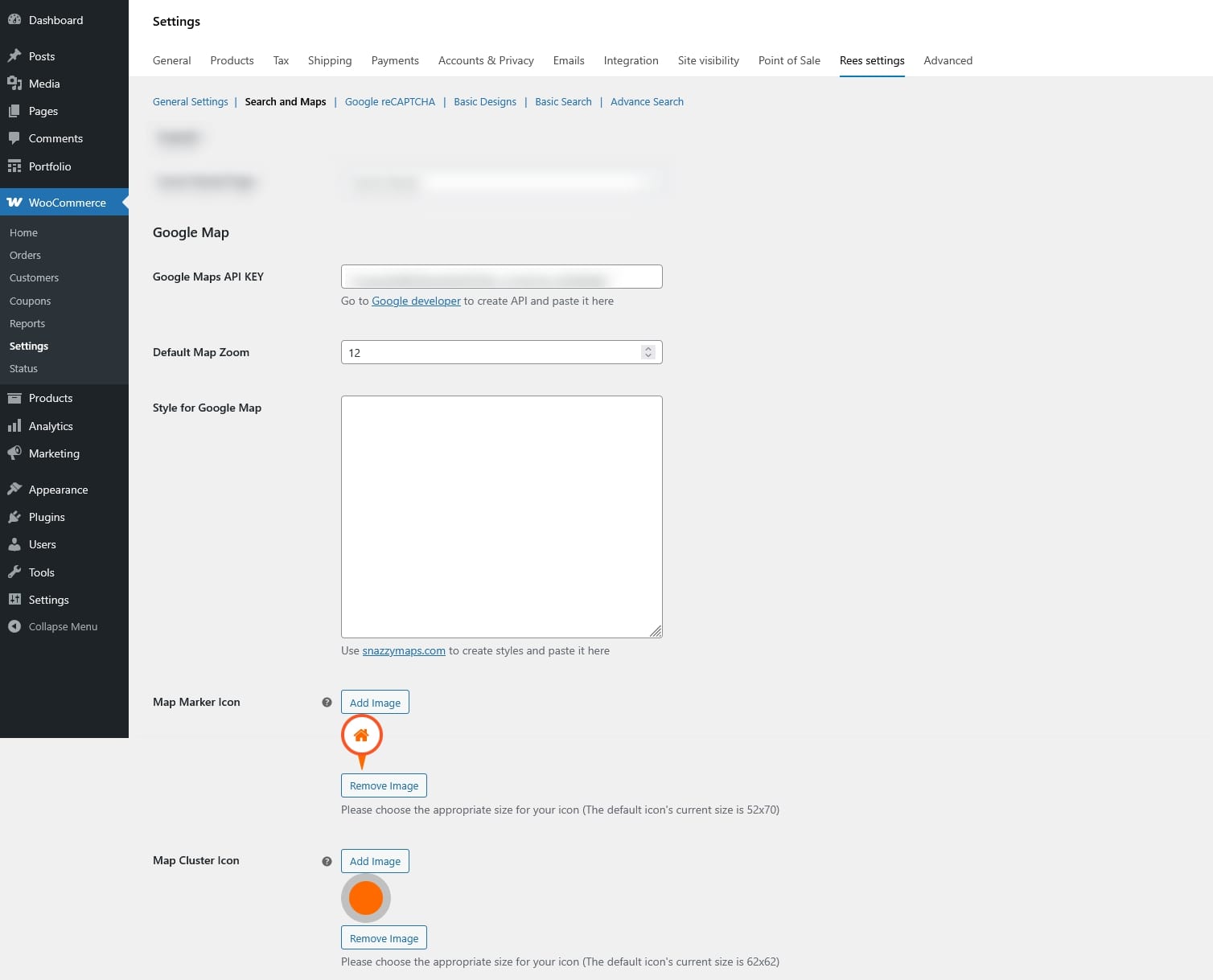
↑ Back to topStep 1: Configure Google map
Create Google Maps API key from Google developer and paste the key to “Google Maps API KEY” under Search and Maps settings. Then configure the other settings related like:
- Default Map Zoom
- Style for Google Map
- Map Marker Icon
- Map Cluster Icon
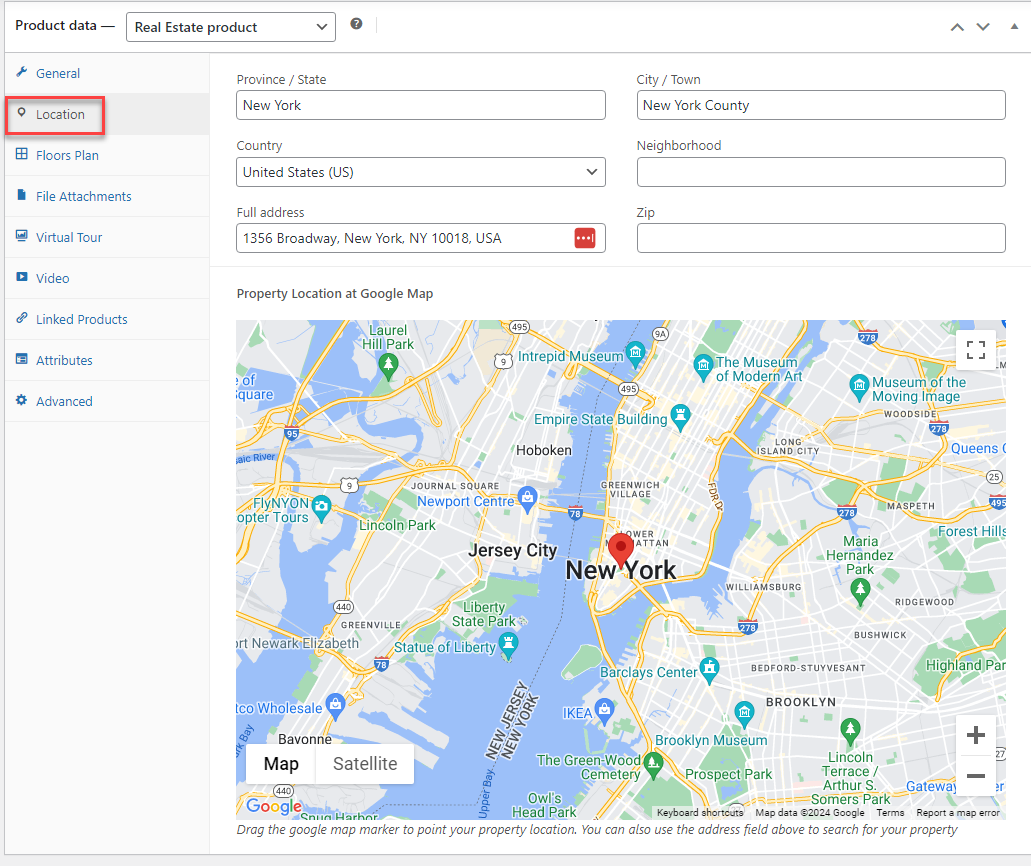
Step 2: Enter the location of the property
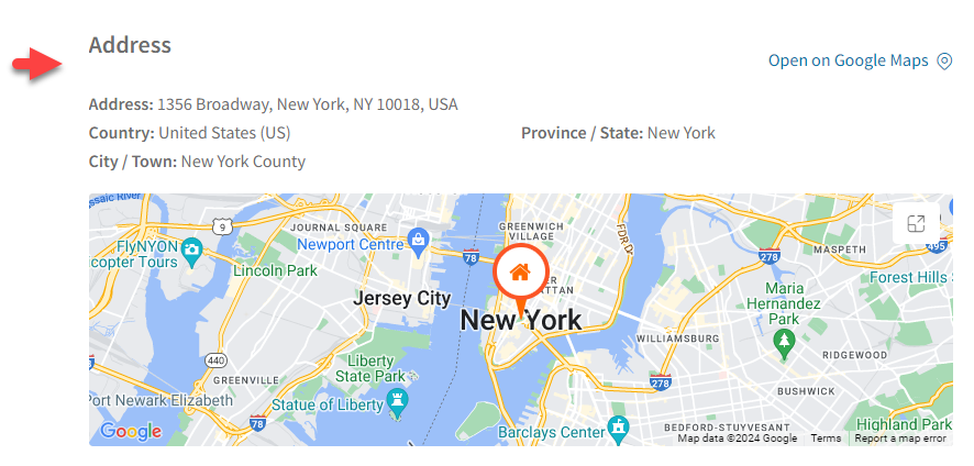
The location provides detailed information about the property’s geographical position, including the Province/State, City/Town, Country, Neighborhood, Full address, and zip code of the real estate. This information helps potential buyers or renters evaluate the property’s desirability and suitability based on their lifestyle preferences and needs.
Go to the Product editing page > In the Product data > Location: Including these details ensures potential buyers or renters can easily identify and locate the property including the Province/State, City/Town, Country, Neighborhood, Full address, and zip code of the real estate.
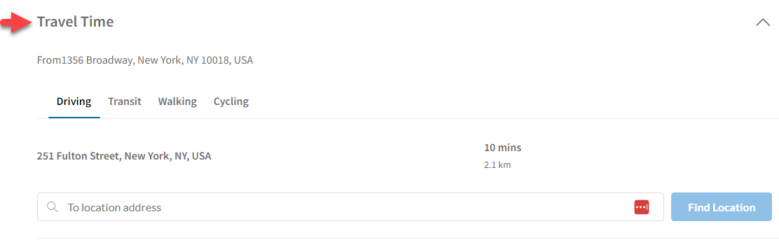
Step 3: Enable travel time and nearby place feature
Besides you can display the travel time which refers to the duration it takes to commute from a specific location to the real estate property.
Go to Dashboard > WooCommerce > Settings > Rees settings > Search and Maps =>> Enable Travel Time
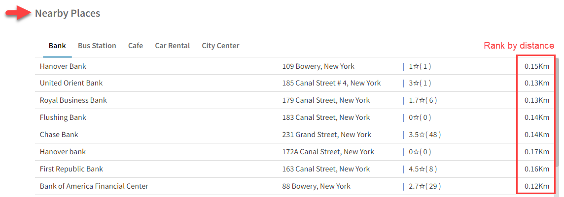
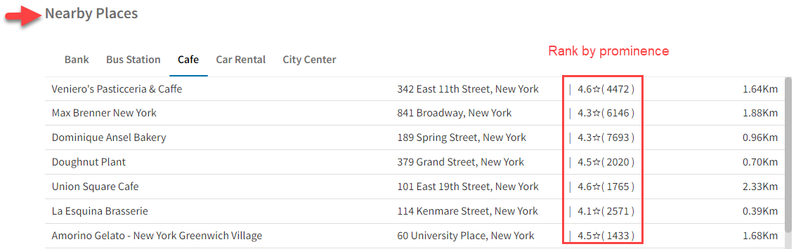
In addition, the Nearby place feature provides information about nearby places helps potential buyers or renters assess the convenience and desirability of the property’s location based on their lifestyle preferences and daily needs.
Go to Dashboard > WooCommerce > Settings > Rees settings > Search and Maps > Nearby Places =>>Enable Nearby Places
Nearby place can be ranked by distance or prominence
- By distance:
- By prominence
Floor plans
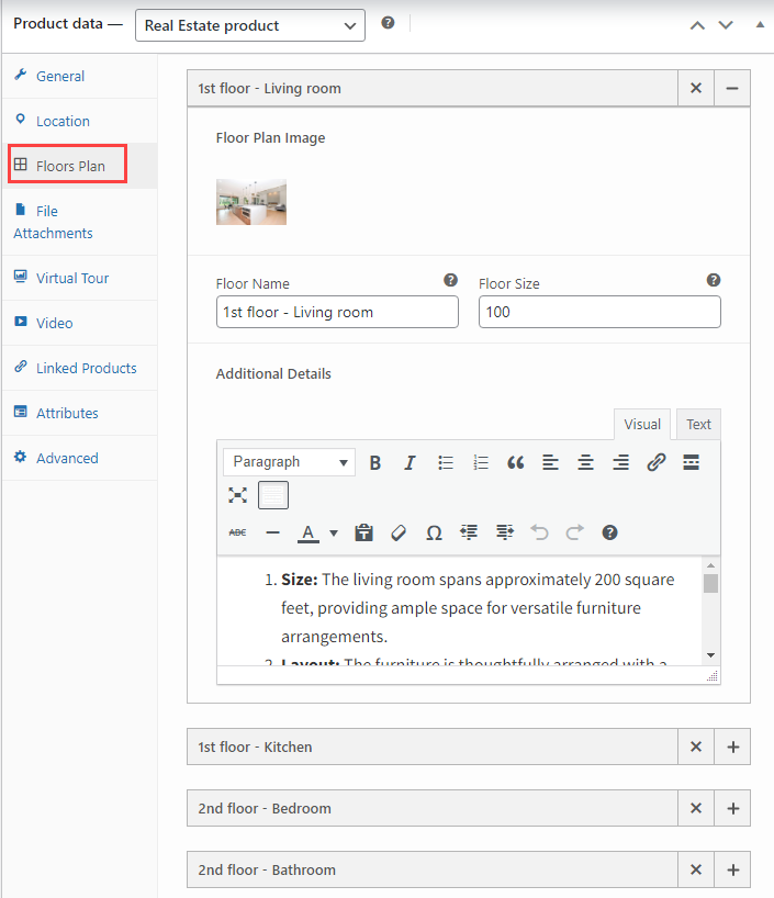
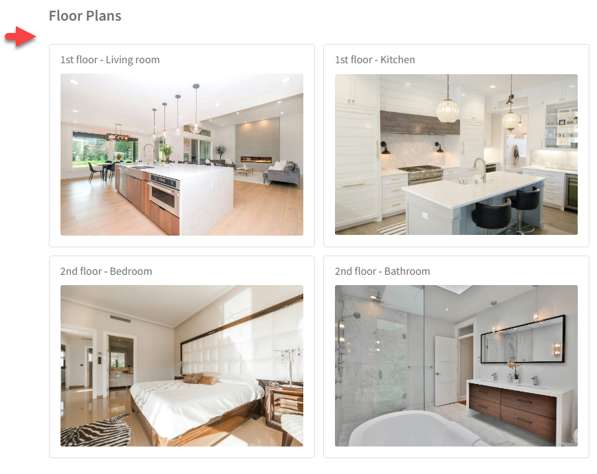
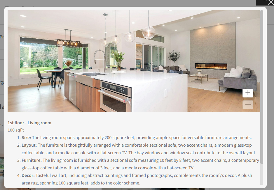
↑ Back to topA Floor plan is a detailed graphical representation illustrating the layout and dimensions of each room and space within the property and provides a visual guide for potential buyers or renters to understand the spatial arrangement and flow of the property.
Go to the Product editing page > In the Product data > Floor plan: Provides information including the floor name, the plan image of each floor, the floor size, and additional information about each floor.
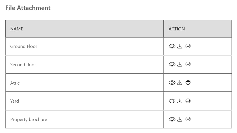
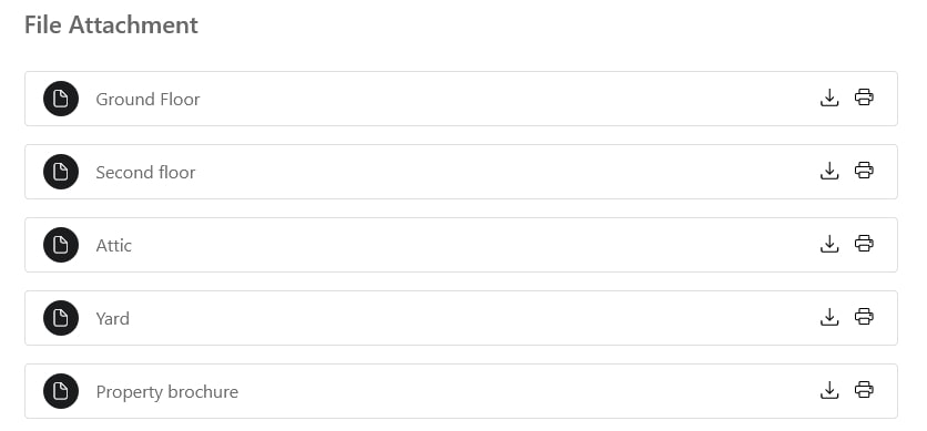
File Attrachment
↑ Back to topA file attachment is the inclusion of supplementary files or documents relevant to the property listing, such as PDFs, brochures, or additional images.
Go to the Product editing page > In the Product data > File attachment: this allows for the sharing of comprehensive information, documents, or promotional materials related to the property.
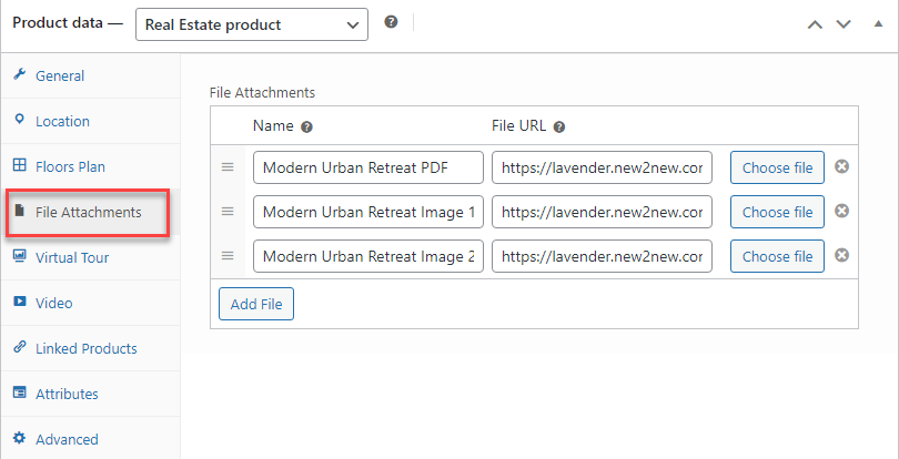
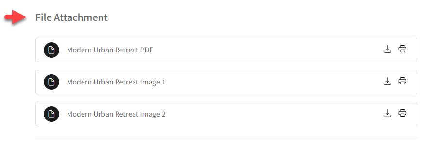
You can change the styles of file attachments: Table style or list style – in Dashboard > WooCommerce > Settings > Rees settings > Choose one option from “Style for File Attachment”
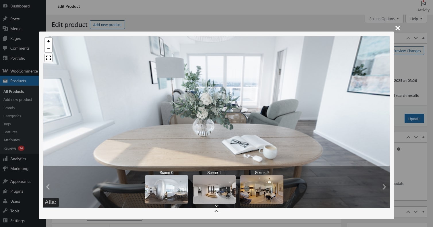
Virtual tour
↑ Back to topThe virtual tour is an immersive, interactive online presentation that allows users to navigate and explore the property virtually.
Go to the Product editing page > In the Product data > Virtual tour: Offers a realistic and dynamic experience for potential buyers or renters who cannot physically visit the property, enhancing their understanding of its features.
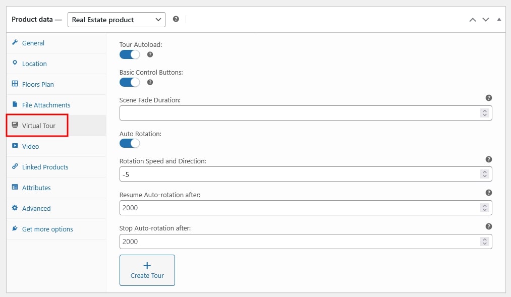
- Tour Autoload: Tour Preview Image will appear if this is turned off
- Basic Control Buttons: This option will display Zoom In, Zoom Out and Full Screen buttons on the tour.
- Scene Fade Duration: This will set the scene fade effect and execution time.
- Auto Rotation:
- Rotation Speed and Direction: Set a value to determine the speed of rotation. The higher the number, the faster it will rotate. Positive values will make it rotate clockwise and negative values will make it rotate anti-clockwise
- Resume Auto-rotation after: When someone clicks on the tour, auto-rotation stops. Here, set a time after which auto-rotation will start again. Assign in milliseconds, where 1000 milliseconds = 1 second
- Stop Auto-rotation after Set a time after which auto-rotation will stop. Assign in milliseconds, where 1000 milliseconds = 1 second.
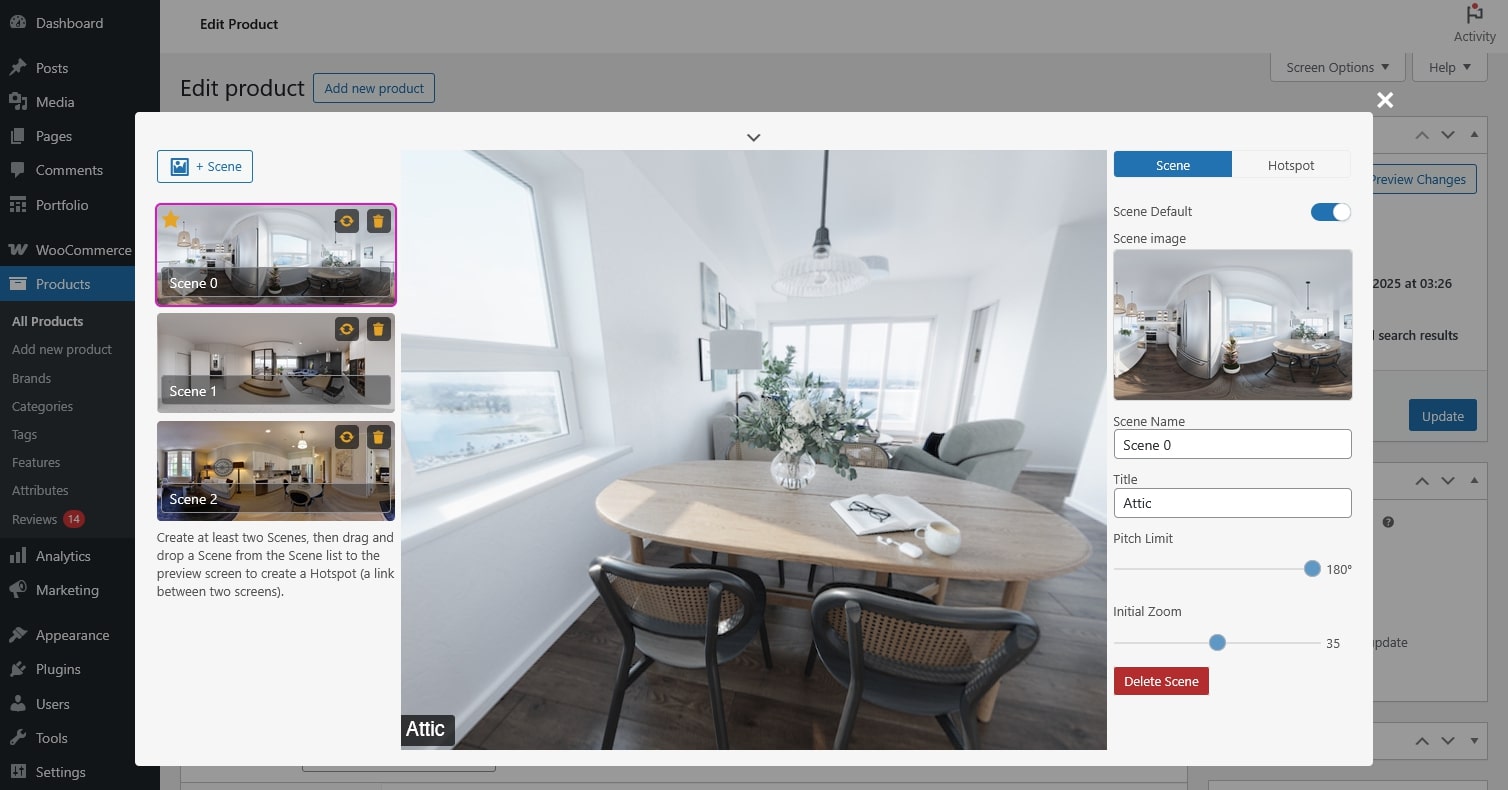
Click the top chevron to open the virtual tour preview and expand or collapse the pages.
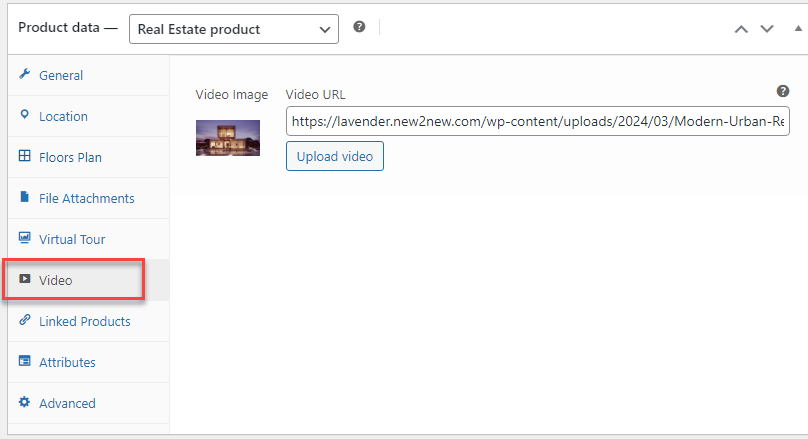
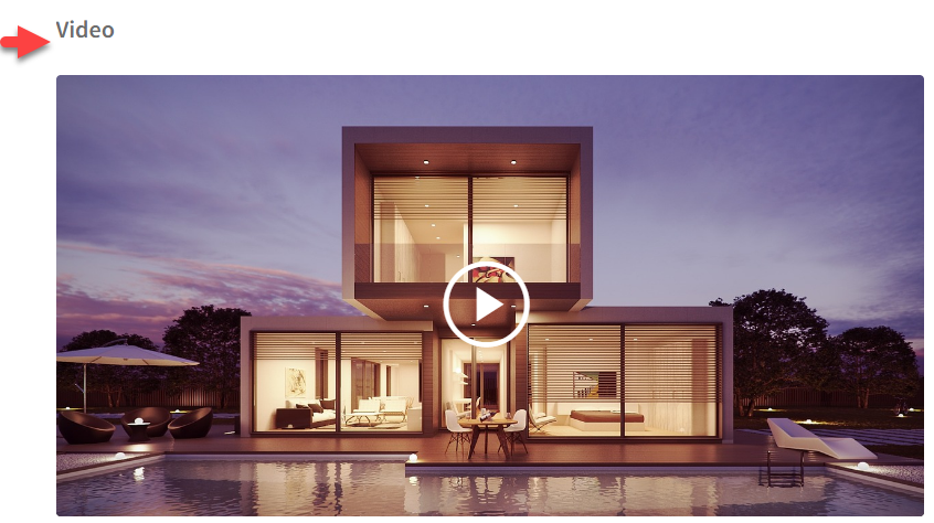
Video
↑ Back to topA video is a visual presentation, typically in motion, showcasing the property’s interior, exterior, and surroundings.
Go to the Product editing page > In the Product data > Video: Update the video and a preview image for the video.
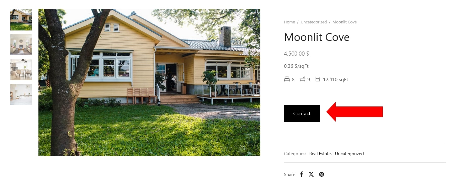
Contact and Google ReCAPTCHA
↑ Back to topContact refers to reaching out to the individual or entity responsible for selling a real estate property. This typically involves initiating communication through various channels such as phone, email, social media.

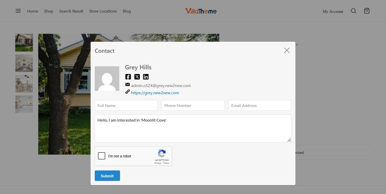
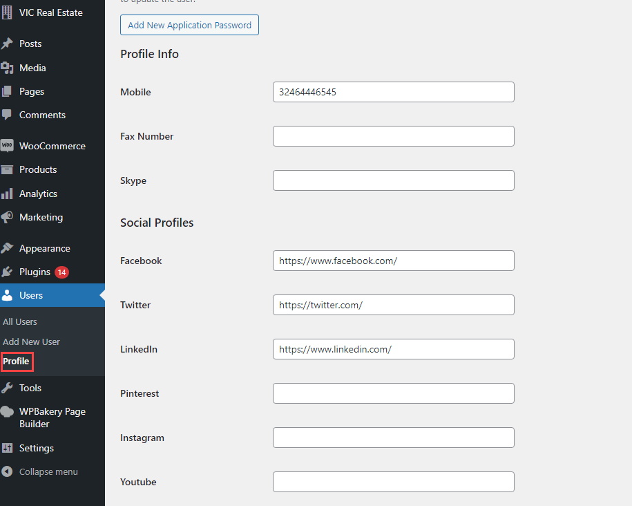
Add admin contact
- An admin account is created in Dashboard > Users > Add new user, you can see this guide.
- The information of the admin in charge of selling a real estate property will be added, along with some extra details.
Add Google ReCAPTCHA: Go to WooCommerce > Settings > Rees settings > Google ReCAPTCHA, configure Google ReCAPTCHA.
Select the admin contact: Go to WooCommerce > Settings > Rees settings > General Settings, in the Admin Contact, select an admin account.
Mortgage Calculation and Shortcode
↑ Back to topThe Mortgage calculation section can be used to estimate monthly mortgage payments and deposit based on property price, interest rate, repayment term. It helps users understand the financial impact of taking out a mortgage loan.
- Mortgage calculation section on single product page
On the single product page, the mortgage calculation is located under a real estate information section. In order to compute monthly mortgage payments, the price of the property will automatically be added. Buyers or renters can use this information to recalculate the desired load.
Go to Dashboard > WooCommerce > Settings > Rees settings > Search and Maps > Calculation =>> Enable “Mortgage calculator”
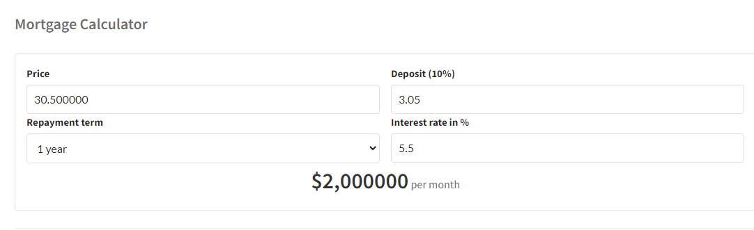
- Mortgage calculation shortcode
Besides, Mortgage calculator shortcode is also available and can be added into your desired area you want such as the sidebar area by going to Appearance -> Widgets.
[woore_mortgage_calculator]
Search Property on Result pages
↑ Back to topSearch Property conveniently with the search form on a Search Result page.
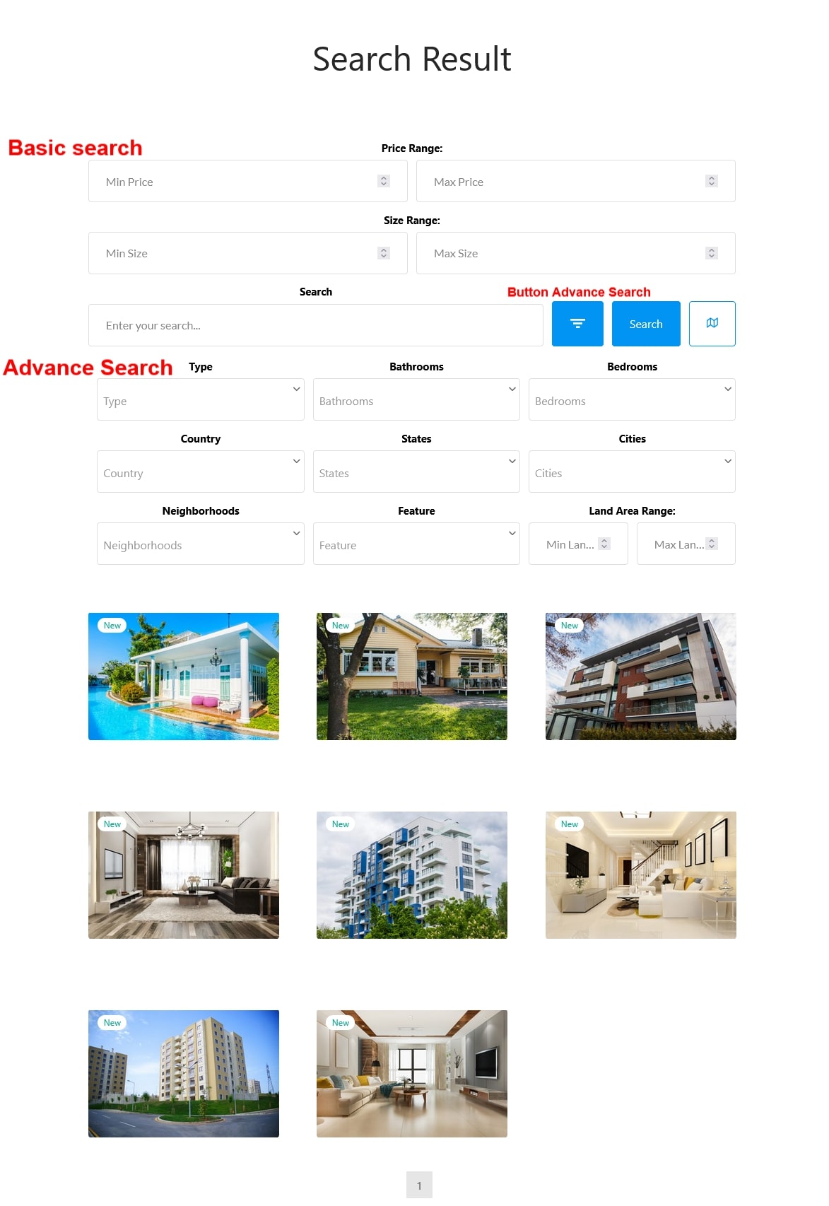
Edit or customize the search form under Rees settings – Basic Designs | Basic Search | Advance Search
Advanced configuration
↑ Back to topSort Property Information Components
↑ Back to topThe components of the property information can be reordered: Overview, Location, Travel time, Video, Virtual tour, Floor plans, Mortgage calculation, Nearby places, File attachment, Contact.
Go to Dashboard > WooCommerce > Settings > Rees settings > General Settings, in “Order of components “, drag and drop the components.
General Settings configuration
↑ Back to topGo to Dashboard > WooCommerce > Settings > Rees Settings > General Settings
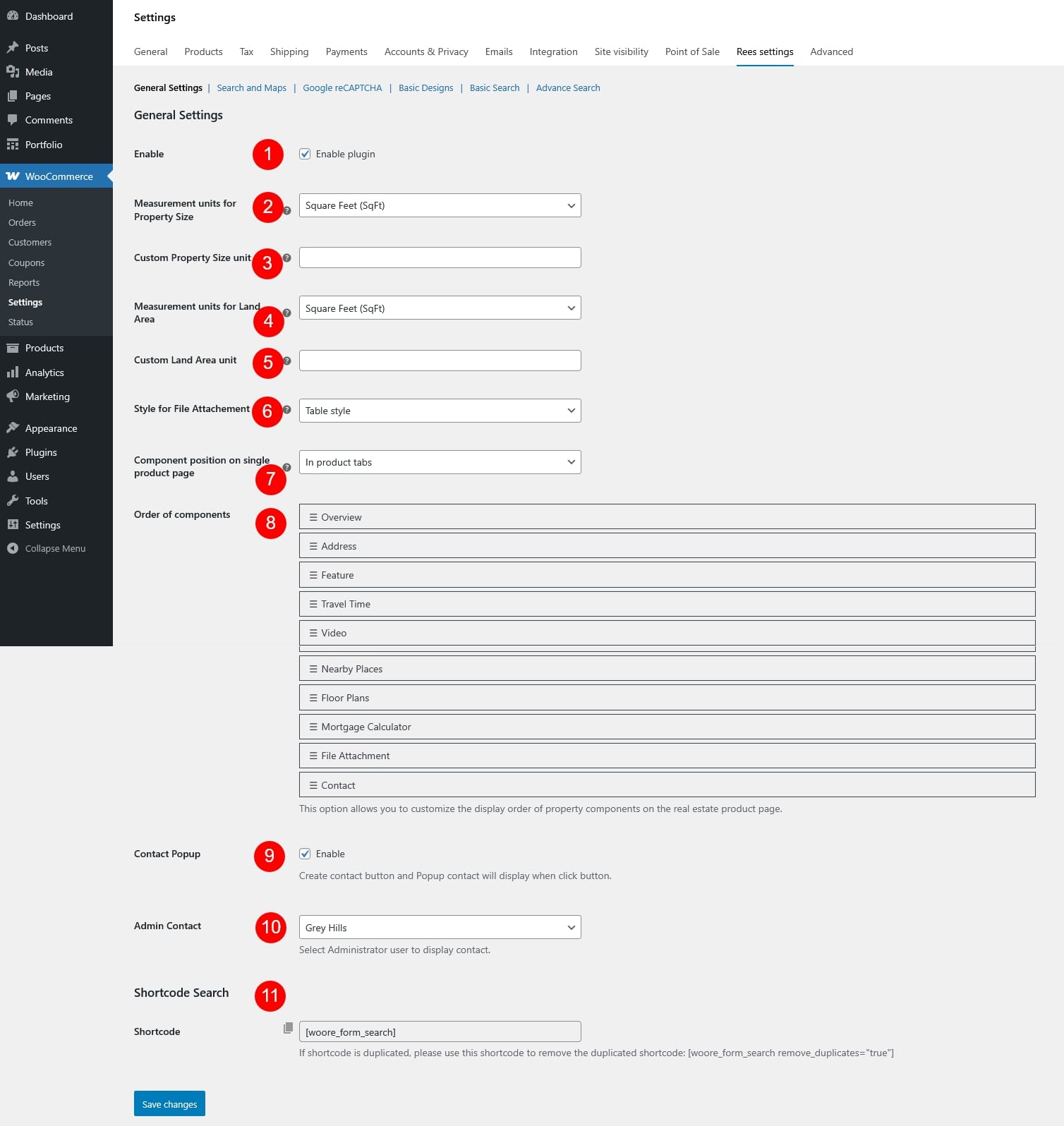
- Enable: Turn the real estate features on or off. When disabled, all property-related components and functions provided by the plugin will not be displayed on the frontend.
- Measurement units for Property Size: Choose the unit used to display the property size throughout the site. Available options include:
- Square feet (SqFt)
- Square meters (m²)
- Custom unit
- Custom Property Size unit: If Custom unit is selected for property size, enter the unit name here, e.g. sq, yd, hectare… This unit will be shown next to the property size value
- Measurement units for Land Area: Select the unit used to display the land area of the property. Available options include:
- Square feet (SqFt)
- Square meters (m²)
- Custom unit
- Custom Land Area unit: If Custom unit is selected for property size, enter the unit name for the land area size
- Style for File Attachment: Choose how attached files are displayed on the property page
- Table style: Displays attachments in a structured table format
- List style: Displays attachments in a simple list format
- Table style: Displays attachments in a structured table format
- Component position on single product page: Select where the property information component will appear on the single product page. This allows you to control how property details are presented within the page layout
- On product tabs: Above all product tabs like Description, Reviews, Additional Information…
- In product tabs: Add a separate tab for the details, named “Property Information”
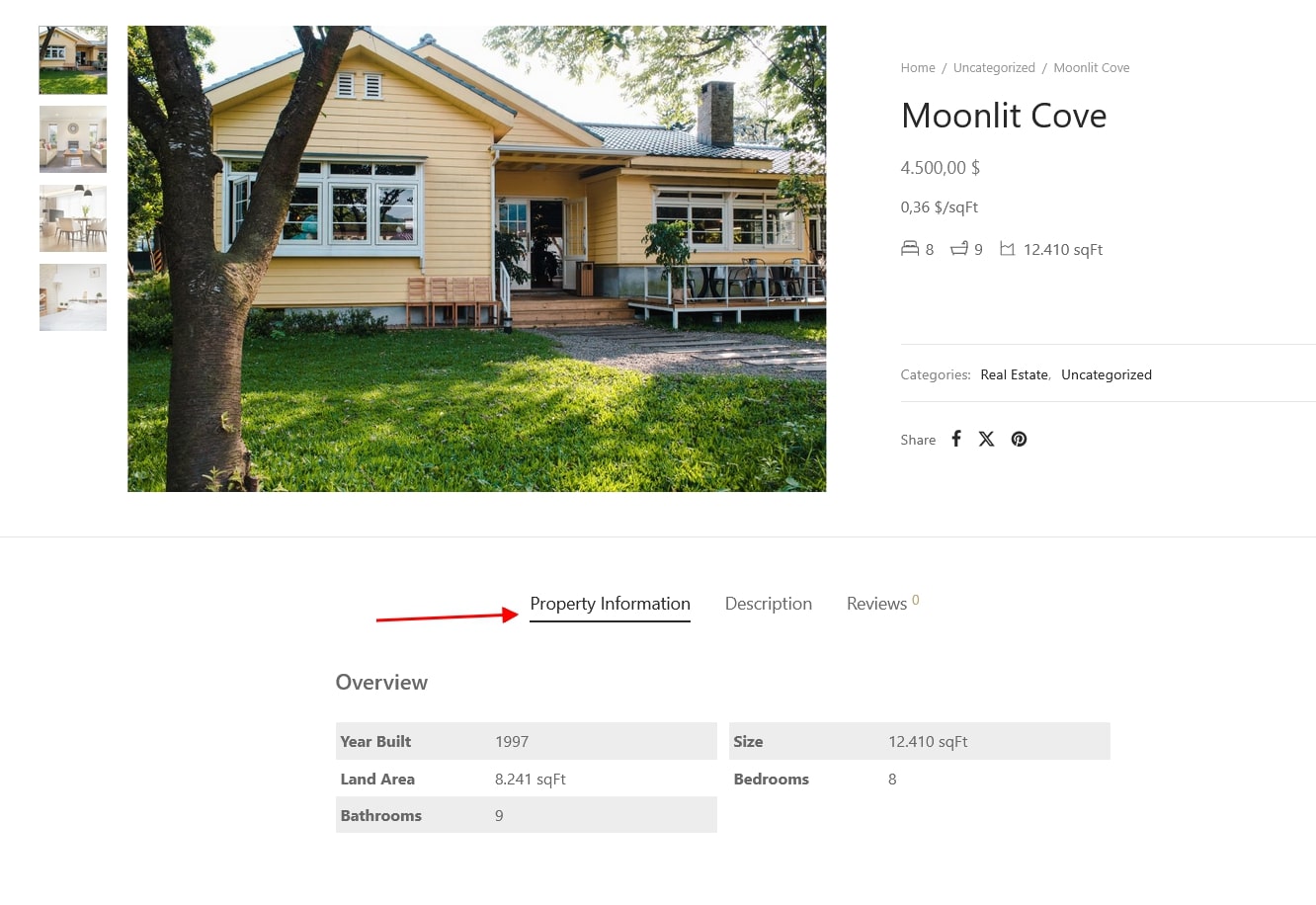
- In description tab: Inside the description tab
- Order of components: Reorder the property information components to control the display sequence on the product page, drag and drop the components to sort their order as you need.
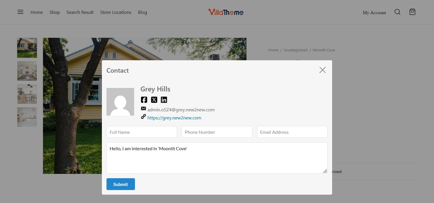
- Contact Popup: Enable a contact button on the single product page, when clicked, a popup contact form will appear, allowing visitors to quickly reach out to the agent for inquiries about the property.
- Admin Contact: Select the administrator user whose contact information will be displayed in the contact popup
- Shortcode Search: Click the provided shortcode to copy and paste it into any page, post, or widget where you want the property search form to appear. If the search form is displayed multiple times due to duplicated shortcodes, use the following shortcode to remove duplicates: [woore_form_search remove_duplicates=”true”]
Search and Maps
↑ Back to topGo to Dashboard > WooCommerce > Settings > Rees settings > Search and Maps

- Search
- Search Page: Select the page used to display search results when users submit the property search form.
- Google Map
- Google Maps API KEY: Follow the link in the note to get the Google ReCAPTCHA link
- Default Map Zoom: You can change the map’s zoom level to see where the property is located. The higher the zoom, the more visible the property is on the map.
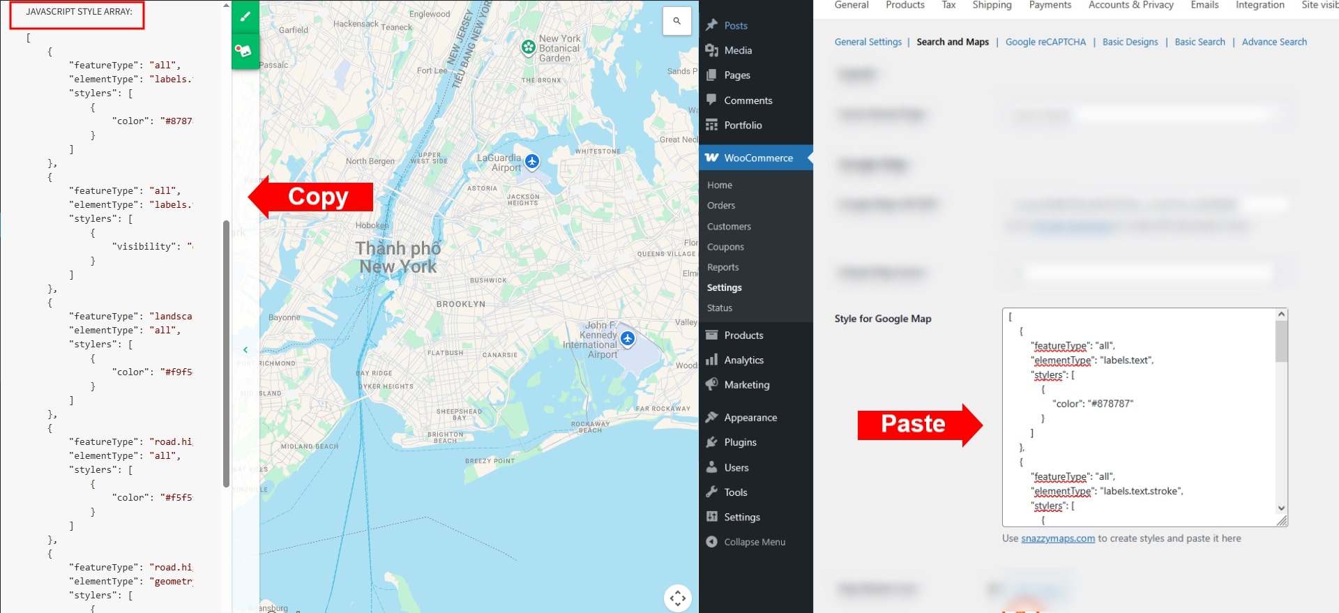
- Style for Google Map: You can change different styles for google map. Just go to the link in the note, it will be redirected to this website, where you can explore different styles of Google map. Then click a prefer one, expand the Javascript and paste into the blank frame
- Map Marker Icon: You can choose the default marker icon, or upload one from your site
- Map Cluster Icon: Select or upload the icon used for clustered markers when multiple properties are located close together on the map.
- Enable Travel Time: Enable to use the travel time feature. It can estimate the distance between the location of the property to a certain spot by Driving, Transit, Walking, Cycling.
- Distance Units: Choose a unit for the distance. It can be Kilometer or mile.
- Nearby Places
- Enable nearby places: Enable to use the nearby places feature
- Rank by: The results of a cretiria can be ranked by distance or prominence
- Distance: Ranks place results by distance from the location.
- Prominence: Ranks place results by their prominence.
- Nearyby place distance in: It can be Kilometer or mile.
- Nearby place field: Select useful areas near the properly, which will serve as information for choosing it.
- Calculation
- Mortgage calculation: Enable to use the mortgage calculation on the single product page as a section located under a real estate information section.
- Interest rate: A default interest rate to compute monthly mortgage payments.
- Number of repayment year: Set a default year which refers to the duration over a mortgage loan is repaid
- Mortgage Calculator Shortcode: Use this shortcode to display the Mortgage calculator anywhere you want
Google ReCAPTCHA
↑ Back to topGo to Dashboard > WooCommerce > Settings > Rees settings > Google ReCAPTCHA
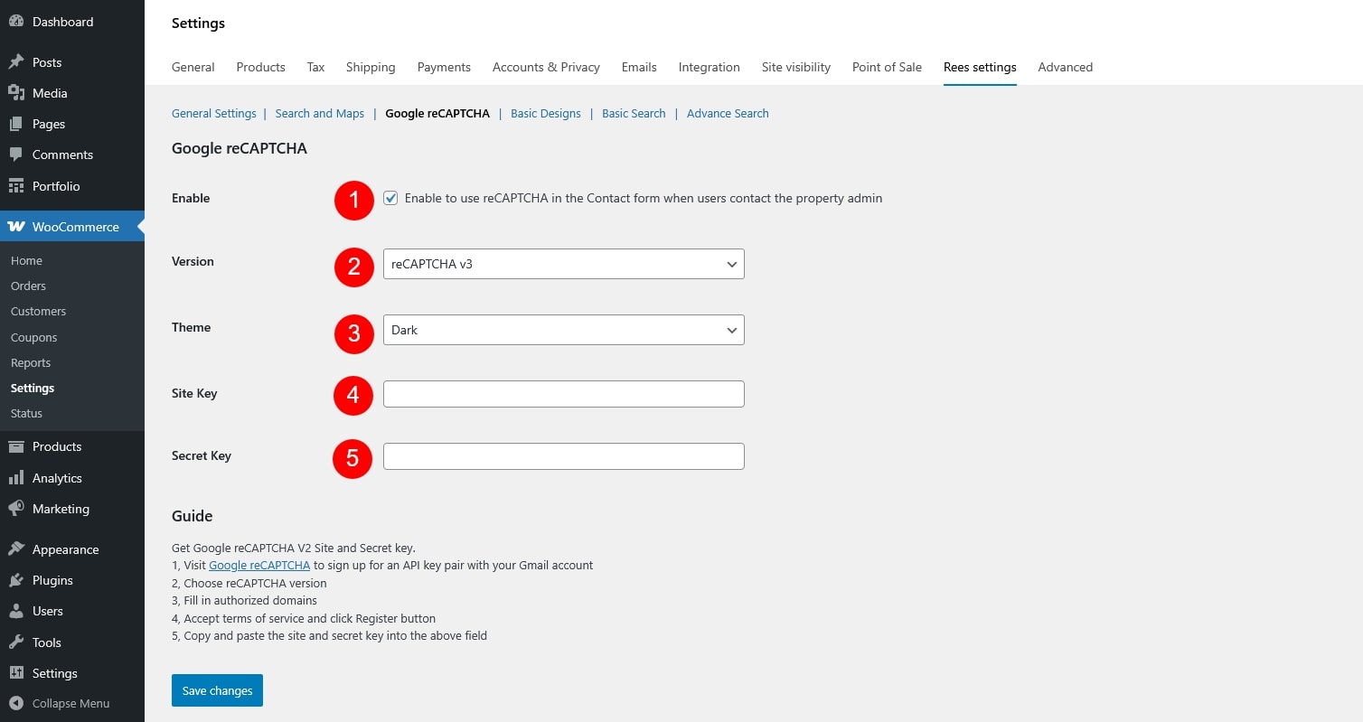
- Enable: Turn reCAPTCHA on or off for the supported forms.
- Version: Choose the reCAPTCHA version you want to use
- ReCaptcha 2: “I’m not a robot” Checkbox. This requires the user to click a checkbox indicating the user is not a robot. This will either pass the user immediately (with No CAPTCHA) or challenge them to validate whether or not they are human. This is the simplest option to integrate with and only requires two lines of HTML to render the checkbox.
- ReCaptcha 3: reCAPTCHA v3 allows you to verify if an interaction is legitimate without any user interaction. It is a pure JavaScript API returning a score, giving you the ability to take action in the context of your site: for instance requiring additional factors of authentication, sending a post to moderation, or throttling bots that may be scraping content.
- Theme: Select the appearance of the reCAPTCHA widget (Light or Dark). Applies to v2 only.
- Site Key: The public key provided by Google, used on the frontend to display reCAPTCHA.
- Secret Key: The private key provided by Google, used on the server to verify the reCAPTCHA response with Google.
Get Google reCAPTCHA V2 Site and Secret key
- Visit page to sign up for an API key pair with your Gmail account
- Choose reCAPTCHA v2 checkbox
- Fill in authorized domains
- Accept terms of service and click Register button
- Copy and paste the site and secret key into the above field
- Both Site Key and Secret Key must be generated from the Google reCAPTCHA admin console and entered correctly for reCAPTCHA to work

Basic Design
↑ Back to topGo to Dashboard > WooCommerce > Settings > Rees settings > Basic Designs
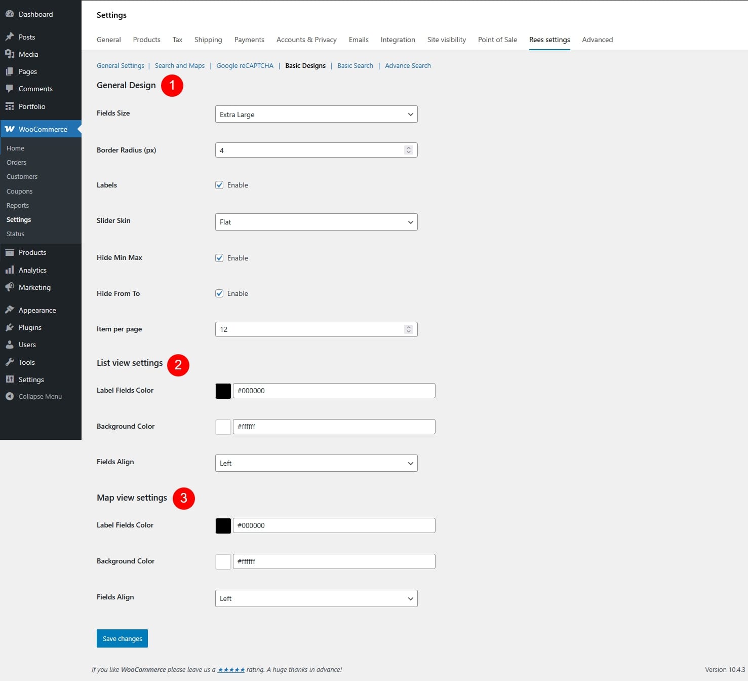
- General Design
- Fields Size: Set the overall size of input fields – small, extra small, medium, large, extra large
- Border Radius (px): Control how rounded the field corners are.
- Labels: Show or hide field labels.
- Slider Skin: Choose the visual style of the range/price slider.
- Flat

- Big

- Modern

- Sharp

- Round

- Square

- Flat
- List View Settings
- Label Fields Color: Color of field labels in list view.
- Background Color: Background color of filter fields in list view.
- Fields Align: Align filter fields (left / center / right).
- Map View Settings
- Label Fields Color: Color of field labels in map view.
- Background Color: Background color of filter fields in map view.
- Fields Align: Align filter fields (left / center / right).
Basic Search
↑ Back to topGo to Dashboard > WooCommerce > Settings > Rees settings > Basic Search
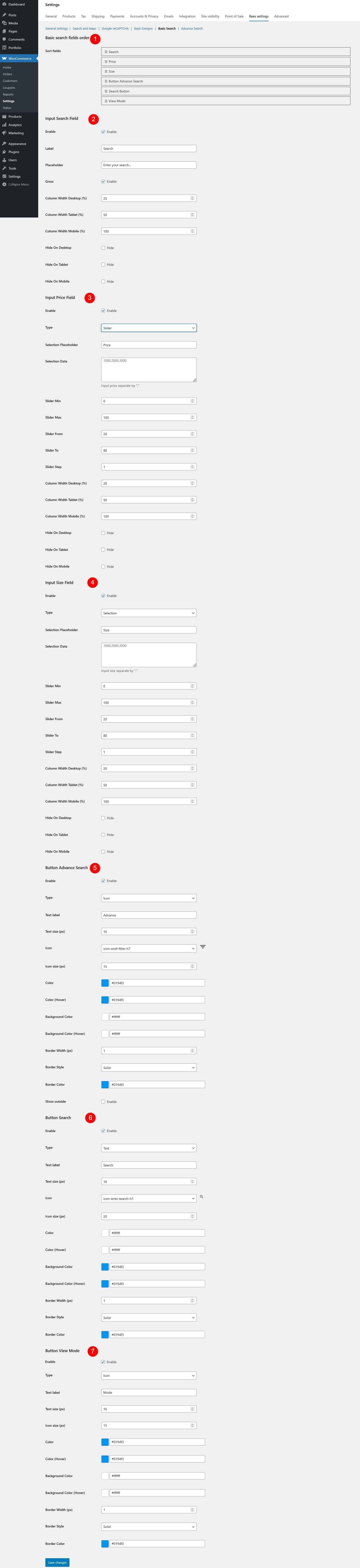
- Basic Search Fields Order
- Sort fields: Drag and drop to define the display order of search fields in the search form.
- Input Search Field
- Enable: Turn the keyword search field on/off.
- Label: Text shown as the field label.
- Placeholder: Text displayed inside the input field.
- Grow: Controls whether the Input Search Field can expand to fill available space in its row.
- Enabled: The search field will automatically grow and take up more horizontal space compared to other fields in the same row, making it more prominent and easier to use.
- Disabled: The search field keeps its fixed width based on the column width settings and will not expand beyond that size
- Column Width Desktop (%): Field width on desktop.
- Column Width Tablet (%): Field width on tablet.
- Column Width Mobile (%): Field width on mobile.
- Hide On Desktop: If enabled, this field will be hidden on desktop devices.
- Hide On Tablet: If enabled, this field will be hidden on tablet devices.
- Hide On Mobile: If enabled, this field will be hidden on mobile devices.
- Input Price Field
- Enable: Enable or disable price filtering.
- Type: Choose the type for the price input field
- Input
- Slider
- Selection
- Selection Placeholder: Text displayed when no price option has been selected.
- Selection Data: Available price options for selection type. Values must be separated by commas.
- Slider Min: Set the minimum price value available in the slider.
- Slider Max: Set the maximum price value available in the slider.
- Slider From: Default starting price when the slider is first loaded.
- Slider To: Default ending price when the slider is first loaded.
- Slider Step: Set the price increment step for the slider.
- Column Width Desktop (%): Field width on desktop.
- Column Width Tablet (%): Field width on tablet.
- Column Width Mobile (%): Field width on mobile.
- Hide On Desktop: If enabled, this field will be hidden on desktop devices.
- Hide On Tablet: If enabled, this field will be hidden on tablet devices.
- Hide On Mobile: If enabled, this field will be hidden on mobile devices.
- Input Size Field
- Enable: Enable or disable size filtering.
- Type: Choose how the size filter works
- Input
- Slider
- Selection
- Selection Placeholder: Text displayed when no size option has been selected.
- Selection Data: Define the available size options for the dropdown selection type. Values must be separated by commas.
- Slider Min: Set the minimum size value available in the slider.
- Slider Max: Set the maximum size value available in the slider.
- Slider From: Default starting size when the slider is first loaded.
- Slider To: Default ending size when the slider is first loaded.
- Slider Step: Set the size increment step for the slider.
- Column Width Desktop (%): Field width on desktop.
- Column Width Tablet (%): Field width on tablet.
- Column Width Mobile (%): Field width on mobile.
- Hide On Desktop: If enabled, this field will be hidden on desktop devices.
- Hide On Tablet: If enabled, this field will be hidden on tablet devices.
- Hide On Mobile: If enabled, this field will be hidden on mobile devices.
- Button Advance Search
- Enable: Show or hide the advanced search button.
- Type: Choose the button style – Text, Icon, or Icon Text (Text + Icon)
- Text Label: Text displayed on the button.
- Text Size (px): Font size of the button text.
- Icon: Select an icon from the built-in icon list and preview it.
- Icon Size (px): Set the size of the icon.
- Color: Set the text or icon color.
- Color (Hover): Set the text or icon color when hovered.
- Background Color: Set the button background color.
- Background Color (Hover): Set the background color when hovered.
- Border Width (px): Set the thickness of the button border.
- Border Style: Choose the border style – dashed, solid, or dotted.
- Border Color: Set the color of the button border.
- Show Outside: Display the button outside the search form layout.
- Button Search
- Enable: Enable or disable the search button.
- Type: Choose the button style – Text, Icon, or Icon Text (Text + Icon)
- Text label: Text displayed on the button.
- Text size (px): Font size of the button text.
- Icon: Select an icon to display on the button.
- Icon size (px): Set the size of the icon.
- Color: Set the text or icon color.
- Color (Hover): Set the text or icon color when hovered.
- Background Color: Set the button background color.
- Background Color (Hover): Set the background color when hovered.
- Border Width (px): Set the thickness of the button border.
- Border Style: Choose the border style – dashed, solid, or dotted.
- Border Color: Set the color of the button border.
- Button View Mode
- Enable: Enable or disable view mode switch.
- Type: Choose the button style – Text, Icon, or Icon Text (Text + Icon)
- Text label: Text displayed on the button.
- Text size (px): Font size of the button text.
- Icon size (px): Set the size of the icon.
- Color: Set the text or icon color.
- Color (Hover): Set the text or icon color when hovered.
- Background Color: Set the button background color.
- Background Color (Hover): Set the background color when hovered.
- Border Width (px): Set the thickness of the button border.
- Border Style: Choose the border style – dashed, solid, or dotted.
- Border Color: Set the color of the button border.
Advanced Search configuration
↑ Back to topGo to Dashboard > WooCommerce > Settings > Rees settings > Advance Search

- Advance search fields order
- Sort fields: Drag and drop to define the display order of advanced search fields in the search form.
- Input Type Field
- Enable: Enable or disable the property type field in the advanced search form.
- Label: Text displayed as the field label.
- Placeholder: Text displayed inside the field when there’s no value selected to guide user input.
- Column Width Desktop (%): Set the field width on desktop devices.
- Column Width Tablet (%): Set the field width on tablet devices.
- Column Width Mobile (%): Set the field width on mobile devices.
- Hide On Desktop: If enabled, the field will be hidden on desktop devices.
- Hide On Tablet: If enabled, the field will be hidden on tablet devices.
- Hide On Mobile: If enabled, the field will be hidden on mobile devices.
- Input Bathrooms Field
- Enable: Enable or disable the bathrooms field in the advanced search form.
- Label: Text displayed as the field label.
- Placeholder: Text displayed inside the field when there’s no value selected to guide user input.
- Data:Define the maximum number used to generate dropdown options for this field.
- Column Width Desktop (%): Set the field width on desktop devices.
- Column Width Tablet (%): Set the field width on tablet devices.
- Column Width Mobile (%): Set the field width on mobile devices.
- Hide On Desktop: If enabled, the field will be hidden on desktop devices.
- Hide On Tablet: If enabled, the field will be hidden on tablet devices.
- Hide On Mobile: If enabled, the field will be hidden on mobile devices.
- Input Bedrooms Field
- Enable: Enable or disable the bedrooms field in the advanced search form.
- Label: Text displayed as the field label.
- Placeholder: Text displayed inside the field when there’s no value selected to guide user input.
- Data: Define the maximum number used to generate dropdown options for this field.
- Column Width Desktop (%): Set the field width on desktop devices.
- Column Width Tablet (%): Set the field width on tablet devices.
- Column Width Mobile (%): Set the field width on mobile devices.
- Hide On Desktop: If enabled, the field will be hidden on desktop devices.
- Hide On Tablet: If enabled, the field will be hidden on tablet devices.
- Hide On Mobile: If enabled, the field will be hidden on mobile devices.
- Input Country Field
- Enable: Enable or disable the country field in the advanced search form.
- Label: Text displayed as the field label.
- Placeholder: Text displayed inside the field when there’s no value selected to guide user input.
- Column Width Desktop (%): Set the field width on desktop devices.
- Column Width Tablet (%): Set the field width on tablet devices.
- Column Width Mobile (%): Set the field width on mobile devices.
- Hide On Desktop: If enabled, the field will be hidden on desktop devices.
- Hide On Tablet: If enabled, the field will be hidden on tablet devices.
- Hide On Mobile: If enabled, the field will be hidden on mobile devices.
- Input States Field
- Enable: Enable or disable the states field in the advanced search form.
- Label: Text displayed as the field label.
- Placeholder: Text displayed inside the field when there’s no value selected to guide user input.
- Column Width Desktop (%): Set the field width on desktop devices.
- Column Width Tablet (%): Set the field width on tablet devices.
- Column Width Mobile (%): Set the field width on mobile devices.
- Hide On Desktop: If enabled, the field will be hidden on desktop devices.
- Hide On Tablet: If enabled, the field will be hidden on tablet devices.
- Hide On Mobile: If enabled, the field will be hidden on mobile devices.
- Input Cities Field
- Enable: Enable or disable the cities field in the advanced search form.
- Label: Text displayed as the field label.
- Placeholder: Text displayed inside the field when there’s no value selected to guide user input.
- Column Width Desktop (%): Set the field width on desktop devices.
- Column Width Tablet (%): Set the field width on tablet devices.
- Column Width Mobile (%): Set the field width on mobile devices.
- Hide On Desktop: If enabled, the field will be hidden on desktop devices.
- Hide On Tablet: If enabled, the field will be hidden on tablet devices.
- Hide On Mobile: If enabled, the field will be hidden on mobile devices.
- Input Neighborhoods Field
- Enable: Enable or disable the neighborhoods field in the advanced search form.
- Label: Text displayed as the field label.
- Placeholder: Text displayed inside the field when there’s no value selected to guide user input.
- Column Width Desktop (%): Set the field width on desktop devices.
- Column Width Tablet (%): Set the field width on tablet devices.
- Column Width Mobile (%): Set the field width on mobile devices.
- Hide On Desktop: If enabled, the field will be hidden on desktop devices.
- Hide On Tablet: If enabled, the field will be hidden on tablet devices.
- Hide On Mobile: If enabled, the field will be hidden on mobile devices.
- Input Feature Field
- Enable: Enable or disable the feature field in the advanced search form.
- Label: Text displayed as the field label.
- Placeholder: Text displayed inside the field when there’s no value selected to guide user input.
- Column Width Desktop (%): Set the field width on desktop devices.
- Column Width Tablet (%): Set the field width on tablet devices.
- Column Width Mobile (%): Set the field width on mobile devices.
- Hide On Desktop: If enabled, the field will be hidden on desktop devices.
- Hide On Tablet: If enabled, the field will be hidden on tablet devices.
- Hide On Mobile: If enabled, the field will be hidden on mobile devices.
- Input Land Area Field
- Enable: Enable or disable the feature field in the advanced search form.
- Туре: Choose how the land area filter is displayed
- Input
- Selection
- Slider
- Selection Placeholder: Text displayed when no value has been selected.
- Selection Data: Enter available land area values. Values must be separated by commas (e.g. 100, 200, 300).
- Slider Min: Set the minimum land area value available in the slider.
- Slider Max: Set the maximum land area value available in the slider.
- Slider From: Default starting land area when the slider is first loaded.
- Slider To: Default ending land area when the slider is first loaded.
- Slider Step: Set the land area increment step for the slider.
- Column Width Desktop (%): Set the field width on desktop devices.
- Column Width Tablet (%): Set the field width on tablet devices.
- Column Width Mobile (%): Set the field width on mobile devices.
- Hide On Desktop: If enabled, the field will be hidden on desktop devices.
- Hide On Tablet: If enabled, the field will be hidden on tablet devices.
- Hide On Mobile: If enabled, the field will be hidden on mobile devices.
Usage
↑ Back to topLearn how to use through this tutorial video
What customers see on the front end.